What Is the Brightest Color in the World?
The brightest color is a yellow-green around 555 nanometres — not because of chemistry but because of the eye. Here is what brightness really is, and how to use it.
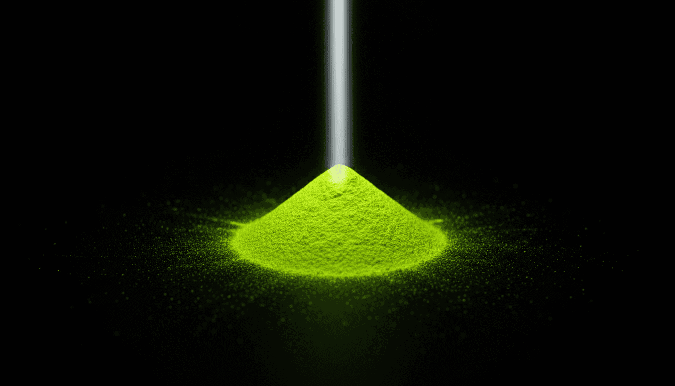
Ask someone what the brightest colour is and they'll usually say white, or maybe a fire-engine red. Neither is correct in the sense that matters most. The brightest colour to the human eye is a yellow-green around 555 nanometres, and the reason has nothing to do with the pigment or the light source — it's a property of the eye itself, and it explains far more about how colour actually works than the question sounds like it should.
At a glance
- Brightest light to the human eye
- yellow-green, ~555 nm
- Brightest common pigment (by reflectance)
- titanium white
- Brightest thing you can actually buy
- fluorescent yellow-green
- Brightest on a screen
- pure white, or a saturated RGB primary
- Brightest in nature
- bioluminescence
Why "brightest" isn't one question
Brightness splits into at least three different measurements that get casually collapsed into one word. Luminance is the physical intensity of light leaving a surface. Luminous efficiency is how strongly the eye responds to a given wavelength — this is where 555 nm wins outright. Lightness, which painters call value, is how bright a colour appears relative to white, a perceptual judgment rather than a physical one. A saturated red and a pale grey can share the same luminance and look nothing alike; a colour can be physically dim and perceptually vivid. Once you separate these, "the brightest colour" stops being a single fact and becomes three different, non-competing answers.
Why yellow-green wins
The eye has three types of cone cell, and their combined response — called the photopic luminous efficiency function — isn't flat across the spectrum. It peaks sharply at around 555 nanometres, in the yellow-green range, because that's where the medium- and long-wavelength cones' sensitivities overlap most and where daylight itself happens to peak. Light at that wavelength produces the strongest visual signal for a given amount of physical energy; move toward red or violet and you need dramatically more actual power to look equally bright, the same underlying reason additive light mixing can produce a brighter result than any pigment ever will. This is not a matter of taste — it's why tennis balls and high-visibility clothing converge on the same shade of loud yellow-green, and why American road rules now require it on school-zone warning signs and allow it on pedestrian and bicycle ones.
The trick that beats the limit
No ordinary surface can reflect more light than falls on it, which sets a hard ceiling on how bright a pigment can look — except for one workaround. Fluorescent pigments absorb light at one wavelength, usually ultraviolet, and re-emit it at a longer, visible one, adding emitted light on top of whatever they reflect. Under UV-rich daylight, a fluorescent yellow-green can genuinely look brighter than a plain white surface, which is physically impossible for a pigment that only reflects. This is the entire secret behind Day-Glo colours and high-visibility safety gear: they're not just sitting at the eye's peak sensitivity, they're cheating the brightness ceiling on top of it.
Advertisement
Why value beats pigment choice
Here's the part that's actually useful at the easel: the eye judges brightness relative to its surroundings, not in absolute terms — a grey square looks lighter against black than against white, even though it's identical in both, which is a large part of why black in a painting is never simply the absence of colour but an active tool for pushing everything nearby brighter. That means the brightest passage in a painting isn't decided by which tube of paint you bought; it's decided by what you place next to it. A single stroke of white surrounded by dark values reads as light. The same white surrounded by other light values reads as flat grey. Painters chasing brightness by buying ever-brighter pigments are fighting the eye; painters who arrange a wide value range and reserve their lightest values for one or two passages are working with it, and it costs nothing extra.
The bottom line
There isn't one brightest colour — there's a brightest wavelength (yellow-green, because of how the eye is built), a brightest ordinary pigment (titanium white, because it reflects the most light), and a way to cheat past both limits (fluorescence, which adds light rather than just bouncing it back). All three point to the same underlying fact: brightness is a negotiation between the light, the material, and the eye, and the eye is doing most of the deciding.
FAQ
What is the actual brightest colour in the world?
To human vision, a yellow-green around 555 nanometres, because the eye's sensitivity peaks there; among ordinary pigments, titanium white reflects the most light overall.
Why do fluorescent colours look brighter than white?
Because they absorb invisible ultraviolet light and re-emit it as visible light, adding to what they reflect — something a normal, non-fluorescent surface can never do.
Is brightness the same thing as saturation?
No. Saturation describes how intense a hue is; brightness describes how much light a surface appears to reflect or emit. A colour can be highly saturated and still relatively dark.
Does the brightest colour change in dim light?
Yes — in low light, the eye's rod cells take over from the cones, and peak sensitivity shifts toward blue-green, around 507 nanometres, a phenomenon called the Purkinje shift.
Why does contrast matter more than pigment for making a painting look bright?
Because the eye judges brightness relative to its immediate surroundings. A light value against a dark one reads as bright regardless of which specific pigment is used.