Color Bias and Mixing: Why Your Combinations Don't Match Your Expectations
Why do some color mixtures work perfectly while others turn muddy? Understanding color bias in paint transforms frustrating mixing into predictable control.
You've mixed blue and yellow a hundred times, but sometimes you get a beautiful, vibrant green and other times you get something that looks like it died on the palette. You follow the same color theory rules everyone teaches, but your purples turn muddy, your oranges look dull, and you can't figure out why the mixture in your head never matches what actually happens on your palette.
The missing piece is color bias, and once you understand it, color mixing transforms from frustrating guesswork into predictable control.
What Color Bias Actually Means
Here's what nobody tells you in basic color theory: there's no such thing as a pure primary color in paint.
That cadmium red you're using? It leans either toward orange or toward purple. Your ultramarine blue? It's got a purple bias. Lemon yellow tilts toward green, while cadmium yellow middle leans orange. These lean directions, these subtle undertones, are what we call color bias. And they're the reason your color mixing often fails to meet your expectations.
Think of it this way. If you're trying to mix a clean, vibrant orange, you need a yellow that's already biased toward orange (warm) and a red that's also biased toward orange (warm). Mix a cool yellow (one leaning toward green) with a cool red (one leaning toward purple) and you're essentially adding traces of all three primaries to your mixture. That's mud waiting to happen.
The traditional color wheel shows red, yellow, and blue as if they're single points. In reality, each primary exists along a spectrum. There are warm reds and cool reds. Warm yellows and cool yellows. Warm blues and cool blues. Manufacturers might call them all "red" or "blue" or "yellow," but the differences are enormous when you start mixing.
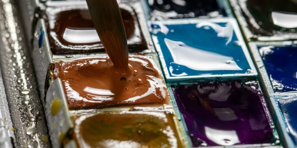
Let me be specific. Cadmium red medium is a warm red with an orange bias. Quinacridone magenta is a cool red with a purple bias. These are both red, but mix cadmium red with ultramarine blue and you'll get a completely different purple than mixing quinacridone magenta with ultramarine. One will be cleaner, more vibrant. The other will be muddier, more neutralized.
Here's the test you can do right now with your own paints. Take any blue and any yellow from your palette and mix them. Then try a different blue with a different yellow. Then another combination. You'll get greens ranging from vibrant and clean to dull and brownish. Same two primaries, wildly different results. That's bias at work.
Manufacturers don't make this easy. They'll label different chemical formulations with the same color name. "Cadmium yellow" from one brand might have a slightly different bias than "cadmium yellow" from another. This is why professional painters often stick with specific brands and specific pigment names, not just color names. They learn the bias of each tube through experience.
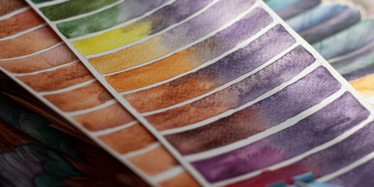
You can identify bias by comparing colors. Put your reds in a row and you'll see some lean distinctly orange, others distinctly purple. Do the same with your yellows and blues. The differences become obvious when you're looking for them. Make notes. Swatch them out. This isn't busy work; it's building the foundational knowledge that makes everything else easier.
The Impact of Bias on Secondary Colors
Secondary colors expose bias problems immediately. This is where most painters first encounter the frustration.
Let's start with green because it's usually the worst offender. You want a rich, vibrant green for foliage or landscape. You mix blue and yellow. Sometimes it works. Sometimes you get olive. Sometimes you get something that barely reads as green at all.
The issue is that most blues have a purple bias. Ultramarine, the most common blue on palettes, definitely leans purple. Mix it with lemon yellow, which leans toward green, and you get a decent green because at least one of your primaries is heading in the right direction. But mix ultramarine with cadmium yellow medium (orange-biased) and you're mixing blue-leaning-purple with yellow-leaning-orange. You've now got all three primaries in your mixture to some degree. That's guaranteed to dull your green.
The solution is understanding which combinations give you what results. For a clean, vibrant grass green, you want a blue that leans toward green (like phthalo blue green shade) and a yellow that also leans toward green (like lemon yellow or Hansa yellow light). Both pigments are heading in the same direction, toward green, so your mixture stays clean and saturated.
For a warmer, more olive or yellowish green, you might deliberately choose a warm yellow and a warm blue. This introduces some dulling, but in a controlled way that gives you the temperature and saturation you're actually after. The key is knowing you're doing it and why.
Violets and purples are even trickier because purple is famously difficult to mix. Most reds have an orange bias. Most blues have a purple bias. So when you mix a typical red with a typical blue, you're fighting against the red's tendency to pull toward orange. You get purples that look brownish or dull.
The cleanest purples come from a cool red (quinacridone magenta, alizarin crimson, or similar) mixed with a purple-leaning blue (ultramarine, French ultramarine). Both pigments want to go toward purple, so they cooperate. Mix a warm red like cadmium red with that same blue and compare the results. The difference is dramatic.
Orange seems easy because both typical reds and typical yellows tend to lean warm. Cadmium red and cadmium yellow give you a beautiful, vibrant orange because both are heading in the same direction. But if you grab quinacridone magenta and lemon yellow, your orange will be duller because you're working with a cool red and a cool yellow, each pulling away from pure orange.
Here's the pattern: for clean, vibrant secondaries, use two primaries that both bias toward the secondary you want. For more neutralized, complex secondaries, deliberately mix primaries that bias away from each other. Both approaches are useful. Neither is wrong. But you need to know which you're doing.
The mixing ratios matter too, and bias affects them. You can't just mix equal parts blue and yellow and expect consistent greens. A strong, highly saturated blue like phthalo needs very little to overpower a yellow. A more subtle blue like cerulean might need to be mixed in much larger proportion. The bias affects the strength and tinting power of each pigment, so your ratios need to compensate.
I recommend creating a mixing chart with your actual paints. Take every blue you own and mix it with every yellow you own in various ratios. Label them. You'll see exactly which combinations give you which greens. Do the same for reds and blues for purples, reds and yellows for oranges. This isn't wasting paint or time. This is building a reference library that will save you hours of frustration later.
Advanced Mixing Strategies Using Bias
Once you understand bias, you can use it strategically to get exactly the colors you need.
The split-primary palette is the most common system for working with bias intentionally. Instead of one red, one yellow, one blue, you carry two of each: a warm and a cool version. This gives you six colors instead of three, but those six give you access to far cleaner secondaries and far more mixing options.
A typical split-primary palette might include:
- Warm red: cadmium red medium
- Cool red: quinacridone magenta
- Warm yellow: cadmium yellow medium
- Cool yellow: lemon yellow
- Warm blue: ultramarine blue
- Cool blue: phthalo blue (green shade)
With these six colors plus white, you can mix nearly any color you need, and you can choose to mix it clean and vibrant or deliberately neutralized. Want a bright orange? Warm red and warm yellow. Want a vibrant purple? Cool red and warm blue (yes, the warm blue, because it leans purple). Want a clean green? Cool blue and cool yellow.
But here's where it gets really useful: you can also mix colors with intentional complexity. Want a sophisticated, neutralized orange that's not just dull but has character? Mix your warm red with your cool yellow. The yellow's green bias will slightly neutralize the orange, giving you something more subtle than a pure secondary. These slightly dulled colors are often exactly what you need for realistic painting, for atmospheric effects, for sophisticated color relationships.
Temperature control becomes precise once you understand bias. Need to shift a color warmer or cooler without changing the hue significantly? Add a tiny amount of a biased version of a related color. Your green is too cool? Add a touch of warm yellow rather than orange. Your purple feels off? A tiny bit of cool red might adjust it perfectly.
Creating specific color targets becomes a systematic process instead of magic. Let's say you're trying to match a specific observed color, maybe a weathered brick or a particular sky tone. You can analyze what primaries went into that color and what biases they must have had. Is it a dull orange? That's warm red and warm yellow with some blue to neutralize. Is that blue warm or cool? How much did it neutralize? You start breaking colors down into their component biases.
This is how painters work from life effectively. They're not guessing. They're reading the temperature, the saturation, the underlying bias of what they see, and then selecting palette colors with the appropriate biases to recreate those qualities.
Complex tertiary colors, the browns and olives and deep murky tones, all come from managing bias. A beautiful, rich brown isn't just "mix all the primaries." It's "mix these specific primaries with these specific biases in these specific proportions." Control the biases and you control the exact character of the brown. An orange-brown versus a purple-brown versus a green-brown are all different, and bias is what creates those differences.
Documentation matters here more than anywhere else in painting. When you mix a color you love, write down what went into it. Not just "red and blue" but "cadmium red medium and ultramarine blue, roughly 2:1 ratio." The bias information is crucial. Otherwise you'll never recreate that color exactly when you need it again six months from now.
I keep mixing notes in my studio. Not for every single mixture, but for ones that worked particularly well or solved a specific problem. "Sky gray, overcast, warm light: ultramarine + burnt sienna + white, very little sienna." That tells me not just what colors but what biases I used. Ultramarine's purple bias plus burnt sienna's orange bias creates a particular kind of neutral gray that's perfect for that specific atmospheric condition.
Building a personal mixing matrix takes time but pays off forever. Create charts that show your most-used colors mixed with each other in various ratios. You'll start to see patterns. You'll discover combination that you reach for again and again. You'll identify gaps where you need a color you can't quite mix cleanly, which might tell you to add one more tube to your palette with a specific bias.
The goal isn't to memorize everything. The goal is to understand the system well enough that mixing becomes logical rather than mystical. You develop intuition about what will happen when you mix specific pigments because you understand their biases and how those biases interact.
Optical Mixing and Broken Color
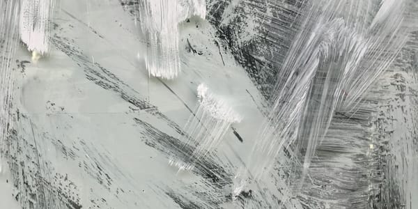
Mixing on the palette isn't the only way to create colors, and sometimes it's not even the best way. Optical mixing, where colors combine in the viewer's eye rather than on your palette, preserves intensity in ways that physical mixing can't.
The Impressionists and Post-Impressionists understood this deeply. Look at a Monet or a Seurat up close and you'll see distinct strokes of different colors sitting next to each other. Step back and those colors blend optically into new hues that are often more vibrant than if those same colors had been mixed on the palette first.
This works because of how our visual system processes color. When you physically mix blue and yellow on the palette, you're creating a substance that absorbs certain wavelengths of light. But when you put blue strokes next to yellow strokes, each stroke still reflects its own wavelengths. Your eye receives both sets of wavelengths and processes them together, creating the perception of green without the same kind of dulling you get from physical mixing.
The effect is subtle but real. Optical greens can have a shimmer, a vibrancy that mixed greens lack. This is especially true when you're trying to create luminous color or vibrating edges.
Pointillism takes this to an extreme, using tiny dots of pure color that blend at viewing distance. But you don't need to be that systematic to use the principle. Broken color, where you apply paint in separate strokes that remain visible, achieves similar effects with a looser approach.
Glazing is another form of optical mixing. When you apply a transparent or semi-transparent layer over a dried layer underneath, the colors interact optically. Light travels through the top layer, bounces off the lower layer, and travels back through the top layer to your eye. The colors mix in that light path rather than as physical substances.
This is why glazing creates depth and luminosity that direct mixing can't quite achieve. A glazed shadow has complexity because you're seeing multiple layers of color information. The bias of each glazed layer matters enormously. A cool glaze over a warm undertone creates different optical effects than a warm glaze over a cool undertone.
Scumbling, where you drag broken color over a dried layer so that both layers show through, is related. The optical mixing happens where the colors interact visually, while areas of pure underlying color and pure top color also remain. This creates richness and variation within a single passage.
The advantage of optical approaches is that you preserve the intensity and bias of individual colors while creating new color experiences for the viewer. Instead of neutralizing colors through mixing, you're letting them maintain their character while creating complex color relationships.
The disadvantage is that optical mixing requires more painting than simple direct color. You're building in layers or working in broken strokes rather than applying one mixed color and being done. For some subjects and some approaches, that extra work is worth it. For others, direct mixing is more efficient.
Understanding both approaches means you can choose which is right for any given situation. Sometimes I'll mix a color on the palette because I know that direct approach will give me exactly what I need. Other times I'll work in layers or broken color because I want that optical vibration, that sense of light moving through color rather than just sitting on the surface.
The key is recognizing that bias still matters in optical mixing. The individual colors you're layering or juxtaposing still have their biases, and those biases affect the optical result. A warm blue scumbled over a cool yellow creates a different optical green than a cool blue over a warm yellow. You're still managing bias; you're just doing it through application method rather than palette mixing.
Practical Palette Organization for Mixing
How you arrange your palette matters more than you might think. Thoughtful organization makes bias-aware mixing almost automatic.
The most straightforward system is the split-primary arrangement. Put your warm and cool versions of each primary in consistent positions. I keep my palette organized like this:
- Top left: warm yellow, cool yellow
- Top center: warm red, cool red
- Top right: warm blue, cool blue
- Along the edge: earth colors and any convenience colors
- Center: mixing area and white
This layout means I always know where to find the bias I need. I'm not hunting through tubes or guessing which blue is which. Warm yellow is always in the same spot. Cool red is always in the same spot. This consistency speeds up mixing because my hand goes to the right place automatically.
Some painters prefer a different organization, arranging colors around the palette like a color wheel. That works too, as long as you're consistent and you know the bias of each position. The goal is to make accessing the right bias intuitive rather than requiring thought.
Earth colors deserve mention here because they're essentially pre-mixed colors with built-in biases. Burnt sienna is an orange-brown with a warm bias. Raw umber is a green-brown with a cool bias. Yellow ochre is a warm, slightly orange yellow. These earth tones are incredibly useful because they give you complex, neutralized colors without mixing, but understanding their biases helps you use them effectively.
I used to avoid earth colors, thinking they were shortcuts or crutches. Now I recognize they're efficient tools. Burnt sienna mixed with ultramarine gives me beautiful, complex grays and browns much faster than building those colors from primaries. But I still need to understand that burnt sienna's orange bias and ultramarine's purple bias are creating those specific neutral tones.
Convenience colors are the pre-mixed secondaries and specialty colors that manufacturers offer. Permanent green, dioxazine purple, cadmium orange. These can be useful, but they can also make you lazy about understanding bias. I include a few convenience colors on my palette, but I make sure I can mix equivalents from primaries if needed. The convenience colors save time when I need that specific hue repeatedly, but I'm not dependent on them.
The mixing area in the center of your palette is where bias knowledge pays off most directly. Keep it clean enough that you can see what you're actually mixing. Muddy palette, muddy colors. I scrape my mixing area clean between major color changes so I'm not accidentally contaminating new mixtures with old ones.
White placement matters. I keep a large amount of white readily accessible because I use it constantly for tinting, lightening, and creating opacity. But I'm careful about white contamination. A tiny amount of white in your pure colors changes them significantly, usually cooling them and reducing saturation. Keep your mixing knife clean when moving between white and pure colors.
Limited palettes are excellent for learning bias. Try working with just six colors (the split primaries) for a series of paintings. This forces you to really understand how those six biases work together. You'll learn more about color mixing in six paintings with a limited palette than in sixty paintings where you just grab whatever tube looks close to what you need.
As you get comfortable with a limited palette, you might expand to eight or ten colors. But expansion should be strategic. Add colors that fill specific gaps or solve specific problems. Don't just accumulate tubes because they exist. Every color on your palette should earn its place by doing something your other colors can't do, or by doing it much more efficiently.
I've experimented with huge palettes and tiny palettes. These days I work with about ten colors plus white: two yellows, two reds, two blues, three earth tones, and maybe one convenience green. This gives me enough bias variation to mix anything I need while keeping decisions manageable. Your ideal palette might be different, but the principle is the same: enough bias variety to mix cleanly, not so many choices that you're paralyzed.
Troubleshooting Common Mixing Problems
Let's address the specific problems that drive painters crazy, because understanding why they happen is half of solving them.
Your color goes muddy immediately. This is almost always a bias problem. You're mixing primaries whose biases work against each other, introducing all three primaries into the mixture. Solution: check the bias of what you're mixing. For clean secondaries, make sure both primaries lean toward the secondary you want. For controlled neutralization, deliberately choose opposing biases but do it knowing what you're doing and why.
You can't achieve the saturation you want. You're either starting with low-saturation pigments or you're adding too much white too soon. Some pigments are naturally more intense than others. Phthalo blue is intensely saturated. Cerulean blue is beautiful but relatively soft. If you need high saturation, start with high-saturation pigments. And remember that white desaturates color while lightening it. For pale but saturated colors, start with a tiny amount of pure color and add white gradually, not the reverse.
Your mixture has unexpected temperature shifts. This is usually subtle bias at work. You mixed what you thought was a neutral gray, but it reads warm or cool in context. Check the bias of your mixing components. A "neutral" gray mixed from burnt sienna and ultramarine will lean slightly warm because burnt sienna's orange bias is strong. A "neutral" gray mixed from phthalo blue and burnt sienna will lean cooler because phthalo is so much stronger. Adjust your ratios or choose different pigments with different biases to get true neutrality.
Your mixture looks wrong but you can't identify why. Put it next to the color you're trying to match if you're working from reference. Is it too warm or too cool? Too light or too dark? Too saturated or too dull? Break the problem into components. Temperature problems are bias problems. Saturation problems are usually about mixing complementary colors or adding white. Value problems are about proportion and the actual darkness of your pigments.
The mixture separates or looks wrong when it dries. This is often a medium or technique issue rather than a bias issue, but it can also happen when you're mixing pigments with very different properties. Some pigments are transparent, others opaque. Some are heavy and granular, others smooth and staining. These physical properties affect how mixtures behave. Pay attention to pigment characteristics beyond just hue and bias. Mixing a transparent with an opaque can give you unexpected results as the mixture dries and the underlying layer affects the final appearance.
Overmixing creates lifeless color. Too much palette-knife action can actually dull colors slightly by introducing air and over-blending. Undermixing leaves streaks that might be beautiful broken color or might just look unfinished. Find the middle ground. Mix enough to combine the colors uniformly, but don't work the paint to death. For some applications, slightly unmixed color is actually richer and more interesting than perfectly blended color.
Your mixed color photographs differently than it looks in person. This is often about metamerism and the way different pigments reflect light under different conditions. Some pigment combinations that look right in studio light look completely different in daylight or under camera flash. There's no perfect solution, but awareness helps. Test your colors under different lighting conditions. If you're working for reproduction, photograph as you go and adjust based on how the camera sees the work, not just how your eye sees it.
You can't recreate a color you mixed before. This is why documentation matters. Write it down. Photograph your palette with notes. Keep mixing charts. The exact color you mixed last week is probably gone forever unless you recorded what went into it. This isn't a failure; it's the nature of hand-mixing color. But for colors you know you'll need repeatedly, documentation prevents endless frustration.
Building Color Mixing Mastery
Understanding bias intellectually is different from developing intuitive bias sense. The knowledge becomes useful when it becomes automatic, when you don't have to think through the logic every single time.
Practice exercises matter. Set up deliberate mixing challenges. Mix as many greens as you can from the blues and yellows on your palette. Really push the variation. Get twenty different greens. Notice which combinations give you which results. Do the same with purples, with oranges, with browns. This isn't busywork. This is training your eye and your mixing hand to work together.
Create personal mixing guides. These can be as simple as painted swatches with notes about what pigments and ratios created each color. Or as complex as full charts showing multiple pigments mixed in various combinations and ratios. The act of creating these guides teaches you as much as the final references help you later.
Test new pigments systematically when you add them to your palette. Don't just squeeze out a new color and start using it randomly. Mix it with each of your existing colors to see what it does. Test its bias by mixing it toward different secondaries. See how it behaves with white, with black, with earth tones. Spend time getting to know a new pigment before you depend on it in actual work.
Work from observation regularly. Trying to match actual observed colors forces you to analyze bias in real-world color. That weathered red barn isn't just red. It's a red with a specific bias, probably warm, probably slightly neutralized by atmospheric effects and age, maybe cooled in shadow areas. Trying to mix it precisely makes you think about bias in concrete rather than abstract terms.
Study how painters you admire handle color. Look at original paintings in museums if you can, or high-quality reproductions. Try to analyze what biases they must have used to create specific color relationships. What blues created those atmospheric distances? What reds and yellows made those flesh tones feel alive rather than flat? You're training your eye to read bias in finished work, which deepens your understanding.
Limit yourself periodically. Go back to a basic split-primary palette and work with just those six colors for a while. This prevents you from relying on convenience and forces you to really understand bias mixing. Some of my strongest color learning happened during periods when I deliberately restricted my palette.
Document your discoveries. When you mix a color that surprises you or solves a problem, write it down. When you figure out why a mixture failed, note that too. These notes become your personal color mixing manual, more valuable than any generic color theory book because it's specific to your pigments, your medium, your working methods.
Keep mixing charts updated. As you replace pigments or add new ones, update your reference charts. When you discover a new mixing combination that works well, add it to your charts. These aren't one-time projects. They're living documents that grow with your practice.
Learn through repetition. The first time you consciously choose a cool blue instead of a warm blue to mix a specific green, you have to think about it. The hundredth time, your hand goes to the cool blue automatically. That's when bias knowledge has become working knowledge. Trust that repetition builds intuition.
Balance experimentation with practical application. Some studio time should be pure exploration: what happens if I mix these things? Other time should be focused on specific goals: I need this exact color for this painting. Both types of work teach you about bias, but in different ways. Exploration reveals possibilities. Application refines control.
Recognize that color mixing mastery is ongoing. You'll never finish learning how colors interact because there are infinite combinations and infinite contextual variations. That's not frustrating; it's what keeps color work interesting decade after decade. There's always something new to discover about how bias affects mixing, always another subtle relationship to understand.
The goal isn't perfect knowledge. The goal is working knowledge that makes your painting practice more efficient and gives you more expressive range. When you can look at a color you need and know which biases to combine to get it, when mixing stops being guesswork and starts being predictable, when you can adjust a color toward exactly the quality you want, that's when bias understanding transforms from intellectual concept to practical skill.
And here's the thing about mastery: it doesn't make painting easier in the sense of requiring less thought. It makes painting easier in the sense of giving you access to exactly the colors you need to say what you want to say. Your color becomes a more precise instrument for your ideas, your vision, your unique way of seeing. That precision doesn't constrain you. It frees you to work with greater subtlety, greater complexity, greater control.
Understanding bias is foundational to that freedom. It's one of those things that seems like technical minutiae until you actually grasp it, and then you realize it changes everything about how you mix, how you see, how you paint. The blues and yellows you've been mixing for years reveal themselves as having been working with or against you all along, depending on their biases and whether you knew what those biases were doing.
So take the time to learn your pigments. Test them, chart them, mix them in every combination you can think of. Write down what works. Learn from what doesn't. Build the kind of intimate familiarity with your colors that lets you use them with precision and confidence. The payoff isn't just cleaner greens or better purples, though you'll get those too. The payoff is color that does exactly what you need it to do, every time, because you understand the system that governs how it behaves.
That understanding is what transforms color mixing from frustration into control, from guessing into knowing, from fighting your materials into working with them. And that's worth every minute you spend learning it.