You're Not Seeing Color the Same Way as Everyone Else
Color exists in your brain more than in the world. The science of color perception explains optical illusions, simultaneous contrast, and why context changes everything about how we see color.

Color doesn't exist in the world the way we think it does. It's not a property of objects like weight or temperature. Color is an interpretation your brain makes based on wavelengths of light, and that interpretation happens through biological systems that vary from person to person. The red you see might be genuinely different from the red someone else sees, and you'd never know because you both learned to call that experience "red." This isn't just philosophical speculation, it's neuroscience and psychology that has profound implications for how you think about and use color in your work.
Understanding that color is constructed by your brain rather than discovered in the world changes how you approach color mixing, color relationships, and color communication. You start recognizing that color isn't objective truth you're trying to match accurately, it's perceptual experience you're trying to create. The goal isn't making your painting's green exactly match the green of a leaf because that "exact match" doesn't actually exist. The goal is creating color relationships that produce the experience of looking at foliage, which is a different problem entirely.
The science of color perception also explains phenomena that seem impossible or contradictory. Why does the same gray look different against different backgrounds? Why do colors that clash in one context work beautifully in another? Why can you see colors that don't "exist" in the physical spectrum? All of these perceptual effects come from how your visual system processes color, and understanding them helps you use color more effectively because you're working with perception rather than fighting against it.
This isn't just theoretical knowledge. These perceptual effects are tools you can deploy intentionally once you understand them. Simultaneous contrast, color constancy, optical mixing, afterimages, all of these are practical techniques that artists use to create specific effects. The science gives you vocabulary and framework for understanding color experiences that intuition alone might miss, and that understanding makes you more capable as a colorist regardless of your medium or style.
How Eyes and Brains Create Color
The process of seeing color involves multiple stages, from light hitting your retina to your brain constructing the final color experience. Understanding this process helps you recognize where and why color perception can vary and what that means for making art.
Light itself isn't colored. Light is electromagnetic radiation at various wavelengths, and only a tiny slice of the electromagnetic spectrum, from about 380 to 700 nanometers, is visible to humans. Within this visible range, different wavelengths trigger different color sensations. Shorter wavelengths around 400-450nm typically create blue sensations, medium wavelengths around 500-570nm create green, longer wavelengths around 620-700nm create red. But this one-to-one wavelength-to-color relationship is oversimplified and misleading because most color experiences don't come from single wavelengths.
Your retina contains two types of photoreceptors, rods and cones. Rods handle low-light vision but don't distinguish color. Cones, concentrated in your fovea at the center of your vision, are responsible for color perception and detailed vision. Most people have three types of cones, each sensitive to different ranges of wavelengths. S-cones respond best to short wavelengths in the blue range. M-cones respond to medium wavelengths in the green range. L-cones respond to longer wavelengths in the red-orange range. But these sensitivities overlap significantly, and individual cone responses don't directly equal color experiences.
The key insight is that your brain doesn't have access to wavelength information directly. It only knows how much each cone type is firing. A specific pattern of S, M, and L cone activation creates the experience of a color, but different combinations of wavelengths can create the same pattern and thus the same color experience. This is called metamerism, and it's why different light sources make colors look different even though the object itself hasn't changed. The wavelengths reaching your eye are different, but if they trigger the same cone pattern, you see the same color.
The signal from your cones gets processed through multiple layers of neural processing before reaching your conscious awareness as color. Retinal ganglion cells compare outputs from different cone types, creating opponent channels. One channel compares L and M cones, creating the red-green opposition. Another compares S cones to a combination of L and M, creating blue-yellow opposition. A third channel combines all cone types for brightness information. This opponent process explains why you can't imagine reddish-green or bluish-yellow. These combinations are opponent at the neural level, they cancel each other rather than combining.
Your visual cortex, particularly area V4, performs additional processing that creates the final color experience. This processing includes comparing colors across your visual field, adjusting for lighting conditions, and integrating color with form and depth information. By the time you consciously experience color, it's been interpreted through multiple processing stages, each one potentially influenced by context, expectation, attention, and individual variation in biology.
Individual differences in color perception start at the receptor level. Cone density varies between people. The specific wavelengths that activate your cones most strongly vary slightly from person to person. Some people, mostly women, have four types of cones rather than three, potentially seeing color distinctions that trichromats can't. About eight percent of men and a much smaller percentage of women have some form of color vision deficiency, usually in the red-green system. These biological variations mean color experience genuinely differs between individuals.
The implications for artists are significant. You can't assume everyone sees your color choices the way you do. What reads as subtle distinction to you might be invisible to someone with different color perception. What seems like obvious clash to you might work harmoniously for someone else. This doesn't mean color is meaningless or that color communication is impossible. It means understanding that color is perceptual and that you're creating effects in viewers' brains rather than placing objective properties on canvas or screen.
Cultural and linguistic differences add another layer to perceptual variation. Different languages divide the color spectrum differently, and there's evidence that language affects color perception. Russian speakers, whose language has different words for light blue and dark blue, can distinguish these colors faster than English speakers who use one word for both. This suggests that how we talk about color actually influences how we see it, not just how we describe it. The implications for how artists from different linguistic backgrounds think about and use color are profound.
Simultaneous Contrast and Color Interaction
One of the most important perceptual effects for artists is simultaneous contrast, the phenomenon where colors influence each other based on proximity. Understanding this effect is essential for controlling how colors actually appear rather than just what pigments you apply.
The basic effect is that any color appears different depending on what surrounds it. A gray square on a dark background looks lighter than the same gray on a light background. A gray on a red background appears slightly greenish. A gray on a blue background appears slightly orange. This isn't optical illusion in the sense of being fake or wrong, it's how color vision actually works. Your visual system is constantly comparing colors to each other rather than evaluating them in isolation.
This comparative processing evolved because it's more useful for survival than absolute color measurement. Knowing that a fruit is redder than the surrounding leaves matters more than knowing its absolute wavelength. Your brain optimizes for detecting contrasts and boundaries because that's where important information usually lives. This means that color is inherently relational. A color doesn't have a fixed appearance, it appears differently in different contexts, and this contextual variation is a feature of perception rather than a bug to overcome.
Simultaneous contrast affects hue, value, and saturation. A color surrounded by its complement appears more saturated. A warm color on a cool background appears warmer and vice versa. A light color on a dark ground appears lighter than the same color on a light ground. These effects aren't subtle, they're dramatic enough to make the same physical color appear distinctly different in different contexts. This is why colors that work beautifully in your palette look different once they're on the canvas surrounded by other colors.
Artists who understand simultaneous contrast use it intentionally rather than fighting against it. If you want a color to appear particularly intense, surround it with its complement or with neutral. If you want a passage to appear lighter, place it against darker surroundings. If you want to create visual vibration and energy, place colors that enhance each other's intensity in proximity. The color you apply isn't the color people see. The color people see is the result of the color you applied plus the effects of simultaneous contrast with surrounding colors.
Value contrast affects color perception more than most artists realize. The same hue at the same saturation looks drastically different at different values, and value contrast with surroundings affects apparent color temperature and intensity. A medium value red appears warm against darker values but can appear almost cool against very light values. Understanding this value-color interaction prevents you from trying to fix color problems that are actually value problems. Sometimes adjusting value relationships fixes what seems like a color issue.
The amount of each color affects simultaneous contrast effects. A tiny spot of color surrounded by a large area of another color is affected more than large areas of similar size. This is why accents and small details need to account for simultaneous contrast more carefully than large color areas. That small highlight you paint might look very different once it's surrounded by the shadow colors around it. Test it in context rather than mixing it in isolation.
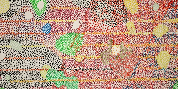
Edges and boundaries create the strongest simultaneous contrast effects. The interaction happens most intensely right at color boundaries, creating halos or edge effects that can enhance or muddy transitions depending on how they're handled. Impressionists and Pointillists exploited these edge effects deliberately, creating vibrant color through strategic contrast at boundaries. Understanding edge effects helps you control whether color transitions feel sharp and vibrant or soft and blended.
Simultaneous contrast effects are stronger at medium lightness levels than at extremes. Very dark or very light colors show less simultaneous contrast than middle values. This is why extremes of value sometimes need extra saturation to maintain color identity. A very light yellow needs to be quite saturated to read as yellow rather than white. A very dark blue might need extra saturation to read as blue rather than black. The middle value range is where color is most sensitive to context and where simultaneous contrast has greatest effect.
Why Color Changes With Context
Beyond simultaneous contrast, color perception is affected by broader contextual factors including the larger composition, the viewing conditions, the viewer's expectations, and the relationship between colors at greater distances from each other. Understanding these contextual effects helps you think about color at a composition level rather than just locally.
Color constancy is your brain's attempt to maintain stable color perception despite changing illumination. You perceive a white shirt as white whether it's in sunlight, shade, or indoor light, even though the actual wavelengths reaching your eye are very different in each condition. Your visual system discounts the illumination to extract object color. This is incredibly useful for navigating the world but it creates problems for artists trying to match observed color because you have to overcome this automatic compensation to see the actual color of light on surfaces.
Breaking through color constancy to see real color relationships requires training and tricks. Squinting reduces detail and makes you see broad color relationships. Looking at scenes through a hole in paper isolates color from context, breaking constancy. Comparing observed colors directly to your palette rather than trying to match from memory helps. Digital tools like taking photos and sampling color in editing software can reveal how different observed colors actually are from what your brain tells you they are. These methods help you see past your visual system's helpful but artistically limiting constancy mechanisms.
Memory color, your brain's stored information about what color things "should" be, influences what you see and remember. You know grass is green, so you tend to see and remember grass as greener than it might actually appear in specific lighting. You know faces are peachy-tan, so you perceive that even when actual flesh color includes greens, grays, purples. Fighting against memory color is part of learning to observe accurately. The color you remember seeing is often quite different from the color that was actually there, and this memory distortion happens automatically.
Expectation and attention affect color perception more than most people realize. If you're told to look for warm colors, you'll notice them more readily than cool colors. If you expect something to be a certain color, you might literally perceive it that way even if it's different. Artists working from reference need to consciously observe rather than assuming, because assumption and expectation filter perception. The color you think you see is often the color you expect rather than the color that's there.
Adaptation, where your color perception shifts based on what you've been looking at, creates another contextual effect. Stare at red for a while and you'll see a green afterimage when you look away. Your cones fatigue and your opponent process creates the complementary sensation. But adaptation happens more subtly too. Working on a painting with a particular color cast for hours makes you adapted to that cast, unable to see it clearly. Stepping away and returning with fresh eyes often reveals color issues you couldn't see while adapted. This is why breaks and fresh viewing matter for assessing color accurately.
Cultural context affects color perception and interpretation even if the basic sensory experience is similar. The same purple might read as royal in one context and psychedelic in another. The same red might feel traditional or radical depending on what surrounds it and what cultural moment you're in. These associative effects are learned rather than biological but they affect color experience as surely as perceptual effects do. Understanding that color meaning is contextual helps you use color with awareness of how context shapes interpretation.
Temporal context, what colors have appeared earlier in a sequence, affects how current colors are perceived. In film and video, color grading creates emotional trajectories by shifting overall color palette across scenes. In paintings, where the eye tends to scan in certain patterns, earlier-seen colors affect how later-seen colors register. This sequential effect is less obvious than spatial simultaneous contrast but it operates similarly. Your perception of any color is affected by what you saw immediately before, creating temporal color relationships that sophisticated work exploits.
Color Constancy and Adaptation
Understanding how your visual system maintains color constancy and adapts to different viewing conditions helps you both overcome these effects when trying to observe accurately and exploit them when trying to create specific perceptual experiences in your work.
The classic demonstration of color constancy is the checkerboard shadow illusion, where a square in shadow appears the same lightness as a square in light even though the physical luminance is dramatically different. Your brain interprets "this square is white in shadow" versus "this square is medium gray in light" even though the actual light reaching your eye is identical. This interpretation is so strong that even when you know intellectually the squares are the same, you can't make yourself see them that way. The constancy mechanism overrides conscious knowledge.
The usefulness of color constancy for daily life makes it a challenge for visual artists. You're trying to reproduce appearances, but the appearances you perceive aren't the appearances that create those percepts. To paint a white object in shadow, you need to paint a medium value, but your brain keeps telling you it's white. Learning to see past constancy, to observe the actual color-value relationships independent of your knowledge of object properties, is one of the fundamental challenges of representational painting.
Adaptation to overall illumination happens quickly but unconsciously. Move from outdoors to indoors and within minutes your perception adapts to the different color temperature of the light. The indoor light might be much warmer than daylight, but you stop noticing this as your visual system adjusts. This is why photographs taken indoors without white balance correction look so orange while the scene appeared normal to you. Your brain compensated in ways the camera didn't.
Using this adaptation deliberately creates effects in your work. If you establish a particular overall color temperature and maintain it consistently, viewers adapt to it and it becomes their neutral. Then introducing something with different color temperature creates strong emphasis because it stands out against the adapted neutral. Films use this technique extensively, establishing color palettes that viewers adapt to, then introducing contrasting color for emotional or narrative emphasis.
Local adaptation, where specific areas of your retina adapt differently based on what they're looking at, creates stronger and more useful effects for artists. This is what happens with afterimages. Stare at a red square, then look at white, and you see a green square. Your red cones fatigued, leaving the other cones relatively more active, creating green sensation. But this also happens continuously and less dramatically during normal viewing. Whatever you're looking at is being discounted, making you more sensitive to different colors when you shift gaze.
Successive contrast, the afterimage effect, can be used deliberately in sequential viewing situations like film, animation, or series of paintings. Showing one color strongly, then switching to another, creates stronger perception of the second color than it would have without the first. The adaptation to the first color enhances the perception of the second if they're appropriately related, usually complementary. This temporal manipulation of color perception adds a dimension to color use that static single images don't have.
The adaptation state viewers arrive in affects how they see your work. Someone coming from bright outdoor light sees your indoor exhibition work differently than someone who's been indoors for an hour. There's no single "correct" viewing condition, and you can't control viewer adaptation state entirely. But you can consider it, perhaps creating work that functions across different adaptation states or understanding that gallery lighting creates particular adaptation that affects how colors appear compared to studio lighting.
Breaking adaptation deliberately to see fresh is an essential skill for artists. Work on a painting long enough and you adapt to its color palette, making you blind to issues that would be obvious to a fresh viewer. Techniques for breaking adaptation include taking breaks and returning with fresh eyes, viewing work in different lighting, viewing in a mirror which reverses and freshens your perception, viewing at a distance, and getting outside opinions from people who haven't adapted to your palette. These methods help you see your color choices as others will see them rather than through your adapted perception.
Individual Differences in Color Vision
Understanding that color perception varies between individuals helps you make more informed decisions about color use and prevents you from assuming your color experience is universal. These differences range from subtle variations in normal color vision to more significant color vision deficiencies.
Normal color vision, technically trichromatic vision, varies more than most people realize. Even among people with normal color vision, slight differences in cone pigments mean that color matches vary between individuals. What one person sees as a perfect neutral gray might look slightly warm or cool to another. These differences are usually subtle enough not to matter for most purposes, but they mean that precise color matching between people is actually impossible at a technical level even though it works well enough practically.
Tetrachromacy, having four types of cones instead of three, occurs in a small percentage of people, mostly women. This is because the genes for the M and L cones are on the X chromosome, and some women have variant forms of both, giving them four cone types. Tetrachromats potentially see color distinctions that trichromats can't, though whether this potential is realized in actual perceptual experience is complicated and not fully understood. For artists, the implication is that some viewers might see subtle color distinctions you can't, while you might see distinctions others miss.
Color vision deficiency, affecting about eight percent of men and less than one percent of women, usually involves altered M or L cone function, creating red-green confusion. This doesn't mean seeing in black and white, it means reduced ability to distinguish certain red-green differences while other color perception remains normal. Less commonly, blue-yellow deficiencies occur, and very rarely, total color blindness. Understanding these variations helps you make work accessible to wider audiences by not relying entirely on color distinctions that some viewers can't see.
Designing for color vision deficiency doesn't mean avoiding color, it means ensuring that important information isn't conveyed by color alone. If two elements need to be distinguished, make sure they differ in value or saturation, not just hue. Red and green that are the same value might be indistinguishable to someone with red-green deficiency, but if one is also darker, the distinction remains visible. Digital tools can simulate different types of color vision deficiency, helping you test whether your color choices work for all viewers.
Age affects color perception progressively. The lens yellows with age, filtering out blue light and shifting color perception toward warmer. This is why elderly people sometimes prefer brighter, cooler color choices to compensate for their yellowed lenses, while younger people might find these choices too cool. Understanding this age effect helps you recognize that viewers of different ages might literally see different colors when looking at the same work. There's no single correct perception, just different perceptions based on different biological systems.
Individual differences in color naming and categories affect how people think about and remember color even if their perceptual experience is similar. Some people have rich color vocabularies with names for subtle distinctions. Others use broader categories. These linguistic differences affect how people communicate about color but they might also affect how they perceive and remember color. An artist with extensive color vocabulary might see and use distinctions that someone with simpler color categories doesn't notice or consider important.
Synesthesia, where color perception is triggered by non-visual stimuli like sounds or letters, creates radically different color experiences for some people. Synesthetes might have strong, automatic associations between colors and other experiences that non-synesthetes don't share. While rare, synesthesia shows how variable color experience can be and reminds us that the color experiences we take for granted aren't universal.
The practical implication of all this individual variation is humility about color communication. You can't assume everyone sees what you see or responds to color the way you do. This doesn't make color meaningless or color-based art impossible. It means working with the knowledge that color is perceptual, individual, and contextual. You create color experiences for viewers, knowing those experiences will vary, rather than placing objective colors that everyone will perceive identically. This perceptual understanding makes you more effective, not less, because you're working with reality rather than with idealized assumptions about color perception.
Using Perceptual Effects Intentionally
Understanding the science of color perception transforms from theoretical knowledge to practical skill when you learn to use these effects deliberately in your work. This section covers specific techniques that exploit perceptual phenomena to create particular effects.
Simultaneous contrast for emphasis means placing colors against backgrounds that enhance rather than diminish them. Want a color to appear more intense? Place it against its complement or a neutral. Want it to appear lighter? Surround it with darker values. Want it to advance? Place it against cooler colors. These basic applications of simultaneous contrast give you control over how colors actually appear rather than leaving it to chance.
Optical mixing, where separate colors blend in perception rather than on the palette, creates luminosity and vibration that physical mixing can't match. Pointillist techniques place complementary colors in small dots that mix optically, creating more vibrant color than mixing those complements on the palette would. This technique isn't just historical, it's useful anytime you want maximum color intensity. Broken color, scumbling, any technique that lets colors interact optically rather than physically can create effects that premixed color can't.
Using afterimages and successive contrast deliberately creates effects in sequential work. In film, showing a scene saturated with warm color, then cutting to a cooler scene, makes the second scene appear even cooler than it physically is because viewers are adapted to warmth. In installations with multiple pieces, you can use viewing sequence to create perceptual effects where each piece affects how the next is perceived. This temporal dimension of color use adds possibilities beyond single static images.
Exploiting color constancy rather than fighting it means using consistent color temperature to establish a "light source" that viewers accept and adapt to, then using variations from that temperature to create emphasis. If your overall palette establishes warm light, anything neutral or cool automatically reads as shadow or different lighting, using the viewer's constancy mechanisms to interpret spatial and lighting relationships. This is how chiaroscuro works at the color level, not just value.
Creating perceptual transparency and luminosity uses how your visual system interprets overlapping colors. When one color looks like it's showing through another, specific color relationships make this effect convincing. The overlapping color needs to be a believable mixture of the two "separate" colors, and value relationships need to support the interpretation. Understanding the perceptual rules that create transparency effects lets you create them convincingly even when no actual transparency exists.
Edge effects and how boundaries between colors create perceptual phenomena can be exploited for various purposes. Soft edges between similar colors create gentle transitions. Hard edges between contrasting colors create vibration and energy. Controlling edge quality controls how colors interact and how attention moves through the work. This isn't just about technical painting skill, it's about understanding how edges affect color perception.
Using value and saturation to control simultaneous contrast intensity means understanding that these effects are strongest at certain value and saturation levels. If you want strong simultaneous contrast, use medium values and moderate saturation. If you want to minimize it, push toward very light or very dark values where constancy is weaker. This gives you control over whether colors influence each other strongly or remain more independent.
Understanding these perceptual effects also prevents you from creating accidental effects you don't want. Knowing that certain color combinations will vibrate uncomfortably means you can avoid them unless vibration is your goal. Knowing that certain value relationships will create unwanted spatial effects means you can design value structure that supports your spatial intentions. Knowledge of perceptual effects gives you control rather than leaving these crucial aspects to accident.