How Color Symbolism in Religious Painting Changed Across Centuries
Religious painting color symbolism changed dramatically across centuries. Blue shifted from modest to divine, gold lost dominance, and meaning evolved with theology.
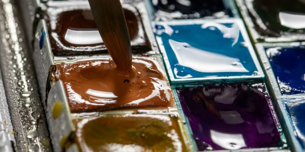
Mary's blue robes didn't always signify divinity. For centuries, blue meant humility, servitude, even poverty. Then ultramarine arrived from Afghanistan, costs exceeded gold, and suddenly blue became the most precious color available to painters.
Economics transformed theology into color.
The assumption that religious painting color symbolism remained static across Christian art history collapses under basic material examination. What blue, red, gold, white, purple, and green signified in 6th-century Byzantine mosaics differs substantially from 15th-century Flemish altarpieces, which differ again from 17th-century Baroque ceiling frescoes.
These shifts weren't arbitrary aesthetic choices. They responded to changing theological emphasis, available pigment technologies, patronage economics, and evolving relationships between religious institutions and artistic practice.
Understanding how color symbolism transformed requires examining why certain colors became associated with specific religious figures, how material scarcity shaped symbolic meaning, when theological reforms altered color conventions, and how artistic innovation disrupted established systems.
The story isn't linear progression toward more sophisticated color use. It's series of disruptions, economic interventions, theological debates, and artistic rebellions that cumulatively transformed how color communicated religious meaning.
Early Christian Color as Byzantine Inheritance
Early Christian art inherited color symbolism from late Roman and Byzantine traditions rather than developing autonomous Christian system from theological principles.
Purple maintained imperial associations from Roman practice. The color signified authority, wealth, and divine right to rule because Tyrian purple dye cost extraordinary amounts and was legally restricted to imperial use. This secular color hierarchy transferred directly into Christian iconography.
Christ appears in purple robes in early mosaics because imperial purple signified supreme authority. The theological claim that Christ represents ultimate spiritual authority found visual expression through existing color symbolism of temporal power.
Gold dominated Byzantine religious art not primarily for symbolic reasons but because gold tessera in mosaics created luminous surfaces that transformed architectural spaces into otherworldly environments. The theological justification followed the aesthetic effect rather than preceding it.
The gold backgrounds in Byzantine icons eliminated spatial depth and earthly context, creating transcendent space where sacred figures existed outside normal reality. This formal function became sacralized as theological necessity, but the origins were as much practical and aesthetic as spiritual.
White in early Christian art signified purity and resurrection, but also carried associations with Roman toga practices where pure white garments indicated citizenship and social status. The sacred meaning built on secular foundation.
Red's association with martyrdom and sacrifice developed gradually through repeated use in depicting martyrs' garments and Christ's passion. The color didn't carry inherent sacrificial meaning. It acquired those associations through centuries of artistic practice linking red fabric to spilled blood.
The limited palette of available stable pigments shaped early Christian color symbolism as much as theology. You worked with what materials provided: ochres for earth tones, azurite for blue, red lead and vermillion for reds, malachite for greens. The symbolic system developed within constraints of material reality.
The Ultramarine Revolution and Mary's Blue
Ultramarine's arrival in European painting markets during the medieval period fundamentally transformed color symbolism by making blue the most expensive pigment available.
Before ultramarine, blue came from azurite, a relatively common copper-based mineral that produced dull, greenish blues. Azurite was cheaper than good reds, which meant blue functioned as secondary color without particular prestige.
Ultramarine derived from lapis lazuli mined in Afghanistan required transport across continents, laborious processing to extract pure pigment from stone, and resulted in costs exceeding gold. Suddenly blue became most precious color in painter's palette.
The economic transformation immediately affected religious iconography. If you're patron commissioning Virgin Mary painting and ultramarine costs more than gold, using it for Mary's robes becomes devotional act demonstrating proper reverence through material expenditure.
The theological justification followed economic reality. Mary's blue robes began signifying heavenly perfection, divine grace, and spiritual elevation. But these meanings developed because ultramarine's expense made blue the appropriate color for the most important female religious figure.
The shift happened gradually across 13th and 14th centuries as ultramarine availability increased while remaining extraordinarily expensive. Earlier paintings show Mary in various colors depending on regional traditions and available pigments. Later medieval and Renaissance paintings standardize blue robes as Marian attribute.
The contracts for major altarpieces specified ultramarine use explicitly, with painters required to use genuine lapis-based blue rather than cheaper azurite substitutes. These contractual requirements weren't aesthetic preferences. They were devotional obligations enforced through legal agreements.
Some painters cheated by using azurite underneath and tiny amounts of ultramarine on surface to satisfy contract while reducing costs. These material deceptions demonstrate that color symbolism operated through economic rather than purely spiritual logic.
The Protestant Reformation's rejection of material luxury in religious art partially responded to this economics-theology conflation. Reformers argued that spending enormous sums on blue pigment contradicted Christian humility and diverted resources from helping the poor.
Gold's Decline and the Rise of Atmospheric Space
Gold's dominance in religious painting declined not because theology changed but because Renaissance spatial innovations made gold backgrounds incompatible with new pictorial goals.
Byzantine and medieval painting used gold to create transcendent non-space where holy figures existed outside earthly reality. The flat gold denied recession, eliminated landscape, and asserted spiritual realm's primacy over material world.
This theological program worked perfectly until painters became interested in depicting holy scenes as if they occurred in observable space with light, atmosphere, and physical laws. You can't combine convincing atmospheric perspective with flat gold background. The representational systems contradict each other.
Giotto's Arena Chapel frescoes demonstrate the transition. Some sections maintain gold halos and decorative elements while the overall spatial treatment moves toward architectural illusion and landscape depth. The gold persists as sacred marker while losing its totalizing environmental function.
By the High Renaissance, gold largely disappeared from serious religious painting except as material represented within pictorial space. Halos became subtle linear elements rather than gold leaf discs. Gold fabric appears on robes through paint rather than applied metal.
The theological implications were substantial. Shifting from gold backgrounds to landscape settings meant depicting holy events as occurring within material world rather than separate sacred realm. This theological naturalism aligned with humanist emphasis on Christ's incarnation in actual human form within historical time.
The loss of gold also democratized religious imagery economically. Paintings no longer required expensive metallic materials beyond pigments. This made religious art more accessible to smaller churches and modest patrons while reducing the visual distinction between sacred and secular painting.
Baroque painting occasionally revived gold for specific effects, particularly in ceiling frescoes meant to create illusionistic heavens opening above viewers. But the gold functioned as representational element depicting divine light rather than as transcendent material negating pictorial space.
Counter-Reformation Color as Emotional Manipulation
The Counter-Reformation deliberately weaponized color to create emotional religious experiences that would compete with Protestant austerity and reinforce Catholic theological positions.
Protestant reforms stripped churches of visual imagery, rejected colorful decoration as distraction from scripture, and emphasized plain aesthetics as properly humble worship. Catholic Counter-Reformation responded by intensifying visual splendor and emotional manipulation through color.
Baroque religious painting deployed saturated colors, dramatic contrasts, and color harmonies designed to provoke specific emotional states aligned with Counter-Reformation devotional goals. The color choices weren't symbolic in medieval sense of blue=heaven, red=martyrdom. They were psychological tools creating experiences meant to overwhelm rational resistance.
Caravaggio's chiaroscuro established dark grounds against which saturated reds, blues, and golds emerged with shocking intensity. The color contrasts created emotional drama that made religious subjects feel immediate and visceral rather than distant and symbolic.
The flesh tones in Counter-Reformation painting became increasingly naturalistic, rendering saints and martyrs as recognizably human bodies experiencing real physical suffering. This color naturalism served theological purpose of emphasizing Christ's actual human incarnation and saints' genuine bodily sacrifice.
Rubens used color to create ecstatic religious experiences through paintings where heavenly figures in luminous pastels descended toward earthly figures painted in saturated local colors. The color temperature and saturation shifts visually demonstrated movement between divine and human realms.
The emotional manipulation extended to church architecture where ceiling frescoes used color to create illusionistic openings into heaven. Viewers looked up at architectural trompe l'oeil painted with increasingly light, desaturated colors receding into clouds where barely-tinted figures suggested infinite divine space.
This Baroque color strategy abandoned medieval symbolic systems for psychological impact. Color didn't signify through learned associations. It operated on nervous system to create feelings of awe, devotion, ecstasy, or terror depending on subject matter and intended emotional effect.
Protestant Rejection and the Monochrome Alternative
Protestant theological positions on religious imagery created alternative color practices that rejected Catholic chromatic excess while maintaining space for visual religious art.
Luther's relatively moderate position allowed religious imagery if it served educational rather than devotional purposes. This created market for Protestant religious prints and paintings that used restrained color palettes signaling theological sobriety.
Rembrandt's religious paintings employed narrow tonal ranges, earth colors, and chiaroscuro that located divine presence within everyday material reality rather than transcendent chromatic splendor. The browns, ochres, and warm darks suggested immanent divinity accessible through humble attention.
The Dutch Reformed tradition's discomfort with visual imagery in churches didn't prevent domestic religious painting, but the acceptable color palette shifted toward muted tones that wouldn't suggest Catholic sensuality or material luxury.
Calvinist aesthetics especially emphasized dark colors, limited palettes, and rejection of vivid hues as appropriate for depicting religious subjects. The theological position that humanity's sinful nature made colorful decoration prideful found visual expression through chromatic restraint.
Protestant book illustration and printmaking developed sophisticated use of black and white as sufficient for religious imagery. The elimination of color became theological statement about focusing on content rather than surface appeal.
This Protestant color austerity influenced secular painting in Reformed regions. The overall aesthetic preference for subdued palettes, careful tonal modulation, and restraint of saturated color extended beyond explicitly religious subjects.
English religious painting under various Protestant regimes oscillated between accepting colorful imagery and iconoclastic destruction depending on which theological faction held power. The resulting uncertainty made painters cautious about deploying traditional Catholic color symbolism.
Colonial Christianity and Color Syncretism
European Christian color symbolism confronted indigenous color systems when Christianity spread through colonization, creating hybrid symbolic frameworks that transformed both traditions.
Spanish colonial religious painting in the Americas incorporated indigenous pigments and color preferences while maintaining European iconographic conventions. The Virgin of Guadalupe's specific blue-green robes combine European Marian blue with Aztec associations of turquoise with divinity.
The African diaspora in the Americas created syncretic religious practices blending Catholic saints with African spiritual traditions, producing color symbolisms that operated simultaneously within multiple frameworks. The same red that signified martyrdom in European iconography connected to African associations with life force and ancestor veneration.
Indigenous artists trained by European missionaries to paint religious subjects sometimes maintained pre-Christian color symbolisms while superficially adopting European iconographic conventions. The resulting works communicated differently to indigenous viewers who read color through traditional frameworks versus European clergy who assumed conventional Christian symbolism.
The material exchange introduced new pigments to both European and colonial contexts. Cochineal red from the Americas became major European pigment, while European ultramarine and other imported colors appeared in colonial religious art creating economic hierarchies similar to European patterns.
Asian Christianity developed distinct color traditions when Catholic and Protestant missions encountered Chinese, Japanese, and Indian color systems. The resulting religious art in these contexts navigated between European iconographic expectations and local color symbolisms.
These colonial encounters demonstrate that Christian color symbolism wasn't unified system transmitted unchanged across cultures. It transformed through contact with other traditions, creating multiplicities that complicate narratives of simple symbolic meanings.
The Death of Traditional Religious Symbolism
The 19th-century secularization of European culture gradually eliminated the shared literacy in Christian color symbolism that earlier centuries assumed.
As religious education declined and church attendance dropped, viewers no longer automatically recognized that blue robes indicated Mary, purple signaled Christ's royalty, or white represented resurrection. The symbolic system required cultural transmission that increasingly didn't occur.
Academic art training shifted from religious subjects to secular themes, mythology, portraiture, and landscape. Artists no longer learned traditional religious color symbolisms as fundamental professional knowledge.
The Pre-Raphaelites attempted to revive medieval color practices but their work was received primarily as aesthetic choice rather than functioning religious symbolism. The meaning had detached from the formal qualities.
Symbolist painters like Gustave Moreau used religious color conventions but drained of specifically Christian content, applying the formal systems to personal mystical visions and syncretic spirituality. The colors maintained atmospheric associations while losing doctrinal specificity.
By the early 20th century, painters like Rouault could use intense reds and blues in religious subjects where the colors communicated through emotional impact rather than symbolic tradition. The formal power of color persisted while the iconographic meanings faded.
The collapse of shared religious visual literacy meant that modern religious painting couldn't assume viewers understood traditional color symbolism. Artists either worked within diminished subcultures that maintained the knowledge or abandoned symbolic systems for expressive color use.
Twentieth-Century Revival and Reinterpretation
Some 20th-century artists deliberately engaged historical religious color symbolism while transforming its functions and meanings.
Matisse's Chapel of the Rosary in Vence deployed saturated blues, yellows, and greens in stained glass that transformed interior space through colored light. The color operated phenomenologically rather than symbolically, creating spiritual experience through optical sensation.
Mark Rothko claimed his color field paintings were religious despite lack of iconographic content, arguing that contemplation of luminous color areas produced experiences equivalent to traditional religious art. Whether viewers experienced this depended on bringing interpretive framework that read abstract color as spiritually significant.
Barnett Newman's "Stations of the Cross" series used restricted palette of blacks and whites to address Christian subject matter through abstraction, stripping away all iconographic convention while maintaining titular reference to religious narrative.
These modernist engagements with religious themes often rejected traditional color symbolism while claiming spiritual content resided in color relationships themselves rather than iconographic associations. This formalist spirituality required audiences to accept that color harmonies and contrasts could carry meaning equivalent to traditional religious imagery.
Catholic churches commissioning modern religious art sometimes received abstract works using color experimentally rather than symbolically. Henri Matisse, Georges Rouault, and Marc Chagall all created religious works for churches where color functioned through various frameworks rather than medieval symbolic conventions.
The Second Vatican Council's modernization of Catholic practice created brief period where experimental religious art flourished before conservative reaction reasserted preference for traditional iconography and color symbolism.
Contemporary Religious Art and Lost Symbolism
Contemporary religious painting exists in awkward position where traditional color symbolism has largely lost public legibility while subcultures maintaining the knowledge remain culturally powerful.
Evangelical Protestant visual culture often uses realistic color in religious imagery where the hues simply represent natural appearance rather than carrying symbolic weight. Jesus wears brown robes because that's historically plausible clothing color, not because brown signifies anything theologically.
Catholic churches still commissioning traditional religious art sometimes insist on conventional color symbolism (blue for Mary, purple for Lent, white for Easter) but the insistence often stems from institutional conservatism rather than living symbolic tradition.
The most interesting contemporary religious art often comes from artists engaging Christian themes without attempting to revive historical color symbolism. They treat religious subjects as available cultural material rather than requiring proper iconographic treatment.
Kehinde Wiley's "Rumors of War" and similar works borrow compositional structures from religious painting while deploying contemporary realistic color that doesn't reference symbolic traditions. The formal quotation happens without symbolic continuation.
Some contemporary artists deliberately learn historical religious color symbolism to use it ironically, subversively, or critically. The knowledge becomes artistic material rather than devotional requirement.
The gap between historical symbolic systems and contemporary meaning-making creates interpretive challenges. Medieval religious painting displayed in museums gets viewed aesthetically by audiences who can't read the color symbolism that originally communicated specific theological content.
What Artists Inherit and What They Ignore
Contemporary painters addressing religious subjects must decide what relationship to maintain with historical color symbolism traditions.
Some artists working within religious communities maintain traditional associations because their audiences still read color symbolically. Commission from Catholic church might require conventional Marian blue regardless of artist's personal aesthetic preferences.
Others deliberately violate traditional color associations to signal contemporary engagement rather than historical recreation. Black Madonna figures or Christ painted with unexpected skin tones use color to address racial politics while abandoning symbolic traditions.
The inherited knowledge of what colors "meant" historically can inform contemporary practice even when not applied literally. Understanding that gold signified transcendence allows conscious choice to use or reject that association.
Many contemporary artists simply lack knowledge of historical religious color symbolism because it's no longer transmitted through standard art education. The ignorance isn't rejection. It's cultural forgetting.
The question becomes whether historical color symbolism retains any authority for contemporary practice or exists purely as historical knowledge without prescriptive force. Different artists answer differently based on their relationships to religious traditions and artistic communities.
The Material Dimension That Remains
While symbolic meanings attached to colors have transformed across centuries, certain material realities of pigment behavior persist independent of cultural interpretation.
Ultramarine still costs significantly more than most other pigments. Artists using genuine lapis-based blue make economic choice that echoes medieval decisions even if symbolic meaning has changed.
Gold leaf still creates optical effects impossible with paint, producing luminosity that transcends color mixing. Contemporary artists using gold connect materially to centuries of religious art practice whether or not they maintain symbolic intentions.
The fugitive nature of certain organic pigments means historical religious paintings don't display their original colors. What we see has been transformed by chemical degradation, making our understanding of historical color symbolism partially based on altered evidence.
The development of synthetic pigments eliminated many constraints that shaped historical color use. Artists can now access brilliant, stable colors at reasonable costs that medieval and Renaissance painters couldn't imagine.
This democratization of color means contemporary religious painting doesn't require wealth to use full chromatic range. The material barriers that created symbolic hierarchies (expensive blue for important figures, cheap earth colors for minor characters) no longer operate.
Yet the accumulated associations persist culturally even when material causes have disappeared. Blue still reads as "special" partially because of centuries when it literally was most precious color available.
Color Theory Independent of Symbolism
Beyond symbolic meanings attached to specific hues, religious painting across centuries engaged color relationships and optical phenomena that operated independent of iconographic conventions.
Byzantine mosaicists understood simultaneous contrast even without modern color theory terminology. They placed complementary color tessera adjacent to create optical mixing and vibration that made images appear luminous.
Renaissance painters developed sophisticated understanding of atmospheric perspective using color temperature and saturation shifts to create spatial recession. This optical knowledge operated separately from symbolic color meanings.
Baroque painters exploited color's emotional effects through saturation, temperature, and contrast relationships. The psychological impact of color harmonies and clashes functioned regardless of whether viewers understood symbolic associations.
These formal uses of color created effects that persist when symbolic meanings fade. A Titian painting's emotional power derives partly from color orchestration that works on perception independent of knowing what colors symbolized theologically.
Contemporary viewers can respond to religious painting's color relationships without literacy in historical symbolism. The formal power operates through optical and psychological mechanisms that transcend cultural coding.
This suggests two parallel histories of color in religious painting: the symbolic meanings attached to hues, and the formal investigations of color relationships, contrast, harmony, and optical effects. The second history remains accessible when the first becomes obscure.
Teaching Religious Color Symbolism Today
Art history education faces challenges teaching religious color symbolism to students who lack basic Christian theological literacy and don't automatically recognize iconographic conventions.
The instructor can't assume students know who Mary is, why martyrdom matters, or what transfiguration means. The religious content requires explanation before color symbolism makes sense.
This creates pedagogical choice between teaching historical color meanings as purely historical information versus suggesting they might carry contemporary relevance. Different instructors choose differently based on their relationships to religious traditions.
The complexity increases when addressing non-Christian religious art where color symbolisms operate through different theological frameworks. Buddhist, Hindu, Islamic, and other traditions developed distinct color meanings requiring separate study.
Students from various religious backgrounds bring different levels of familiarity with symbolic systems. A Catholic student might recognize Marian blue while a Buddhist student notices different color conventions entirely.
The solution isn't treating Christian color symbolism as universal default with everything else as exception. It requires teaching multiple symbolic systems as equally valid frameworks that developed in different cultural and theological contexts.
This multiplicity challenges Western art historical canon's dominance while acknowledging that much preserved historical religious painting comes from Christian European traditions simply because those institutions maintained resources for artistic patronage and preservation.
The Future of Religious Color Meaning
Whether religious color symbolism continues transforming or stabilizes into purely historical knowledge depends on relationships between religious institutions, artistic practice, and cultural transmission.
Communities maintaining traditional religious practice continue using and understanding historical color symbolism. Orthodox iconography still follows conventions established centuries ago because theological conservatism values continuity.
But broader cultural secularization means this knowledge survives primarily within religious subcultures rather than as shared public literacy. The symbolic meanings function for diminishing audience.
Contemporary artists interested in spiritual content often develop personal color symbolisms rather than working within historical frameworks. The meaning becomes individual rather than collective.
Digital culture introduces new color associations through screen technology, branding, and interface design that compete with historical symbolic systems. Younger generations encountering color primarily through screens may develop entirely different intuitive color associations.
The museum preservation and display of historical religious painting maintains visual access to works employing traditional color symbolism even as interpretive frameworks for reading them dissolve.
Art historical scholarship continues documenting and analyzing historical color symbolism, creating written record that outlasts living transmission. The knowledge becomes academic rather than practical.
The transformation from living symbolic system to historical information represents final stage in centuries of change. Color meanings in religious painting never were static. Their current dissolution into purely academic knowledge continues the pattern of continuous transformation that characterized their entire history.