Why Warm and Cool Colors Change Everything in Your Art
Meta Description: Color temperature affects mood, depth, and visual impact more than you think. Understanding warm and cool colors transforms how you see, mix, and use every hue in your work, but temperature is relative rather than absolute and exists within every color.
Color temperature is one of those concepts that seems simple until you actually try to use it. Warm colors are reds, oranges, yellows. Cool colors are blues, greens, purples. Easy enough. But then you start painting and realize that there are warm blues and cool blues, warm greens and cool greens, that temperature is relative rather than absolute, and that your ability to see and control temperature is what separates sophisticated color use from muddy, confused palettes. Temperature affects everything about how colors work together, how they create space, how they generate mood, and how they direct the viewer's eye.
Most artists understand temperature intellectually but struggle to see it and apply it practically. You know that warm colors advance and cool colors recede, but your paintings still feel flat. You know that temperature creates depth, but you can't quite figure out how to make it work. You mix what you think is a warm shadow color and it looks wrong but you can't articulate why. These struggles come from treating temperature as a binary, warm or cool, rather than as a spectrum that exists within every color and affects every relationship in your work.
The real power of temperature comes from understanding that it's not about individual colors being warm or cool, it's about relationships. A blue can be warm compared to another blue but cool compared to a red. A yellow can be cool in one context and warm in another. This relativity means you have to think about temperature contextually, comparing colors to each other rather than judging them in isolation. Once you start seeing temperature this way, as comparative relationships rather than fixed qualities, you unlock a level of color control that transforms everything you make.
Learning to see temperature takes practice and attention. Your eye can learn to detect subtle temperature shifts that you currently miss. Your brain can develop the vocabulary to describe what makes one green feel warmer than another even though they're both green. Your hand can learn to mix colors with specific temperature relationships rather than just hoping they'll work together. This skill development doesn't happen overnight, but it's the foundation for sophisticated color use in any medium, from painting to digital art to photography.
What Color Temperature Actually Means
Color temperature as a concept comes from physics, from the color of light emitted by objects at different temperatures. Heat something enough and it glows red, then orange, then yellow, then white, then blue-white. This physical relationship between temperature and color created the metaphor of warm and cool colors, where reds and oranges feel hot because they're the colors of fire and heat, while blues feel cold because they're the colors of ice and water. But in art, temperature is about perception and relationship rather than actual physics.
Warm colors are generally reds, oranges, and yellows, the colors associated with fire, sun, heat, energy. These colors feel active, advancing, stimulating. They create psychological warmth even when depicting cold subjects. A painting dominated by warm colors feels energetic and often aggressive or passionate, regardless of its actual subject matter. Warm colors demand attention and create immediacy, bringing things forward in space both literally through optical effects and metaphorically through psychological impact.
Cool colors are blues, blue-greens, and blue-purples, the colors of water, ice, sky, shadow. These colors feel calmer, receding, more contemplative. They create psychological distance and coolness even when depicting warm subjects. A painting dominated by cool colors feels more serene or sometimes melancholic, creating space for reflection rather than immediate reaction. Cool colors allow the eye to rest and create depth, pushing things back in space and providing relief from warm color intensity.
But this simple warm-cool division breaks down when you look closely at actual colors. Every hue exists in both warm and cool versions. Cadmium red is warm, leaning toward orange. Alizarin crimson is cool, leaning toward purple. Cadmium yellow is warm, almost orange. Lemon yellow is cool, with a slight green cast. Understanding that temperature exists within each hue, not just between different hues, is crucial for sophisticated color use.
The temperature of a color is determined by which direction it leans on the color wheel. If a color leans toward red, orange, or yellow, it's warming. If it leans toward blue, it's cooling. A red that leans toward orange is warmer than a red that leans toward purple. A blue that leans toward violet is warmer than a blue that leans toward green. This directional understanding of temperature helps you see subtle distinctions that make huge differences in how colors work together.
Temperature is always relative to surrounding colors. A neutral gray can read as warm next to a cool blue or as cool next to a warm orange. The same green can feel warm in a cool palette or cool in a warm palette. This contextual nature of temperature means you can't just memorize which colors are warm and which are cool. You have to assess temperature relationships in the specific context of your work, comparing each color to its neighbors rather than judging it in isolation.
The psychological effects of temperature are real and measurable. Warm colored rooms literally feel warmer than cool colored rooms at the same actual temperature. People perceive warm colored objects as closer and cool colored objects as farther away. These aren't just cultural associations, they're perceptual effects that happen automatically and unconsciously. Understanding these effects helps you use temperature intentionally to create the spatial and emotional qualities you want in your work.
Temperature also affects how colors mix. Warm and cool versions of the same hue mix differently. Mixing a warm blue with a warm yellow produces a different green than mixing a cool blue with a cool yellow. Understanding the temperature of your mixing colors helps you get the results you want rather than accidentally creating muddy or unexpected mixtures. This is why experienced colorists care deeply about the specific temperature of each pigment in their palette.
How Temperature Creates Depth and Space
The relationship between temperature and spatial depth is one of color's most powerful tools for creating convincing three-dimensional space on a flat surface. Understanding how temperature affects perceived distance transforms how you approach composition and spatial construction.
The fundamental principle is that warm colors advance and cool colors recede. This happens for both optical and psychological reasons. Warm colors are literally more stimulating to the eye, creating slight effects in how the lens focuses that make warm objects seem closer. Psychologically, we associate warmth with proximity and coolness with distance, from a lifetime of experience seeing atmospheric effects cool and lighten distant objects while near objects retain warm local color.
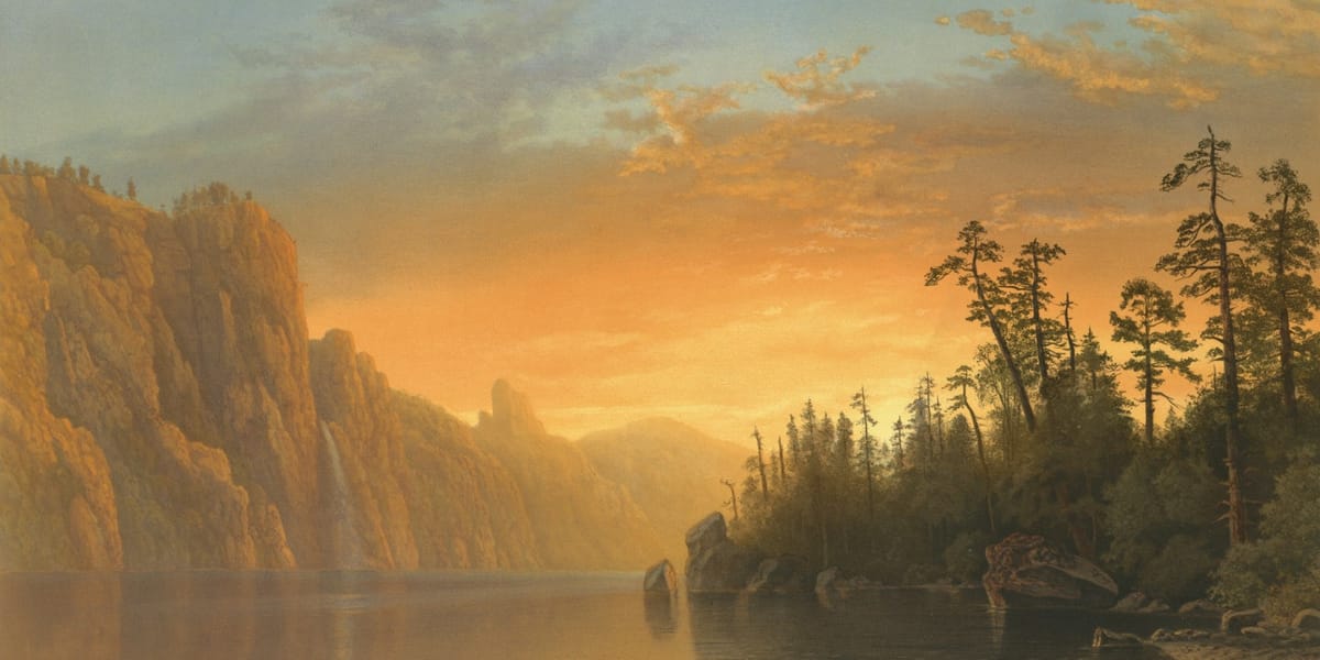
Atmospheric perspective, the phenomenon where distant objects appear lighter, less saturated, and cooler, is the most obvious application of temperature to depth. Mountains in the distance turn blue-gray. Distant forests look cool and desaturated. Foreground elements retain warm, saturated color. Reproducing this temperature shift in your work creates convincing depth even without other perspective cues. A warm foreground transitioning to a cool background immediately reads as spatial recession.
But temperature creates depth more subtly than just painting distant things cool and near things warm. Within a single object, temperature shifts define form and suggest light. The warm side of a form where light hits directly contrasts with cooler shadows, creating volume through temperature rather than just value. This temperature modeling is what makes objects feel three-dimensional rather than flat. Ignoring temperature and modeling only with value creates flatter, less convincing form.
Overlapping forms can be distinguished and ordered spatially through temperature even when their values are similar. A warm object overlapping a cool object reads clearly as in front, even if they're the same value. This temperature-based spatial separation works when value contrast isn't available or when you want to maintain a limited value range. Understanding this lets you create complex spatial relationships without relying only on value.
Cast shadows typically cool as they recede from the object casting them. The shadow nearest the object retains some warmth from reflected light or from the object's color influence. As the shadow extends away, it cools, showing the influence of ambient blue skylight or simply cooling through distance. This temperature shift within shadows adds realism and depth that uniform shadow temperature can't achieve. Paying attention to shadow temperature makes lighting effects more convincing.
Reflected light often provides warm notes in otherwise cool shadow areas. When direct light is warm, reflected light bouncing into shadows creates warm accents that model form beautifully. These warm reflected lights in cool shadows create the temperature variation that makes form feel real and grounded in a light environment. Without this temperature interplay, shadows feel flat and dead rather than luminous and spatial.
Color temperature affects aerial perspective more than value or saturation alone. Distant objects don't just get lighter and less saturated, they get cooler, shifting toward blue through atmospheric scattering. This temperature shift is often the most important cue for distance. You can maintain relatively high saturation in distant objects if you cool them appropriately, or you can desaturate foreground objects if you keep them warm. Temperature gives you flexibility in how you create depth.
Interior spaces use temperature to create depth differently than landscapes but following the same principles. Warm artificial light in foreground with cool ambient light in background creates spatial layering. Objects near light sources are warmer, objects in shadow or at distance cool. Even in relatively shallow interior space, subtle temperature shifts help differentiate planes and create dimensional space rather than flat pattern.
Warm vs Cool Versions of Every Color
Understanding that every color has both warm and cool versions is essential for sophisticated color mixing and palette control. This section breaks down how to see and use temperature within each major hue.
Red's temperature range is surprisingly wide. Cadmium red and vermillion lean toward orange, feeling hot and energetic. These warm reds are what most people think of as red, the red of fire engines and stop signs. Alizarin crimson and quinacridone reds lean toward purple, feeling cooler and more sophisticated. These cool reds appear in shadows and in mixtures that need purple qualities without going fully purple. The temperature difference between warm and cool reds is dramatic enough that they mix very differently and create entirely different color relationships.
Orange is inherently warm, being positioned between red and yellow, but it still has temperature variation. Orange that leans toward red feels warmer and more intense than orange that leans toward yellow, which can feel brighter but slightly less hot. Burnt sienna, a muted orange-brown, is cooler than pure cadmium orange even though both are technically warm colors. Understanding these distinctions within orange helps you use it with more nuance than just treating all orange as equally warm.
Yellow splits into warm and cool versions that behave very differently. Cadmium yellow is warm, almost orange, and creates warm color schemes naturally. Lemon yellow is cool, with a slight green cast that makes it feel fresher and lighter. Mixing these different yellows produces different results. Warm yellow with warm red makes clean, bright orange. Cool yellow with cool red makes muddy orange. The temperature of your yellow dramatically affects all your warm color mixtures.
Green's temperature range is enormous and crucial for landscape painting. Warm greens lean toward yellow and work for sunlit foliage, spring growth, anything that needs to feel alive and warm. Cool greens lean toward blue and work for shadows, evergreens, distant foliage, anything that needs to recede or feel cold. Many artists struggle with green specifically because they don't control its temperature, using greens that are too warm in shadows or too cool in light, creating unconvincing results. Learning to shift green's temperature appropriately is essential for naturalistic work.
Blue might seem obviously cool, but blues vary significantly in temperature. Ultramarine blue is warm for a blue, leaning toward purple. This warmth makes ultramarine versatile for mixing purples and for creating blues that don't feel icy. Phthalo blue and cerulean are cool blues, closer to pure blue or even slightly greenish. These cool blues create different atmospheric effects and mix differently. The warmest blue is still cooler than the coolest red, but relative to other blues, temperature matters enormously.
Purple inherently sits between warm red and cool blue, making its temperature particularly ambiguous and dependent on which direction it leans. Purple that leans toward red feels warmer and more passionate. Purple that leans toward blue feels cooler and more mystical. This temperature ambiguity is part of what makes purple interesting and useful for creating complex color relationships. You can push purple warm or cool depending on what your composition needs.
Brown, often overlooked in temperature discussions, has significant temperature variation. Warm browns like burnt sienna and raw sienna lean toward red or orange and feel earthy and inviting. Cool browns like burnt umber lean toward purple or blue and feel more neutral or even cold. Understanding brown's temperature is essential for creating convincing earth tones, for mixing neutral colors that aren't dead gray, and for creating sophisticated neutral palettes that have temperature life.
Gray theoretically should be neutral, but in practice, every gray leans slightly warm or cool. A warm gray has slight red, orange, or yellow influence. A cool gray has slight blue or purple influence. These subtle temperature differences in grays affect everything around them and determine whether neutral areas support warm or cool color schemes. Mixing truly neutral gray is actually quite difficult. Most grays have temperature, and understanding that temperature helps you use grays effectively rather than having them fight against your color scheme.
Using Temperature for Emotional Impact
Beyond its spatial and optical effects, temperature has profound emotional and psychological impacts that you can harness to create specific moods and viewer responses. Understanding how temperature affects emotion lets you use color more expressively and intentionally.
Warm palettes create feelings of energy, passion, comfort, or aggression depending on how they're deployed. A painting dominated by warm reds and oranges feels active and demanding. Warm yellows and golds create richness and comfort. Even warm browns and ochres feel inviting and grounded. This emotional warmth isn't just metaphorical, it's a real psychological response that happens automatically. People feel more energized and engaged in warm colored environments and this translates to viewing warm colored artwork.
Cool palettes create calm, contemplation, melancholy, or isolation depending on context and execution. Blues and cool greens feel serene and spacious, allowing for reflection rather than immediate reaction. Cool purples can feel spiritual or sad. Cool grays create somber or sophisticated moods. This emotional coolness provides relief and space but can also create distance or alienation if pushed too far. Understanding when you want to create warmth and when you want coolness helps you use temperature for emotional effect rather than just spatial construction.
Contrasting warm and cool creates drama and tension that neither temperature alone achieves. A warm figure against a cool background creates emotional isolation or emphasis. Cool shadows in warm light create the sense of depth and reality that makes representational work convincing. Juxtaposing warm and cool generates visual energy and interest that monochromatic temperature can't match. But the contrast has to be controlled. Too much temperature contrast becomes chaotic. Too little becomes bland. Finding the right balance creates dynamic color relationships.
Seasonal associations with temperature affect emotional response. Warm autumn palettes create nostalgia and richness. Cool winter palettes feel harsh or peaceful depending on execution. Warm summer colors feel abundant and lazy. Cool spring colors feel fresh and new. These seasonal temperature associations are culturally learned but powerful, giving you shorthand for creating specific temporal and emotional atmospheres. You can use seasonal temperature palettes even for non-landscape subjects to invoke these associations.
Time of day correlates with temperature in ways that affect mood. Warm sunrise and sunset light creates feelings of transition, beauty, the passage of time. Cool midday light feels harsher and more revealing. Warm artificial light at night feels intimate and cozy. Cool moonlight feels mysterious or lonely. Using temperature to suggest time of day brings these emotional associations even when you're not depicting literal times of day. A warm palette feels like golden hour. A cool palette feels like twilight or night.
Cultural associations with temperature vary somewhat but share common threads. Warm colors across most cultures associate with life, energy, celebration, danger. Cool colors associate with peace, spirituality, sadness, death. These aren't universal absolutes but strong enough patterns that you can rely on them for communicating emotion. Understanding cultural temperature associations helps you use color to create intended emotional responses rather than accidentally creating the wrong mood.
Personal associations with temperature also matter. Some people respond positively to warm, energetic palettes while others find them overwhelming. Some people find cool palettes calming while others find them depressing. While you can't control individual viewer responses completely, understanding that temperature affects people emotionally helps you make intentional choices about what temperature balance serves your work's intentions.
Memory and nostalgia often have temperature associations. Warm, slightly faded color palettes create nostalgic feelings, suggesting old photographs or memories softened by time. Cooler palettes can feel more immediate or documentary. Understanding how temperature affects the sense of temporal distance helps you create work that engages with memory and time in sophisticated ways. The temperature of your palette affects whether work feels contemporary or historical, immediate or remembered.
Common Temperature Mistakes Artists Make
Recognizing common temperature errors helps you avoid them in your own work and develop your eye for temperature problems. These mistakes appear in work at all skill levels but become obvious once you know what to look for.
Using temperature inconsistently within a single light scenario is perhaps the most common error. If your light source is warm, shadows should be cool and vice versa. But many artists paint both light and shadow warm, or both cool, creating confusion about the light environment and flattening the form. This happens because artists think about local color rather than how light temperature affects that color. Establishing consistent temperature logic throughout a piece creates coherence that inconsistent temperature destroys.
Failing to cool distant elements appropriately makes landscapes and any work with depth feel flat and unconvincing. Artists often maintain the same temperature throughout the spatial depth, missing the crucial temperature shift that creates atmospheric perspective. Even in relatively shallow space, slight cooling of background elements helps establish depth. This mistake comes from painting what things are rather than how they appear at distance. Training yourself to see temperature change with distance fixes this issue.
Over-neutralizing colors in an attempt to be subtle often eliminates necessary temperature entirely. Artists afraid of garish color or trying to achieve sophistication sometimes mix everything to neutral gray-brown, losing the temperature relationships that create life and interest. Even very subtle color needs temperature direction. It can be almost neutral and still lean slightly warm or cool. Completely dead neutral colors rarely appear in nature and feel lifeless in painting. Maintaining subtle temperature even in neutrals keeps color alive.
Using the wrong temperature in shadows is extremely common. Artists often paint shadows as simply darker versions of the lit color, missing the temperature shift that occurs in shadow. If the light is warm, shadows receive cool ambient light from sky or environment and should cool noticeably. If the light is cool, shadows pick up warm reflected light and should warm. This temperature shift in shadow is what makes lighting feel real rather than flat and local.
Ignoring the temperature of mixing colors leads to muddy, unexpected results. Mixing a warm blue with a warm yellow produces a different green than mixing a cool blue with a cool yellow, but many artists don't consider this when mixing. Using whatever blue and yellow are handy rather than selecting for temperature appropriate to the desired green creates frustrated mixing experiences. Understanding the temperature of your palette colors and choosing appropriately for each mixture eliminates this problem.
Painting every color at maximum saturation without temperature variation creates garish, unconvincing work. Colors in nature vary in both saturation and temperature, rarely appearing at pure, intense temperature extremes. Even in high-key, colorful work, temperature variation creates sophistication that uniform temperature intensity can't match. Modulating temperature along with saturation creates richer, more interesting color than just using everything at full intensity.
Missing the temperature opportunities in reflected light results in flat, unconvincing form. Reflected light typically introduces temperature that contrasts with the main light source, creating temperature variation within shadows that describes form beautifully. Artists who ignore this or who treat all shadow as uniformly cool lose this sculptural quality. Training your eye to see reflected light temperature and consciously including it creates much more dimensional form.
Treating skin tones as uniform temperature is a specific version of the general temperature mistake but worth noting separately because it's so common. Skin has enormous temperature variation depending on blood flow, bone structure, light conditions. Warm areas where blood is close to the surface, cool areas over bone, temperature shifts from light to shadow, all create the reality of skin. Painting skin as uniformly peachy or uniformly brown loses this temperature life and makes figures look flat and artificial.
Training Your Eye to See Temperature
Developing the ability to see temperature clearly is a skill that improves with practice and attention. These methods help train your eye to perceive subtle temperature differences that you currently miss.
Comparing colors directly side by side reveals temperature differences that aren't obvious in isolation. Put two greens next to each other and you can see which leans warmer toward yellow and which cooler toward blue. Put two grays side by side and subtle warm or cool casts become obvious. This comparative method works because temperature is relative. Your eye may not be able to judge absolute temperature well, but it's excellent at comparing temperatures. Use this comparative ability by always looking at colors in relationship rather than trying to judge them individually.
Squinting to eliminate detail and see broad color relationships helps you perceive temperature patterns. When you squint away the complexity, you see the overall warm or cool cast of different areas more clearly. This reveals temperature structure that detail and local color obscure. Practice squinting at your work and at reference to see temperature patterns rather than individual colors. This trains your brain to think in terms of temperature relationships rather than getting lost in specifics.
Looking at work through colored gels or filters can make temperature visible in new ways. A red filter will emphasize warm areas and de-emphasize cool areas. A blue filter does the reverse. While you wouldn't use this method while actually painting, using it to analyze temperature in master works or in your own finished pieces helps you understand temperature structure. Digital artists can use adjustment layers to similar effect, isolating temperature channels to see patterns.
Photographing work in black and white shows value structure separate from color, but then comparing the black and white to color reveals what's purely temperature-based versus what's value-based. Colors that are the same value but different temperature will look identical in black and white but distinct in color. This comparison helps you separate temperature from value in your thinking, making temperature control more conscious and deliberate.
Studying old master paintings specifically for temperature helps develop your eye. Great paintings almost always have sophisticated temperature structure, with clear warm and cool areas that create depth and mood. Analyze how they use temperature in light and shadow, in foreground and background, in different times of day. Copy passages focusing specifically on temperature relationships rather than just matching color. This focused study develops your sensitivity to temperature faster than casual observation.
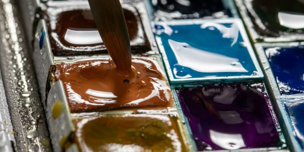
Color charts and swatches comparing warm and cool versions of each hue build your conceptual understanding and visual vocabulary. Make your own charts showing warm and cool versions of red, yellow, green, blue. See them side by side. Mix them systematically to understand how temperature affects mixing. These systematic explorations might feel dry compared to making finished work, but they build the foundation of temperature understanding that makes all your future work more sophisticated.
Painting from life is ultimately the best temperature training. Photographs flatten and distort temperature relationships. Life presents temperature clearly if you're looking for it. Paint still lifes, landscapes, figures from observation, focusing specifically on temperature. Ask yourself constantly which area is warmer, which cooler, and by how much. This focused observation while painting from life develops your eye faster than any other method. You start seeing temperature shifts you never noticed before, and that seeing transforms into doing.

