
The archive
Journal
Everything published on materials, colour, technique, art history, exhibitions, and conservation — newest first.
November 2025
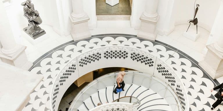
Turner and Constable at Tate Britain: What Their Rivalry Teaches Working Artists
The landmark Turner and Constable exhibition at Tate Britain through April 2026 pairs Britain's greatest landscape rivals. Here's what their different approaches to atmosphere, light, and ambition reveal for contemporary practice.
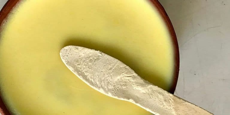
Working with Unconventional Materials in Art
Unconventional materials strengthen work when their properties and cultural associations serve your concepts, not when they're just surprising. The distinction matters more than the materials themselves.
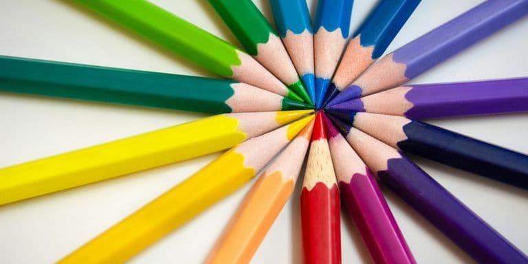
The Synergy of Water and Wax: Mastering Watercolor and Colored Pencil
One medium is fluid and transparent, the other waxy and opaque. Understanding how watercolor and colored pencil work together opens new visual possibilities.
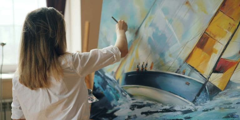
Before You Quit Your Day Job: Essential Questions for the Aspiring Professional Artist
The fantasy of quitting your job to make art looks nothing like the reality. Ask yourself these hard questions before making moves you can't reverse.
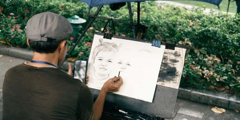
The Commission Pricing Formula Every Emerging Artist Needs
Pricing art commissions isn't about what feels comfortable to charge. It's about calculating actual costs and building rates that support your growth as an artist.
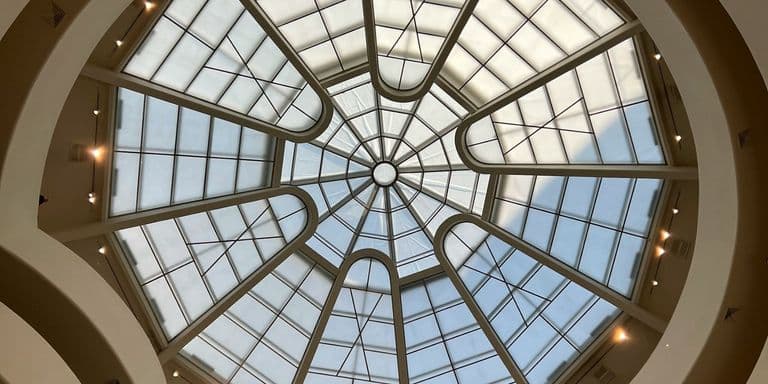
What Artists Can Learn from Rashid Johnson's Guggenheim Retrospective
Rashid Johnson's major Guggenheim retrospective through January 2026 spans three decades of multidisciplinary practice. Here's what working artists can learn from his use of materials, serial work, and conceptual consistency.
Making Art About Places Without Sentimentality
Land, environment, and location are central to contemporary practice, but place-based work often slides into postcard territory. Here's how artists engage with geography as concept rather than backdrop.
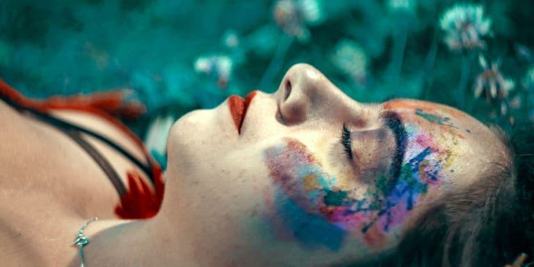
You're Not Seeing Color the Same Way as Everyone Else
Color exists in your brain more than in the world. The science of color perception explains optical illusions, simultaneous contrast, and why context changes everything about how we see color.
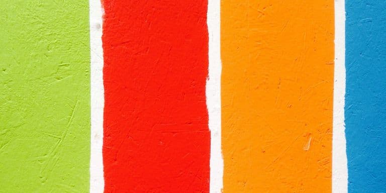
Working With Fewer Colors Makes Your Art Stronger
Limited palettes force creativity and create cohesion in ways full palettes never do. Working with three to five colors teaches you more about color mixing and harmony than using everything.
October 2025
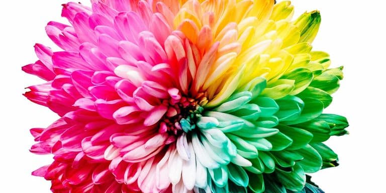
Color Harmony Isn't About Following Rules You Learned in School
Complementary, analogous, triadic schemes feel limiting until you understand why they work. Color harmony systems give you frameworks for creating palettes that actually feel cohesive and intentional, but the formulas are starting points for exploration rather than rules to follow blindly.
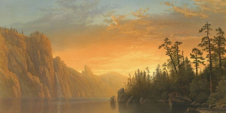
Why Warm and Cool Colors Change Everything in Your Art
Meta Description: Color temperature affects mood, depth, and visual impact more than you think. Understanding warm and cool colors transforms how you see, mix, and use every hue in your work, but temperature is relative rather than absolute and exists within every color.
Purple Was the Most Expensive Color for Thousands of Years
Purple was so rare and expensive for thousands of years that only royalty could afford it. A single gram of Tyrian purple required thousands of sea snails, making it worth more than gold and creating associations with power and spirituality that persist today.