Why Your Paintings Look Muddy and How to Fix Color Mixing Problems
Why paintings look muddy and how to fix color mixing problems. The science of chromatic neutralization, pigment transparency, and value control in mixing.
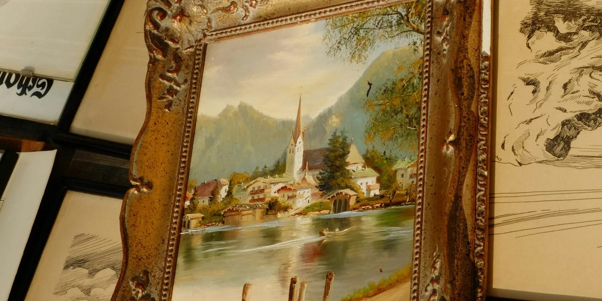
The landscape you're painting contains vibrant greens, clear blues, and warm earth tones when you look at it. The painting on your easel shows grayish olive-brown where greens should be, chalky blue-gray instead of clear sky, and brownish mud throughout.
This isn't failure of observation or lack of talent. It's chromatic neutralization through poor color mixing decisions.
Muddy color results from specific physical and optical processes that occur when you combine pigments. Understanding why mud happens allows preventing it through informed mixing rather than hoping for improvement through repeated failed attempts.
The problem operates at multiple levels simultaneously. The pigment chemistry determines what happens when specific paints combine. The optical mixing affects how layered colors interact visually. The value relationships determine whether colors appear clear or muddy regardless of hue. The color temperature mixtures create either vibration or neutralization.
Most painting instruction addresses color mixing through simplified rules: "don't mix complementaries," "use limited palette," "add white carefully." These rules help but don't explain the underlying mechanisms. Understanding why the rules work allows breaking them strategically rather than following them blindly.
The mud problem affects beginners most severely because they haven't developed intuitive sense of which mixtures produce clear color versus neutral gray-brown. But intermediate painters also struggle when attempting color effects beyond their empirical knowledge.
The solution requires both theoretical understanding of color behavior and practical experience with specific pigments. The theory explains what to avoid and why. The experience develops recognition of which particular paints in your palette create problems when mixed.
The Physical Reality of Pigment Mixing
When you mix paints, you're combining solid pigment particles suspended in binder. The physical mixture follows subtractive color theory where pigments absorb wavelengths rather than emitting light.
Each pigment absorbs certain wavelengths while reflecting others. Yellow pigment absorbs blue and violet wavelengths while reflecting yellow, orange, and green. Blue pigment absorbs red and orange while reflecting blue, green, and violet.
When you mix these pigments, the combined mixture absorbs all the wavelengths that either pigment absorbs individually. The reflected light represents only wavelengths that both pigments reflect. This is why mixing yellow and blue produces green—the only wavelengths both reflect.
The problem emerges when the pigments' absorption spectra overlap in ways that eliminate most wavelengths. If your yellow absorbs some green (having reddish bias) and your blue absorbs some green (having reddish bias), mixing them produces muddy green because both pigments absorb the very wavelengths that should dominate the mixture.
This absorption overlap creates chromatic neutralization. The more wavelengths the combined pigments absorb, the less light they reflect, resulting in darker, grayer mixtures.
The pigment transparency also matters. Transparent pigments allow light to pass through, reflect from the white surface beneath, and pass back through the pigment. This creates optical clarity. Opaque pigments block light at the surface, creating flat appearance and more neutralization when mixed.
The particle size affects mixing behavior too. Fine pigment particles distribute evenly, creating smooth mixtures. Coarse particles create texture and uneven color distribution that can appear muddy at certain viewing distances.
The binder (oil, acrylic medium, watercolor gum) influences how pigments interact optically. Oil's refractive index creates different optical effects than acrylic or watercolor, affecting whether mixtures appear clear or muddy.
Complementary Color Neutralization
The classic mud-creation method involves mixing complementary colors in equal or near-equal proportions.
Complementary colors sit opposite on the color wheel: red-green, blue-orange, yellow-violet. These pairs share minimal reflected wavelengths. Red reflects long wavelengths, green reflects middle wavelengths. Mixing them produces brown or gray because they absorb most of the visible spectrum between them.
This neutralization isn't inherently bad. Controlled complementary mixing creates useful neutral tones for shadows, subtle color variations, and atmospheric effects. The problem occurs when you accidentally neutralize colors through unwitting complementary mixing.
The common mistake involves mixing colors that contain hidden complementary components. Your "pure" red might contain some blue (making it violet-red). Your green might lean yellow. Mixing them doesn't just combine red and green—it adds the blue and yellow components, creating complex neutralization.
The three-color mixture danger multiplies this problem. Each additional pigment brings its own absorption spectrum and potential complementary relationships. Three randomly chosen colors often neutralize each other substantially.
The value of limiting your palette partly involves limiting complementary neutralization. Fewer pigments mean fewer potential complementary interactions creating mud.
The strategic use of complementary mixing allows creating specific neutral tones rather than producing them accidentally. Want neutral shadow color? Mix complementaries deliberately. Don't want neutralization? Avoid mixing colors with complementary relationships.
The Temperature Trap
Color temperature mixing represents subtler mud-creation mechanism that confuses painters because the colors seem compatible.
Warm and cool versions exist for each hue. Cadmium red (warm, orange-leaning) versus alizarin crimson (cool, violet-leaning). Ultramarine blue (warm, violet-leaning) versus phthalo blue (cool, green-leaning). Lemon yellow (cool, green-leaning) versus cadmium yellow (warm, orange-leaning).
Mixing warm and cool versions of the same hue creates neutralization similar to complementary mixing because the temperature bias introduces complementary elements. Mixing warm blue (which contains some red) with cool yellow (which contains some blue and green) produces muddy green.
The solution requires understanding your pigments' temperature biases and mixing colors with compatible temperatures. Cool blue plus cool yellow produces clear green. Warm red plus warm yellow produces clear orange. Mixing across temperature boundaries within the same hue creates mud.
This explains why the limited palette of primary colors often fails for beginners. They mix their single blue (often ultramarine, warm) with their single yellow (often cadmium, warm) and get muddy green because both colors lean toward red in different ways.
The split-primary palette addresses this by providing warm and cool versions of each primary. You mix cool colors together (phthalo blue + lemon yellow = clear green) and warm colors together (cadmium red + cadmium yellow = clear orange).
The temperature awareness extends beyond primaries. Your mixed green has temperature bias based on which blue and yellow created it. Mixing this green with other colors requires considering its temperature to avoid unwanted neutralization.
The Value Problem That Creates Mud
Sometimes the mixture has correct hue and saturation but appears muddy because the value is wrong for the context.
Color appears muddy when its value (lightness/darkness) doesn't match the light conditions you're depicting. A shadow color with too-light value looks muddy even if the hue and saturation are perfect. A highlight with too-dark value appears muddy regardless of color accuracy.
The white addition trap creates this problem frequently. Adding white to darken colors (trying to lighten a too-dark mixture) raises value but also reduces saturation and cools the color. The result often appears chalky and muddy despite having higher value.
The black addition trap works inversely. Adding black to darken colors reduces value but also neutralizes and cools them. The dark mixtures become muddy gray-black rather than rich dark colors.
The solution involves controlling value through pigment choice rather than relying on white or black adjustments. Dark colors should use naturally dark pigments mixed strategically. Light colors should use naturally light pigments or transparent darks that allow white ground to influence value.
The value relationships between adjacent colors affect whether individual colors appear muddy. A mid-value green surrounded by very light and very dark colors appears clear. The same green surrounded by similar mid-values appears muddy because it lacks value contrast to define its edges.
The atmospheric perspective issue relates to value control. Distant objects should have higher value and lower saturation than near objects. If your distant colors have too-low value or too-high saturation, they appear muddy rather than atmospheric.
Transparent Versus Opaque Pigments
The transparency characteristic of pigments dramatically affects mixing clarity and whether results appear muddy.
Transparent pigments allow light to penetrate, bounce off the white surface (paper or ground), and emerge back through the pigment. This double passage creates optical clarity and luminosity. Colors mixed from transparent pigments tend toward clarity.
Opaque pigments block light at or near the surface. The reflected light comes primarily from the pigment surface rather than from beneath. Colors mixed from opaque pigments tend toward chalkiness and can appear muddy even when the hue is correct.
The cadmium pigments (red, yellow, orange) are opaque. They create strong, solid color but mixing multiple opaques together produces heavy, potentially muddy results. The light can't penetrate the mixture to create optical interaction.
The transparent alternatives include quinacridones (red, magenta, violet), phthalo colors (blue, green), and transparent earth tones. These create lighter, more luminous mixtures that resist muddiness.
The semi-transparent pigments (ultramarine blue, some earth colors) behave intermediately. They provide some optical depth without the heaviness of fully opaque pigments.
The practical application involves understanding which pigments in your palette are transparent versus opaque. Mixing multiple opaques requires careful value and saturation control to avoid mud. Mixing transparents offers more forgiveness.
The layering approach in oil or acrylic painting exploits transparency. Transparent darks over white ground create luminous shadows. Opaque lights over dark ground create solid highlights. The transparency characteristics determine layering strategy.
The watercolor painting depends almost entirely on transparency. Opaque watercolors (gouache, or watercolor used heavily) lose the medium's characteristic luminosity. The mud in watercolor often results from using naturally opaque pigments or mixing too many colors that reduce transparency.
The Overworking Problem
Physical paint manipulation creates mud through mechanical mixing and disturbing underlying layers.
The canvas or paper surface mixing occurs when you apply new color over insufficiently dry previous layer. The brush picks up the underlying color, mixing it with fresh paint on the brush. Each stroke becomes progressively more contaminated, creating mud.
The solution requires patience. Let layers dry sufficiently before overpainting. In oil, this might mean days or weeks between sessions. In acrylic, hours or minutes. In watercolor, seconds to minutes depending on paper wetness.
The brush contamination happens when you fail to clean brushes adequately between colors. The residual paint on the brush mixes with each new color you pick up, progressively neutralizing the colors.
The palette mud develops when you mix colors in previously used areas of your palette without cleaning first. The residual paint from previous mixtures contaminates new mixtures, creating progressively more neutral colors.
The overblending in wet-into-wet technique can overmix colors, destroying the color variety and creating homogeneous mud. Some color variation and visible brushwork creates vitality. Excessive blending eliminates this.
The reworking of passages that were working creates mud by disturbing successful color that should have been left alone. The compulsion to adjust and perfect leads to overworking that destroys freshness.
The solution involves discipline: clean brushes thoroughly, use fresh palette areas, avoid excessive blending, know when to stop.
The Atmospheric and Optical Mixing Factors
Colors that appear clear when viewed in isolation can appear muddy in context due to optical mixing and atmospheric effects.
The simultaneous contrast means colors influence how we perceive adjacent colors. A neutral gray appears warm next to cool colors and cool next to warm colors. Your green might be clear but appears muddy because surrounding colors create optical neutralization.
The optical mixing at viewing distance combines separate colors that are close together. The individual colors might be clear, but viewed from distance they mix optically into mud. Pointillist techniques exploit this deliberately, but accidental optical mixing creates unwanted neutralization.
The atmospheric haze in nature adds blue-violet to distant colors. If you paint distant objects without accounting for this atmospheric color, they appear muddy rather than distant. The same green that works for foreground looks muddy in background without the atmospheric adjustment.
The reflected light from surroundings affects local color. An object near a red wall receives reflected red light, warming its color. If you paint it without accounting for this reflected color, it appears muddy compared to the actual appearance.
The solution involves painting relationships rather than isolated colors. Consider how each color interacts with adjacent colors and overall atmospheric conditions.
Common Specific Mixing Mistakes
Certain color combinations reliably produce mud unless handled carefully.
The green mixing failure happens when using warm blue (ultramarine) and warm yellow (cadmium). Both lean toward red, so mixing them includes red component that neutralizes the green. Use cool blue (phthalo) and cool yellow (lemon) instead.
The orange mixing problem occurs when using cool red (alizarin) and cool yellow (lemon). Both lean away from orange, producing muddy orange. Use warm red (cadmium) and warm yellow (cadmium) for clear orange.
The purple mixing challenge involves mixing blue and red when one or both lean away from purple. Cool red (alizarin) and warm blue (ultramarine) produce clearer purple than warm red (cadmium) and cool blue (phthalo).
The earth tone mixing can create mud when combining multiple earth colors. Raw sienna plus burnt sienna plus raw umber produces muddy brown. Use fewer earth colors or mix earth tones from primaries instead.
The black mixing trap involves adding black to darken colors. Black neutralizes and cools, creating muddy darks. Mix darks from complements or use transparent dark pigments instead.
The white mixing problem happens when lightening colors with excessive white. White raises value but reduces saturation and cools temperature, creating chalky mud. Use less white or choose lighter-value base colors.
The three-color limit acknowledges that mixing more than two or three colors usually produces neutralization. Each additional pigment brings potential complementary relationships creating mud.
The Pigment-Specific Knowledge Requirement
Understanding color theory doesn't prevent mud without also knowing your specific pigments' properties.
Each pigment has characteristic behavior: transparency, tinting strength, color bias, mixing qualities. Cadmium red behaves completely differently than quinacridone red despite both being "red."
The tinting strength determines how much pigment influences mixtures. Phthalo blue has extreme tinting strength—tiny amounts dominate mixtures. Earth colors have lower tinting strength, requiring more paint to influence mixtures.
This means proportions matter enormously. Equal amounts of phthalo blue and yellow produce muddy blue-green because the blue overwhelms. A tiny amount of phthalo blue with lots of yellow produces clear green.
The color bias indicates which adjacent hues the pigment leans toward. Ultramarine blue leans violet (warm). Phthalo blue leans green (cool). This bias determines mixing behavior.
The only way to learn these properties involves painting with your specific pigments. Color charts and written descriptions help, but direct experience with how your particular paints behave proves essential.
The brand variations mean that "cadmium red" from different manufacturers may behave differently due to pigment processing differences. Professional-grade paints generally contain more pure pigment, creating clearer mixtures than student-grade paints with extenders and fillers.
The pigment information on tube labels (like "PY42" for yellow oxide) allows comparing different brands' paints. Paints with the same pigment designation should behave similarly regardless of manufacturer.
The Limited Palette Solution
The limited palette approach prevents mud by constraining color mixing possibilities to known successful combinations.
The Zorn palette (yellow ochre, ivory black, vermillion, white) creates full color range despite extreme limitation. The key involves understanding how to mix these specific colors to produce clean results.
The earth color palette (ochres, siennas, umbers, white) produces harmonious color automatically because all pigments share earth-tone character that prevents excessive neutralization.
The primary triad (one red, one yellow, one blue, plus white) forces learning how to mix secondary and tertiary colors from just three pigments. This develops mixing skills while preventing the mud that comes from having too many options.
The split-primary palette (warm and cool versions of red, yellow, blue, plus white) provides enough range for clear secondaries while remaining manageable and preventing accidental neutralization.
The advantage involves developing deep understanding of few pigments' behavior rather than superficial knowledge of many. You learn exactly how your limited colors mix because you use them constantly.
The disadvantage involves lack of certain colors that single pigments provide more easily than mixtures. Intense violets, certain greens, and chromatic darks challenge limited palettes.
The solution for most painters involves starting with limited palette to develop mixing skills, then carefully expanding by adding single pigments as specific needs arise rather than collecting every available color.
The Value Study Approach
Creating value studies before color painting helps identify and prevent value-based muddiness.
The monochrome study in black, white, and grays establishes correct value relationships without color complications. This reveals whether your composition works structurally before color introduces additional variables.
The value mistakes show clearly in monochrome: lights too dark, shadows too light, insufficient contrast, ambiguous spatial relationships. Fixing these in the value study prevents them from creating mud in the color painting.
The translation from value study to color painting requires maintaining the established value relationships while adding hue and saturation. The color choices must hit the correct values or the painting appears muddy regardless of color accuracy.
The squinting technique helps evaluate whether color painting maintains the value study's structure. Squinting reduces color perception, revealing value relationships. If the squinted color painting doesn't match the value study, values need adjustment.
The advantage involves separating value problems from color problems. Is the passage muddy because of wrong value, wrong hue, wrong saturation, or some combination? The value study isolates one variable.
Fixing Existing Mud
When a painting has already developed muddy color, several remediation approaches can help.
The glazing solution involves applying transparent color over muddy opaque areas. The glaze adds color intensity without disturbing the underlying structure. This works best in oil painting where slow drying allows controlled glazing.
The scumbling technique drags opaque color lightly over muddy areas, allowing some underlying color to show through. This creates broken color that appears more vibrant than solid muddy areas.
The wiping-back approach removes wet muddy paint before it dries, returning to a cleaner state where fresh color can be applied more successfully.
The painting-over strategy accepts the mud as underpainting and applies new layers with more care to avoid repeating the mistakes. Sometimes the muddy underlayer provides useful neutral foundation.
The selective adjustment addresses only the muddiest areas rather than reworking the entire painting. This prevents extending the mud to currently successful passages.
The abandonment option acknowledges that some paintings are too muddy to save. Starting fresh with lessons learned may be more productive than extensive remediation.
Color Mixing Practice Exercises
Systematic practice develops intuitive sense of which mixtures produce clear color versus mud.
The two-color matrix exercise involves mixing every color in your palette with every other color in various proportions. This creates reference chart showing each possible mixture's result.
The advantage involves discovering which combinations produce mud before attempting them in a painting. The chart becomes reference showing which mixtures to avoid or handle carefully.
The temperature exercise mixes warm and cool versions of each hue to see the difference. Cool blue plus cool yellow versus warm blue plus warm yellow demonstrates temperature's impact on clarity.
The value ladder exercise creates gradual value transitions using single pigment plus white. This reveals how much white creates chalky mud versus useful tints.
The complementary mixing exercise deliberately mixes complements in various proportions to learn how much mixing creates useful neutrals versus unusable mud.
The transparency comparison mixes transparent versus opaque pigments to experience their different optical qualities and mud potential.
The overworking test involves mixing color, then continuously reworking it to see how many strokes create mud through overblending and contamination.
These exercises develop empirical knowledge that supplements theoretical understanding. You learn your specific paints' behavior through direct experience.
Accepting Strategic Neutralization
Not all neutral, low-saturation color is "mud." Sometimes subdued color serves the painting better than chromatic intensity.
The atmospheric color in landscapes requires neutralized color to create depth. Distant mountains should be less saturated than foreground elements. This intentional neutralization differs from accidental mud.
The shadow color often benefits from neutral tones created through complementary mixing. Pure, saturated shadows can appear artificial. Subtle neutrals create naturalistic shadow.
The color harmony sometimes requires reducing overall saturation so that accent colors stand out. A painting with every color at maximum saturation appears garish rather than colorful. Strategic neutralization creates hierarchy.
The tonal painting approach deliberately limits saturation, working primarily with value changes rather than chromatic variety. The neutral palette creates specific atmospheric quality that saturated color would destroy.
The difference between intentional neutral color and accidental mud involves control and purpose. Neutral color serving compositional goals is sophisticated technique. Mud created through poor mixing is technical failure.
Learning when to neutralize color deliberately and how to do it cleanly represents advanced skill distinct from avoiding mud through limited color mixing.
The Psychological Component
The perception of muddiness partly involves psychological expectations and comparative relationships rather than absolute color properties.
If you've been looking at muddy mixtures for hours, your perception adapts and the mud starts looking normal. Fresh eyes reveal the neutralization that you've become blind to.
The solution involves taking breaks and returning to work with fresh perception. The muddy passages become obvious after time away.
The comparative context matters. Color appears muddy when surrounded by clearer colors but might appear fine in different context. Adjusting surrounding colors sometimes solves apparent mud in unchanged areas.
The mental image you're trying to match influences whether results appear muddy. If your reference is nature or another painting, your color might be clear but still appear muddy because it doesn't match the mental target.
The technical confidence affects color mixing decisions. Fear of mud leads to timid, undersaturated color that appears muddy through excessive caution. Confidence allows pushing saturation without overstepping into actual neutralization.
The problem ultimately requires both technical knowledge of color behavior and perceptual awareness of what you're actually creating versus what you think you're creating. Fresh eyes, systematic practice, and understanding color theory combine to prevent and fix mud while allowing intentional neutral color when the painting requires it.

