Orange Gets Ignored and That's a Mistake in Your Palette
Orange sits between red's aggression and yellow's cheerfulness, often overlooked for being too loud or too autumn. But orange offers warmth and energy that neither parent color can match on its own.
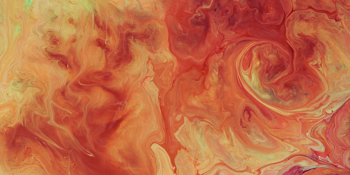
Orange occupies an awkward position in the color hierarchy. It's not a primary color, so it doesn't get the foundational respect of red, yellow, or blue. It's too bold to be a neutral, too warm to be versatile, too associated with specific seasons and contexts to feel universally applicable. Most artists treat orange as a supporting player, something you mix when you need it but not a color that deserves serious attention in its own right. This dismissal is a mistake that limits your palette and keeps you from accessing orange's unique powers.
The bias against orange is partly cultural. Orange became associated with cheap, loud design in the 1970s and never fully recovered. It's the color of traffic cones and safety vests, of things that need to be noticed rather than appreciated. It's Halloween and autumn and pumpkin spice, confined to specific seasonal contexts. It's considered unsophisticated in a way that red isn't, too juvenile or too garish for serious work. These associations make many artists instinctively avoid orange or use it only in the most obvious contexts.
But orange has qualities no other color can replicate. It combines red's energy with yellow's luminosity, creating warmth and visibility that feels inviting rather than aggressive. Orange can be sophisticated when handled well, creating palettes that feel rich and complex rather than loud. It works in contexts from ancient frescoes to contemporary abstraction, from sacred art to street art. Dismissing orange means missing opportunities for color relationships and emotional effects that staying in safer color territory can't achieve.
Learning to see orange clearly, beyond the cultural baggage and seasonal stereotypes, opens up your color thinking. Orange teaches you about temperature, about saturation, about how tertiary colors can be as powerful as primaries when used with intention. It bridges warm and cool in ways that create transition and flow. It offers alternatives to the red-yellow-blue primary thinking that dominates color education. Taking orange seriously as a color rather than treating it as an afterthought or an accident transforms how you build and use your entire palette.
Why Orange Feels So Energetic
Orange's psychological and physiological effects sit between its parent colors, creating a unique profile that explains both its power and why it's often misused. Understanding orange's impact on viewers helps you deploy it strategically rather than just hoping it works.
Orange combines red's physiological arousal with yellow's attention-grabbing brightness, but it tempers both. Where red can feel aggressive or alarming, orange feels enthusiastic. Where yellow can be sharp or anxious, orange is warm and welcoming. This middle position makes orange energizing without being overwhelming, stimulating without being stressful. Orange wakes people up and draws them in, which is why it's used so extensively in marketing and design for products that want to seem friendly and exciting.
The energetic quality of orange comes partly from its warmth. Orange is objectively one of the warmest colors, associated with fire and sunset, with heat and comfort. This warmth creates psychological effects that are measurable. Rooms painted orange feel warmer than rooms painted in cooler colors at the same temperature. Orange light makes people more social and talkative. These aren't just associations, they're real perceptual and behavioral effects that orange triggers more than other colors.
Orange's visibility is almost as high as yellow's but without yellow's harshness. This makes orange excellent for things that need to be noticed but shouldn't feel alarming. Safety equipment is orange rather than red because orange says "pay attention" without saying "danger." In artwork, this means orange can create focal points and draw the eye effectively while feeling more inviting than red. Orange says "look here" rather than "watch out," a subtle but important difference in how viewers respond.
The appetite stimulation effect of orange is well-documented. Many food brands and restaurant designs use orange because it makes people hungry and increases their sense that food is fresh and appealing. This connection to appetite and pleasure makes orange feel abundant and satisfying in ways that cooler colors don't. In still life painting or any work dealing with food and abundance, orange taps into these associations automatically.
Orange's relationship to sunset and sunrise gives it temporal and transitional qualities. Orange is the color of change, of day becoming night or night becoming day. This transitional nature makes orange useful for suggesting movement, change, or threshold moments. Unlike the stability of blue or the constancy of green, orange implies that something is happening or about to happen. This dynamic quality can energize compositions and create narrative tension.
The social and extroverted associations of orange make it read as friendly and approachable rather than serious or formal. Where blue might be used for corporate or professional contexts and red for passion or danger, orange occupies this middle ground of enthusiasm and accessibility. This makes orange tricky in contexts that need to feel serious or sophisticated, but perfect for work that wants to feel warm and inviting. Understanding this social dimension of orange helps you use it in contexts where its friendliness enhances the work rather than undermining it.
Orange's energetic quality also means it's hard to use in large areas without overwhelming the viewer. A little orange energizes a composition. A lot of orange can feel exhausting or chaotic. Finding the right proportion of orange relative to other colors is key to harnessing its energy without letting it dominate. This is similar to red's challenge but slightly different in character. Where too much red feels aggressive, too much orange feels juvenile or garish. The balance point is different and requires its own calibration.
Orange in Religious and Cultural Symbolism
Orange's cultural meanings are more varied and specific than its middling position in the color wheel might suggest. Different traditions have assigned orange significance that affects how it functions in art and how viewers interpret it.
In Buddhism and Hinduism, orange and saffron robes mark monks and holy people, connecting orange to spirituality and renunciation. This sacred orange is slightly different from commercial orange, more toward yellow-orange or saffron, but the association is strong. Orange in this context represents the path between worldly concerns and spiritual transcendence, the transition from ordinary life to dedicated practice. Using orange in work that engages with Eastern religious themes requires awareness of these sacred associations.
The Dutch association with orange comes from the House of Orange-Nassau and the Dutch royal family. Orange is the national color of the Netherlands, appearing in celebrations, sports, and national identity. This gives orange specific patriotic and cultural meaning in Dutch contexts that might not translate elsewhere. Dutch still life paintings often feature oranges and orange tones partly because of this cultural significance beyond just representing the actual fruit.
Celtic and pagan traditions associate orange with autumn, harvest, and the thinning of boundaries between worlds. Orange appears in Samhain celebrations that evolved into Halloween, connecting orange to themes of transition, death, and supernatural crossing points. This darker side of orange, its connection to the macabre and mysterious, exists alongside its cheerful associations, creating complexity that sophisticated use of orange can exploit.
Protestant traditions, particularly in Ireland, use orange as a sectarian marker, creating political and religious significance that's deeply contentious in specific contexts. Orange marches and orange symbols mark Protestant identity in ways that are neutral or positive to some viewers and threatening to others. This political dimension of orange shows how color meaning is never universal and can carry weights that have nothing to do with the color itself.
In Thai Buddhism, orange holds different significance on different days of the week, with orange specifically connected to Thursday and certain astrological associations. This specificity of color meaning tied to temporal cycles shows how elaborate color symbolism can become in cultures where color is deeply integrated into spiritual and daily life practices.
African uses of orange vary by region and tradition but often connect to earth, to harvest, to celebration and communal gathering. Orange fabrics and dyes appear in ceremonial contexts, in textiles and body decoration, carrying meanings that are specific to particular ethnic groups and practices. The use of orange in African diasporic art carries some of these associations forward while also adapting to new cultural contexts.
Native American traditions have specific uses of orange ochres and earth pigments in ceremonial contexts, in pottery and body painting, in sacred art. These orange earth tones connect to land and place in ways that synthetic bright orange doesn't, showing how the source and nature of the color affects its meaning as much as its hue.
Contemporary Western associations of orange with Halloween, autumn, hunting season, and traffic safety create layers of meaning that are relatively recent but powerful. Orange pumpkins, orange leaves, orange vests, orange cones, these ubiquitous oranges shape how contemporary viewers read the color in ways that historical viewers wouldn't have. Using orange in contemporary work means navigating these associations, either embracing them, subverting them, or trying to work around them.
The commercial and brand associations of orange are also significant. Major companies and products have claimed specific oranges as part of their identity, from orange sodas to telecommunications companies to shipping services. These commercial oranges create mental associations between the color and specific products or services that can interfere with other uses of orange. This is the cost of orange's high visibility and memorability, it gets claimed and branded in ways that affect its availability for other meanings.
The Rise and Fall of Orange in Design
Orange's trajectory through design history reveals changing attitudes toward color, toward loudness versus subtlety, toward what feels modern versus what feels dated. Understanding this history helps you use orange in ways that feel fresh rather than stale.
Ancient use of orange was limited by pigment availability. Natural orange came from ochres and earth pigments, creating muted orange-browns rather than bright saturated orange. These earth oranges appear throughout ancient art, in cave paintings and pottery, creating warm palettes that feel grounded and natural. The brightness we associate with orange now wasn't really possible until synthetic pigments became available.
Renaissance and Baroque artists used orange sparingly and strategically, often in drapery or to represent specific objects like oranges the fruit. Orange wasn't a hero color in classical painting, it was a supporting player. The earth orange of skin tones and warm shadows mattered more than pure bright orange. When bright orange did appear, it was often in Venetian painting where rich colors and warm palettes were more accepted than in other schools.
The nineteenth century development of chrome orange and cadmium orange made bright, stable orange available to artists and designers. This coincided with movements that wanted to use pure, saturated color. Van Gogh used orange extensively in his palette, particularly in his southern France period where bright Mediterranean light justified brilliant color. His oranges, often combined with blues for maximum contrast, show orange beginning to claim a more prominent role.
The Arts and Crafts movement and Art Nouveau used orange in decorative contexts, often in stained glass or textile design. This orange was part of rich, complex color schemes that celebrated color itself as decoration. The organic forms of Art Nouveau paired naturally with orange's warmth, creating flowing designs that integrated orange without making it dominate.
The 1960s and 70s marked orange's peak in design and popular culture. Orange furniture, orange appliances, orange graphics, orange dominated in ways that now seem excessive. This was orange as rebellion against conservative color schemes, orange as modern and forward-looking. Psychedelic posters used orange alongside other saturated colors, creating vibrant combinations that matched the era's aesthetic.
The backlash against 70s excess included a backlash against orange. By the 1980s, orange felt dated and cheap. Minimalism and the rise of neutral palettes pushed orange to the margins. When orange did appear, it was often in deliberately retro contexts, acknowledging that orange now signified a specific historical moment rather than feeling contemporary.
The 2000s saw attempts to rehabilitate orange, with some designers trying to make it sophisticated again. This involved using orange in more muted tones, in burnt orange or terra cotta rather than bright traffic cone orange. Combining orange with unexpected colors, using it in materials that gave it depth and richness, trying to separate orange from its 70s associations. These efforts were partially successful but orange never regained its earlier prominence.
Contemporary design uses orange strategically and carefully. It appears in tech branding, in startup aesthetics, in contexts that want to feel energetic and friendly. But it's usually balanced with lots of white space and neutral colors, used as accent rather than dominant tone. The loud orange of earlier eras has given way to more considered use of orange as one tool among many.
In fine art, orange's trajectory is different from its path in commercial design. Artists have used orange consistently regardless of whether it was fashionable, because orange offers color relationships that matter more than trends. Abstract painters use orange for its warmth and its complementary relationship with blue. Colorfield painters use orange for its intensity. Photographers and video artists use orange light and orange color grading for specific atmospheric effects. Art's relationship to orange is more stable than design's, less affected by what feels current.
Creating Sophisticated Orange Palettes
The challenge with orange is making it feel intentional and sophisticated rather than accidental or garish. This requires understanding how to combine orange with other colors in ways that enhance both, creating complexity rather than chaos.
Orange and blue form a complementary pair that's almost as powerful as red and green but used less often. This complementary relationship creates strong contrast and makes both colors appear more intense. The warm-cool opposition is as extreme as you can get, creating dynamic tension that energizes compositions. But this same intensity makes the combination easy to overdo. The key is varying the proportions, using more of one than the other, and modulating both colors rather than using them at full saturation. A soft orange with a deep blue, or a bright orange with a muted blue, creates more sophisticated relationships than both at maximum intensity.
Orange with analogous colors like red and yellow creates warm, harmonious palettes that feel cohesive but can lack tension. Adding a small amount of complementary blue or blue-green prevents these warm palettes from becoming monotonous while keeping orange as the dominant temperature. This approach works well for work that wants to feel warm and inviting while still having visual interest.
Orange and purple create a split-complementary relationship that's less obvious than orange and blue but just as powerful. Purple provides the cool contrast that orange needs while feeling slightly more sophisticated than straight blue. This combination appears in sunset palettes naturally, which makes it feel organic rather than constructed. Varying the balance between warm orange and cool purple creates everything from dramatic contrasts to subtle gradations.
Neutral palettes with orange accents let orange be the star without overwhelming the work. Grays, taupes, browns, whites, all of these neutrals make orange pop without competing with it. This approach is especially useful in contemporary work where the neutrals feel sophisticated and the orange provides the energy and focal point. The proportion matters a lot here. Too much orange and the neutrals disappear. Just enough orange and it creates perfect punctuation.
Earth tone palettes where orange is part of a range of browns, ochres, and warm neutrals feel natural and grounded. This is orange in its most subtle form, not bright and shouty but integrated into a cohesive warm palette. These palettes work for representational work, for landscapes, for anything that wants to feel organic and connected to natural color relationships. The orange here is less about intensity and more about warmth and richness.
Monochromatic orange palettes, using various tints, tones, and shades of orange, create cohesive work that explores orange's range rather than its relationships with other colors. This approach can feel limiting but it forces you to understand orange deeply, to see all its nuances and possibilities. Monochromatic orange work has to rely on value, saturation, and temperature variations within orange to create interest, which develops sophisticated understanding of the color.
Seasonal palettes that include orange need to navigate orange's strong autumn associations. Spring palettes with orange might use soft peachy orange with fresh greens. Summer palettes might use bright tangerine with hot pinks and yellows. Winter palettes could use burnt orange with deep teals and whites. Autumn palettes obviously embrace orange but can avoid cliché by using unexpected oranges or combining them with non-traditional autumn colors. The key is being conscious of the seasonal associations rather than unconsciously falling into them.
Cultural color combinations that include orange draw from traditions where orange has specific roles. Indian palettes might combine orange with magenta, gold, and turquoise. Dutch palettes might use orange with delft blue. Buddhist palettes combine orange robes with deep reds and golds. These culturally rooted palettes feel rich and intentional because they're drawing from established color traditions rather than making arbitrary choices.
Orange as a Transitional Color
One of orange's most useful but underappreciated qualities is its ability to create transitions between other colors. Orange sits between red and yellow on the color wheel, making it naturally suited for bridging these colors. But it also serves as a transition between warm and cool, between light and dark, between intense and muted. Understanding orange's transitional nature unlocks uses for it beyond just being orange.
In color gradients and transitions, orange creates smooth movement from red to yellow that feels natural and flowing. Without orange, moving from red to yellow either requires mixing them, which creates orange anyway, or jumping directly, which can feel abrupt. Orange as an explicit middle step makes warm color transitions feel intentional and controlled. This works in both representational contexts like rendering flesh tones or sunsets and in abstract contexts where color transition is part of the composition's structure.
Orange also bridges the temperature gap between warm and cool colors more gracefully than jumping directly from warm to cool. Moving from warm reds and yellows through orange to cool blues and greens creates a logical color journey that guides the eye and creates depth. This use of orange as a temperature transition is particularly useful in landscapes where atmospheric perspective requires cooling colors as they recede. Orange in the mid-ground bridges hot foreground and cool background naturally.
In lighting situations, orange represents that transitional moment between full daylight and darkness, between fire's bright flame and its glowing embers. This temporal quality makes orange useful for suggesting change, movement through time, threshold moments. Orange skies say sunset or sunrise, moments of transition rather than stable states. Using orange this way adds narrative quality to work, suggesting that what we're seeing is temporary, that change is happening or imminent.
Orange's ability to suggest reflected or indirect light makes it useful for creating atmospheric effects. Direct light might be yellow, shadow might be blue or purple, but reflected light and indirect illumination are often orange or peachy. This orange reflected light warms shadows and mid-tones, creating the color richness that makes paintings feel luminous rather than flat. Understanding this role of orange in light logic helps create convincing illumination effects.
In mixing, orange functions as a transition between primaries, making it useful for neutralizing or modifying colors. A touch of orange can warm a color without making it overtly orange. Orange mixed with its complement blue creates neutral grays and browns that have warmth and life rather than feeling dead. These orange-based neutrals are more interesting than black-based neutrals, creating subtle color even in desaturated areas.
Orange's transitional quality also works emotionally and symbolically. It's warmer than yellow but less aggressive than red, creating middle ground emotionally. It's associated with change and transition in cultural contexts from autumn to sunset to flames dying down. Using orange to represent threshold states, moments of change, or emotional middle grounds exploits these transitional associations in ways that more stable colors like blue or green can't.
The technical transition from yellow to red through orange is essential in representational painting. Flesh tones, wood tones, warm metals, all of these require navigating the red-orange-yellow range with sophistication. You can't render skin convincingly without understanding how to move through these warm colors, where to use which temperature of orange, how to create form through warm color transitions. This technical mastery of orange's transitional quality is foundational to realistic painting.
Natural Orange Pigments and Earth Tones
Understanding orange pigments, particularly natural earth oranges, changes how you think about and use orange in your work. Earth oranges have a history and character that synthetic oranges don't, creating different aesthetic and conceptual effects.
Natural ochres and iron oxide pigments create a range of earth oranges from pale peachy tones to deep burnt sienna and burnt umber. These pigments have been used since prehistoric times, making them some of humanity's oldest colors. Cave paintings used red and yellow ochres that mixed create natural orange, showing that humans have been working with earth orange for tens of thousands of years. This deep history gives earth orange a timeless quality that bright synthetic orange lacks.
Burnt sienna, created by heating raw sienna clay, produces rich reddish-orange that's transparent and perfect for glazing. This pigment appears extensively in classical painting for warm shadows, for skin tones, for creating depth and richness. Burnt sienna is one of those workhorse colors that doesn't call attention to itself but does enormous work in creating warm, complex color. Its muted intensity means it plays well with other colors, never overwhelming them.
Burnt umber, darker and more brownish than burnt sienna, sits at the border between orange and brown. It's technically an orange-brown but so muted that many artists don't think of it as orange at all. Understanding burnt umber as a dark, neutral orange helps you use it more effectively, recognizing that it can warm and darken without going muddy the way black does. Burnt umber mixed with blues creates beautiful blue-grays that have warmth and depth.
Raw sienna and raw umber are the unheated versions, more yellow-brown than their burnt counterparts. These earthy oranges feel natural and organic, perfect for landscapes and any work that wants to evoke earth, soil, natural materials. They mix beautifully with greens for landscape work and with other earth tones for creating rich, harmonious palettes that feel grounded.
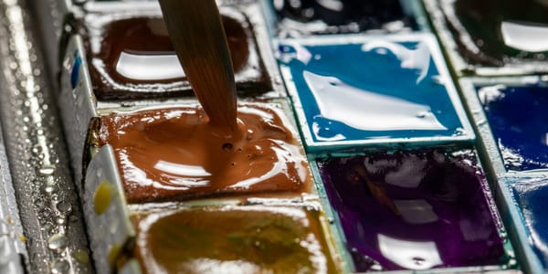
Cadmium orange provided the first reliable bright, opaque orange pigment. Like cadmium red and yellow, cadmium orange is permanent, intense, and expensive. It offers saturated orange that holds its own against any other color. Cadmium orange doesn't mix from red and yellow the way you might expect. Having it as a separate pigment gives you cleaner, brighter orange than mixing can achieve, though mixing cadmium red and yellow gets close.
Modern synthetic oranges like pyrrole orange offer intense color with transparency and excellent lightfastness. These newer pigments sometimes outperform traditional pigments in specific applications, particularly for glazing or creating bright, pure orange that needs to be transparent. The availability of high-quality synthetic oranges means contemporary artists have orange options that earlier artists could only dream of.
The distinction between earth oranges and bright synthetic oranges isn't just technical, it's aesthetic and conceptual. Earth oranges feel natural, timeless, connected to landscape and human history. Bright synthetic oranges feel modern, artificial, energetic. Choosing between them isn't just about color mixing, it's about what associations and qualities you want orange to bring to your work. Some work demands earth orange's subtlety and historical resonance. Other work needs bright orange's intensity and contemporary feel.
Mixing oranges from red and yellow versus using premixed orange pigments produces different results. Mixed oranges give you infinite gradations between the parent colors. Premixed oranges often are brighter and cleaner than mixed ones. Some artists never buy orange, always mixing it, preferring the control and the slight complexity that mixing introduces. Others keep multiple oranges on hand, recognizing that premixed pigments offer qualities that mixing can't replicate. There's no single right answer, but understanding the difference helps you make informed choices.
The permanence and stability of orange pigments varies. Earth oranges are generally extremely permanent. Cadmium orange is very stable. Some synthetic oranges are lightfast and permanent while others fade over time. Checking the lightfastness rating on any orange you use protects your work from degrading. For work that needs to last, permanent orange pigments are essential. For studies or temporary work, less permanent options might be fine and more economical.
Understanding orange at the pigment level, knowing what you're actually working with and what its properties are, gives you control and confidence. Orange stops being a vague idea and becomes specific materials with specific behaviors. This concrete understanding of orange pigments makes you a better painter, allowing you to exploit each orange's strengths and work around its limitations rather than fighting against materials that aren't doing what you expect.

