The Psychology of Blue in Contemporary Art
Blue dominates contemporary art for reasons beyond aesthetics. How artists use blue to manipulate emotion, suggest depth, and challenge color expectations.
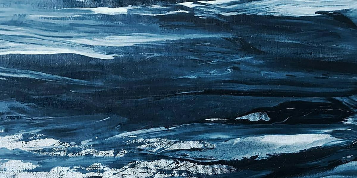
Walk through any contemporary art museum and you'll notice something: blue appears everywhere. Not just as accent or detail but as dominant presence. Entire canvases saturated in blue, sculptural installations bathed in blue light, video work tinged with blue filters. Contemporary artists return to blue with remarkable consistency, using it in ways that feel both timeless and distinctly of this moment.
This isn't coincidence. Blue carries unique psychological and cultural properties that make it particularly compelling for contemporary artistic concerns. Understanding why blue matters so much to contemporary artists reveals something about both color psychology and our current cultural moment.
Blue's Psychological Complexity
Among all colors, blue presents the most paradoxical psychological profile. It simultaneously calms and melancholizes, suggests both distance and depth, evokes spirituality and technology. This complexity makes it endlessly useful for artists exploring ambiguous emotional territories.
The Calming Effect
Research consistently shows blue's physiological calming effects. It can lower heart rate and blood pressure, reduce anxiety, and promote feelings of tranquility. This isn't purely cultural association but appears to have biological basis, possibly relating to blue's association with clear sky and clean water—signals of safety in evolutionary terms.
Contemporary artists leverage this calming quality when creating contemplative works. Large blue canvases or installations create environments that slow viewers down, inviting sustained attention rather than quick consumption. The color itself does psychological work before any conceptual content registers.
Artists like Yves Klein famously pursued this quality, developing his signature "International Klein Blue" specifically for its luminous, almost hypnotic effect. His monochromes aimed to create transcendent experiences through pure color impact, and blue served this purpose more effectively than other hues.
The Melancholic Dimension
Yet blue also evokes sadness and melancholy. We describe depression as "feeling blue." The "blues" in music expresses sorrow and longing. Blue carries emotional weight quite different from its calming associations.
This dual nature makes blue particularly rich for artists addressing complex emotional states. The color can suggest both the peace that follows turmoil and the sadness that underlies apparent calm. Contemporary work exploring depression, isolation, or alienation frequently uses blue to embody these ambiguous affective states.
The melancholic blue differs from bright, cheerful blue through saturation and value. Deeper, grayer blues tend toward sadness while lighter, more saturated blues feel uplifting. Artists manipulate these variables to calibrate emotional effects precisely.
Coldness and Distance
Blue reads as cool, both literally (we perceive blue light as cooler than warm colors) and metaphorically (emotional coldness, social distance). This coolness serves artists exploring themes of alienation, technological society, or emotional disconnection.
In contemporary work addressing digital life, surveillance, or posthuman existence, blue often provides chromatic environment suggesting the cold interface between human and technological. The blue light of screens, the blue tinge of medical imaging, the blue glow of security systems—these associations make blue feel distinctly contemporary.
Artists use blue's distancing quality to create works that resist easy emotional access. Where warm colors invite approach, blue can hold viewers at remove, creating contemplative rather than immersive experiences.
Depth and Infinity
Blue suggests spatial depth more than any other color. It recedes optically, creating impression of distance or vastness. Clear skies and deep water both appear blue, linking the color to limitlessness and expanse.
Contemporary artists use this spatial quality to create ambiguous pictorial space. Blue grounds can seem to extend indefinitely, refusing to resolve into definite distance. This spatial ambiguity serves work that questions perception or explores phenomenological experience.
The association with sky and ocean also connects blue to contemplation of infinity, transcendence, and the sublime. Artists addressing spiritual or existential themes often turn to blue for its capacity to suggest something beyond immediate material reality.
Blue in Art History
Contemporary blue builds on rich historical associations while transforming their meanings for current contexts.
Religious and Royal Blue
Historically, certain blues carried tremendous significance. Ultramarine, made from ground lapis lazuli, was more expensive than gold and reserved for depicting the Virgin Mary in Renaissance painting. Blue's preciousness and difficulty to produce made it symbol of divine importance.
Royal blue similarly signified power and prestige. The difficulty of producing colorfast blue dyes meant that deep blue fabrics indicated wealth and status.
Contemporary artists sometimes reference these historical associations ironically or nostalgically, using blue to evoke lost meanings or to comment on how color signifies differently in age of synthetic pigments.
Modernist Blue
Modern art embraced blue's formal possibilities. Picasso's Blue Period explored melancholy through restricted palette. Matisse used blue to create decorative pattern and spatial ambiguity. Kandinsky assigned blue spiritual and emotional meanings in his color theory.
Abstract Expressionists deployed blue dramatically. Rothko's blue canvases create atmospheric environments. Motherwell used blue in compositions suggesting both depth and surface. These modernist explorations established blue as legitimate subject for serious painting rather than merely descriptive tool.
Klein's Revolution
Yves Klein's work with blue represents watershed moment. By patenting International Klein Blue and creating monochrome works in this single color, Klein argued that blue itself could be artwork's subject and content.
Klein believed blue embodied immateriality and spirituality. His blue monochromes aimed to create pure experiences of color divorced from representation or even varied formal relationships. This idea that color alone could carry meaning profoundly influenced subsequent artists.
How Contemporary Artists Use Blue
Current artistic practice employs blue's psychological and cultural properties in diverse ways, often playing with or subverting traditional associations.
Blue as Technological Marker
In work addressing digital life and technology, blue functions as chromatic signature of contemporary existence. The blue light of screens, LED indicators, and digital interfaces makes blue feel distinctly of this technological moment.
Artists creating immersive video installations often use blue lighting to signal digital space. The color immediately communicates that you're entering technological rather than natural environment. This blue carries different associations than historical blue—it's artificial, electric, connected to machines rather than sky or water.
Work exploring surveillance, data, or virtual reality frequently employs blue to suggest the cold, impersonal quality of technological mediation. The color becomes visual shorthand for algorithmic logic and digital infrastructure.
Blue and Environmentalism
Contemporary environmental art often uses blue to evoke water, sky, and the endangered natural world. As climate change makes water scarcity and ocean degradation increasingly urgent, blue takes on new meaning related to environmental crisis.
Artists addressing these themes use blue to suggest both what we're losing (clean water, clear skies) and what threatens us (rising seas, storms). The color carries both nostalgic and apocalyptic dimensions in environmental contexts.
Some work uses blue to create beauty from environmental data—visualizing ocean temperatures, air quality, or water pollution through blue palettes. This aesthetic translation makes abstract environmental data emotionally affecting.
Blue and Identity
Blue's gender associations (culturally coded masculine in contemporary West, though this is historically recent) make it useful for artists exploring gender, identity, and social construction.
Some artists deliberately play with blue's masculine associations, using it to question gender binaries or explore how color signifies socially rather than naturally. Others use blue to explore specifically masculine experiences or critique patriarchal structures.
Blue's associations can also shift across cultures, making it useful for work addressing cultural identity and the relativity of color meaning.
Blue as Formal Element
Beyond symbolic or psychological associations, many contemporary artists use blue simply for its formal properties—how it interacts with other colors, how it structures pictorial space, how it absorbs or reflects light.
Abstract painters might choose blue for chromatic harmony with complementary oranges, for spatial recession against advancing warm colors, or for how certain blue pigments handle physically. These formal concerns aren't about meaning but about how blue functions visually.
This pure formal interest in blue continues modernist abstract traditions while remaining relevant to contemporary painterly practice.
Varieties of Blue
"Blue" encompasses vast range of distinct hues with different qualities and associations. Contemporary artists choose specific blues deliberately for their particular effects.
Ultramarine and Cobalt
These traditional pigments remain popular for their intensity and permanence. Ultramarine leans slightly purple, creating rich, deep blues that suggest luxury and depth. Cobalt blue reads clearer and brighter, with almost electric quality.
Artists working with historical awareness or interested in pigment properties specifically often choose these traditional blues for their art historical resonance and unique handling characteristics.
Prussian and Indigo
Prussian blue, the first modern synthetic pigment, has dark, greenish quality. It creates shadowy, moody blues quite different from brighter alternatives. Contemporary work addressing darkness, mystery, or historical weight often employs Prussian blue's particular character.
Indigo, with its connection to textile dyeing and colonial trade, carries cultural and historical baggage useful for work addressing these themes. The color suggests both labor and beauty, craft tradition and exploitation.
Cerulean and Sky Blue
Lighter blues suggest openness, air, and optimism. They tend toward decorative rather than heavy emotional content, making them useful for work that embraces pleasure and visual beauty without irony.
Contemporary artists sometimes deliberately choose these cheerful blues against expectation, creating tension between color's associations and content's seriousness, or simply reclaiming joy and beauty as legitimate artistic aims.
Turquoise and Cyan
Blue-greens occupy liminal space between categories. Turquoise carries cultural associations (particularly to Native American jewelry and Southwest aesthetics) while cyan suggests digital space and printing processes.
Artists interested in hybrid identities, technological interfaces, or chromatic ambiguity often explore these boundary blues that resist clear classification.
Blue Light vs. Blue Pigment
Contemporary art's use of artificial light creates new possibilities for blue distinct from traditional pigment.
Blue LED Installations
Light-based work using blue LEDs creates different experience than painted blue surfaces. Blue light actively illuminates space, creating atmospheric environments that viewers inhabit rather than observe.
This blue light often references technological sources—screens, indicators, medical equipment—while also creating contemplative spaces. The artificiality becomes aesthetic quality rather than limitation.
Artists like James Turrell, while working across color spectrum, frequently employ blue light to create perceptual experiences that confuse spatial boundaries and question how we process visual information.
Blue Video and Projection
Video work's characteristic blue-tinged quality comes from screen technology and is now deeply associated with moving image art. This blue tinge signals "video" even when depicting things that shouldn't appear blue.
Artists either lean into this quality, embracing video's artificial chromatic signature, or work against it through color correction. The choice itself becomes meaningful decision about whether to mark work as explicitly mediated or pursue illusionistic naturalism.
Fluorescence and Glow
Fluorescent blue pigments and light-activated materials create intense, almost unnatural blues that seem to emit rather than reflect light. These blues feel distinctly contemporary, possible only through modern materials.
Work using fluorescent blue often addresses artificiality, spectacle, or technological mediation. The color's intensity and slight toxicity create both attraction and unease.
Cultural Variations in Blue
While this article focuses on Western contemporary art's use of blue, the color signifies differently across cultures, complicating universal claims about its meanings.
Blue in Islamic Art
Islamic artistic traditions have long history of sophisticated blue use, particularly in ceramics and architectural decoration. Persian blue tiles, Turkish Iznik pottery, and Moroccan architecture create distinctive blue vocabularies.
Contemporary artists from these traditions often engage with this blue heritage, either continuing it, commenting on it, or deliberately working against its associations.
Blue in East Asian Art
Traditional East Asian art used blue less centrally than Western traditions, partly due to different available pigments and partly due to different aesthetic priorities. When blue appears, it often carries different associations than in Western contexts.
Contemporary Asian artists working globally navigate between these different blue traditions, sometimes deliberately playing with or confusing cultural expectations about what blue means.
Blue Across Contexts
The point isn't that blue means one thing here and another there, but that blue's meanings are culturally constructed and historically contingent. Contemporary artists working internationally must negotiate these different associations.
This cultural complexity makes blue useful for work addressing globalization, cultural exchange, and how meaning travels across contexts.
Why Blue Dominates Now
Beyond blue's inherent properties, specific contemporary conditions make it particularly resonant for current artistic practice.
Digital Life
Our daily visual environment is increasingly blue-tinted. Screens, interfaces, LED lighting all lean blue. Contemporary art's blue reflects and comments on this chromatic environment.
Artists don't need to explicitly address technology to feel influence of this pervasive blue. It's simply the color of contemporary life in ways that, for instance, candlelight yellow was for earlier periods.
Environmental Anxiety
As environmental crisis intensifies, blue's associations with water and sky take on new urgency. The color suggests both what we're losing and what threatens us.
This environmental dimension gives blue contemporary relevance distinct from its historical meanings. It's not just beautiful or spiritual but politically charged and emotionally fraught.
Emotional Complexity
Contemporary culture's increasing comfort with emotional ambiguity and complexity finds match in blue's paradoxical psychology. The color suits moment that values nuance over certainty.
Where earlier periods might have favored emotionally clearer colors, contemporary practice embraces blue's ability to suggest multiple, even contradictory feelings simultaneously.
Aesthetic Shifts
Broad aesthetic shifts in contemporary culture favor cool tones over warm. Instagram filters, interior design trends, fashion all lean toward blues and grays rather than warm earth tones.
Art both reflects and shapes these broader aesthetic currents. Contemporary blue participates in larger chromatic zeitgeist while also driving it through artistic influence on visual culture.
Working With Blue
For artists, blue presents both opportunities and challenges distinct from other colors.
Technical Considerations
Different blue pigments handle differently. Some granulate, others remain smooth. Some are transparent, others opaque. Some mix cleanly, others muddy. These physical properties affect how blue functions in paintings or mixed media work.
Digital blue operates differently than physical blue. RGB blue (pure blue light) creates different effect than CMYK blue (cyan mixed with magenta). Artists working across media must understand these differences.
Compositional Roles
Blue's tendency to recede means it functions differently compositionally than advancing warm colors. Large blue areas create depth or atmosphere rather than forward presence.
Artists must account for this when balancing compositions. Blue requires different formal consideration than red or yellow, which naturally grab attention.
Overcoming Cliché
Blue's popularity creates risk of cliché. The color appears so frequently that making it feel fresh rather than predictable requires conscious effort.
Contemporary artists address this through unusual shades, unexpected contexts, or deliberate engagement with blue's overfamiliarity. Some embrace the cliché as part of the content.
Living With Blue Art
For collectors and viewers, blue art affects domestic and institutional spaces distinctly.
Spatial Effects
Blue art can make spaces feel larger through color's receding quality. A large blue painting opens up space rather than closing it down.
However, extensive blue can also feel cold or unwelcoming if not balanced with warmer elements. The calming effect can tip into emotional flatness.
Lighting Considerations
Blue requires careful lighting. It can deaden under warm light or become overly intense under cool light. The blue's particular shade and saturation determine optimal lighting conditions.
Natural light dramatically affects blue art throughout the day. Morning and evening light shift blue differently than midday light, creating changing experience of the same work.
Emotional Impact
Living with significant blue art means regular exposure to color's psychological effects. The contemplative, cooling qualities influence environment's overall feeling.
For some, this creates desired atmosphere. Others find extensive blue depressing or cold. Personal response to blue's emotional qualities should inform collecting decisions.
Blue's Future
Will blue's contemporary dominance continue? Color preferences shift culturally and historically. What feels right for this moment may date quickly or evolve in unexpected directions.
Some signs suggest blue's relevance will persist. Environmental concerns aren't diminishing. Digital life continues expanding. The cultural conditions that make blue resonate now seem likely to intensify.
However, aesthetic reactions against dominant trends inevitably emerge. Future art might deliberately avoid blue precisely because it's currently so prevalent.
Regardless of future shifts, blue's role in contemporary practice reflects something genuine about current experience and concerns. Understanding why blue matters now provides insight into both contemporary art and contemporary life.

