The Triadic Power of Purple, Orange, and Green in Art Nouveau
Art Nouveau's signature palette wasn't accidental. This triadic harmony of purple, orange, and green embodied the movement's philosophy while solving technical problems.
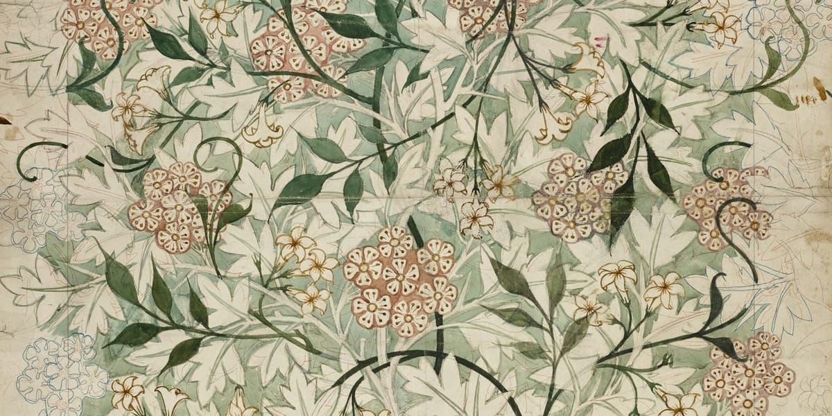
Art Nouveau didn't just happen to use purple, orange, and green together frequently. This specific triadic harmony, spaced evenly around the color wheel at 120-degree intervals, became so intrinsically linked to the movement that seeing these three colors in combination still evokes turn-of-the-century decorative aesthetics over a century later. Understanding why this particular triad dominated Art Nouveau reveals how color relationships can define entire artistic movements and continues to inform contemporary color choices.
The prevalence of this palette wasn't accidental or purely aesthetic. It emerged from convergent factors: newly available synthetic pigments making certain colors affordable and stable, symbolic associations with nature and spirituality that the movement prized, technical properties that suited the printmaking and decorative processes Art Nouveau favored, and deliberate rejection of academic color traditions. These three colors working together created visual effects that embodied Art Nouveau's philosophical aspirations while remaining technically practical for the commercial applications that sustained the movement.
Most discussions of Art Nouveau color focus on its general vibrancy or its nature-inspired palette without examining why specific color combinations recur so consistently. The purple-orange-green triad appears in Alphonse Mucha's posters, Louis Comfort Tiffany's glass, Aubrey Beardsley's illustrations, Gustav Klimt's paintings, and countless decorative objects, architectural details, and graphic designs. This wasn't coincidence or unconscious trend following. Artists and designers of the period understood color theory and deployed this triad deliberately for its optical and symbolic properties.
Understanding Triadic Harmony and Why It Works
Before examining Art Nouveau's specific application, we need to understand what makes triadic color schemes powerful and how they differ from other color relationships. A triad uses three colors equally spaced around the color wheel, creating balanced tension that's simultaneously harmonious and dynamic.
The traditional primary triad of red, yellow, and blue provides maximum contrast and vibration. Each color sits as far as possible from the others in color space, creating energetic visual relationships without the direct opposition of complementary pairs. The secondary triad of purple, orange, and green offers similar balanced tension but with more sophistication and complexity than the primaries.
Triadic schemes create what color theorists call "visual stability through balanced tension." Unlike complementary pairs that create direct opposition, or analogous schemes that create gentle harmony, triads establish three-way relationships where each color supports and activates the others without any pair dominating. Your eye moves between the three colors in dynamic circulation rather than settling into static relationship or jumping between only two poles.
Purple, orange, and green specifically occupy interesting positions in human color perception. None are primary colors, each is a mixture, which gives them inherent complexity. They represent the colors you create when you mix primaries: purple from red and blue, orange from red and yellow, green from blue and yellow. This secondary nature made them feel more sophisticated and less crude than primary triads.
The optical properties of this specific triad create particular effects. Purple and orange share red, creating subtle connection despite their separation on the color wheel. Orange and green share yellow. Green and purple share blue. These shared components mean the three colors aren't completely isolated from each other, they have hidden relationships that create cohesion within the contrast. This makes the triad feel more unified than the primary triad despite similar spacing.
The relative value and saturation ranges of these three colors also contributed to their utility. Green exists naturally at middle values and can range from very dark to relatively light. Purple tends toward darker values in its pure state. Orange is naturally lighter and brighter. This built-in value variation meant artists could use the colors at full saturation and still create value structure, or they could modulate values further for specific effects.
Temperature relationships add another layer. Orange is unambiguously warm. Green and purple can read as either warm or cool depending on their specific hue and context. A yellow-green reads warm, a blue-green cool. A red-purple reads warm, a blue-purple cool. This temperature flexibility let Art Nouveau artists create both warm-dominant and cool-dominant compositions while maintaining the triadic structure.
The Symbolic Resonance That Made This Palette Inevitable
Art Nouveau emerged as deliberate rejection of industrial mechanization and academic rigidity, seeking to reunite art with nature and spirituality. The purple-orange-green triad embodied these aspirations through its symbolic associations, making it ideologically as well as aesthetically appropriate.
Green's association with nature and growth aligned perfectly with Art Nouveau's organic forms and botanical inspirations. The movement drew heavily from plant forms, flowing stems, unfurling leaves, and blossoming flowers. Green provided the obvious color foundation for this nature-inspired vocabulary. But Art Nouveau's green wasn't typically the bright grass green of naturalistic representation. It tended toward more complex, ambiguous greens: sage, olive, verdigris, peacock. These sophisticated greens felt cultivated rather than wild, suggesting nature refined rather than nature raw.
Purple carried associations with spirituality, mysticism, and the exotic that resonated with Art Nouveau's interests in symbolism, theosophy, and non-Western aesthetics. The color's historical connection to royalty and luxury also suited a movement that, despite democratic aspirations, often served wealthy patrons. Purple in Art Nouveau work often appears in flowers, irises, wisteria, violets, connecting spiritual connotations to natural forms.
Orange served multiple symbolic functions. Its association with sunset and twilight matched the movement's fascination with transitional states and atmospheric effects. Its warmth and vibrancy provided necessary energy in compositions that might otherwise feel too cool or subdued. Orange often appeared in hair, one of Art Nouveau's obsessive motifs, and in decorative flames and glowing lights that suggested both natural energy and artificial illumination.
Together, these three colors suggested a specific worldview: nature elevated to spiritual significance, material world infused with otherworldly beauty, organic forms enhanced rather than merely reproduced. The palette wasn't trying to capture nature as it appears but nature as it might be experienced in heightened aesthetic or spiritual state.
The triad also carried subtle rejection of academic color theory. Traditional academic painting privileged earth tones, subtle modeling, and naturalistic color relationships. The bold deployment of purple, orange, and green in high saturation represented opposition to this restraint. It suggested color could be expressive and decorative rather than merely descriptive.
Technical Advantages That Made the Palette Practical
Beyond aesthetics and symbolism, practical technical factors made this triadic palette particularly suited to Art Nouveau's dominant media and processes. The movement flourished in commercial graphic arts, decorative objects, and architectural applications where technical constraints shaped color choices significantly.
The lithographic printing process that produced Art Nouveau's iconic posters worked with limited color plates, typically three to six colors plus black. The purple-orange-green triad provided maximum color impact with minimal plates. Each color was distinct enough that separations remained clean, avoiding the muddy mixing that could result from using colors too close together on the wheel. The balanced spacing meant designers could create rich, varied compositions without needing numerous additional colors.
The transparent inks used in lithography meant these colors could be overprinted to create additional hues. Purple over orange created rich browns and terra cottas. Green over orange yielded olive and gold tones. Purple over green produced deep teals and forest greens. This multiplicative potential meant three base colors could generate a much broader palette through strategic overlapping, increasing visual complexity without adding printing costs.
Art Nouveau's extensive use of stained glass and enamelwork also benefited from this palette. Glass colorants that produced stable, vibrant purples, oranges, and greens were more reliable than those for certain other colors. Red glass could be unstable or expensive. Bright yellows could fade. But copper-based greens, manganese purples, and selenium oranges provided consistent, durable color that held up under light exposure and atmospheric conditions.
The reflective and transparent properties of glass amplified the optical effects of the triadic relationship. Light transmitted through these colored glasses created glowing, luminous color that seemed to radiate rather than just reflect. The complementary undertones, orange against blue-green, purple against yellow-green, created subtle vibration that made colored light feel alive and dynamic.
Textile work, another major Art Nouveau application, found these colors technically accommodating. Natural dyes that produced these hues were relatively lightfast and worked well with period fabric treatments. Synthetic aniline dyes introduced in the late 19th century made brilliant purples and greens particularly accessible and affordable, democratizing colors that had previously been expensive or difficult to produce consistently.
The palette also suited period interior applications. These colors worked well in artificial light, gaslight and early electric lighting, which had different color rendering properties than daylight. The warm orange provided necessary brightness in dim interiors while purple and green didn't deaden or gray out as some colors did under yellow-tinted artificial light.
Mucha's Masterful Deployment of the Triad
Alphonse Mucha stands as perhaps the most recognized Art Nouveau colorist, and his poster work demonstrates the purple-orange-green triad's possibilities with particular clarity. His approach reveals how the triad could be modulated, emphasized, and integrated into specific compositional needs while maintaining its essential structure.
In Mucha's iconic posters for Sarah Bernhardt and various commercial products, the triadic structure typically manifests with one color dominating, another supporting, and the third providing accent. A poster might feature predominantly green-toned background and drapery, orange in the central figure's hair and glowing aureoles, with purple in flowers, fabric details, and decorative borders. This hierarchical application prevented the triad from feeling mechanically balanced while maintaining its structural integrity.
Mucha's treatment of the female figure, central to most of his compositions, typically deployed orange for hair and skin tones, creating warm focal points against cooler backgrounds. This wasn't naturalistic color, skin wasn't actually orange and hair rarely that particular shade of red-orange he favored. But the chromatic choice served compositional function by establishing warm-cool contrasts and creating luminous, idealized figures.
His decorative borders and frames extensively used purple and green in intricate, interwoven patterns. These elaborate frameworks demonstrated how the triad could create visual interest at small scale through close juxtaposition. Purple vines with green leaves, purple flowers with green stems, created microcosms of the larger triadic relationship in detailed passages that rewarded close viewing.
The way Mucha modulated saturation across the triad showed sophisticated understanding of color balance. His greens often appeared at relatively high saturation, especially in backgrounds and large areas. Orange appeared in concentrated bursts at high saturation or spread across larger areas at lower saturation for flesh tones. Purple typically remained at moderate saturation, rarely pushed to maximum intensity except in small accents. This varied saturation prevented any single color from overwhelming the composition while maintaining the triadic structure.
Mucha also understood the value dimension of the triad. His purples tended dark, his oranges light to middle value, his greens middle to dark. This natural value progression created inherent depth and dimensionality. Light orange figures advanced in space against darker purple and green backgrounds without requiring complex perspective or modeling.
His later paintings, less constrained by printing limitations, used the same triadic foundation but with more subtle transitions and expanded the palette through tints, shades, and tones of the base triad. He demonstrated that the purple-orange-green structure could support sophisticated painterly work, not just graphic design applications.
Klimt's Decorative Integration of the Triadic Palette
Gustav Klimt approached the purple-orange-green triad differently than Mucha, integrating it into his unique fusion of naturalism and decorative abstraction. His work shows how the palette could serve both representational and purely ornamental functions simultaneously.
In Klimt's portrait work, particularly his golden period paintings, the triad often appears in the ornamental passages surrounding realistically rendered faces and hands. The decorative backgrounds and clothing feature elaborate patterns in purple, orange, and green, sometimes with gold, creating rich tapestries that frame and contrast with the naturalistic flesh tones. This division between realistic and decorative shows the triad working as explicitly ornamental choice rather than attempting representational accuracy.
His landscape paintings deployed the triad more subtly, using it to organize color relationships while maintaining naturalistic appearance. Garden and forest scenes featured purple flowers, orange foliage, and green leaves in arrangements that created triadic balance while still reading as observed nature. The color scheme imposed order on natural abundance without feeling artificial or imposed.
Klimt's treatment of purple particularly shows the color's versatility. In decorative passages, purple appears as pure, saturated color in geometric or floral patterns. In representational areas, purple becomes shadow color, modeling form through purple-toned shadows rather than simple darkening. This dual function let purple participate both in ornamental surface pattern and spatial recession.
The relationship between pattern and depth in Klimt's work demonstrates how the triadic palette could flatten and elaborate space simultaneously. The decorative orange and purple patterns assert surface, preventing illusionistic depth. But value and saturation modulation within the triadic framework creates subtle spatial recession despite the flat patterns. This tension between surface and depth, fundamental to Art Nouveau aesthetics, found perfect expression through the managed contrast of the triad.
Klimt also explored the triad's potential for creating jewel-like intensity. In works like "The Kiss" and various portraits, small areas of pure orange and purple against gold and green create concentrated color intensity that draws and holds attention. These color accents function like actual gems, spots of saturated hue that punctuate broader, more modulated areas.
The Palette in Architecture and Applied Arts
The purple-orange-green triad extended beyond two-dimensional work into Art Nouveau's ambitious integration of art into daily life through architecture and decorative objects. This three-dimensional application revealed new aspects of the palette's potential while also showing its limitations.
Hector Guimard's Paris Metro entrances, though primarily known for their organic ironwork forms, incorporated the triadic palette in painted and enameled details. Orange lights glowed against green painted metal and purple shadows in the cast iron. The palette helped the structures read as unified artistic compositions rather than merely functional architecture, asserting their role as public art.
Interior applications used the triad to create enveloping environments. Art Nouveau interiors might feature green walls with orange woodwork and purple upholstery, or purple wallpaper with orange and green furnishings. These saturated color schemes created intensely atmospheric spaces that contemporary viewers found either enchanting or overwhelming depending on their tolerance for color saturation.
Glasswork by Tiffany, Gallé, and others used the triad to spectacular effect. Lampshades with purple wisteria flowers, orange dragonfly bodies, and green leaves created glowing compositions when lit from within. The transparent and translucent properties of glass made colors interact through overlapping and light transmission, creating additional hues from the base triad.
Ceramic work deployed the palette in both figurative and abstract applications. Vases might feature purple iris flowers with orange centers and green leaves, or purely abstract flowing forms in triadic glazes. The glossy surfaces of Art Nouveau ceramics amplified color intensity, creating jewel-like objects that functioned as color experiences as much as functional vessels.
Jewelry design used the triad through stone selection and enamel work. Amethyst, citrine, and peridot provided natural triadic palette. Enamelwork on gold created miniature compositions in purple, orange, and green that demonstrated the palette's effectiveness at tiny scale. These portable objects spread Art Nouveau aesthetics beyond fixed installations.
The application to furniture revealed the triad's limitations. Large wooden furniture pieces couldn't easily deploy saturated purple, orange, and green without becoming overwhelming in domestic spaces. The palette worked better as accent through upholstery, inlay, or painted decoration than as dominant furniture color. This pushed furniture designers toward more subdued versions of the triad or toward using it only in smaller decorative objects.
Why This Specific Triad Faded With the Movement
The tight association between the purple-orange-green triad and Art Nouveau meant the palette's popularity declined as the movement waned. Understanding why this happened reveals how color schemes can become temporally bounded, linked so specifically to particular aesthetic moments that they become difficult to use outside that context.
By 1910, Art Nouveau was already facing criticism as overly decorative, feminized, and backward-looking as artistic culture shifted toward more geometric, industrial aesthetics. The very colors that embodied the movement's aspirations became markers of the style in ways that limited their use. Deploying purple, orange, and green in combination immediately evoked Art Nouveau, making it nearly impossible to use the triad without historical association.
The emergence of Art Deco and modernist aesthetics favored different color relationships. Art Deco preferred metallic colors, black and white contrasts, and different triads when color appeared. Modernism pushed toward reduced palettes and often eschewed saturated color entirely. The visual language shifted away from organic curves toward geometric forms, and the color palette shifted accordingly.
Technical changes also affected the palette's prevalence. As lithographic printing gave way to different processes and mass production techniques changed, the specific advantages that made this triad practical became less relevant. New dyes and pigments made previously difficult colors accessible, expanding available palettes beyond what the movement had worked with.
Cultural associations that gave the triad its symbolic resonance changed too. The nature mysticism and spiritual seeking of Art Nouveau gave way to different preoccupations in the early 20th century. The colors that suggested sophisticated spirituality and elevated nature in 1900 read differently by 1920 as cultural context shifted.
The palette never completely disappeared but it became strongly historicized. When these colors appeared together after Art Nouveau's decline, they functioned as deliberate reference to the movement rather than independent color choice. This historical burden made the triad less available for contemporary use, locked into specific time period in ways that other color relationships weren't.
Contemporary Applications and Lessons
Despite its historical specificity, the purple-orange-green triad offers lessons for contemporary color use and occasionally resurfaces in work that either references Art Nouveau deliberately or discovers the palette's effectiveness independently.
The triad appears periodically in illustration and graphic design, particularly work with deliberately retro or decorative aesthetic. Contemporary illustrators working with nature subjects sometimes arrive at similar palettes, discovering that purple, orange, and green effectively organize complex botanical imagery. The colors' association with flowers, leaves, and organic forms makes them natural choices for similar subjects.
The palette occasionally appears in contemporary interiors, usually in deliberately eclectic or maximalist spaces that embrace historical reference. The saturated triad works well in small doses, in bathrooms, powder rooms, or accent walls, where its intensity doesn't overwhelm. Full rooms in these colors feel distinctly period in ways that can be either desired effect or problematic limitation.
Fashion periodically rediscovers the triad, often in spring collections drawing on floral and garden themes. The colors work together in print patterns and occasionally in color blocking, though contemporary fashion tends toward less saturated versions than Art Nouveau's full-intensity deployment. The associations with nature and femininity that made the palette appealing to Art Nouveau persist in fashion applications.
The digital realm has created new contexts for the triad where historical associations carry less weight. Website designs, app interfaces, and digital art sometimes use purple, orange, and green combinations where the Art Nouveau reference is weakened by the thoroughly contemporary medium. The colors' optical properties, their balanced contrast and energetic circulation, work regardless of historical context.
Contemporary artists can learn from Art Nouveau's sophisticated deployment of the triad even if they don't use these specific colors. The principles of triadic harmony, the understanding of how to modulate saturation and value within a triad, the integration of color structure with compositional needs, all remain relevant regardless of which three colors you're working with.
The palette demonstrates how color schemes can become historically specific while the underlying principles remain timeless. The purple-orange-green triad carries Art Nouveau associations that limit its use in certain contexts, but understanding why it worked so effectively for that movement illuminates color theory that applies broadly.
Adapting Triadic Thinking to Your Practice
Whether or not you work with purple, orange, and green specifically, understanding how Art Nouveau artists deployed this triad provides framework for using any triadic color scheme effectively.
Start by identifying the triadic structure you want to explore. The primary triad (red, yellow, blue), the secondary triad (purple, orange, green), or any three colors spaced equally around the color wheel can work. Each triad has different character and associations. Test several to find which serves your particular needs and aesthetic sensibilities.
Consider hierarchical application rather than mechanical balance. Art Nouveau artists rarely used their three colors in equal amounts. One color dominated, another supported, the third accented. This creates visual interest and directs attention while maintaining the structural relationship. Experiment with different hierarchies using the same three colors to see how emphasis shifts composition.
Modulate saturation strategically across your triad. Using all three colors at maximum saturation can create overwhelming intensity. Varying saturation, perhaps one color fully saturated, one at moderate saturation, one desaturated, creates more sophisticated relationships while maintaining color identity. Test different saturation combinations to find what serves your work.
Pay attention to value relationships within your triad. Some triads have built-in value contrast, others require deliberate adjustment. Consider whether you need one color to read as light, one dark, one middle, or whether you want all three at similar values for different effect. Value structure often matters more than color choice for creating readable compositions.
Understand temperature relationships in your chosen triad. Some triads contain clearly warm and cool colors, others are more ambiguous. This temperature structure affects how colors interact spatially and emotionally. Warm colors tend to advance, cool colors recede, which you can use to create depth or fight against to create flatness depending on your goals.
Test your triad at different scales. Colors that work beautifully in large areas might overwhelm at small scale or lose impact when reduced. Art Nouveau's success with the purple-orange-green triad came partly from understanding which colors worked in large fields versus small details. Experiment with your triad in various applications before committing to large work.
Consider the symbolic and associative dimensions of your color choices. Art Nouveau's triad carried specific meanings that reinforced the movement's ideology. Your chosen colors bring their own associations, cultural, personal, and universal. Work with these associations rather than against them, or deliberately subvert them if that serves your intent.
Study how your triad behaves in your specific medium. Different materials and processes affect how colors appear and interact. Test extensively to understand what your medium does to color relationships before assuming they'll work identically to other contexts.
The Enduring Influence of a Period Palette
The purple-orange-green triad's tight association with Art Nouveau makes it both historically significant and contemporarily challenging. It demonstrates how effectively a color scheme can define an entire artistic movement while also showing how that definition can limit the palette's future use. The triad became so thoroughly linked to specific aesthetic moment that it carries that history wherever it appears.
Yet this historical specificity doesn't diminish the palette's importance for understanding color theory and application. The sophisticated ways Art Nouveau artists deployed these three colors, their attention to optical effects, symbolic resonance, and technical practicality, provides model for color thinking that transcends the specific hues. The lessons about triadic harmony, hierarchical application, and integration of color with form remain relevant for any artist working with color relationships.
The palette also demonstrates that color schemes exist in cultural context, not just optical space. Colors carry associations, trigger memories, evoke period styles. This contextual dimension shapes how colors communicate beyond their purely visual properties. Understanding these associations lets artists work with them deliberately rather than discovering them accidentally when viewers respond to work in unexpected ways.
For contemporary artists, the purple-orange-green triad offers both caution and opportunity. The caution is against unconscious historical reference, using color combinations without awareness of their associations. The opportunity is in understanding why certain color relationships work effectively and adapting those principles to fresh applications. The triad's effectiveness came from systematic thinking about color properties and deliberate deployment for specific effects. These approaches remain valuable regardless of which colors you choose to work with.
Art Nouveau's triadic palette ultimately stands as testament to how thoroughly color can embody artistic philosophy and define visual movement. The choice wasn't arbitrary or purely aesthetic. It emerged from convergent factors, symbolic, technical, and theoretical, that made these three colors perfect expression of the movement's aspirations. Understanding this convergence illuminates how color functions not just as decoration but as fundamental component of artistic meaning and visual identity.

