Why Red Means Different Things in Western and Chinese Painting
Red means aggression in Western painting but celebration in Chinese art. How cultural context changes color symbolism and what artists need to understand.
Red occupies opposite symbolic positions in Western and Chinese painting traditions. Western art historical convention reads red as violence, passion, transgression, and moral danger. Chinese painting tradition treats red as celebration, fortune, joy, and cultural vitality.
This isn't subtle difference in shading or interpretation. It's fundamental opposition.
A Western painter deploying saturated red across large canvas areas creates visual aggression that viewers interpret as emotional intensity bordering on violence. Think Rothko's dark reds signaling existential dread. Bacon's crimson flesh suggesting brutality and meat. The blood symbolism running through centuries of Christian martyrdom paintings.
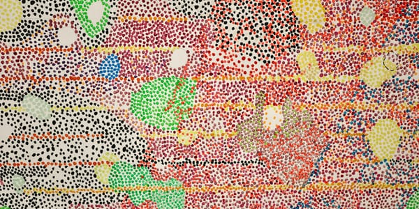
A Chinese painter using equivalent red saturation creates festive atmosphere signaling celebration, prosperity, and auspicious occasions. Red lanterns, red wedding garments, red seals on calligraphy. The color functions as visual announcement of joy rather than warning of danger.
Understanding why these divergent readings exist requires examining how color accumulates cultural meaning through centuries of artistic practice, religious symbolism, political associations, and daily material culture. Color doesn't carry inherent meaning. Cultures construct significance through repeated association until symbolic weight feels natural rather than learned.
For contemporary artists working across cultural contexts, this divergence creates both challenge and opportunity. You can't assume color communicates universally. But you can exploit the tension between different cultural readings to create work that operates differently depending on viewer's cultural framework.
The Christian Blood Legacy in Western Red
Western painting's relationship to red begins with blood. Specifically, Christ's blood spilled during crucifixion, the martyrs' blood shed for faith, and the symbolic blood of communion wine representing sacrifice and redemption.
Early Christian art established red as color of martyrdom and suffering. The saints wear red in countless altarpieces, their garments signaling willingness to die for belief. Mary Magdalene appears in red robes across Renaissance paintings, the color marking her as reformed sinner whose passionate nature found righteous outlet.
This blood association never fully separated from red's symbolic function in Western art. Even when secularization reduced explicit religious content, the accumulated centuries of Christian color coding persisted in how viewers read crimson, scarlet, and vermillion hues.
The martyrdom paintings created visual vocabulary where red fabric = spilled blood = noble suffering = spiritual transcendence. Artists like Caravaggio intensified this connection by making the red drapery in religious paintings look almost like congealed blood, the fabric and fluid becoming visually analogous.
The communion wine adds another layer. Red wine standing in for Christ's blood creates equation between red liquid and spiritual salvation purchased through violence. Catholics consume this symbolic blood weekly, reinforcing red's association with sacrifice through repeated ritual practice.
Western red also carries connections to hellfire, demonic imagery, and moral corruption. Medieval devils appear in red. Hellish landscapes glow red. Sinful women wear red clothing signaling sexual transgression. The color becomes visual shorthand for spiritual danger.
The Spanish Inquisition dressed condemned heretics in red robes before execution. Revolutionary France used red caps as symbols of liberty but also red to mark guillotine victims. Red's association with violence and social upheaval reinforced its threatening connotations.
Even when Western painters move beyond explicitly religious content, this symbolic weight persists. Abstract expressionists deploying red create works interpreted through centuries of accumulated association with blood, violence, passion, and danger. The color can't escape its history.
Chinese Red as Celebratory Life Force
Chinese culture developed entirely different relationship to red through separate symbolic traditions and material practices.
Red functions as primary celebratory color in Chinese culture. Weddings feature red extensively. New Year decorations emphasize red. Birth announcements use red. Any auspicious occasion incorporates red as visual announcement of joy and good fortune.
The linguistic connection matters. In Mandarin, red (hóng 红) shares pronunciation with words related to prosperity and success. This phonetic association reinforces symbolic connection between red color and positive outcomes.
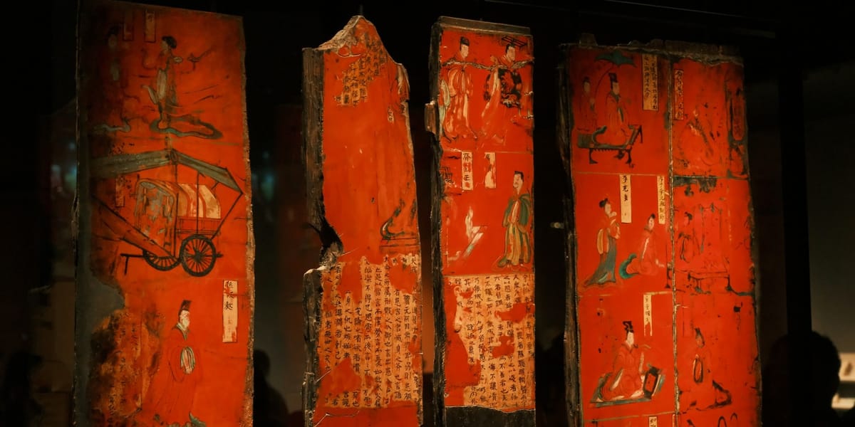
Traditional Chinese painting uses red seal stamps (印章 yìnzhāng) to mark completed works, authenticate authorship, and add decorative elements. These red seals function as signatures but also as compositional elements, the red creating visual punctuation that balances ink paintings' monochromatic restraint.
The cinnabar pigment used for these seals carries its own significance. Cinnabar (mercury sulfide) was associated with longevity and immortality in Daoist alchemy. The red color derived from cinnabar thus connects to life extension and spiritual transcendence, but through vitality rather than martyrdom.
Chinese red also associates with fire element in five-element theory (五行 wǔxíng). Fire represents summer, growth, expansion, and yang energy. Red participates in this elemental symbolism, carrying associations with warmth, life, and positive transformation.
The imperial connection reinforced red's prestigious status. Red walls surrounded the Forbidden City. Imperial decrees used red ink. Red became color of authority and power, but power manifesting as cultural sophistication rather than violent domination.
Chinese New Year practices saturate environment with red. Red paper cuttings, red lanterns, red envelopes containing money. The visual omnipresence of red during the most important cultural celebration embeds positive associations from childhood. You literally grow up seeing red as happiness.
The avoidance of red in certain contexts reveals its symbolic power. Funerals exclude red because its celebratory associations would be inappropriate for mourning. Writing someone's name in red traditionally implied wishing them death. But these prohibitions work because red's default meaning is so powerfully positive that its absence or misuse carries weight.
How Pigment History Shapes Color Meaning
The different materials used to create red in Western and Chinese painting traditions influenced how the color functioned artistically and symbolically.
Western painting relied heavily on expensive red pigments that limited who could use them and how. Vermillion (mercury sulfide), similar to Chinese cinnabar, cost enormous amounts. Carmine and cochineal derived from crushed insects required labor-intensive processing. These expensive reds appeared primarily in religious and aristocratic commissions, reinforcing associations with power, wealth, and important subjects.
The cost meant painters used red strategically rather than liberally. You didn't waste expensive vermillion on backgrounds or incidental details. Red appeared on important figures, significant objects, symbolic elements. This economic constraint reinforced red's association with importance, danger, or moral weight.
Chinese painting tradition had easier access to cinnabar, which was mined extensively in China. While still valuable, the relative availability meant red could function more freely in compositions. The seals especially demonstrate casual deployment of red impossible in contexts where the pigment cost meant every application required justification.
The different painting techniques also shaped red's function. Western oil painting builds opacity through layered glazes, allowing painters to create deep, blood-like reds that seem to glow from within. These luminous dark reds become almost supernatural, the color appearing to generate its own light.
Chinese ink painting typically uses red sparingly as accent color against monochrome ink. The red seals, occasional red robes on figures, or red architectural details function as visual punctuation rather than dominant color masses. This restraint makes red's appearances feel celebratory and intentional rather than overwhelming.
The fading and material degradation of historical pigments also affects how we read red in older paintings. Western paintings in museums often show darkened, browned reds because organic red lakes have degraded over centuries. We're literally seeing different color than original viewers saw, which shapes our understanding of how red functioned historically.
Red in Contemporary Cross-Cultural Practice
Contemporary artists working across cultural boundaries must navigate red's divergent symbolic associations.
Chinese artists making work for international audiences face decisions about whether to deploy red in ways that assume Chinese cultural framework or acknowledge Western interpretations. An installation saturated in red reads celebratory to Chinese viewers but potentially threatening or aggressive to Western audiences unfamiliar with Chinese color conventions.
Ai Weiwei's use of red in installations like his sunflower seeds plays with this tension. The red color references Chinese cultural identity and Communist Party associations simultaneously, creating complexity that operates differently depending on viewer's cultural literacy.
Western artists incorporating red need awareness that significant portions of global audiences read the color differently than Western art history suggests. A painting using red to signify violence or passion might communicate celebration or good fortune to viewers from cultures with different color symbolism.
The commercial art market complicates these dynamics. International collectors might purchase Chinese contemporary art specifically because red's cultural associations feel exotic or provide access to different symbolic framework. This can lead to essentialist expectations that Chinese artists must use red "authentically" rather than experimentally.
Some artists deliberately exploit the symbolic divergence. Zhang Huan's red-dominated performances and paintings function differently in Beijing versus New York, the same visual elements triggering different cultural associations. This multiplicity becomes artistic strategy rather than communication problem.
The digital context introduces another variable. Screen-based red appears differently than pigment red. The glowing quality of backlit red on monitors creates associations with warning signals, error messages, and digital alert systems that neither traditional Western nor Chinese painting established. Contemporary artists working digitally inherit different set of red associations.
Political Red and Revolutionary Symbolism
Red's political associations further complicate its symbolic landscape, with Western and Chinese revolutionary traditions deploying the color differently.
Western socialist and communist movements adopted red flags, red imagery, and red symbolism as markers of working-class solidarity and revolutionary politics. The color signified blood spilled by workers, radical transformation, and opposition to existing power structures.
This political red created tension with red's earlier religious associations. Revolutionary red deliberately inverted Christianity's blood symbolism, transforming martyrdom from religious sacrifice to political resistance. The Paris Commune, Russian Revolution, and various socialist movements weaponized red as visual declaration of opposition.
The Chinese Communist Party similarly adopted red, but the color's existing positive associations in Chinese culture meant less symbolic disruption. Red already signified celebration, fortune, and cultural vitality. The CCP's red carried revolutionary meaning but didn't fight against centuries of red meaning danger or transgression.
Mao's Little Red Book became global symbol of Chinese communism, the red cover both revolutionary marker and culturally resonant choice. Western audiences reading the red as threatening or aggressive mapped onto revolutionary content, while Chinese audiences encountered red that already carried positive associations.
The Cultural Revolution's red armbands, red flags, and red propaganda posters saturated visual culture with the color. This omnipresence transformed red's meaning for generations of Chinese who grew up surrounded by politically charged red imagery alongside traditional celebratory applications.
Contemporary Chinese artists who lived through Cultural Revolution often have complicated relationships to red that combine childhood celebration, political trauma, and cultural identity. The color carries layered personal and historical associations impossible to separate cleanly.
Western artists referencing communist history through red imagery tap into different emotional registers than Chinese artists using similar visual language. The red hammer and sickle reads primarily as threatening authoritarian symbol to many Western viewers, while Chinese audiences might experience more complex response mixing political history with cultural color associations.
Red in Religious and Spiritual Contexts
Religious traditions beyond Christianity developed their own relationships to red that further complicate color's symbolic landscape.
Buddhist traditions in various Asian contexts use red differently than Chinese secular culture. Tibetan Buddhism especially employs red extensively in religious art, but the associations differ from Chinese celebratory red or Western blood symbolism.
Hindu traditions associate red with Shakti, divine feminine energy, and use the color in religious ceremonies, wedding rituals, and devotional practices. The red bindi worn on foreheads carries spiritual significance distinct from both Western and Chinese secular associations.
Islamic artistic traditions generally avoided representing living beings, so red appears primarily in geometric patterns, calligraphy, and architectural decoration. The symbolic weight differs from figurative painting traditions where red clothing or objects carry narrative meaning.
Jewish tradition uses red in various ritual contexts, including red string bracelets and red wine for Sabbath, creating associations separate from Christian communion wine symbolism despite using similar material.
These multiple religious frameworks demonstrate that red's meaning isn't simply Western versus Chinese binary. It's network of culturally specific associations developed through different spiritual practices, ritual uses, and symbolic systems.
Contemporary artists from these various traditions bring different inherited relationships to red that don't map neatly onto simplified Western/Eastern divide. An Indian artist's use of red draws from Hindu cultural context that differs from both European Christian and Chinese secular frameworks.
Teaching Color Across Cultural Contexts
Art education faces challenges when teaching color theory and symbolism to culturally diverse students who bring different inherited associations to color interpretation.
The standard Western art school curriculum typically teaches color symbolism through European art history, establishing red as passion, danger, violence without acknowledging these associations are culturally constructed rather than universal truths about color perception.
Students from Chinese, Indian, or other cultural backgrounds where red carries different associations must negotiate between their inherited color literacy and Western art historical conventions. This creates productive tension but also potential for miscommunication or cultural erasure.
The solution isn't abandoning discussion of cultural color associations but rather teaching them as multiple valid frameworks rather than single authoritative interpretation. Red can mean multiple things. Context determines which associations activate.
This requires instructors to have actual knowledge of non-Western color symbolism rather than superficial multiculturalism that mentions "red means good luck in China" without understanding the depth and complexity of Chinese color theory and practice.
The color exercises common in foundation courses (creating emotional responses through color combinations, exploring color harmony, investigating simultaneous contrast) often unconsciously embed Western color associations as natural responses rather than learned cultural interpretations.
A more sophisticated approach acknowledges cultural construction of color meaning while teaching perceptual color phenomena that operate across cultural contexts. Simultaneous contrast works regardless of symbolic associations. Complementary color vibration creates visual tension independent of cultural meaning.
Students can then deploy color with awareness of how different audiences might interpret their choices. An installation using red operates with knowledge of divergent associations rather than assumption of universal reading.
Red in Commercial and Popular Culture
Consumer culture and global branding create another layer of red associations that complicate artistic deployment of the color.
Coca-Cola red, Target red, YouTube red. Corporate branding has claimed specific red hues as proprietary territory, creating associations that viewers carry into encounters with contemporary art. An artist using particular red might unintentionally reference brand rather than cultural tradition or art historical precedent.
The "like" button and notification icons in social media platforms glow red, training millions of people to associate red with validation, attention, and algorithmic reward. This digital red creates new symbolic territory distinct from both Western blood associations and Chinese celebratory meanings.
Sports team colors embed local associations with particular reds. Someone raised in Liverpool encounters red differently than someone from Manchester. These regional brand loyalties shape color perception in ways unrelated to high art traditions.
Valentine's Day commercialization saturates Western visual culture with red-and-pink combinations every February, creating seasonal color associations that blend romantic love, commercial pressure, and cultural expectation. This red differs from religious martyrdom red or revolutionary red.
Chinese commercial culture's embrace of red for consumer products, packaging, and advertising intensifies the color's celebratory associations through constant reinforcement. Walking through Chinese retail environment means encountering red continuously as marker of newness, importance, and desirability.
The stoplight red creates nearly universal association with danger and prohibition through traffic control systems deployed globally. This functional red use creates baseline association with warning regardless of cultural color traditions.
Contemporary artists must navigate these accumulated commercial and functional associations alongside art historical and cultural symbolic frameworks. Color doesn't exist in aesthetic isolation from the visual environment viewers inhabit daily.
Practical Application for Contemporary Artists
Understanding red's divergent cultural associations creates strategic opportunities rather than just presenting obstacles.
Artists can deploy red with awareness of how different audiences will interpret the choice. A painting using red for Chinese viewers might function entirely differently for Western audiences encountering same visual material. This multiplicity can be intentional artistic strategy.
The key involves understanding what cultural framework you're working within or against. If making work for primarily Western institutional context, red carries Western art historical associations whether you intend them or not. Viewers bring inherited interpretive frameworks to color perception.
But you can work against these expectations. Use red in ways that deliberately violate Western symbolic conventions to create dissonance. Paint celebration in red that Western audiences expect to signal danger. The violation of expectation becomes the artistic content.
Conversely, artists from non-Western traditions working in Western contexts can choose whether to assimilate Western color conventions or maintain cultural specificity. Neither choice is inherently better. The decision depends on what you're trying to accomplish.
Documentation and artist statements can provide context for viewers unfamiliar with cultural associations informing your color choices. Though over-explaining risks didacticism that undermines visual experience.
Some artists avoid the issue entirely by treating red primarily through formal properties rather than symbolic associations. Investigate red's perceptual behavior, optical effects, material characteristics. This formalist approach sidesteps cultural meaning debates by focusing on how red functions visually.
But even formalist use of red can't completely escape symbolic weight. Centuries of association have made red psychologically and emotionally loaded regardless of artist intention. The color carries meaning whether you want it to or not.
The Perceptual Reality Beneath Symbolic Difference
Despite divergent cultural associations, red creates certain perceptual effects that operate across interpretive frameworks.
Red appears to advance spatially compared to cool colors. This optical phenomenon happens regardless of whether viewer reads red as celebration or danger. The perceptual effect transcends cultural meaning.
Red affects heart rate and blood pressure when viewed in large quantities or high saturation. These physiological responses happen across cultures, though interpretation of the arousal varies. Western viewer might read the activation as aggression. Chinese viewer might experience it as excitement.
Red has longest wavelength of visible spectrum colors, making it literally the most energetic color we can perceive. This physical reality underlies various cultural associations with vitality, energy, and importance across different traditions.
The complementary relationship between red and green creates maximum simultaneous contrast regardless of symbolic frameworks. Placing red next to green generates visual vibration through optical mixing that happens in the eye rather than in cultural interpretation.
These perceptual realities provide foundation that cultural associations build upon. The symbolic meanings aren't arbitrary. They develop from physical and physiological properties of color perception, then accumulate specific cultural associations through historical practice.
Understanding both the perceptual base and the cultural overlay allows more sophisticated use of color. You can deploy red's optical properties while being aware of symbolic weight it carries in different cultural contexts.
When Cultural Color Translation Fails
Attempting to translate color associations across cultures sometimes creates confusion rather than understanding.
Western artists who learned "red means good luck in China" sometimes deploy red in superficial ways that feel appropriative or exoticizing rather than demonstrating genuine engagement with Chinese color theory and practice.
The reduction of complex cultural color systems to simple equations (Western red = danger, Chinese red = celebration) flattens sophisticated traditions into tourism-level understanding. Real cultural color literacy requires deeper study than learning symbolic equivalents.
Chinese contemporary artists working for Western markets sometimes find themselves expected to use red in ethnically marked ways that satisfy Western audiences' expectations of what "Chinese art" should look like. This essentialist pressure limits artistic freedom to investigate color outside cultural stereotype.
The global contemporary art world's increasing diversity means exhibitions routinely include work from multiple cultural traditions with different color associations. Gallery viewers need more sophisticated color literacy than traditional Western art history provides.
But assuming audiences will automatically understand non-Western color conventions also fails. Artists can't expect viewers to bring cultural knowledge they haven't acquired. The gap between intended meaning and audience interpretation remains real obstacle.
Some artists address this through exhibition design, wall texts, or curatorial framing that provides cultural context. Others embrace the ambiguity, allowing work to function differently depending on viewer's interpretive framework.
Neither approach fully resolves the challenge of color meaning across cultural boundaries. But awareness of the complexity prevents naive assumptions about universal color communication.
Moving Beyond Binary Understanding
The Western versus Chinese framework used here simplifies reality to make analysis manageable. Actual color symbolism operates through countless cultural traditions with their own associations and histories.
African textile traditions developed sophisticated color systems distinct from both European and Asian frameworks. Indigenous American cultures maintained color symbolisms tied to specific geographic and spiritual contexts. Middle Eastern color theory evolved through Islamic artistic and philosophical traditions.
Treating color meaning as Western/non-Western binary replicates colonial frameworks that position European practice as default with everything else as variation. More accurate understanding acknowledges multiple centers of color theory and practice developing simultaneously across cultures.
Contemporary globalization creates hybrid color associations as cultural practices mix, migrate, and transform. Diaspora artists navigate multiple cultural frameworks simultaneously. Digital culture creates new color associations that spread globally through screens rather than traditional cultural transmission.
The future of color theory needs to accommodate this multiplicity rather than seeking single authoritative interpretation. Red means many things. Context, cultural framework, artistic intention, and viewer interpretation all shape how color functions.
For practicing artists, this complexity offers freedom rather than constraint. You can deploy color with awareness of multiple possible readings, creating work that operates differently across cultural contexts or deliberately exploits symbolic divergence for artistic purpose.
Color doesn't belong to single tradition or interpretation. It exists as perceptual phenomenon that cultures have invested with meaning through centuries of practice. Understanding both the phenomenon and the meanings allows more sophisticated use of color's full potential.