Red Demands Attention and That's Exactly Why It's Dangerous
Red is the most psychologically powerful color, triggering immediate physical and emotional responses. Understanding red means knowing when to use its intensity and when it overwhelms everything else in your composition.
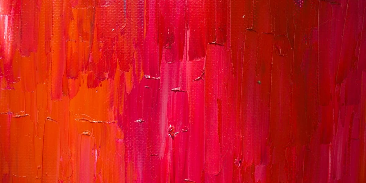
Red is the first color humans see as infants and the last color we lose in dim light. It's the color of blood, fire, passion, and warning. It makes your heart beat faster, literally. Studies show that seeing red increases blood pressure and respiration rate, triggers heightened alertness, and even affects physical performance in sports. No other color has this kind of immediate physiological impact. When you put red in your work, you're not just making a visual choice, you're creating a biological response in everyone who sees it.
This power makes red both incredibly useful and incredibly dangerous in art. Used well, it creates focal points that draw the eye exactly where you want it, communicates urgency or passion or intensity that no other color can match, and adds energy to compositions that might otherwise feel static or cold. Used poorly, it overwhelms everything else, makes subtlety impossible, and creates visual chaos where the eye doesn't know where to look because every red element is screaming for attention simultaneously.
The challenge with red is that it's never neutral. You can't use it casually or let it blend into the background. Every instance of red in your work is a decision that affects the entire composition. Too much red and the piece feels aggressive or anxious. Too little and you might not be taking advantage of red's unique properties. Getting the balance right requires understanding not just how red works visually, but how it works psychologically and culturally, why it affects us the way it does, and how to harness that power without letting it take over.
Why Red Affects Us Physiologically
The human response to red goes deeper than culture or learning. It's hardwired into our biology in ways that other colors aren't. This makes red uniquely powerful but also means you're working with responses you can't completely control. Understanding why we react to red helps you use it more intentionally and avoid triggering reactions you don't want.
Red wavelengths are among the longest in the visible spectrum, which means they penetrate atmospheric interference better than shorter wavelengths. This is why stop signs and warning lights are red, why fire engines are red, why danger markers are red. But it's also why sunsets are red, why red stands out against green foliage, why our ancestors could spot ripe fruit or see blood from a distance. Our visual system evolved to pay special attention to red because noticing it quickly often meant the difference between eating and starving, between safety and danger.
When you see red, your autonomic nervous system responds before your conscious mind even processes what you're looking at. Your pupils dilate slightly. Your heart rate increases. Blood flow to your muscles improves. These are the same physiological changes that happen when you're preparing to fight or flee. Red puts your body on alert, ready to respond to whatever the red thing turns out to be. This happens even when you know consciously that there's no threat, that you're just looking at a painting. The response is automatic and involuntary.
This biological reaction explains why red is so effective at grabbing attention but also why it's exhausting to look at for extended periods. A room painted entirely red feels oppressive and agitating after a while because your nervous system can't relax. You're in a constant low-level state of arousal that's draining over time. In artwork, this means red areas need breathing room, need to be balanced with cooler or less intense colors that give the viewer's nervous system a chance to settle.
Red also affects perceived temperature in space. Rooms painted red feel warmer than rooms painted blue, even at the same actual temperature. This isn't just psychological association, it's a measurable perceptual effect. In artwork, red advances visually more than any other color. It comes forward in space, which is why it's so useful for creating focal points but also why it can destroy depth if you're not careful. A red object in the background of a painting will fight to come forward, flattening your carefully constructed spatial relationships.
The connection between red and arousal extends to social and sexual contexts too. Studies show that people perceive others as more attractive when they're wearing red or photographed against red backgrounds. Athletes wearing red have a small but measurable advantage in competitions. These effects are subtle but real, operating below conscious awareness. When you use red in portraiture or figure work, you're tapping into these associations whether you intend to or not.
Understanding these physiological responses helps you make more informed decisions about when and how to use red. If you want to create tension or energy or grab attention immediately, red is your tool. If you want contemplation or subtlety or a sense of calm, red needs to be used very carefully or avoided entirely. The color comes with built-in effects that you can emphasize or mitigate but can't eliminate.
Cultural Meanings of Red Across Societies
While the physiological responses to red are universal, the meanings we assign to it vary dramatically across cultures. What red symbolizes in one society can be nearly opposite in another, and these cultural associations are so deeply embedded that they feel natural and inevitable even though they're learned. Understanding this cultural dimension of red helps you use it more intentionally and avoid unintended meanings when your work crosses cultural boundaries.
In Western cultures, red carries a complicated mix of associations. It's the color of love and romance, hence red roses, red hearts, Valentine's Day saturation with red imagery. But it's also the color of danger and warning, of stop signs and error messages and red alerts. This contradiction exists because red's intensity works for both passionate emotion and urgent threat. The context determines which association dominates, but both are always present to some degree.
Western religious tradition loads red with additional meanings. It's the color of the Holy Spirit in Christian iconography, of Pentecost, of martyrdom and sacrifice. Cardinals wear red to symbolize their willingness to shed blood for the faith. But red is also associated with sin and temptation, with the devil and hellfire, with the scarlet woman and scarlet sins. This dual nature, sacred and profane, makes red especially complex in Western religious art.
Eastern cultures see red very differently in many ways. In China and much of East Asia, red is the color of luck, prosperity, celebration, and joy. Brides traditionally wear red. Red envelopes contain money gifts. Red decorations mark festivals and celebrations. Death and mourning are associated with white, not black, making the color associations nearly inverted from Western traditions. Using red in Chinese art carries connotations of good fortune and happiness that Western viewers might not immediately grasp.
In India, red has powerful religious and cultural significance through its association with Hindu deities and rituals. Red kumkum powder marks the forehead in religious ceremonies. Brides wear red saris. Red is associated with Shakti, the divine feminine energy, and with Lakshmi, the goddess of prosperity. The cultural weight of red in Indian art connects to these deep religious and social meanings in ways that pure visual impact alone doesn't capture.
African cultures use red extensively in ceremonial contexts, often from natural ochre pigments that have been used for thousands of years. The specific meanings vary by region and ethnic group, but red frequently appears in coming-of-age ceremonies, in funeral rites, in decoration of sacred objects and spaces. The red ochre tradition connects contemporary use to ancient practices, carrying historical weight that affects how the color resonates.
Political uses of red have their own complex history. Red became associated with radical politics and revolution through various historical movements, giving us red flags, red brigades, the Red Army. This political red carries different implications depending on context and viewer, from liberation and progress to threat and subversion. Using red in politically oriented work triggers these associations whether you intend to engage with them or not.
The cultural meanings of red also shift over time within the same culture. Red in Victorian England carried different implications than red in 1960s America or contemporary digital culture. Understanding the historical moment and cultural context in which you're making and showing work helps you navigate red's multiple meanings. You can't control how every viewer interprets red, but you can be aware of the major associations and use them consciously rather than accidentally.
These cultural layers don't negate red's biological impact, they add to it. The physiological response happens first and the cultural interpretation follows, creating a complex interaction between immediate bodily reaction and learned meaning. Sophisticated use of red navigates both dimensions, using the biological impact while being aware of the cultural freight the color carries.
Red in Art History and Movements
Red has always been technically challenging and symbolically loaded, which makes its history in art particularly rich. How artists have used red, which reds they had access to, and what red meant in different artistic movements reveals a lot about both the technical evolution of art-making and changing cultural attitudes toward color itself.
Ancient artists worked with limited red pigments, primarily red ochre from iron oxide deposits. These earth reds were stable, abundant, and relatively easy to process, which explains their prevalence in cave paintings and ancient art worldwide. Red ochre appears in some of the earliest known human artifacts, suggesting that the impulse to use red goes back tens of thousands of years. These earth reds are warm and somewhat muted compared to modern reds, creating a specific palette that defined ancient art's possibilities.
The ancient world's most prized red was cinnabar or vermilion, made from mercury sulfide. This brilliant, pure red was expensive and somewhat toxic, but its intensity made it valuable for important works. Chinese artists used cinnabar extensively, and it appears in illuminated manuscripts and significant paintings throughout medieval Europe. The cost of vermilion meant that using it signaled importance and wealth, affecting what subjects were deemed worthy of such precious pigment.
The Renaissance obsession with representing reality drove artists to use red strategically for creating depth and modeling form. Red's advancing quality meant it worked well for figures and foreground elements. The Venetian school, particularly Titian, became famous for rich reds achieved through layers of glazing. These reds had depth and luminosity that flat application couldn't match, creating a quality that still impresses viewers today. Understanding how these old masters built their reds through layers rather than single applications changes how you approach using red in your own work.
The development of new red pigments in the modern era transformed what was possible. Cadmium red, developed in the early twentieth century, offered intensity and permanence that older reds couldn't match. This coincided with modernist movements that wanted to use pure, saturated color rather than subtle mixed hues. Matisse's use of red, particularly in his later cutouts, shows this new approach where red becomes almost abstract, valued for its intensity and emotional impact rather than its representational accuracy.
The Fauves took red to extremes, using it for skies, for faces, for anything they wanted regardless of natural color. This liberation of red from its descriptive function opened possibilities that influenced everything that came after. Red didn't have to represent something red anymore. It could represent emotion, energy, structure, anything the artist wanted. This conceptual shift matters as much as any technical development.
Abstract Expressionists used red for its emotional intensity. Rothko's red paintings create immersive emotional environments where the red itself becomes the subject. These aren't paintings of red things, they're explorations of what red feels like, how it affects space and mood and psychological state. This approach to red as experience rather than description influences contemporary color field painting and installation work.
Pop Art brought back representational red but in a completely different way, using the flat, commercial reds of advertising and mass production. Warhol's red is the red of screen printing and product packaging, artificial and unapologetic about its artificiality. This commercial red comments on consumer culture while also embracing its visual impact, creating a complicated relationship between high art and commercial aesthetics.
Contemporary artists use red with full awareness of this loaded history. Every use of red now comes with the weight of everything red has meant before, from cave paintings to consumer culture. Some artists engage with this history directly, others try to use red in ways that sidestep or subvert expectations. But you can't use red naively anymore. It's too saturated with meaning and association to be just a color choice.
Using Red for Emphasis Without Overwhelm
The practical challenge with red is using its attention-grabbing power without letting it dominate everything else in your work. Red is so visually loud that it takes careful planning to include it without creating chaos. Understanding the principles that govern how red interacts with other elements helps you harness its intensity while maintaining compositional control.
The most basic principle is that a little red goes a long way. A small area of intense red in a composition of muted colors will draw the eye immediately and hold attention. This makes red perfect for focal points, for the exact spot you want viewers to look first. But it also means that multiple red elements compete with each other, fracturing attention rather than directing it. If everything is important, nothing is important. If everything is red, the eye doesn't know where to focus.
One effective approach is using red as punctuation rather than dominant color. Small red accents in strategic locations guide viewers through the composition, creating visual paths and hierarchies. Think of how a small red signature in the corner of a painting draws the eye without overwhelming the work, or how a touch of red in a neutral palette creates a focal point that everything else organizes around. This punctuation use of red takes advantage of its power while respecting its intensity.
Surrounding red with cooler colors enhances its impact while giving the eye relief. Red against blue or green advances even more than red against warm colors, creating strong spatial relationships and emphasizing the red's intensity. But this contrast also provides visual breathing room. The cool colors calm the physiological arousal that red triggers, creating a balanced experience where the red feels dynamic without being exhausting.
Varying the value and saturation of your reds gives you more control over their impact. A deep, dark red has different energy than a bright, saturated red. Muted or grayed reds can be intense without being aggressive. Using a range of reds rather than single intensity lets you modulate attention within the red areas themselves, creating nuance that pure intensity can't achieve. This approach keeps red interesting without overwhelming through sheer saturation.
Context dramatically affects how red reads. Red in a painting of a sunset feels natural and beautiful. The same red in a portrait might feel alarming or symbolic. Red in abstract work carries different implications than red in representational work. Being conscious of what red means in the specific context of your piece helps you use it appropriately. Sometimes red's intensity serves the work perfectly. Other times it fights against what you're trying to achieve.
Scale matters too. A large area of red creates different effects than small red details. Large red fields can be meditative or overwhelming depending on execution and context. Small red elements provide energy and movement. Medium-sized red areas need the most careful handling because they're big enough to dominate but not big enough to create the immersive effect that very large red areas can achieve. Thinking about the scale of your red elements relative to the overall composition helps you use red more effectively.
Texture and surface quality change how red behaves. Matte red feels very different from glossy red. Transparent red has different properties than opaque red. Rough textured red reads differently than smooth red. These surface qualities affect how the red interacts with light and how intense it appears. Experimenting with different red surfaces gives you more options for controlling its impact beyond just hue and saturation.
The key to using red without overwhelm is treating it with respect. Red isn't just another color you can throw around carelessly. Every instance of red in your work needs to be deliberate and considered. Ask yourself why that element needs to be red specifically, what the red is contributing to the piece, whether the red is serving your intentions or fighting them. This conscious approach to red prevents it from taking over while letting you use its unique properties when they genuinely enhance the work.
Warm Reds vs Cool Reds
Not all reds are created equal. The difference between warm reds and cool reds is as significant as the difference between red and entirely different colors. Understanding this distinction and being able to control it gives you much more nuanced control over how red functions in your work. Warm and cool reds create different moods, different spatial relationships, and different interactions with surrounding colors.
Warm reds lean toward orange and yellow. Think of vermilion, scarlet, tomato red, fire engine red. These reds feel hot, energetic, advancing, sometimes aggressive. They're the reds of fire and blood, carrying those primal associations. Warm reds work well when you want maximum impact and attention, when you want the red to jump forward in space, when you want energy and intensity. They're extroverted reds that demand to be noticed.
Cool reds lean toward blue and purple. Think of crimson, burgundy, wine red, magenta. These reds feel deeper, more mysterious, sometimes more sophisticated than warm reds. They still have red's intensity but with a different character, more brooding than bright. Cool reds can recede in space more than warm reds, making them useful when you want red without having it completely dominate the spatial relationships in your piece.
The temperature difference affects how reds interact with other colors. Warm reds next to oranges and yellows create harmonious, high-energy relationships. The same warm reds next to cool blues create maximum contrast and vibration. Cool reds next to purples and blues feel more cohesive and less jarring. Next to warm yellows and oranges, cool reds create interesting tension without the aggressive clash that warm reds might produce.
Mixing warm versus cool reds requires understanding your base pigments. Cadmium red is inherently warm, leaning toward orange. Alizarin crimson is cool, leaning toward purple. If you start with a warm red and try to cool it down by adding blue, you'll likely get muddy results because you're mixing complements. Starting with a cool red and warming it with orange works better, or having both warm and cool red pigments available gives you the most control without fighting the inherent temperature of your colors.
Light affects warm and cool reds differently. Warm reds in direct light can be almost unbearably intense, while cool reds maintain more sophistication even in bright light. In shadow, warm reds can look brownish or dead, while cool reds often deepen beautifully, taking on rich, jewel-like qualities. Understanding how light changes your reds helps you choose the right red for the lighting conditions in your piece.
Skin tones require careful attention to red temperature. Most skin contains both warm and cool red notes depending on undertones and lighting. Getting skin tones right often means mixing multiple reds or choosing between warm and cool reds based on the specific person and lighting situation. The same red that works for one skin tone will look completely wrong for another because the temperature doesn't match the underlying color structure.
Cultural and symbolic associations can shift based on red temperature too. Warm reds tend to feel more celebratory, passionate, urgent. Cool reds can feel more elegant, serious, sometimes melancholic. A warm red dress reads differently than a cool red dress even though both are red. Being conscious of these subtle differences in how temperature affects perception helps you make more precise color choices.
Most sophisticated red palettes include both warm and cool reds. Using only one temperature of red can feel limited, while having both gives you range and nuance. You can create transitions and gradations within your reds, can use temperature shifts to define form or create movement, can play warm and cool reds against each other for visual interest. This approach treats red as a family of related but distinct colors rather than a single hue.
Red Pigments and Their Characteristics
Understanding the actual pigments that create red affects how you work with the color. Different reds have different properties in terms of transparency, tinting strength, lightfastness, and mixing behavior. Knowing your reds helps you choose the right one for specific applications and avoid frustrating surprises when colors don't behave as expected.
Traditional red ochre, made from iron oxide, is one of the most permanent and stable pigments available. It's somewhat muted compared to brighter reds but this earthiness has its own appeal. Red ochre is opaque, mixes well with other earth tones, and has been used since prehistoric times. It's the foundation color for many warm, natural palettes and understands its place in your color scheme without trying to take over.
Cadmium red revolutionized painting when it became available in the early twentieth century. It's intensely saturated, highly opaque, and extremely permanent. Cadmium red is your go-to for pure, bright red that holds its own against any other color. The downside is that it's expensive and toxic, though modern safety standards make it reasonably safe to use with basic precautions. Cadmium red's opacity means it covers well but doesn't glaze well, so it's better for direct painting than building layers.
Alizarin crimson or quinacridone reds offer cool, transparent alternatives to warm, opaque cadmium. These reds are perfect for glazing, for creating depth through layers, for mixing rich darks. Transparent reds behave completely differently than opaque reds, allowing underlying layers to show through and creating luminosity that opacity can't match. The transparency means they have less covering power, which is a limitation in some contexts but a feature in others.
Vermilion, the traditional bright red made from mercury sulfide, has largely been replaced by modern alternatives because of its toxicity and tendency to darken over time when exposed to light. Historical paintings using vermilion sometimes show this darkening, where bright reds have turned brown or black. Modern vermilion hues use safer pigments that approximate the color without the problems, but understanding this history helps you appreciate why pigment stability matters.
Naphthol reds are modern synthetic pigments that offer good color and permanence at lower cost than cadmium. They're somewhat transparent and have strong tinting strength, meaning a little goes a long way. Naphthol reds work well for mixing and can create a wide range of reds and oranges. They're not quite as intense as cadmium but they're versatile and reliable, making them good workhorse reds for general use.
Pyrrole reds are even more recent synthetic pigments with exceptional properties. They're intensely saturated, transparent, and extremely lightfast. Pyrrole reds can do things other reds can't, like creating pure, bright oranges when mixed with yellow without going muddy. They're becoming increasingly popular among painters who want the intensity of cadmium with the transparency and mixing properties of traditional lake pigments.
Each red pigment mixes differently with other colors. Some reds make clean purples when mixed with blue, others go muddy immediately. Some reds create bright oranges with yellow, others produce dull or brownish results. Understanding which reds do what in mixture helps you choose the right red for the specific colors you're trying to achieve. This takes experimentation and note-taking, building personal knowledge of how your specific reds behave.
Lightfastness varies significantly among red pigments. Some reds, particularly certain organic reds, will fade noticeably over time when exposed to light. Others, like cadmium and earth reds, are essentially permanent. If you're making work intended to last, checking the lightfastness ratings on your reds and choosing accordingly protects your work from degrading. If you're doing temporary work or just practicing, less permanent reds might be fine and more economical.
The physical properties of red pigments affect handling too. Some reds are grainy or textured, others are smooth. Some are heavy and settle out of solution, others stay suspended well. Some are easy to disperse, others clump and resist mixing. These practical considerations matter when you're actually working with the colors. Testing how your specific red pigments behave in your specific medium helps you use them more effectively.

