The Return of Pink: From Dismissal to Reclamation
Pink once seemed too feminine for serious art. Contemporary artists now reclaim it—not naively, but with full awareness of its fraught gendered history.

For much of the 20th century, pink carried baggage that made it problematic for serious art. Coded feminine, associated with frivolity and sentimentality, dismissed as decorative rather than substantial, pink seemed antithetical to artistic ambition. Artists who wanted to be taken seriously avoided it. Museums and galleries treated pink work with suspicion. The color itself became gendered in ways that limited its artistic possibilities.
Something has shifted. Walk through contemporary galleries now and pink appears everywhere, deployed by artists across gender identities and artistic approaches. This isn't naive embrace of traditional femininity but rather complex reclamation that transforms pink's meanings while acknowledging its fraught history. Contemporary pink is simultaneously earnest and ironic, political and aesthetic, reclaimed and reimagined.
Understanding pink's return requires examining how the color became gendered, why that gendering limited its use, and how contemporary artists are liberating pink from constraining associations while using those very associations as content.
How Pink Became Feminine
Pink's association with femininity feels natural and timeless to many people, but it's actually recent and culturally specific. The story of how pink became "the girl color" reveals how arbitrary and constructed color meanings can be.
Historical Fluidity
Through most of Western history, pink didn't have strong gender associations. In 18th century, both men and women wore pink clothing. Pink was seen as lighter version of red, which coded masculine through associations with blood, warfare, and power. By this logic, pink was actually more appropriate for boys than girls.
Early 20th century advice on dressing children sometimes recommended pink for boys and blue for girls. A 1918 trade publication stated that pink was "more decided and stronger" and therefore suited to boys, while blue was "more delicate and dainty" and appropriate for girls.
This reveals that the pink-girls, blue-boys association isn't natural or inevitable but rather culturally constructed and historically recent.
Post-War Gendering
The rigid gender-color coding we know today solidified after World War II. As part of broader postwar emphasis on clear gender roles and domestic femininity, pink became increasingly associated with girls and women while blue coded masculine.
Marketing and consumer culture drove this association. Manufacturers could sell more products if they convinced parents that boys and girls needed completely different colored items. The gendering of pink served commercial interests as much as reflecting genuine cultural meanings.
By mid-century, pink's feminine association was so entrenched that questioning it seemed bizarre. The color had become naturalized as inherently feminine despite its arbitrary and recent gendering.
Cultural Reinforcement
Once established, pink's feminine coding reinforced itself through multiple channels. Girls' toys, clothing, and room decoration defaulted to pink. Media representations showed femininity through pink. The association became self-perpetuating.
This created situation where pink carried automatic feminine connotations regardless of context. Artists using pink couldn't escape these associations even if they wanted to. The color arrived pre-loaded with gendered meanings.
Pink's Dismissal in Art
As pink became coded feminine, it simultaneously became coded as artistically unserious. This dismissal reflected broader devaluation of anything associated with femininity.
Serious Art as Masculine
Modern art's development coincided with increasing emphasis on artistic seriousness and intellectual rigor. This seriousness coded masculine through association with rationality, strength, and emotional restraint.
Colors associated with femininity (pinks, pastels, soft tones) seemed incompatible with serious artistic ambition. Real artists used bold colors, dark tones, or austere palettes. Pink suggested decoration, sentiment, and lack of gravitas.
This gendering of aesthetic qualities meant that color choices carried implications about artistic seriousness. Using pink risked being dismissed as feminine and therefore not serious.
The Decorative Problem
Pink's association with interior decoration and domestic spaces further limited its artistic legitimacy. Decorative art occupied lower status than fine art, and pink's prevalence in decorative contexts made it seem inappropriate for serious work.
The decorative/fine art hierarchy itself reflected gendered assumptions about value. Domestic spaces coded feminine; public spaces masculine. Decoration served private comfort; art addressed universal concerns. These binaries devalued anything associated with traditional femininity, including pink.
Sentimentality and Emotion
Pink also suggested sentimentality and excessive emotion, qualities modernism rejected. Serious art pursued intellectual rigor, formal innovation, and emotional restraint. Sentimentality seemed weak, indulgent, or manipulative.
Pink's associations with romance, sweetness, and gentle emotion made it seem sentimental by nature. Artists wanting to avoid accusations of sentimentality avoided pink.
This fear of sentimentality particularly affected women artists, who faced assumptions that their work would be emotional and sentimental simply because of their gender. Using pink confirmed these prejudices, so many women artists deliberately avoided it.
Early Pink Reclamation
While pink's widespread reclamation in contemporary art is recent, earlier artists began questioning and reclaiming the color's possibilities.
Feminist Artists
Second-wave feminism in 1960s and 70s saw some artists deliberately embracing pink and other "feminine" colors as political statement. If pink was devalued because it coded feminine, then claiming pink became way to claim femininity itself as valuable.
Judy Chicago's "Dinner Party" used pink prominently in its celebration of women's history and achievement. The pinks weren't ironic or distanced but earnest embrace of feminine aesthetics as legitimate artistic vocabulary.
This reclamation faced criticism from multiple directions. Some feminists worried that embracing feminine aesthetics reinforced limiting gender roles. Others dismissed the work as essentialist. Mainstream art world often treated it as political statement rather than serious art.
Queer Subversions
Gay rights movements also began reclaiming pink, transforming the pink triangle (Nazi symbol for homosexual prisoners) into symbol of pride and resistance. This deliberate inversion of oppressive symbol into source of power provided model for pink's artistic reclamation.
Queer artists used pink to signal sexual identity while also playing with gender expectations. Pink could be camp, ironic, fierce, or celebratory rather than simply feminine. This expanded pink's possible meanings beyond heteronormative femininity.
Pop Art's Pink
Pop artists like Andy Warhol used bright pinks as part of their engagement with commercial culture and mass media. Pop Art's pinks weren't about femininity but about consumer culture, artificiality, and contemporary visual environment.
This provided alternative framework for pink that wasn't primarily gendered. Pink could reference candy, advertising, plastic objects, and urban signage rather than necessarily coding feminine.
Contemporary Pink's Complexity
Current artistic use of pink operates with full awareness of the color's fraught history. Contemporary pink is simultaneously political statement, aesthetic choice, and ironic commentary.
Strategic Essentialism
Some contemporary artists embrace pink knowing its feminine associations but reclaiming those associations as sources of strength rather than weakness. This strategic essentialism deliberately deploys gendered signifiers while refusing the devaluation that traditionally accompanied them.
Work by artists across gender identities uses pink to claim space for femininity in contexts that historically excluded or dismissed it. The pink announces rather than apologizes for feminine aesthetics.
This approach risks reinforcing gender binaries even while resisting their hierarchies. The strategy involves accepting gender coding while inverting its valuations.
Post-Ironic Pink
Much contemporary pink operates in space beyond simple irony. Artists use pink neither naively (unaware of gendered associations) nor purely ironically (mocking those associations) but rather post-ironically (aware of associations, playing with them, but also genuinely invested in pink's aesthetic possibilities).
This post-ironic pink can be simultaneously serious and playful, critical and celebratory. It refuses the binary between embracing and rejecting pink's feminine associations, instead occupying more complex territory.
Pink as Aggression
Some artists weaponize pink, using it aggressively rather than gently. Hot pinks, neon pinks, and shocking pinks create visual assault rather than decoration. This aggressive pink refuses the passivity and sweetness traditionally associated with the color.
Bright pink demands attention and refuses to recede politely into backgrounds. Used at scale or intensity, it becomes almost violent in its chromatic forcefulness. This transforms pink from submissive to dominant color.
Queer Pink
Contemporary queer art uses pink with particular complexity, drawing on history of gay rights movements while also questioning gender binaries and expanding pink's meanings beyond simplistic male/female coding.
Pink can signal queerness, play with gender performance, or simply exist as color choice freed from heteronormative associations. Queer artists' use of pink expands the color's vocabulary while acknowledging its gendered history.
Political Pink
Pink hats, pink pussy hats, Code Pink—political movements have embraced pink as marker of feminist resistance and women's solidarity. This political pink deliberately claims femininity as source of political power.
Artists engaging with contemporary feminism often deploy pink to connect visual work to broader political movements. The color links artwork to activist contexts beyond gallery walls.
Varieties of Contemporary Pink
"Pink" encompasses vast range of distinct hues, each carrying different associations and effects. Contemporary artists choose specific pinks deliberately.
Millennial Pink
The muted, dusty pink that dominated design and fashion in 2010s—often called "millennial pink"—found its way into contemporary art. This pink feels sophisticated and contemporary rather than childish or sweet.
Millennial pink suggests calm, minimalism, and contemporary good taste. It's pink that doesn't scream its pinkness but rather whispers it. This allows pink presence without overwhelming associations.
Artists use millennial pink to engage with contemporary aesthetic trends while maintaining pink's presence. It's safe pink, acceptable pink, pink that doesn't make viewers uncomfortable.
Hot Pink and Neon
Intense, saturated pinks create entirely different effect than muted alternatives. Hot pink refuses subtlety or restraint. It's deliberately excessive, artificial, attention-grabbing.
Contemporary artists use intense pink to create visual shock or discomfort. This pink isn't pretty or decorative but confrontational. It makes you look even if you'd prefer not to.
Neon pink in particular suggests artificiality, nightlife, and contemporary urban environments. It's distinctly unnatural pink that announces its synthetic origins.
Flesh and Body Pink
Pinks referencing skin tones—whether pale pinks suggesting white skin or deeper pinks suggesting other tones—connect pink to body and flesh. Contemporary artists exploring embodiment, sexuality, or physical vulnerability often use these corporeal pinks.
These pinks are intimate and visceral rather than decorative. They suggest blood, organs, vulnerability, and physical reality beneath skin. Artists addressing body politics or physical experience find these pinks particularly useful.
Baker-Miller Pink
Particular shade of pink (often called "drunk tank pink") has documented psychological effects, supposedly reducing aggression and anxiety. Some contemporary artists use this specific pink for its psychological properties rather than its cultural associations.
Work engaging with psychology, institutional spaces, or behavioral control sometimes employs this pink for its purported effects on viewers. The color becomes tool for affecting audience physically rather than just symbolically.
Pastel and Baby Pink
Traditional soft, sweet pinks carry strongest associations with infantilized femininity. Contemporary artists using these pinks must navigate their loaded meanings.
Some deliberately embrace these associations, refusing the embarrassment they're supposed to generate. Others use them ironically, placing saccharine pink in contexts that create tension or discomfort. Still others simply reclaim these pinks as legitimate aesthetic choices regardless of associations.
Pink in Different Media
Pink functions differently across artistic media, each presenting unique possibilities and challenges.
Pink in Painting
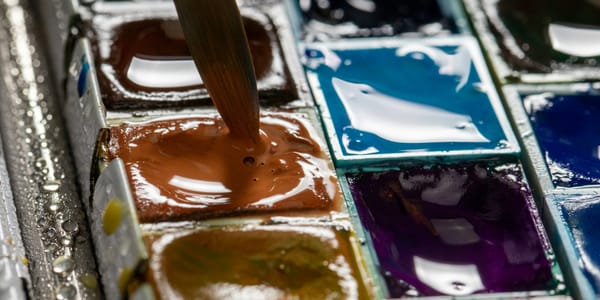
Painted pink allows enormous range from transparent washes to opaque impasto. Different pink pigments handle differently—some granulate, others stay smooth, some mix cleanly, others muddy.
Contemporary painters exploit pink's range to create everything from subtle atmospheric effects to aggressive chromatic statements. Pink can structure entire compositions or provide key accents that activate other colors.
Pink Light and Installation
Bathing spaces in pink light creates atmospheric environments quite different from pink surfaces. Pink light affects how viewers perceive themselves and others, creating somewhat surreal or dreamlike conditions.
Contemporary installation artists use pink light to alter gallery spaces, making them feel intimate, uncomfortable, or otherworldly. The light affects viewers' bodies and perceptions rather than remaining external to them.
Pink Photography and Video
Pink filters, gels, and lighting in photography and video create specific aesthetic associated with fashion, advertising, and contemporary visual culture. This photographic pink carries different associations than painted pink.
Contemporary artists working with lens-based media often use pink to reference these commercial and fashion contexts while also exploring pink's aesthetic and psychological effects in time-based work.
Pink Sculpture and Objects
Three-dimensional pink objects have particular presence because pink surface affects how form reads spatially. Pink can make sculptures feel lighter or softer than they physically are.
Contemporary sculptors sometimes use pink to create tension between visual softness and actual hardness, or to make monumental objects feel less imposing.
Cultural and Global Perspectives
While this discussion focuses primarily on Western contemporary art, pink signifies differently across cultures, complicating universal claims about its meanings.
Pink in Japanese Culture
In Japan, pink cherry blossoms carry profound cultural significance. This pink is beautiful, transient, and deeply meaningful in ways distinct from Western pink's associations.
Contemporary Japanese artists working with pink navigate between these traditional associations and contemporary global pink culture. Their pink can reference both cherry blossoms and Harajuku fashion, creating hybrid meanings.
Pink Across Contexts
Pink's gendering varies in intensity and character across cultures. While Western influence has exported some gendered associations globally, local meanings and traditions create different pink vocabularies.
Contemporary artists working internationally must navigate these different pink languages, sometimes deliberately confusing or combining them.
Why Pink Now
Beyond individual artistic choices, broader cultural shifts make pink particularly resonant for contemporary moment.
Gender Fluidity
As culture increasingly questions rigid gender binaries, pink becomes available for more fluid deployment. If gender itself is performed and fluid rather than fixed and binary, then pink's gendered associations can be played with rather than simply accepted or rejected.
Contemporary pink benefits from this cultural moment where gender means more complexly. The color can reference femininity without fixing it as essential or natural.
Feminist Resurgence
Contemporary feminism's visibility and energy make claiming feminine aesthetics feel politically powerful rather than apologetic. Pink becomes color of resistance rather than submission.
This political dimension gives contemporary pink urgency beyond pure aesthetics. Using pink can be statement about gender politics whether or not that's the primary intention.
Aesthetic Rebellion
Pink's previous dismissal makes it appealing for artists interested in challenging good taste or aesthetic hierarchies. Using pink seriously defies expectations about what serious contemporary art should look like.
This rebellious dimension appeals particularly to younger artists less invested in proving their seriousness through austere aesthetics.
Social Media Aesthetics
Pink's prevalence in Instagram and social media aesthetics influences broader visual culture including art. Contemporary artists both reference and critique these pink-saturated digital environments.
The "Instagram pink" wall phenomenon and pink's dominance in social media visual culture make the color feel distinctly contemporary regardless of historical associations.
Living With Pink Art
For collectors and viewers, pink art affects spaces and experiences distinctly from other color choices.
Spatial Effects
Pink art can make spaces feel warmer, more intimate, or more playful depending on shade and intensity. Large pink surfaces create distinct atmospheric environments.
However, extensive pink risks feeling overwhelming or cloying. The color requires careful balance and consideration of how much pink presence a space can sustain.
Lighting Considerations
Pink art behaves unpredictably under different lighting. It can look radically different under warm versus cool light, in natural versus artificial illumination.
Gallery lighting typically uses neutral white light to minimize color distortion, but domestic contexts rarely maintain such controlled lighting. Pink art's appearance will shift throughout the day and under different bulbs.
Social Response
Pink art generates stronger reactions than many color choices. People have opinions about pink. It's rarely neutral or invisible.
This means living with pink art involves navigating others' responses to the color. Some will love it; others will find it uncomfortable or problematic. Pink art makes statements whether or not you intend them.
Aging and Dating
Pink's strong associations with contemporary aesthetics raise questions about whether it will date quickly. Will today's pink feel as tied to this moment as 1980s mauve feels tied to that decade?
This risk of dating exists with any color strongly associated with specific period, but pink's intensity and cultural weight make it particularly vulnerable.
Pink's Evolution
Where pink goes from here remains open. The current reclamation might represent lasting liberation of the color from limiting associations, or might prove another phase in pink's ongoing cultural evolution.
Some artists tire of pink's prevalence and deliberately avoid it. Aesthetic reactions against dominant trends inevitably emerge. Pink's current ubiquity might generate anti-pink backlash.
Alternatively, pink might become so thoroughly reclaimed that its gendered associations fade, leaving it simply as color available for any use. This complete liberation from gender coding would represent ultimate success of reclamation project.
More likely, pink will continue carrying complex, contested meanings while remaining available for increasingly diverse deployments. The color's history won't disappear, but that history might become reference point artists play with rather than constraint they must overcome.
What seems certain is that contemporary art's engagement with pink represents genuine cultural shift rather than passing trend. Pink's return isn't simple rehabilitation but complex renegotiation of the color's meanings and possibilities. Understanding this complexity reveals as much about contemporary culture as about contemporary art.


