The Only Color Theory Guide You Actually Need
Color theory isn't rules to memorize but frameworks for understanding how wavelengths, perception, and mixing actually work. Hue, value, saturation, temperature, bias, and context determine whether color serves concepts or just decorates surfaces.
Color theory gets taught as rules to memorize: complementary pairs create vibration, warm colors advance while cool colors recede, analogous harmonies feel peaceful. But treating color theory as a set of prescriptions to follow produces timid, predictable work that looks like every other painting made by someone following the same rules. Real color theory is a framework for understanding how color actually works—how eyes and brains process it, how colors interact with each other, how cultural associations and optical phenomena shape what color means—so decisions come from understanding rather than rote application of formulas.
The difference matters enormously. Artists who understand color theory can break its supposed rules productively, knowing exactly what they're doing and why. They can troubleshoot color problems in their work by understanding what's actually happening optically and perceptually. They can make sophisticated color choices that serve their concepts rather than just applying safe harmonies that don't offend anyone but don't do much either.
This guide covers how color actually works, from the physics of light through the psychology of perception to the practicalities of mixing and using color in different media. It's not a collection of color schemes to copy. It's a foundation for understanding color deeply enough to use it with genuine sophistication.
What Color Actually Is: Physics and Perception
Color doesn't exist in objects. It's perceptual experience created when light of certain wavelengths enters eyes and gets interpreted by brains. This isn't semantic quibbling; it's fundamental to understanding how color works.
Light is electromagnetic radiation. The visible spectrum humans perceive as color ranges from about 380 nanometers (violet) to 740 nanometers (red). Different wavelengths stimulate the cone cells in retinas differently, creating the sensation of different colors.
Three types of cone cells respond to different wavelength ranges: S-cones sensitive to short wavelengths (blue-violet), M-cones sensitive to medium wavelengths (green-yellow), and L-cones sensitive to long wavelengths (yellow-red). The overlapping response curves of these three cone types enable perception of millions of distinct colors through the combination of their signals.
Objects don't "have" color. They reflect certain wavelengths and absorb others. A red apple appears red because its surface reflects wavelengths around 650-700 nanometers and absorbs most other wavelengths. Under different lighting, the same apple appears different colors because the wavelengths available to reflect have changed.
This wavelength-based understanding explains why color matching is so difficult. The same object looks different under incandescent, fluorescent, LED, and natural light because each light source emits different spectral distributions. Color constancy, the brain's ability to perceive relatively stable colors despite changing illumination, helps but doesn't eliminate these shifts.
Metamerism occurs when two colors appear identical under one lighting condition but different under another. This happens because they reflect the same overall amount of light to the eye but have different spectral reflectance curves. Artists working across different lighting conditions need to account for metamerism or colors matched in studio lighting will look wrong in gallery lighting.
The eye-brain system performs significant processing between light entering the eye and conscious color perception. Opponent process theory describes how the brain processes color information through three opponent channels: red-green, blue-yellow, and light-dark. This processing explains several color phenomena including afterimages and simultaneous contrast.
Understanding color as perceptual experience rather than inherent property of objects clarifies why context affects color appearance so dramatically. The famous blue-black versus white-gold dress debate demonstrated how the brain's assumptions about lighting conditions affect color perception even when looking at identical pixel values.
The Traditional Color Wheel and Its Limitations
The RYB (red, yellow, blue) color wheel taught in elementary school is a useful organizational tool but scientifically inaccurate and practically limited.
The RYB primary system claims red, yellow, and blue are primaries that can't be created by mixing other colors, and all other colors come from mixing these primaries. This is false. The RYB system emerged from historical pigment availability, not from how color actually works.
In additive color (light), the primaries are red, green, and blue. Mix these light primaries and they create white light. This is how screens work—RGB pixels creating all visible colors through additive mixing.
In subtractive color (pigments and dyes), the primaries are cyan, magenta, and yellow. Mix these pigment primaries and they theoretically create black through subtractive mixing. This is how printing works—CMYK creating all printed colors.
The RYB system persists in art education despite being wrong because it works acceptably for basic color mixing with traditional artist pigments, most of which aren't spectrally pure anyway. A "primary red" pigment like Cadmium Red is actually fairly orange. "Primary blue" like Ultramarine is actually quite violet. These impure primaries can mix to create a limited range of colors, but nowhere near the range possible with CMY primaries.
Understanding the limitations of RYB prevents frustration when trying to mix certain colors. Trying to mix a vibrant purple from Ultramarine Blue (which leans violet) and Cadmium Red (which leans orange) produces a dull, brownish purple because both pigments contain yellow, and the yellow muddies the mixture. Using Quinacridone Magenta and Ultramarine Blue produces much cleaner purples because there's less contaminating yellow.
Secondary colors in RYB theory—orange, green, violet—result from mixing adjacent primaries. Tertiary colors result from mixing primaries with secondaries. This organizational structure helps understand color relationships even though the specific primaries are wrong.
Complementary pairs in traditional color theory—colors opposite each other on the wheel that theoretically neutralize when mixed—provide useful framework for understanding color relationships. Red-green, blue-orange, yellow-violet complement pairs create maximum contrast and visual vibration when placed adjacently.
But again, the specific colors depend on which primaries the wheel uses. RYB complements differ from CMY complements, which differ from RGB complements. No single "correct" set of complements exists because it depends on the color system being used.
Artists can work productively with RYB color wheels while understanding their limitations, or can adopt CMY-based approaches for cleaner mixing, or can work with multiple color systems depending on context and medium.
Color Dimensions: Hue, Value, and Saturation
Every color can be described using three dimensions: hue, value, and saturation (also called chroma or intensity). Understanding these as independent variables that can be adjusted separately clarifies color relationships and mixing.
Hue is what most people mean by "color"—the quality that makes red different from blue or green. Hue is determined by wavelength (in light) or by which wavelengths are reflected (in pigments). The hue circle organizes colors in spectral order, though there's no natural beginning or end point.
Value describes lightness or darkness, the amount of light a color reflects. Value ranges from white (maximum light reflection) through grays to black (minimum light reflection). Value is independent of hue—red can be light pink or dark maroon while remaining red in hue.
The value dimension is often the most important for composition and readability. Squinting or viewing work in grayscale reveals its value structure. Compositions that work in value but fail in color can be fixed by adjusting color. Compositions that fail in value rarely work no matter how beautiful the colors are.
High-key images use predominantly light values. Low-key images use predominantly dark values. Full-key images use the complete value range from white to black. These value approaches create different moods and serve different concepts regardless of hue choices.
Saturation describes color intensity or purity—how far a color is from neutral gray at the same value. High saturation means pure, intense, vivid color. Low saturation means muted, grayed, or dulled color. Zero saturation means neutral gray.
The saturation dimension is crucial for sophistication. Many inexperienced colorists work only with high-saturation colors, producing garish, visually exhausting work. Varying saturation—using intense colors sparingly alongside muted colors—creates visual hierarchy and prevents chromatic fatigue.
Desaturating colors happens by mixing them with their complement (which contains the opposite hue and therefore neutralizes), mixing with gray at the same value, or adding white or black (which changes value along with saturation). Each approach produces different qualities of desaturation.
The three-dimensional color space—hue circle, value axis, and saturation radius—can be visualized as a cylinder or double cone. Every possible color occupies a position in this three-dimensional space. Understanding color as three-dimensional rather than just the two-dimensional color wheel clarifies why millions of distinct colors exist despite relatively few hues.
Artists can manipulate hue, value, and saturation independently to achieve specific effects. Want a color to recede? Lower its value and saturation. Want it to advance? Increase value contrast with its surroundings and potentially increase saturation. Want subtlety? Keep hue variation with minimal value or saturation variation. Want drama? Maximize all three dimensions of contrast.
Temperature: The Most Useful Color Concept
Color temperature—the warm-cool dimension—is perhaps the most practically useful color concept for artists, affecting spatial illusion, emotional tone, and color harmony.
Warm colors (reds, oranges, yellows) are associated with fire, sun, heat. Cool colors (blues, greens, violets) are associated with water, ice, sky, shade. This temperature association is partly physiological (warm colors slightly increase heart rate and arousal) and partly cultural conditioning.
The spatial effects of temperature are significant. Warm colors generally advance in pictorial space. Cool colors generally recede. This isn't absolute law—context matters enormously—but as a general tendency it's reliable enough to use intentionally.
Atmospheric perspective demonstrates this temperature shift in nature. Distant objects appear cooler, bluer, and less saturated due to atmospheric scattering of light. Warm, saturated colors appear closer. Cooler, desaturated colors appear farther away. Artists can use this relationship to create or enhance spatial illusion.
But temperature is relative, not absolute. Any color can be warm or cool depending on context. Ultramarine Blue is cool compared to Cadmium Red but warm compared to Cerulean Blue. Cadmium Yellow is warm compared to Lemon Yellow but cool compared to Cadmium Orange.
This relativity means temperature works through relationships between colors rather than inherent properties of individual colors. A painting using only warm colors can still create warm-cool variation through relative differences. Same with cool-only palettes.
Temperature affects emotional and atmospheric reading. Warm-dominant palettes feel energetic, aggressive, passionate, or uncomfortable depending on context and handling. Cool-dominant palettes feel calm, distant, melancholy, or austere. Mixed temperature palettes can create tension, balance, or complexity.
Successful color use often involves subtle temperature variation rather than obvious warm-cool division. Slightly warming the lights and cooling the shadows (or vice versa) creates more interesting color than uniform temperature. Temperature shifts across a single passage create vibrancy that flat temperature doesn't achieve.
The temperature of neutrals—grays, browns, near-blacks—significantly affects overall color feeling. Warm grays (grays mixed from complements leaning warm) create different atmosphere than cool grays. Many sophisticated palettes use extensive neutral variation with relatively few saturated color accents.
Light source temperature affects everything. Incandescent light is warm, adding yellow-orange. Fluorescent light is often cool, adding blue-green. Daylight varies from warm morning and evening light to cooler midday light. Sunset light is extremely warm. The color temperature of illumination shifts all perceived colors.
Artists working from life need to identify light source temperature and account for it. Objects in warm light appear warmer in the lit areas and cooler in shadows. Objects in cool light show opposite pattern. Missing this temperature shift in shadows is common beginner mistake.
Indoor versus outdoor work involves different temperature considerations. Indoor studio lighting remains relatively constant. Outdoor natural light changes constantly. Plein air painters chase light as it shifts, trying to capture specific lighting moments before they pass.
Color Bias and Why Mixing Fails
Color bias—the tendency of pigments to lean toward neighboring hues—is the single most important concept for understanding why color mixing succeeds or fails.
No pigment is perfectly pure in hue. Every pigment leans slightly toward one side or the other of its theoretical position on the color wheel. This leaning is the pigment's bias.
Cadmium Red leans orange (warm bias). Alizarin Crimson leans violet (cool bias). Both are red, but their biases make them behave very differently in mixtures.
Ultramarine Blue leans violet (warm bias for a blue). Cerulean Blue leans green (cool bias). Again, both are blue but with opposite biases.
Cadmium Yellow leans orange (warm bias). Lemon Yellow leans green (cool bias). The temperature language describes the bias direction.
When mixing secondary colors, bias determines whether mixtures are clean or muddy. Mixing two primaries that both lean toward the secondary works well. Mixing two primaries that lean away from the secondary produces dull, neutral mixtures.
Example: Mixing orange requires yellow and red. Using warm yellow (Cadmium Yellow, biased toward orange) and warm red (Cadmium Red, biased toward orange) produces clean, vibrant orange. Using cool yellow (Lemon Yellow, biased away from orange toward green) and cool red (Alizarin Crimson, biased away from orange toward violet) produces dull, brownish orange because the green bias in the yellow and violet bias in the red create contamination.
Mixing green requires yellow and blue. Using cool yellow (Lemon Yellow, biased toward green) and cool blue (Cerulean or Phthalo Blue, biased toward green) produces clean, vibrant green. Using warm yellow (Cadmium Yellow, biased toward orange) and warm blue (Ultramarine, biased toward violet) produces dull, grayed green.
Mixing violet requires red and blue. Using cool red (Alizarin Crimson or Quinacridone Magenta, biased toward violet) and warm blue (Ultramarine, biased toward violet) produces clean violet. Using warm red (Cadmium Red, biased away from violet toward orange) and cool blue (Cerulean, biased away from violet toward green) produces muddy, grayish violet.
The pattern is consistent: mixing toward the target color produces clean mixtures; mixing away from it produces neutralized, muddy mixtures.
Understanding bias explains why a split-primary palette—two versions of each primary, one warm and one cool—enables mixing a much wider range of clean colors than a single-primary palette. With six colors (warm and cool versions of red, yellow, and blue), nearly any color can be mixed cleanly by choosing the appropriate biased primaries.
Bias also affects neutrals and earth tones. Those dull, grayed mixtures aren't failures if neutral colors are the goal. Mixing complements with opposing biases produces interesting neutral colors. Warm red and cool green, cool red and warm green, each produces different neutrals.
Many beautiful earth tones—browns, ochres, siennas—come from mixing primaries with opposing biases. These chromatic grays and browns feel more alive than mixing with black or pre-made earth tones because they contain color variation even while being desaturated.
Commercial pigment names often obscure bias. "Primary Red" or "Primary Blue" sound pure but are marketing terms, not descriptions of actual spectral position or bias. Learning individual pigment characteristics through testing reveals their true biases.
Artists working with limited palettes need to choose colors with biases that enable mixing the range they need. A palette of all warm primaries severely limits accessible colors. Same with all cool primaries. Balanced bias across the palette maintains flexibility.
Simultaneous Contrast and Context Effects
Colors don't exist in isolation. Every color is affected by surrounding colors through various contrast phenomena, most importantly simultaneous contrast.
Simultaneous contrast means adjacent colors influence each other's appearance. Gray appears warm when surrounded by cool colors and cool when surrounded by warm colors. Medium value appears lighter against dark background and darker against light background. Saturation appears more intense against desaturated surroundings and less intense against saturated surroundings.
This isn't optical illusion in the sense of misperception. The perceptual system processes color relationally, comparing each color to its context. The same physical stimulus produces different perceptual experiences depending on surrounding stimuli.
Josef Albers's Interaction of Color demonstrates these phenomena extensively. Albers shows how a single color can appear as two completely different colors depending on context, or how two different colors can appear identical when properly contextualized.
Complementary colors create maximum simultaneous contrast. Orange looks more intense next to blue than next to red. Blue looks more saturated next to orange than next to purple. This complementary vibration can be used for energy and emphasis or avoided if it's distracting.
The advancing-receding effect of warm-cool relationships intensifies through simultaneous contrast. Warm colors appear to advance more when surrounded by cool colors than when surrounded by other warm colors. Cool colors recede more against warm backgrounds.
Edge effects are particularly strong manifestations of simultaneous contrast. Colors appear most different where they meet. Moving away from the edge, the contrast diminishes perceptually even though the colors themselves remain constant. This edge phenomenon affects how shapes and forms read.
Afterimages demonstrate opponent-process mechanisms underlying simultaneous contrast. Staring at saturated red for 30 seconds then looking at white surface produces cyan afterimage. The red-green opponent channel fatigues from the red stimulus, temporarily skewing perception toward green. This same mechanism operates continuously at lower intensity, affecting all color perception.
Successive contrast differs from simultaneous contrast but relates to it. Successive contrast is the afterimage effect—looking at one color affects perception of subsequently viewed colors. Simultaneous contrast happens when colors are viewed at the same time.
Artists can use simultaneous contrast strategically. Placing desaturated colors against even more desaturated colors makes them appear relatively saturated. Placing intense colors against neutral backgrounds makes them appear more intense. Context manipulation affects color impact more than the colors themselves do.
Understanding simultaneous contrast also prevents problems. Colors that look perfect in isolation might clash or disappear when placed in their final context. Testing color relationships in intended context prevents surprises.
The size of color areas affects simultaneous contrast strength. Large areas of contrasting colors create stronger effects than small areas. Tiny accents of color don't generate strong simultaneous contrast. Balance between area sizes affects overall color dynamics.
Boundaries between colors can be manipulated to enhance or minimize simultaneous contrast. Hard edges emphasize contrast. Soft, gradual transitions minimize it. Lost edges eliminate it entirely. Edge handling is partly a color concern, not just a drawing or compositional one.
Optical Mixing and Broken Color
Optical mixing occurs when the eye blends separate colors that are too small or distant to see individually, creating a mixed color through visual perception rather than physical pigment mixing.
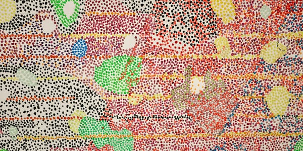
Pointillism, as developed by Seurat and Signac, explicitly uses optical mixing. Small dots of pure color placed adjacently mix optically when viewed from appropriate distance. Red and blue dots create violet when viewed from far enough away that individual dots blur together.
Optical mixing produces different color qualities than physical pigment mixing. Optically mixed colors remain luminous because the individual colors aren't physically combined and darkened through subtractive mixing. The color appears to vibrate or shimmer in ways that flat, physically mixed color doesn't.
Broken color technique in painting uses varied color strokes rather than smooth, blended areas. The strokes remain visible but read as unified color from normal viewing distance. Impressionists used broken color extensively, creating vibrant surfaces through optical mixing of brushstrokes.
The color and size of strokes affect optical mixing results. Larger strokes require greater viewing distance to merge optically. Smaller marks merge at closer range. Artists can control viewing distance and optical mixing through mark size.
Transparency in layered painting creates optical mixing of different sort. When transparent colors layer over each other or over opaque underpainting, light travels through the transparent layer, bounces off the layer beneath, and travels back through transparency. The colors mix optically through this light travel rather than physically blending.
Glazing techniques in oil painting use this transparent optical mixing. A transparent glaze over opaque underpainting creates different color quality than mixing those same pigments together on the palette. The glazed color appears to glow because light travels through it rather than reflecting only from surface.
Scumbling, dragging broken opaque or semi-opaque color over textured underpaint, creates optical mixing where the broken top layer partially reveals the layer beneath. The eye blends the two layers optically, creating complex, vibrating surfaces.
Digital screens use optical mixing inherently. RGB pixels too small to see individually create all screen colors through optical mixing. Understanding this helps artists working digitally understand why screen colors often can't be matched exactly in physical media.
Textile arts use optical mixing constantly. Woven fabrics combine colored threads that the eye blends from normal viewing distance. Printed fabrics often use halftone dots that merge optically. Color in textiles frequently depends on optical rather than physical mixing.
The advantage of optical mixing is luminosity and vibration. The disadvantage is loss of precise color control and dependence on viewing distance. Colors that mix optically at one distance might remain separate at another.
Artists can use optical mixing for specific effects or avoid it by blending colors smoothly to eliminate visible strokes. Neither approach is inherently better; they serve different purposes and create different qualities.
Color Harmony Systems and Their Uses
Color harmony theories provide frameworks for choosing color combinations, though they're guidelines rather than rules and should be understood as tools rather than prescriptions.
Monochromatic harmony uses variations of a single hue with different values and saturations. The consistency creates unity. The risk is monotony if variation in value and saturation isn't sufficient.
Monochromatic schemes work well when color isn't the primary concern or when restraint serves the concept. They're reliable and safe but can feel timid if that's not the intention.
Analogous harmony uses colors adjacent on the color wheel—three to five neighboring hues. This creates harmony through similarity while providing more variety than monochromatic.
Analogous schemes feel cohesive and often appear in nature (sunset colors, autumn foliage). They're versatile and relatively easy to work with. The risk is blandness if the colors are too similar in value and saturation.
Complementary harmony uses colors opposite on the color wheel. Maximum hue contrast creates vibration and energy. This is bold, high-impact, and potentially garish if not handled carefully.
Complementary schemes work best when one color dominates and the complement accents, rather than 50-50 split which often feels heavy-handed. Using muted or tinted versions rather than pure saturated complements creates sophistication.
Split-complementary harmony uses one color plus the two colors adjacent to its complement. This maintains the contrast of complementary but softens it slightly, reducing potential garishness while keeping energy.
Triadic harmony uses three colors evenly spaced on the color wheel. This creates balance and variety. Primary triad (red-yellow-blue) or secondary triad (orange-green-violet) are most common.
Triadic schemes offer variety with inherent balance but can feel artificially structured if used too literally. They work better when one color dominates and others support.
Tetradic or double-complementary harmony uses two complementary pairs. This provides maximum variety but risks chaos if not carefully controlled. Usually one pair should dominate with the other providing accent.
These harmony systems are useful starting points but shouldn't be followed rigidly. The best color use often involves bending or breaking harmony rules while understanding why the bending works.
Real paintings rarely use pure harmony systems. They might be predominantly analogous with complementary accents, or basically complementary with analogous transitions. Hybrid approaches drawn from multiple systems create complexity beyond single-system rigidity.
The value and saturation dimensions matter as much as hue relationships in creating harmony. Perfectly harmonious hues can clash if values and saturations conflict. Slightly dissonant hues can harmonize beautifully if values and saturations relate well.
Proportion matters enormously in harmony. A complementary scheme with equal areas of each color feels different from 90% one color with 10% complement accent. Unequal proportions usually work better than equal distribution.
Cultural and Psychological Color Associations
Colors carry cultural meanings and psychological associations that affect how work is read, though these associations are largely learned rather than inherent.
Red signifies danger, passion, heat, energy, aggression, love, warning, depending on context and culture. In Western cultures, red means danger and stop. In China, red signifies good fortune and celebration. Red clothing reads differently than red wall than red stop sign.
Blue signifies calm, sadness, cold, trust, corporate reliability, masculinity in some contexts. Different blues carry different associations—navy blue means authority, sky blue means peace, dark blue means depression. "Feeling blue" versus "blue sky thinking" shows semantic range.
Yellow signifies happiness, caution, cowardice, optimism, or sickness depending on saturation and context. Bright yellow is cheerful. Desaturated yellow can look sickly. Yellow triangular signs mean caution. Cultural associations with yellow vary more than with red or blue.
Green signifies nature, growth, envy, poison, money, freshness, or environmental concern. "Green with envy," "greenback," "going green" all reference different associations. Green is positive in environmental contexts, sinister in poison contexts.
The associations aren't universal or fixed. They depend on cultural context, historical period, specific use, and individual experience. An artist can work with conventional associations or deliberately work against them.
Symbolic color use in religious art demonstrates culturally specific associations. Christian art uses blue for Virgin Mary's robes (purity, heaven), purple for Christ (royalty, suffering), white for divinity. These associations are meaningful within Christian tradition but not universal.
Corporate color use exploits psychological associations. Blue dominates corporate branding because it suggests trustworthiness and stability. Red suggests energy and passion, good for food and excitement branding. Green suggests environmental responsibility or health.
Artists can use cultural associations intentionally, knowing viewers will bring these meanings to the work. Using red for passion, blue for melancholy, green for nature taps into learned responses that affect reading.
Or artists can work against associations, using colors in ways that contradict conventional meanings. Blue for heat, red for calm, green for death all create dissonance that can be productive if intentional.
Personal color associations vary by individual experience. Someone who associates yellow with a beloved childhood kitchen might respond to yellow differently than someone who associates it with illness. Artists can't control individual associations but can work with broader cultural patterns.
Fashion and trend cycles affect color associations temporarily. Millennial Pink, Gen Z Yellow, whatever color becomes associated with particular cultural moments carries those associations until they fade. Using trendy colors dates work to specific periods.
Timeless color use avoids trend associations by using colors in ways that reference longer artistic or cultural traditions rather than contemporary fashion. This doesn't mean avoiding current colors but using them in ways not reducible to trend participation.
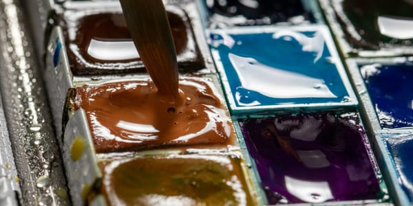
Practical Mixing: Pigments and Paint
Understanding color theory intellectually helps, but practical mixing skill requires knowledge of specific pigments and how they behave in different media.
Pigment selection determines available color range. A palette of earth tones can't produce saturated violets no matter how well they're mixed. A palette heavy on blues produces different results than one heavy on reds. What pigments are available shapes what's possible.
Traditional limited palettes—split primary, Zorn palette, earth palette—each have characteristics determined by included pigments. Split primary (two versions of each primary) enables wide range. Zorn palette (yellow ochre, vermillion, ivory black, white) creates specific color character. Earth palette produces subdued, naturalistic color.
Testing pigments individually reveals their mixing behavior. Some pigments are strong tinters that dominate mixtures. Others are weak tinters that get overwhelmed easily. Knowing pigment strength prevents accidental dominance of one color in mixtures.
Transparent versus opaque pigments behave differently. Transparent pigments like Quinacridones or Phthalos work well for glazing and can create luminous darks. Opaque pigments like Cadmiums or Cerulean provide coverage and solid color but can look chalky in mixtures.
Mixing transparent and opaque pigments can produce interesting effects but requires understanding that the transparent pigment might not significantly affect appearance of the opaque one in direct mixture. Layering works better for combining transparent and opaque colors.
Some pigments physically separate or granulate in mixtures, especially in watercolor. Ultramarine Blue and Burnt Sienna granulate beautifully in watercolor, creating textured washes. Other pigments mix smoothly without separation. Knowing pigment characteristics enables using these properties intentionally.
Chemical compatibility matters in some media. Certain pigment combinations react poorly, causing darkening or color shift over time. Cadmiums can react with copper pigments. Lead white can react with sulfur-based pigments. Understanding compatibility prevents deterioration.
Different media affect mixing behavior. Oil paint can be extended with medium, making colors more transparent and subtle mixing easier. Acrylic dries quickly, requiring faster mixing. Watercolor is transparent, making mixing about layering washes. Gouache is opaque watercolor, enabling different mixing approaches.
Color mixing is primarily about value and saturation control rather than hue shifting. Getting the right value and saturation matters more than getting perfect hue. Slight hue variations are often imperceptible, but value and saturation mistakes are immediately obvious.
Mixing darks without black creates more interesting shadows and darks. Complementary mixtures, especially blue and orange or violet and yellow, produce rich darks with color character. Adding black creates dead, flat darks that feel empty compared to chromatic darks.
Mixing lights without white in some media maintains saturation. In oil painting, using yellow or light opaque colors for lights preserves intensity better than white, which desaturates. In watercolor, preserving white paper creates lights without adding white paint.
Neutrals mixed from complements are more interesting than pre-made grays. Warm and cool grays can be mixed from complementary pairs, creating subtle color variation in neutrals. These chromatic grays unify paintings better than flat, achromatic grays.
Color in Different Media
Color behaves differently across media due to material properties, requiring adapted approaches for each.
Oil painting allows extensive mixing, blending, and layering. Colors can be built up through glazing, creating depth and luminosity. The slow drying time enables complex blending and adjustments. Color appears rich and saturated when properly applied.
Oil paint changes slightly on drying, typically darkening and losing some surface sheen. This "sinking in" affects color appearance. Oiling out or varnishing restores saturation. Understanding these changes prevents disappointment when dried work looks different from wet.
Acrylic painting dries quickly with color shift toward darker and less saturated than wet appearance. This requires adjusting for the shift, making colors lighter and more saturated than intended final appearance. Acrylics can be thinned for watercolor-like washes or used opaquely like oils.
Watercolor is transparent, building color through layered washes. White isn't added; white paper provides lights. Color mixing happens through layering transparent colors, creating optical mixing. Granulating pigments behave differently than smooth-flowing ones.
Watercolor is difficult to lighten once applied. Correcting mistakes is hard. Planning for preserving whites and lights requires different approach than opaque media where lights can be added on top of darks.
Gouache combines watercolor's water-solubility with opacity, allowing lighter colors over darker. Color remains workable when rewetted. Gouache dries matte with slight value shift toward lighter. It's excellent for flat, graphic color areas.
Pastel color appears intense because pigment sits on surface rather than mixed with binder. The matte surface absorbs light differently than glossy paint surfaces. Pastels layer through physical buildup rather than optical mixing in liquid media.
Colored pencil builds color through layering and burnishing. Light pressure creates tints. Heavy pressure creates saturated color. Mixing happens through layering colors, creating optical mixing. The paper texture affects color appearance.
Digital color uses additive RGB mixing rather than subtractive pigment mixing. Bright, saturated colors are easy to achieve. Color remains stable without drying shifts or aging. But screen color doesn't match printed color directly.
Converting digital work to print requires understanding that screen's RGB gamut differs from print's CMYK gamut. Some screen colors can't be printed. Proofing prints before final production prevents color disappointment.
Printmaking color varies by medium. Lithography allows subtle color blending. Screen printing uses flat color areas. Etching allows layered transparent colors. Each print medium has color characteristics determined by process.
Installation and environmental color involves light, materials, and architecture. Colored light behaves additively. Colored materials reflect light subtractively. The interaction creates complex color environments. Scale affects color perception—large color areas feel more intense than small.
Understanding medium-specific color behavior prevents trying to make watercolor do what oil does or expecting acrylic to behave like gouache. Each medium's characteristics shape appropriate color approaches.
Color and Light Source
The color of illumination fundamentally affects perceived object color, something artists must account for whether working from observation or creating color relationships.
Daylight varies enormously by time and weather. Morning and evening light is warm, around 3000-4000K color temperature. Midday sun is cooler, 5000-6500K. Overcast daylight is very cool, 6500-7500K. These temperature shifts change all perceived colors.
North light, traditionally preferred for studio work, is relatively cool and consistent. It doesn't have warm morning and evening shifts of east or west light. But it's dimmer than direct sun, affecting value perception.
Tungsten incandescent light is warm, around 2700-3000K, adding yellow-orange cast to everything. Colors appear warmer under incandescent lighting. Blues look duller, greens yellow-green, reds orange-red.
Fluorescent light varies widely by tube type but often has cool, blue-green cast around 4000-5000K with discontinuous spectrum creating color rendering problems. Certain colors look wrong under fluorescent light due to missing spectral wavelengths.
LED lighting varies enormously by design. Quality LEDs can approximate any color temperature and have good color rendering. Cheap LEDs often have poor color rendering, making certain colors appear distorted.
Gallery lighting is typically neutral to slightly warm, 3000-4000K with high color rendering index (CRI) to display art accurately. But specific galleries vary. Seeing work only in studio lighting risks surprises when installed in different gallery lighting.
Colored light dramatically affects color perception. Red light makes red objects appear light and saturated while making cyan objects appear dark and desaturated. The light color acts as filter, emphasizing wavelengths it contains and suppressing wavelengths it lacks.
Multiple light sources with different color temperatures create complex lighting where objects have different color on different sides or areas. This can be used creatively in installation work or understood as challenge in painting from life.
Artists painting from life need to identify light source color temperature and maintain consistency across the painting. If the light is warm, shadows should lean cool. If the light is cool, shadows should lean warm. This warm-cool opposition creates convincing light.
Plein air painters deal with constantly changing light. The light that existed when starting a painting has shifted by the time it's finished. Committing to specific light and working quickly to capture it before it changes is traditional approach.
Studio painters can control lighting, using daylight-balanced bulbs or consistent north light. This allows extended working time without dramatic light shifts. But the controlled lighting might differ from installation lighting.
Common Color Problems and Solutions
Certain color problems appear repeatedly in developing artists' work. Understanding these common issues and their solutions accelerates color skill development.
Muddy color results from mixing colors with opposing biases or overworking passages. Solution: Mix toward the target color using pigments biased in that direction. Avoid overmixing. Sometimes starting over is faster than trying to save muddy passages.
Garish, overly saturated color schemes exhaust viewers and lack sophistication. Solution: Desaturate most of the painting, using saturated color sparingly for emphasis. Vary saturation as much as hue. Include neutrals and muted colors.
Weak value structure where everything is similar value and colors blend together without clarity. Solution: Establish clear value plan before worrying about hue. Squint at work to check value structure. Increase value contrast in key areas.
Overuse of black creating dead, empty darks without color. Solution: Mix chromatic darks from complementary colors. Use deep blues, violets, greens for darks instead of black. Reserve black for small accents if used at all.
Too many colors creating visual chaos and lack of unity. Solution: Limit palette. Use color families. Establish dominant color temperature and key. Not every color needs equal representation.
Ignoring color temperature creating flat, lifeless color. Solution: Vary temperature. Warm the lights and cool the shadows or vice versa. Use relative temperature within color areas.
Local color obsession where objects are painted their "known" color rather than observed color. Solution: Paint what's actually seen, not what's known intellectually. Observe how light and context affect local color.
Neglecting edges causing colors to feel disconnected. Solution: Vary edges. Hard edges emphasize color contrast. Soft edges reduce it. Lost edges eliminate it. Edge variation creates color integration.
Lack of atmospheric perspective in landscapes where distant objects are as saturated and dark as near ones. Solution: Desaturate and lighten distant objects. Shift them toward cooler blue. Increase contrast in foreground, reduce it in background.
Color without consideration of context. Solution: Always evaluate colors in relation to surroundings. Color that works in isolation might fail in context. Test relationships before committing.
Advanced Color Concepts
Beyond fundamentals, several advanced concepts deepen color understanding for sophisticated color use.
Color constancy describes the perceptual system's ability to perceive relatively stable object colors despite changing illumination. A white shirt appears white under various lighting conditions even though the actual wavelengths reflecting from it vary dramatically.
Understanding color constancy helps artists choose between local color (the "known" color of objects) and observed color (how objects actually appear in specific lighting). Painting observed color creates more convincing light than painting local color.
Metamerism, where colors match under one light but not another, matters for artists showing work in varying lighting. Testing work under different light sources reveals whether colors that appear matched in studio lighting separate under gallery lighting.
Chromatic adaptation describes how the visual system adjusts to ambient light color, normalizing perception. After spending time in warm-lit room, the warm cast becomes less noticeable. Moving between different color temperatures reveals adaptation.
This adaptation explains why judging color accurately requires time. First impressions in new lighting are unreliable. Spending time in the lighting condition allows adaptation, enabling more accurate color perception.
Bezold effect describes how changing one color in a pattern changes perception of other colors even though those colors physically remain unchanged. Adding white to a pattern makes other colors appear lighter. Adding black makes them appear darker.
This effect matters in pattern work, textile design, or anywhere repeated color appears. A single color change can shift the entire pattern's appearance without altering most of the colors.
Spreading effect occurs when colored lines surround areas of different color, affecting the perception of the surrounded areas. Black lines make surrounded areas appear darker. White lines make them appear lighter. Colored lines shift hue of surrounded areas toward the line color.
Purkinje effect describes how color perception changes in dim lighting. As lighting dims, red hues appear to darken faster than blue hues. This shift affects outdoor painting at dusk or anywhere lighting levels drop significantly.
Understanding advanced phenomena doesn't mean explicitly using them but rather recognizing that color perception is complex, contextual, and affected by numerous factors beyond simple wavelength. This complexity is why color is endlessly interesting and impossible to fully master.
Color as Content, Not Just Tool
The most sophisticated color use involves color as conceptual content rather than just aesthetic tool or technical challenge.
Mark Rothko's color field paintings make color the primary content. The colors aren't describing objects or creating illusions. They're creating emotional and contemplative experiences through color relationships, scale, and subtlety.
Rothko's approach demonstrates that color can carry meaning directly without representation. The deep reds, browns, blacks of his late work feel different from the bright oranges and yellows of earlier work. Color itself communicates.
Josef Albers's Homage to the Square series investigates color interaction systematically. The constant format—nested squares—focuses attention entirely on color relationships. Each painting explores how context affects color perception.
Albers's work is both about color interaction and demonstration of it. The content is the color relationships themselves, making visible the principles underlying all color use.
Ellsworth Kelly's shaped canvases and color panels reduce painting to color, shape, and edge relationships. The work has no subject beyond its own physical presence and color. Color becomes the subject, not the means of depicting subjects.
This color-as-subject approach isn't formalism for its own sake. It's acknowledging that color affects us psychologically and physiologically, that it creates meaning through direct perceptual experience.
Artists working with color as content often develop highly refined sensitivity to subtle relationships. Small shifts in hue, value, or saturation become significant when color is the primary concern rather than supporting element.
Even representational work can make color a primary concern equal to or exceeding subject matter. Bonnard's interiors and landscapes use color relationships so central to the work's meaning that the depicted subjects become almost secondary to the color.
Understanding color as potential content rather than just tool expands what color can do in work. Color creates mood, generates spatial relationships, directs attention, carries cultural associations, creates harmony or discord, all of which are meaning-making activities.
The difference between technical color use and conceptual color use is intention. Technical color use aims for accurate representation or pleasing harmony. Conceptual color use employs color for specific communicative or experiential purposes tied to the work's meaning.
Building Color Skill Over Time
Color skill develops through sustained attention and practice, not through memorizing rules or following formulas.
Looking at color in the world—not just in artwork—trains color perception. Notice how light affects object color. Observe color relationships in nature, architecture, clothing. This sustained looking builds visual sensitivity.
Color studies and exercises build practical mixing skill. Paint value scales. Mix color wheels. Create gradients. Match colors from observation. These technical exercises develop the hand-eye-brain coordination required for intentional color use.
Copying master paintings or color studies from artists with exceptional color develops understanding of how sophisticated color works. The copying teaches directly through doing what verbal instruction can't convey.
Limiting palettes forces working with constraints, developing skill at mixing and seeing relationships rather than reaching for pre-mixed solutions. Month-long challenges using only three colors teach more than unlimited palette does.
Working in series where color is the primary variable reveals how color changes affect everything else. Make multiple versions of same composition with different color approaches. The comparisons clarify color's impact.
Photographing work and converting to grayscale checks value structure. If composition fails in grayscale, color won't save it. If it works in grayscale, color can enhance it.
Getting feedback specifically about color from knowledgeable viewers helps identify problems invisible to the maker through familiarity. Fresh eyes notice what habituated vision misses.
Studying color theory through reading provides conceptual framework, but understanding remains abstract until applied in practice. Theory and practice together build deeper understanding than either alone.
Accepting that color skill takes years to develop prevents frustration. No one masters color quickly. Incremental improvement over time is the path. Every painting teaches something about color that informs the next.
Color theory provides frameworks for understanding how color works and tools for using it intentionally. But frameworks aren't rules to follow rigidly. They're conceptual structures supporting informed decision-making. Understanding why color relationships work enables knowing when to follow traditional approaches and when to break them productively. The goal isn't perfect adherence to color harmony systems or mixing formulas but developing sophisticated color sense that serves artistic vision. That sophistication comes from understanding color's physical basis, perceptual mechanisms, practical mixing behavior, and cultural meanings while building practical skill through sustained making and looking. Color is too complex to fully master, which is what makes it endlessly worth studying.