The Synergy of Water and Wax: Mastering Watercolor and Colored Pencil
One medium is fluid and transparent, the other waxy and opaque. Understanding how watercolor and colored pencil work together opens new visual possibilities.
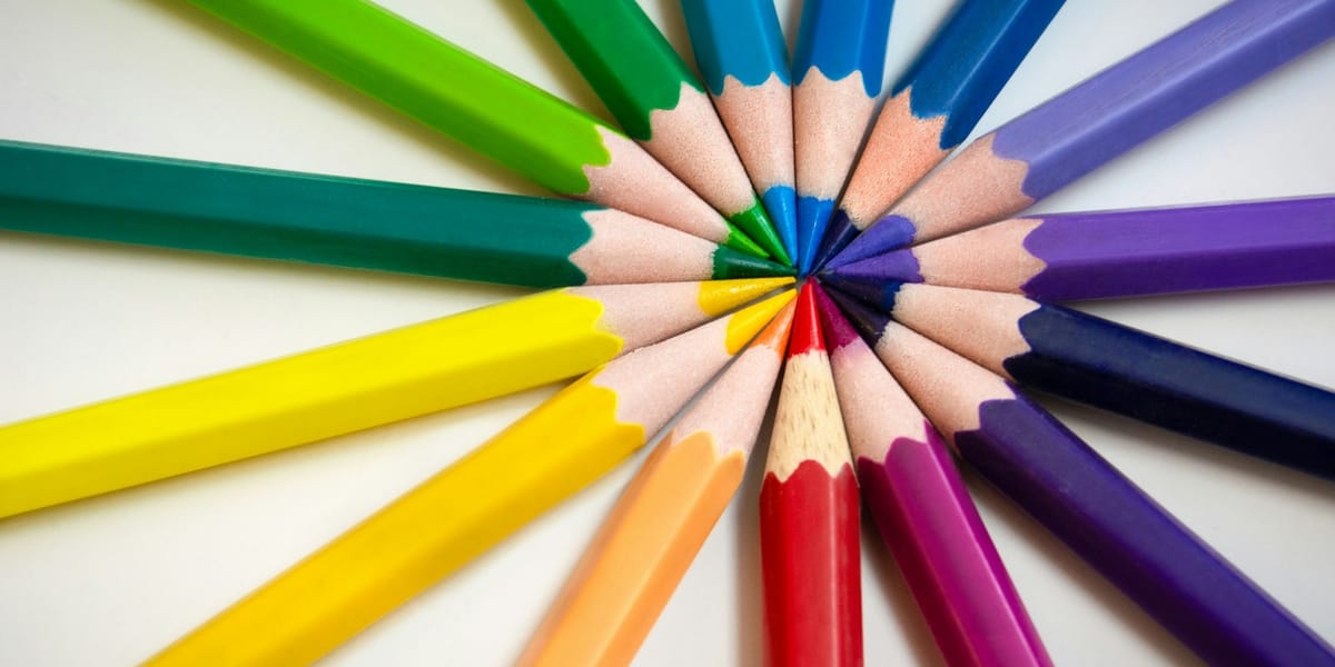
Watercolor and colored pencil shouldn't work together as well as they do. One medium is fluid, unpredictable, and transparent. The other is waxy, controlled, and opaque. Yet when combined thoughtfully, these opposing characteristics create visual effects and textural richness that neither medium achieves alone. The transparency of watercolor provides luminous color foundations, while colored pencil adds precision, texture, and depth that watercolor struggles to capture.
Most artists discover this combination by accident, adding a few pencil details to a watercolor piece or laying watercolor washes over pencil sketches. What begins as experimentation often becomes essential technique once you understand how these media interact and complement each other. The key is knowing when to use each medium, how to layer them for specific effects, and what approaches work with their chemical and physical properties rather than against them.
This isn't about following rigid rules. Mixed media work thrives on experimentation and personal discovery. But understanding the fundamental interactions between watercolor and colored pencil gives you a foundation for intentional choices rather than happy accidents. You'll learn to predict how these media behave together, troubleshoot problems when they don't cooperate, and push the combination in directions that serve your particular vision and working style.
Understanding How These Media Actually Interact
Before you can combine watercolor and colored pencil effectively, you need to understand what happens when water-based and wax-based media meet on paper. The chemical properties of these materials create both opportunities and limitations that shape your approach.
Colored pencils deposit wax or oil-based pigment that sits on the paper's surface rather than soaking into fibers like watercolor. This creates a water-resistant barrier. When you apply watercolor over colored pencil, the water beads and resists in areas where pencil coverage is heavy. This resistance can be frustrating if you want smooth watercolor washes, or it can become a deliberate technique for creating texture and preserving light areas.
The order of application matters tremendously. Watercolor applied first soaks into paper fibers and dries relatively flat, creating an ideal surface for colored pencil application. The pencil grips the slightly textured watercolor surface and allows for controlled mark-making and detail work. This sequence, watercolor first, then colored pencil, gives you the most control and predictable results.
Applying colored pencil first creates different possibilities. Light pencil marks remain visible under watercolor washes, which works beautifully for preserving drawing structure while adding color. Heavy pencil application resists watercolor, creating interesting textural effects where pigment pools around waxy areas. This approach requires more experimental tolerance because you're working with the materials' tendency to separate rather than blend.
Paper quality becomes critical when combining these media. Student-grade paper falls apart under the moisture stress of watercolor and doesn't hold up to the burnishing pressure of colored pencil work. You need paper that can handle both aggressive water application and firm pencil pressure without pilling, tearing, or degrading. Cold-pressed watercolor paper at 140lb weight or heavier provides the durability and texture most artists need for this combination.
The texture of your paper influences how both media perform. Hot-pressed smooth paper gives colored pencils a slick surface that's harder to build up layers on but allows for very fine detail. Rough watercolor paper creates pronounced texture in both watercolor pooling and pencil strokes. Cold-pressed sits between these extremes, offering enough tooth for pencil grip while not being so textured that it dominates your imagery.
Colored pencil brands vary significantly in their wax or oil content, which affects how they interact with watercolor. Wax-based pencils like Prismacolor are softer and lay down more pigment with less pressure, but they also resist water more aggressively. Oil-based pencils like Polychromos are harder and allow for finer detail, with slightly less water resistance. Testing your specific materials together reveals their particular characteristics and informs your technical choices.
Building Luminous Foundations With Watercolor
The power of this mixed media combination often begins with watercolor's unique ability to create transparent, luminous color that colored pencil can't match. Watercolor lets you establish overall color temperature, value structure, and atmospheric effects quickly, creating a foundation that colored pencil work enhances rather than replaces.
Start with loose watercolor washes that establish your composition's major color areas and value relationships. These initial washes should be lighter than you think they need to be. You're creating a color map that colored pencil will later enrich and define. Dark watercolor washes become difficult surfaces for colored pencil work because the waxy pencil struggles to show up against dark, saturated backgrounds.
Think of these initial watercolor layers as setting the mood and providing color harmony that unifies your finished piece. If you're creating a portrait, you might lay in warm ochres and siennas for skin tones, cool blues for shadows, muted greens for backgrounds. These colors don't need to be accurate or detailed yet. They're establishing a color foundation that everything else builds on.
Let each watercolor layer dry completely before adding more color or moving to colored pencil. Patience here prevents muddy color and preserves the luminous quality that makes watercolor valuable in this combination. Use a hair dryer if you're impatient, but test first that the heat doesn't warp your paper. Some artists prefer to let watercolor dry naturally, believing it produces slightly different surface quality than forced drying.
Preserve white areas with masking fluid if you know you'll want bright highlights in your finished piece. Colored pencil can't create the brilliant whites that unpainted paper provides, and trying to build back to white over dark watercolor is nearly impossible. Mask these areas before beginning watercolor application, then remove the masking once watercolor is complete and dry.
Watercolor's tendency to create soft edges and gradual transitions is exactly what you want in these foundation layers. You're not trying to achieve the finished image with watercolor alone. You're creating a color environment that colored pencil will sharpen, define, and texture. Embrace the loose, atmospheric quality of watercolor at this stage rather than fighting for control and precision you'll achieve later with pencil.
Some artists use watercolor strategically for specific effects rather than overall foundation washes. You might create a piece that's primarily colored pencil but use watercolor for sky gradients that would be laborious to achieve with pencil alone. Or you might use watercolor for background elements while handling foreground subjects entirely in colored pencil. There's no requirement to use both media everywhere in every piece.
Adding Definition and Texture With Colored Pencil
Once your watercolor foundation is established and completely dry, colored pencil transforms the piece by adding precision, texture, and dimensional quality that watercolor alone struggles to achieve. This is where the combination becomes more than the sum of its parts.
Begin with light pressure and gradually build up colored pencil application. This gives you more control and prevents wax buildup that can create a slick surface where additional layers won't adhere. Light layers also let you adjust color and value incrementally rather than committing to heavy pigment that's difficult to modify.
Use colored pencil to define edges that watercolor left soft. A watercolor wash might create beautiful atmospheric color in a portrait's background, but the edge where face meets background remains vague. Colored pencil sharpens this transition, clarifying form and bringing the subject forward. This selective edge control lets you direct viewer attention by making some areas crisp while leaving others soft.
Colored pencil excels at creating texture that watercolor can't approach. Use directional pencil strokes to suggest hair, fabric, bark, grass, or any surface with linear texture. The physical marks of the pencil create actual surface variation that tricks the eye into perceiving texture even in a two-dimensional image. Cross-hatching with colored pencil builds rich, complex color that differs from the flat quality of watercolor washes.
Layer complementary colors in colored pencil over watercolor foundations to create vibrant, complex hues. A watercolor base of yellow ochre topped with layers of burnt sienna, red, and even touches of green in colored pencil creates far richer skin tones than flat watercolor washes. This optical color mixing, where colors blend in the viewer's eye rather than on paper, produces luminosity that mixed paint can't match.
Use colored pencil to adjust values after seeing how watercolor dried. Watercolor always dries lighter than it appears when wet, which often means your value structure needs reinforcement. Colored pencil lets you darken areas selectively without disturbing the watercolor underneath. This is particularly useful for deepening shadows and increasing the value range of your piece.
White and light-colored pencils become powerful tools over watercolor. While they won't create bright whites over dark watercolor, they can lighten values, create soft highlights, and modify color temperature. A light blue pencil over warm watercolor cools the color without completely obscuring it. Cream or light ochre pencils over darker watercolor create soft, subtle highlights that look more natural than opaque white paint.
Burnishing, applying heavy pressure to blend colored pencil layers into smooth, saturated color, works differently over watercolor than on blank paper. The watercolor tooth provides resistance that makes burnishing require more pressure, but the results can be stunning. Use this technique selectively in areas where you want intense, saturated color with no paper texture showing through.
Sequencing Your Layers for Specific Effects
The order in which you apply watercolor and colored pencil layers dramatically affects your results. Understanding different sequencing approaches gives you options for various visual goals and allows you to adapt technique to each piece's requirements.
The most common and controllable approach applies watercolor first in multiple layers until you've established all major color and value relationships, then adds colored pencil as the final layer for detail and texture. This sequence gives you watercolor's atmospheric qualities and color transparency while reserving colored pencil for the precision work it handles best. It's particularly effective for subjects where you want watercolor's soft, organic qualities with sharpened detail in focal areas.
Starting with light colored pencil to create an initial drawing, then adding watercolor, then returning with more colored pencil creates a sandwich structure. The initial pencil drawing provides structure that remains subtly visible through watercolor washes, preventing lost edges and maintaining compositional integrity. Watercolor adds color and atmosphere, and final pencil layers add details and refinement. This approach works well when you want drawing to remain visible as part of the aesthetic rather than completely hidden under paint.
Alternating watercolor and colored pencil in multiple cycles builds complex surface and color interactions. You might start with watercolor, add colored pencil details, add more watercolor in selected areas, then more colored pencil. Each layer responds to what's beneath it, creating visual depth and richness that can't be achieved in single-pass applications. This approach requires more planning to avoid overworking areas and creating muddy color, but it offers maximum flexibility for complex subjects.
Using watercolor for backgrounds and colored pencil for subjects creates clear focal hierarchy. The softer, more atmospheric watercolor recedes while detailed colored pencil work advances toward the viewer. This technique effectively directs attention and creates depth without requiring complex perspective or value manipulation. It's particularly useful for subjects like portraits where you want the face sharply defined against a softer environment.
Some artists reverse this, using colored pencil for backgrounds and watercolor for subjects. This creates unexpected results where the subject has soft, painterly qualities while the environment remains detailed and textured. It's less common but can be effective for particular aesthetic goals or when the subject benefits from watercolor's flowing, organic qualities.
Consider also which medium handles specific elements best in each piece. Maybe watercolor creates better skies than colored pencil could, so you use it for that while handling everything else in pencil. Or perhaps colored pencil renders fabric texture beautifully but you want watercolor's transparency for glass or water. Let each medium do what it does best rather than forcing both into every element.
Solving Common Technical Problems
Combining watercolor and colored pencil creates predictable technical challenges that most artists encounter. Understanding these problems and their solutions saves frustration and prevents ruined pieces.
Colored pencil won't adhere properly to heavily saturated watercolor surfaces. The wax-based pigment needs tooth to grip, and dark, wet watercolor creates a slick surface that resists pencil. If you've applied watercolor too heavily and need to add colored pencil, you have several options. Let the watercolor dry completely, then lightly sand the surface with very fine sandpaper to create tooth. Or accept that colored pencil will be subtle in these areas and adjust your approach accordingly. The better solution is preventing the problem by keeping watercolor layers lighter than you think necessary.
Watercolor applied over heavy colored pencil application beads up and refuses to spread evenly. This happens because wax repels water aggressively. If you want smooth watercolor over pencil, you need to apply pencil very lightly or use watercolor pencils for the initial layer instead of wax-based colored pencils. Watercolor pencils create some water resistance but far less than standard colored pencils. Alternatively, embrace the beading effect as intentional texture rather than treating it as a problem to solve.
Wax bloom, a cloudy haze that develops on heavily burnished colored pencil, can appear when you've applied pencil over watercolor with significant pressure. This happens because wax rises to the surface and creates a milky appearance. Fix it by gently buffing the surface with a soft cloth or tissue. Some artists spray fixative over finished pieces to prevent wax bloom, though this can darken colors slightly and changes surface texture.
Paper buckling from watercolor application makes it difficult to apply colored pencil evenly. The warped surface creates inconsistent pressure that produces uneven pencil coverage. Prevent this by stretching watercolor paper before beginning or using heavy enough paper that buckling is minimal. If paper does buckle, you can sometimes flatten it by misting the back with water and pressing under heavy books while it dries, but this doesn't always work and risks damaging the image.
Colors that looked right in watercolor appear different once you've added colored pencil layers. This is frustrating but predictable since colored pencil modifies the appearance of underlying watercolor. The solution is planning ahead and testing color combinations on scrap paper before committing to your actual piece. Create small color studies that layer the specific pencils you intend to use over the watercolors you're planning. This reveals the actual finished color rather than guessing.
Overworking areas by adding too many layers creates muddy color and loss of luminosity. Both watercolor and colored pencil have limits to how many layers they can handle before quality degrades. Watercolor becomes dull and opaque with excessive layers, and colored pencil creates slick, waxy surfaces that won't accept more pigment. Knowing when to stop requires experience, but general guidance is that three to four layers of each medium is approaching the maximum for most subjects.
Developing Your Personal Approach
The technical information provides foundation, but developing your personal voice in this mixed media combination requires experimentation and discovering what serves your aesthetic goals and working temperament.
Some artists lean heavily toward watercolor with colored pencil as accent and detail work. Their pieces read primarily as watercolor paintings enhanced with pencil rather than mixed media with equal presence. This approach suits artists who love watercolor's fluidity and want colored pencil primarily for solving watercolor's weaknesses in detail and texture.
Other artists use watercolor more as underpainting, establishing color and value structure that colored pencil then dominates. Their finished pieces look primarily like colored pencil drawings with rich color foundations rather than obvious watercolor paintings. This approach appeals to artists who prefer the control of colored pencil but want the luminous color that pencil alone struggles to achieve.
Balanced approaches give equal weight to both media, with neither clearly dominating. Watercolor and colored pencil each handle different aspects of the image, creating obvious mixed media aesthetic where both materials remain visible and important. This approach works well when you want the viewer aware of your materials and process rather than hiding technique behind representational accuracy.
Your subject matter influences which approach works best. Portraits often benefit from watercolor skin tones enhanced with colored pencil details. Landscapes might use watercolor for skies and distant elements with colored pencil for foreground detail and texture. Still life subjects could go either direction depending on whether you want soft, atmospheric quality or sharp, detailed rendering.
Working speed is another consideration. Watercolor requires drying time between layers, which some artists find frustrating while others appreciate the enforced pauses that let them assess their work. Colored pencil is slower to cover large areas but doesn't require drying time. Artists who work in long, focused sessions might prefer approaches that minimize waiting, while those who work in shorter bursts might not mind watercolor's necessary pauses.
Your drawing confidence also shapes your approach. Artists comfortable with drawing often start with pencil structure that guides watercolor application. Those less confident with drawing might prefer to establish everything in watercolor where mistakes can be corrected more easily, then add minimal pencil details only where necessary.
Practical Exercises for Skill Development
Understanding concepts matters less than actual practice with materials. These exercises build specific skills in combining watercolor and colored pencil while helping you discover your preferences and strengths.
Create a series of simple spheres using different sequencing approaches. Do one with watercolor foundation and colored pencil details. Do another starting with colored pencil structure overlaid with watercolor then more pencil. Try one alternating between media in multiple layers. These simple forms let you focus entirely on how the materials interact without compositional complexity distracting you. You'll quickly see which approaches produce results you find appealing and which feel natural to your working style.
Choose a simple subject, maybe a single piece of fruit or a simple object, and create multiple versions using different color combinations and layering sequences. This repetition builds familiarity with how specific colors interact across both media. You'll discover that some color combinations work beautifully while others create muddy or dull results. This experimentation on simple subjects means you're not risking more complex pieces while still learning.
Practice edge control by creating compositions with distinct areas that transition from soft to hard edges. Use watercolor to create soft, atmospheric backgrounds and colored pencil to sharpen edges where you want definition. This exercise specifically develops the edge manipulation that makes this media combination powerful. Most weak mixed media work fails because edges are uniformly handled rather than strategically varied.
Work with extreme value contrasts to understand the limits of each medium. Create a small composition with very light areas and very dark areas. You'll quickly discover that watercolor handles light, transparent darks better than colored pencil, but colored pencil can create richer, more saturated darks than watercolor. Understanding these strengths helps you assign tasks to the right medium.
Experiment with different papers by creating the same simple image on hot-pressed, cold-pressed, and rough watercolor paper. The dramatic differences in how both media handle these surfaces will inform your paper choices for future work. Most artists settle on one or two preferred papers, but understanding the full range of options helps you make informed choices rather than defaulting to whatever you tried first.
Create texture studies focusing on different surfaces: smooth metal, rough bark, soft fabric, transparent glass. Use watercolor and colored pencil strategically for each texture's particular qualities. This builds your vocabulary of techniques for rendering different materials and surfaces. You'll develop approaches you can apply to more complex subjects later.
Pushing Beyond Basic Techniques
Once you're comfortable with fundamental watercolor and colored pencil combinations, you can explore more advanced applications and experimental approaches that expand what's possible with these media.
Use colored pencil to create linear texture over watercolor then add another watercolor glaze over the pencil marks. This creates subtle texture where pencil lines show through translucent color, producing effects unlike either medium alone. It requires light pencil application so the wax doesn't completely resist the second watercolor layer, but when it works, it creates beautiful atmospheric texture.
Experiment with watercolor pencils and traditional colored pencils in the same piece. Watercolor pencils bridge the two media, acting as colored pencil when dry but becoming watercolor when activated with water. This gives you precise control over watercolor application in ways that brush work doesn't allow. You can combine watercolor pencils for detailed watercolor effects with traditional colored pencils for final dry details.
Incorporate other mixed media elements like ink, graphite, or gouache along with watercolor and colored pencil. The principles of layering and sequencing remain similar, but additional media expand your expressive possibilities. Ink provides rich, permanent darks that watercolor struggles to match. Graphite adds neutral value without color temperature shifts. Gouache offers opaque coverage for corrections or highlight effects that watercolor and colored pencil can't achieve.
Try working on toned paper rather than white. This changes everything about how both watercolor and colored pencil perform. Watercolor loses some luminosity on toned grounds but can create beautiful jewel-like effects. Colored pencil work becomes more about selectively adding light and dark rather than building up from white. This approach particularly suits artists who think in terms of adding light to darkness rather than darkness to light.
Use colored pencil to create complete underdrawings in complementary colors, then overlay watercolor in the actual local colors. The complementary underpainting shows through subtly, creating vibrant, complex color that neither medium produces alone. For example, create an orange colored pencil underdrawing, then apply blue watercolor over it. The orange shows through in ways that make the blue richer and more interesting than flat watercolor alone.
Experiment with different colored pencil techniques over watercolor: hatching, cross-hatching, stippling, circular strokes, directional strokes. Each creates different visual texture and surface quality. You're not limited to trying to blend colored pencil smoothly over watercolor. Sometimes broken, visible strokes create more life and interest than over-blended surfaces.
Materials That Make a Difference
While you can combine any watercolor and colored pencil, certain materials work better together than others. Understanding what to look for in materials helps you avoid frustration and achieve better results.
For watercolor, artist-grade paints perform noticeably better than student-grade. The increased pigment load means colors stay vibrant and transparent even in multiple layers. Student-grade watercolors often dry chalky and opaque, which creates poor surfaces for colored pencil application. You don't need expensive handmade watercolors, but investing in mid-range professional paints like Winsor & Newton Professional or Daniel Smith makes a meaningful difference.
Choose watercolor paper designed for mixed media or specifically rated for both wet and dry media. Arches cold-pressed watercolor paper handles this combination well, as does Fabriano Artistico. Some brands market specific mixed media paper that performs well with both watercolor and colored pencil. Whatever you choose, it should be at least 140lb weight, ideally 300lb if you work with heavy water application.
For colored pencils, both wax-based and oil-based pencils work with watercolor, but they produce different effects. Wax-based pencils like Prismacolor are softer and lay down color quickly but resist water more aggressively. Oil-based pencils like Faber-Castell Polychromos are firmer, allow finer detail, and have slightly less water resistance. Try both to see which suits your working style and goals.
Invest in a range of values in each color family rather than only mid-tones. Having light, medium, and dark versions of your key colors lets you adjust values without excessive layering. This is particularly important for colored pencil work where excessive layers create wax buildup problems.
Good brushes matter for watercolor application. You need brushes that hold water well and come to fine points for controlled work, but also larger brushes for laying in broad washes efficiently. Round brushes in several sizes typically work better for mixed media than flat brushes, since you'll be doing a lot of detailed watercolor work alongside broader applications.
Having both standard erasers and kneaded erasers helps with colored pencil work. Standard erasers remove more pigment but can damage paper if you're too aggressive. Kneaded erasers lift color gently and can be shaped to precise points for removing small amounts of colored pencil without disturbing watercolor underneath.
Fixative becomes important if you work with heavy colored pencil application. Workable fixative lets you spray between layers to prevent wax bloom and create tooth for additional applications. Final fixative protects finished work and prevents wax bloom over time. Test fixatives on scrap work first, as some darken colors or change surface appearance more than others.
Moving Forward With Intention
Combining watercolor and colored pencil opens technical and expressive possibilities that neither medium offers alone. The key is moving past random experimentation into intentional choices about when and how to use each medium for specific effects and goals.
Don't feel obligated to use both media equally in every piece. Sometimes watercolor carries ninety percent of the image with colored pencil providing small but crucial details. Other pieces might be primarily colored pencil with strategic watercolor accents. Let each medium do what it does best rather than forcing artificial balance.
Your development with this combination happens through repeated practice more than through studying technique. Each piece teaches you something about how these materials behave together, what effects you can achieve, and what approaches suit your aesthetic goals. The technical information provides framework, but personal discovery through making drives real growth.
Pay attention to which aspects of this combination excite you and which feel like obligation. Maybe you love watercolor's loose, atmospheric qualities but find colored pencil detail work tedious. That tells you something about structuring your approach to maximize what you enjoy. Or perhaps you love the control of colored pencil but tolerate watercolor foundation work as necessary preparation. That's equally valid information about your working preferences.
Document your process and results through photos or notes. This creates reference material showing what techniques produced which results. Later, when you want to recreate a particular effect, you'll have evidence of how you achieved it. Memory is unreliable, especially when you're experimenting with multiple variables.
The combination of watercolor and colored pencil represents one specific mixed media approach among many. If you discover it doesn't suit your working style or aesthetic goals, that's valuable information rather than failure. Some artists never combine media, preferring to develop mastery in single materials. Others constantly mix and combine everything available. Neither approach is superior, they serve different artistic visions and temperaments.
The synergy between water and wax, between fluid and solid, between transparent and opaque, creates visual possibilities that make this combination worth exploring. Whether it becomes central to your practice or remains one technique among many, understanding how these materials interact expands your creative options and deepens your technical capabilities. That's ultimately what technique provides, not rigid rules but expanded freedom to realize your artistic vision.

