Why Some Lines Feel Alive and Others Feel Dead
Line weight, speed, pressure, and continuity determine whether marks feel alive or dead. Gestural energy, tool response, and physical commitment create lines that record movement and intention, not just outlines.
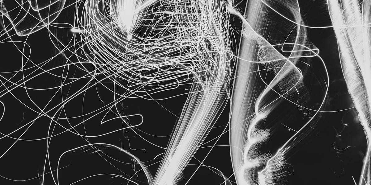
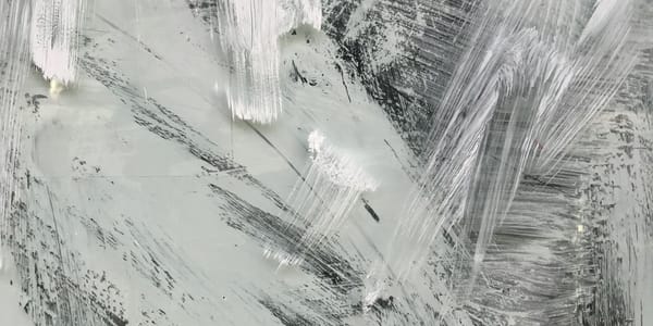
Line is the most immediate, direct mark artists make. A line can capture gesture, describe form, express emotion, create rhythm, define space, or simply exist as a thing in itself. But not all lines are equal. Some lines vibrate with energy and feel like they're still moving. Others lie flat and dead on the surface, inert and lifeless no matter how technically correct they might be. The difference between alive and dead lines isn't about accuracy or neatness—it's about the relationship between hand, tool, surface, and the consciousness guiding them.
Understanding line quality means recognizing that lines aren't just ways to outline shapes or create drawings. Lines are records of physical gesture, traces of bodily movement, evidence of pressure and speed and intention. Good line work carries this physical history visibly. The line reveals how it was made, what tool made it, how fast the hand moved, where pressure increased or decreased, where the maker hesitated or committed. Dead lines erase this physical evidence, presenting themselves as neutral descriptions rather than records of making.
This guide examines what makes lines work—the physical, perceptual, and expressive dimensions of linear mark-making across media and approaches. It's about understanding line deeply enough to make choices rather than just accepting whatever lines happen to emerge from tentative marking.
What Line Actually Is
Line doesn't exist in nature. It's a human invention, an abstraction we use to represent edges, contours, boundaries, and relationships that don't actually exist as lines in the physical world.
In the three-dimensional world, edges occur where forms meet space or where one surface transitions to another. These edges aren't lines—they're changes in plane, value, color, or texture. When artists draw lines to represent these edges, they're translating dimensional information into linear notation.
This abstraction is powerful precisely because it's not literal representation. A line can suggest volume, space, and form through minimal means. A few lines can communicate what would require extensive tonal modeling to achieve photographically.
Understanding line as abstraction rather than representation clarifies why different kinds of lines serve different purposes. Contour lines describe edges. Hatching lines create tone and volume. Gestural lines capture movement and energy. Each type of line is a different kind of notation, a different way of using linear marks to convey information or create effects.
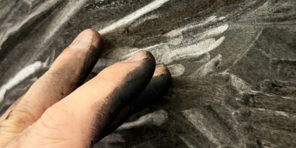
The physical reality of line is that it's a mark made by moving a tool across a surface. The tool deposits material (graphite, ink, paint) or removes material (scratching, etching) creating a visible trace of the movement.
This physical basis means that everything about how the line is made affects how it looks. The tool's hardness, the surface's texture, the speed of movement, the pressure applied, the angle of the tool, all create the line's visual character. Lines aren't generic—they're specific records of specific physical actions.
Different tools create characteristically different lines. Pencil creates soft, variable lines. Pen creates harder, more definite lines. Brush creates fluid, swelling lines. Charcoal creates soft, broad lines. Each tool has affordances and resistances that shape the lines it produces.
The line's width, darkness, texture, and edge quality all result from the interaction between tool, surface, and gesture. A graphite pencil on smooth paper creates different lines than the same pencil on rough paper. The same tool produces different effects depending on how it's used.
Weight and Variation
Line weight—the thickness of a line—is perhaps the most fundamental variable in linear drawing, affecting hierarchy, space, and expressiveness.
Uniform line weight, where all lines are the same thickness, creates flat, graphic quality. This evenness can be intentional stylistic choice or unintentional result of inexperience or timidity. Uniform weight eliminates one dimension of variation, making all marks equal regardless of what they represent.
Technical drawing and some illustration styles use uniform line weight deliberately. The evenness creates clarity and neutrality, preventing the line quality itself from adding interpretation or emphasis. But in expressive drawing, uniform weight usually feels dead because it doesn't respond to what's being drawn.
Varied line weight creates hierarchy, space, and visual interest. Thicker lines advance and command attention. Thinner lines recede and feel lighter. Varying weight across a drawing creates spatial relationships and emphasizes important elements while subordinating less important ones.
Weight variation can describe form directly. Edges facing light can be lighter in weight. Edges in shadow can be heavier. This weight modulation suggests light and volume without tonal shading, using line alone to create dimensional illusion.
Contour drawing with weight variation uses thicker lines where forms turn away and thinner lines where forms face forward. This creates sculptural quality, making flat linear marks suggest three-dimensional form.
The transition between thick and thin matters as much as the weights themselves. Abrupt changes create different effects than gradual transitions. Lines that swell and taper organically feel more alive than lines that shift weight mechanically or arbitrarily.
Pressure control determines weight variation in most drawing media. Pressing harder creates darker, thicker marks. Lightening pressure creates lighter, thinner marks. This pressure modulation should be continuous and responsive, not just on/off switching between two weights.
Developing pressure control requires conscious practice. Many beginning artists either press uniformly hard or uniformly light, afraid to vary pressure. Learning to modulate pressure continuously while drawing transforms line quality immediately.
Tool choice affects weight control capabilities. Pencils allow subtle pressure variation. Technical pens create uniform weight unless tilted. Brushes respond dramatically to pressure changes, swelling and tapering naturally. Choosing tools that support the weight variation needed serves the work.
Speed also affects weight. Fast marks tend toward lighter weight. Slow marks allow more pressure and darker, heavier weight. The relationship between speed and weight creates rhythm and energy in linear work.
Speed and Energy
The speed at which a line is drawn fundamentally affects its energy and character.
Fast lines carry urgency and movement. They're necessarily less controlled, incorporating more variation and accident. Fast lines can't be fussy or overly corrected. They commit immediately, capturing gesture and energy but sacrificing precision.
Gestural drawing relies on fast marks to capture movement and essential character before it's lost. The speed prevents overthinking and forces immediate, intuitive response. This immediacy gives gestural work its alive quality—the lines still feel like they're moving.
Slow lines allow more control and precision. They can be carefully placed, responding to observed detail with accuracy. But slow lines risk becoming tentative or dead if they're so controlled that all energy drains out. The challenge with slow lines is maintaining intention and confidence despite the deliberate pace.
Contour drawing often uses slow, continuous lines following observed edges carefully. When done well, these slow lines accumulate tension and concentration, creating different energy than fast gestural marks but still feeling alive through sustained attention.
The variation between fast and slow within a single drawing creates rhythm and emphasis. Fast, energetic marks in some areas contrast with slower, more deliberate marks elsewhere. This speed variation prevents monotony and directs attention.
Speed affects line quality mechanically. Fast marks skip and break more, creating interrupted lines with texture and variation. Slow marks stay in continuous contact with surface, creating smooth, unbroken lines. Both have value for different purposes.
Tool responsiveness to speed varies. Brush responds beautifully to speed changes, naturally thinning with fast movements and swelling with slow. Pencil maintains more consistent weight across speed changes. Matching tool to intended speed approach helps achieve desired effects.
The physical gesture required for different speeds affects line character. Fast marks use larger muscle groups—shoulder and arm rather than just fingers. This creates looser, more flowing lines. Slow marks often use finger control, creating tighter, more precise lines.
Conscious variation of speed trains hand-brain coordination for intentional mark-making. Exercises moving between very fast and very slow marks in the same drawing develop control over this variable.
Continuous Versus Broken Lines
Whether lines are unbroken or interrupted affects their character and how they function in drawings.
Continuous lines, drawn without lifting the tool, create uninterrupted marks flowing across the surface. These lines emphasize movement and connection. The eye follows them easily, tracking their path. Continuous lines feel confident and committed.
Blind contour drawing uses continuous line exclusively, following edges without looking at the paper. The resulting line has particular energy because it's continuous and responsive to observation rather than preconceived ideas about what the subject should look like.
Modified contour allows occasional glances at the paper while maintaining continuous line. This balances responsiveness to subject with awareness of composition, creating lines that are both observational and considered.
Continuous lines risk becoming monotonous if they're too uniform in weight and speed. Varying these qualities within continuous lines prevents them from feeling like mere outlines.
Broken lines, interrupted by gaps and spaces, create different energy. The breaks suggest light, transparency, incompleteness, or selective emphasis. Broken lines feel lighter and less definite than continuous ones.
Strategic line breaks direct attention and suggest light. Breaking lines where light hits edges suggests illumination without tonal rendering. This selective description through broken line is sophisticated technique requiring knowing what to omit as much as what to include.
Broken lines can result from fast, energetic marking where the tool skips across textured surfaces. This textural breaking is different from deliberate strategic breaking but creates its own liveliness through variation and accident.
The rhythm of breaks matters. Regular, evenly-spaced breaks create different effect than irregular, varied breaks. Regular breaks feel mechanical. Irregular breaks feel more organic and responsive.
Combination of continuous and broken lines in the same work creates variety and hierarchy. Continuous lines might define primary forms. Broken lines might suggest secondary elements or atmospheric effects.
Some artists develop signature approaches to line continuity. Giacometti's searching, multiply-retraced lines are continuous but broken through overlap and reworking. Schiele's confident, varied lines mix continuous contours with broken hatching.
The decision about continuity should serve the work's needs. Neither continuous nor broken is inherently better—they're different tools for different effects.
Direction and Movement
Lines have direction—they move through space creating visual paths that guide the eye and suggest movement.
Directional emphasis in linear marks creates rhythm and energy. Predominantly vertical lines create different feeling than predominantly horizontal or diagonal lines. Vertical suggests stability or aspiration. Horizontal suggests rest or landscape. Diagonal suggests movement or instability.
Hatching direction affects how form reads. Hatching that follows the form's contours describes volume effectively. Hatching that contradicts form creates different, sometimes disorienting effects. Cross-hatching uses multiple directions, building tone through overlaid directional marks.
Gestural line direction captures movement and energy of subjects. Figure drawing uses directional lines to describe gesture—the body's movement and weight distribution. These directional marks follow the action, not just the contours.
Compositional use of line direction creates movement across the picture plane. Lines can lead the eye toward focal points, create visual pathways through the image, or establish overall directional energy.
Conflicting directions create tension and energy. All marks moving the same direction feels static. Varied, conflicting directions create visual complexity and dynamic movement.
The physical gesture creating the line determines its direction. Marks made from wrist movement have different directional character than marks made from shoulder movement. Larger movements create sweeping directional marks. Smaller movements create tighter, more controlled directions.
Some artists develop preferred gestural directions based on handedness and bodily comfort. Right-handed artists often have easier time with certain diagonal directions than left-handed artists and vice versa. Recognizing these tendencies helps either work with them or consciously work against them.
Rotating the paper allows drawing in comfortable directions regardless of the line's orientation in the final image. This practical approach prevents awkward hand positions while maintaining natural, confident mark-making.
Directional marks in abstract work create composition without representation. The directions themselves become content, creating visual movement and energy through their interactions.
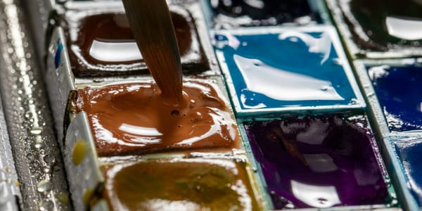
Tool and Its Influence
Every drawing tool has characteristics that affect the lines it produces, shaping what kinds of marks are possible or natural.
Graphite pencils range from hard (H grades) to soft (B grades). Hard pencils create lighter, finer lines with less tonal range. Soft pencils create darker, broader lines with rich blacks. The choice determines available line character.
Hardness affects line crispness. Hard pencils maintain sharp points longer, creating crisp, defined lines. Soft pencils wear quickly, creating broader, softer lines. This affects whether marks feel precise or loose.
Pencil lines can be erased, corrected, and refined. This correctability encourages tentative, reworked marks. Artists confident with pencil use this flexibility productively. Insecure artists can over-correct, creating deadened, overworked lines.
Pen and ink create permanent, uncorrectable marks. This permanence forces commitment and confidence. Each mark stands as made, without option for revision. This commitment often produces more energetic, decisive lines than erasable media allow.
Different pen types create different lines. Technical pens produce uniform-width lines. Fountain pens allow some weight variation through pressure and angle. Brush pens create highly responsive, variable lines. Dip pens require reloading with ink, creating natural breaks and variation in line weight as ink depletes.
Brushes offer maximum responsiveness and variation. The brush tip responds to pressure, speed, and angle, creating swelling, tapering, dynamic lines. Brush lines feel fluid and alive when used skillfully but can feel clumsy without practice.
Brush size determines line character range. Small brushes create finer, more controlled lines. Large brushes create bold, gestural marks. Having range of brush sizes enables varied linear vocabulary.
Charcoal creates soft, broad lines with rich blacks and easy blending. Charcoal lines feel immediate and direct but lack the precision of harder tools. The softness creates particular smudgy, atmospheric quality.
Compressed charcoal is darker and harder than vine charcoal, creating different line quality. Vine charcoal produces lighter, more erasable marks. Compressed charcoal produces denser, more permanent marks.
Conte crayon and similar hard drawing sticks create precise, dense lines harder than charcoal but softer than pencil. They combine some charcoal richness with more pencil-like control.
Markers create uniform, flat color unsuitable for tonal variation but excellent for graphic, consistent line work. Marker permanence and inability to erase creates similar commitment to pen and ink.
Digital tools simulate various traditional media but with complete correctability and lack of physical resistance. Digital marks can feel dead because they lack the slight resistance and variation that physical mark-making provides. Skilled digital artists compensate by using pressure-sensitive tablets and deliberately introducing variation.
Understanding each tool's character helps match tool to purpose. Attempting soft, atmospheric effects with technical pen or precise detail with charcoal fights the tool's nature. Working with tools' natural affordances produces better results.
Surface Effects on Line
The surface being marked affects line quality as much as the tool making the mark.
Smooth paper allows clean, precise lines with consistent contact between tool and surface. Smooth surfaces suit detailed work, uniform lines, and controlled mark-making. The lack of texture means the tool's characteristics dominate line quality.
Rough or textured paper creates broken, varied lines as the tool catches on texture peaks and skips over valleys. This creates livelier, more organic lines with inherent variation. Textured surfaces suit gestural work, atmospheric effects, and energetic mark-making.
Paper tooth—the surface texture—determines how much material the paper holds. More tooth grabs more graphite, charcoal, or pastel, creating darker marks. Less tooth holds less material, producing lighter marks even with same pressure.
The interaction between tool hardness and surface texture affects line character. Soft tools conform to texture, creating continuous contact. Hard tools skip across texture, creating broken lines. This interaction enables controlling line character through tool-surface combination.
Hot-pressed watercolor paper is smooth, creating clean lines. Cold-pressed is moderately textured. Rough watercolor paper has pronounced texture creating very broken, varied lines. These different surfaces suit different approaches to linear watercolor work.
Drawing on toned or colored paper affects how lines read. Light lines on dark paper create different effects than dark lines on white paper. The contrast relationship changes perception of line weight and character.
Prepared surfaces with gesso or other grounds create unique textures affecting line quality. Rough gesso catches drawing media differently than smooth paper. These prepared surfaces can be customized to create specific line characteristics.
Canvas creates textured surface for drawing with its woven texture visible in marks. Drawing on canvas versus paper produces characteristically different lines reflecting the fabric structure.
Wood, metal, stone, and other non-paper surfaces create unique resistance and texture affecting mark-making. Scratching into clay or plaster creates incised lines. Marking on metal with resist creates etched lines. Each surface-tool combination has distinct character.
Testing tools on different surfaces reveals the range of effects possible. The same pencil produces notably different lines on smooth Bristol, rough watercolor paper, and toned charcoal paper. Understanding these differences enables intentional choice.
Contour and Edge
Contour lines—lines describing edges and boundaries—are fundamental to linear drawing but vary enormously in how they're approached and what character they have.
Pure contour drawing follows observed edges with slow, careful attention. The line tracks exactly what the eye sees, responding to every small shift and variation in the edge. This creates dense, information-rich lines describing form precisely.
Contour lines can suggest volume through weight variation. Edges turning away from the viewer can be thicker. Edges facing the viewer can be lighter. This weight modulation implies dimension without tonal shading.
Some contour approaches use multiple lines searching for correct edge placement. The multiple attempts create dense, energetic quality as the eye tracks various possible edges. This searching feels alive because it shows the thinking process.
Ellsworth Kelly's plant drawings use single, definitive contour lines with subtle weight variation. The line commits absolutely, capturing edge with precision while remaining alive through slight weight and speed variations. This confidence creates energy despite slow, careful execution.
Ingres's portrait drawings use refined, precise contours with minimal weight variation but perfect observation. The line quality feels elegant and assured, alive through the absolute confidence and correctness of placement.
Contour lines that are too uniform and mechanical feel dead. When contour becomes mere outline without variation, responsiveness, or character, it's just neutral boundary rather than expressive mark.
The decision about how finished or searching contour lines should be affects their character. Finished, confident contours feel different from tentative, searching ones. Neither is wrong—they serve different purposes and create different effects.
Blind contour, drawn without looking at the paper, creates distorted but energetic lines. The distortion comes from hand-eye coordination working without visual feedback, but the energy comes from the line's continuous responsiveness to observation.
Modified contour allows occasional glances at the paper, balancing observation with composition. This typically produces more accurate but still responsive lines than pure blind contour.
Contours can be broken strategically to suggest light or transparency. Where light hits edges strongly, breaking the contour suggests illumination. This selective description through broken contour is sophisticated restraint.
Hatching and Cross-Hatching
Hatching—parallel lines creating tone and texture—is fundamental technique with enormous variation in approach and character.
Hatching direction affects how form reads. Hatching following form describes volume. Hatching contradicting form creates different, sometimes disturbing effects. The direction is interpretive choice, not neutral application.
Hatching density creates tonal values. Closely spaced lines create darker tones. Widely spaced lines create lighter tones. Varying spacing creates gradual tonal transitions or abrupt value changes.
Individual line quality in hatching affects overall effect. Mechanical, uniform hatching feels dead. Varied, responsive hatching feels alive. Even though hatching uses repeated parallel marks, variation within those marks prevents monotony.
Cross-hatching layers multiple hatching directions, building tone through overlapping linear marks. The angle and density of each layer creates the resulting tone and texture.
Renaissance drawings use systematic cross-hatching building form through patient layering of directional marks. The discipline creates solid, sculptural effects through purely linear means.
The number of cross-hatching layers affects finish and density. Two or three layers creates open, visible linear structure. Many layers creates solid, nearly continuous tone where individual marks disappear.
Expressive cross-hatching uses varied directions, weights, and densities creating energetic surfaces. Rather than systematic tone building, expressive hatching creates texture and movement through mark variation.
Contemporary artists often combine systematic and expressive hatching, using each approach where it serves the work. Systematic hatching might describe primary forms. Expressive hatching might create atmospheric or textural effects.
Hatching on curved forms should ideally follow the surface curvature. Straight hatching on curved surfaces can work but creates different effect than hatching that acknowledges the form's dimensional curvature.
The white paper showing between hatch marks affects overall tone. Wide spacing preserves paper brightness. Close spacing minimizes paper visibility. This relationship between mark and ground shapes the hatching's character.
Some artists develop signature hatching approaches. Durer's systematic cross-hatching is recognizable. Van Gogh's expressive, directional marks are distinctive. These personal approaches emerge from sustained practice and attention to what serves the work.
Gestural Line
Gestural lines capture movement, energy, and essential character through fast, responsive marks prioritizing spirit over accuracy.
The gesture captures the subject's movement or implied movement. In figure drawing, gesture describes how the body moves, where weight is distributed, the overall action. Fast, fluid marks capture this better than slow, careful contours.
Gesture drawing typically uses continuous, unbroken marks flowing through the figure following its movement. These marks prioritize understanding the body's action over describing its edges accurately.
Time limits force gestural approach. Thirty-second or one-minute poses allow only essential marks capturing major movement and proportions. This necessity eliminates fussing and forces decisive marking.
Gestural marks use larger muscle groups—arm and shoulder rather than just fingers. This creates looser, more flowing lines than finger-controlled marks. The physical looseness translates to visual energy.
Gesture isn't limited to figure drawing. Landscape, still life, any subject can be approached gesturally, capturing essential character and energy rather than detailed description.
Giacometti's drawings layer gestural searching marks, repeatedly drawing and redrawing to find form through accumulation. The multiple marks create dense, energetic surfaces where the searching process remains visible.
Rodin's gestural figure drawings use minimal, fluid marks suggesting body and movement with economy. The restraint and speed create figures that feel like they're still moving.
Contemporary gesture drawing often combines observation with interpretation, using the subject's gesture as starting point for expressive marks that aren't purely descriptive.
Gestural understructure beneath more finished work establishes energy and movement that remains even when overlaid with refinement. Starting with gesture prevents finished work from becoming stiff and dead.
The challenge with gestural work is maintaining energy while adding development or detail. Pure gesture feels alive but might lack form. Over-developed gesture can lose its initial energy. Finding balance requires knowing when to stop.
Expressive and Emotional Line
Line quality can carry emotional content and expressive intent beyond its descriptive function.
Aggressive, violent marks create tension and energy. Heavy pressure, fast speed, angular changes all contribute to aggressive line character. Schiele's figure drawings use aggressive contours expressing psychological intensity.
Delicate, sensitive marks create different emotional reading. Light pressure, slow speed, gentle curves all contribute to delicate character. This restraint can express tenderness, fragility, or careful attention.
Anxious, searching marks created through multiple overlapping attempts suggest uncertainty or nervous energy. The accumulation of marks reveals the maker's hesitation or searching process.
Confident, definitive marks made with commitment express assurance and authority. Single, well-placed lines without correction demonstrate mastery and certainty.
Calligraphic, flowing lines suggest grace and control. The fluid movement and varied weight create elegant, confident character. Asian brush painting exemplifies this expressive calligraphic approach.
Scratchy, broken marks create agitation and texture. These marks feel raw and unfinished, suggesting immediacy or disturbance.
The pressure, speed, direction, weight, and continuity all contribute to expressive character. Combining these variables intentionally creates specific emotional qualities.
Expressionist artists use line quality as primary content, not just description. The how of the mark matters as much as what it depicts. Kirchner, Nolde, and other German Expressionists used aggressive, angular marks to create psychological intensity.
Abstract expressionist drawing makes line quality the sole content. The marks exist as gestures and traces of action, not as descriptions of subjects. The energy and character of marks becomes the work's meaning.
Recognizing that line carries emotional content clarifies that technical correctness isn't the only or even primary criterion for successful linear work. Expressive power matters more than accuracy when serving artistic intent.
Architectural and Technical Line
Some linear work prioritizes precision, clarity, and neutrality rather than expressiveness. This approach has its own sophistication and purposes.
Architectural drawing uses controlled, uniform lines to describe structures precisely. The line quality is deliberately neutral, not adding interpretation or emotion. Clarity and accuracy matter more than expressiveness.
Technical illustration similarly uses controlled, descriptive lines. The goal is communicating information clearly, not creating expressive marks. But even technical work benefits from understanding line weight and hierarchy.
Isometric and orthographic drawing use specific line conventions—thick lines for visible edges, thin lines for hidden edges, dashed lines for construction. These conventions create clarity through consistent application.
Precision in technical line requires tools enabling control. Technical pens, ruling pens, and straightedges produce the consistency technical drawing requires. Freehand technical drawing develops steadiness and control.
The discipline of technical line work trains hand steadiness and control that serves all linear work. Even expressive artists benefit from being able to draw controlled, precise lines when needed.
Some contemporary artists use technical drawing aesthetics in fine art contexts. The precision and neutrality become aesthetic choices rather than purely functional necessities.
Clean line work in comics and illustration combines technical precision with expressive character. The lines are controlled and clean but vary in weight and energy to create emotion and emphasis.
Understanding technical line as one approach among many prevents dismissing it as merely mechanical. The discipline and precision have value even for artists primarily interested in expression.
The transition between technical and expressive approaches is spectrum, not binary. Work can incorporate both precise, controlled passages and loose, expressive ones. This combination creates variety and serves different needs within single work.
Digital Line and Its Challenges
Digital tools enable linear mark-making but with different characteristics and challenges than physical media.
Pressure-sensitive tablets respond to stylus pressure, creating weight variation similar to traditional tools. This responsiveness is essential for alive digital lines. Without pressure sensitivity, digital lines feel mechanical and dead.
The lack of physical resistance in digital mark-making affects line character. Traditional tools have friction against paper creating slight resistance that helps control marks. Digital styluses glide frictionlessly across smooth tablet surfaces, requiring different motor control.
Screen texture affects digital drawing experience. Smooth glass screens feel very different from textured screen protectors that simulate paper tooth. Many digital artists add texture to screens to restore some physical feedback.
Digital marks can be endlessly corrected and perfected. This correctability can lead to overworking and dead lines as all spontaneity gets edited out. The challenge is maintaining freshness despite ability to correct everything.
Digital brushes simulate traditional media but imperfectly. The simulation can feel close but not identical to physical tools. Some artists embrace digital's unique character rather than trying to perfectly mimic traditional media.
Vector versus raster affects line character. Vector creates mathematically defined lines that can scale infinitely without quality loss but can feel too smooth and perfect. Raster creates pixel-based marks with more texture and organic character but limited scalability.
Stabilization features in digital software smooth out hand tremors and wobbles, creating cleaner lines. This helps some artists but can remove all variation, creating dead, overly perfect marks. Adjusting stabilization levels balances control and liveliness.
Digital layers enable separating different linear elements and revising them independently. This flexibility is powerful but can encourage indecision and over-complexity as infinite options remain available.
Some digital artists deliberately limit options to force commitment. Using single layer, restricting undo, or other constraints reintroduces some traditional media's permanence and encourages decisive marking.
Digital line work is legitimate approach with unique characteristics, not just inferior simulation of traditional media. Understanding digital's strengths and limitations enables using it effectively rather than fighting its nature.
Cultural and Historical Approaches
Different cultures and historical periods have developed distinct linear vocabularies and approaches to line quality.
Asian brush painting emphasizes calligraphic, expressive line with varied weight and energy. The brush responds to pressure and speed, creating dynamic marks. Centuries of practice developed sophisticated approaches to line quality.
The "bone method" in Chinese painting describes structural lines with strength and confidence. These lines have substance and energy, described as having "bones" rather than being mere outlines.
Japanese sumi-e ink painting uses minimal, decisive marks. Economy and restraint are valued. Each mark counts and carries meaning. The restraint creates powerful impact through suggestion rather than description.
Western classical drawing from Renaissance through neoclassicism emphasized precise, refined contours. The ideal was clean, controlled lines describing form accurately. Expressive mark-making was often subordinated to descriptive accuracy.
Romantic and Expressionist movements valued energetic, emotional line over classical precision. The marks themselves became expressive content, not just descriptive tools.
Modernist movements explored line as independent element. Kandinsky, Klee, and others investigated line's abstract properties—movement, rhythm, energy—separated from representation.
Comics and illustration developed specific linear vocabularies optimized for reproduction and clarity while maintaining expressiveness. Clean line work with strategic weight variation creates readable, reproducible images.
Contemporary approaches mix and draw from various traditions. Artists might combine Asian brush techniques with Western observational drawing or classical precision with expressionist energy.
Understanding historical and cultural approaches provides vocabulary and techniques to draw from. These aren't rules to follow but resources to learn from and adapt.
Building Line Quality Skill
Line quality develops through sustained practice and conscious attention to how marks are made.
Slow continuous contour drawing builds observation and hand-eye coordination. Following edges carefully without lifting the pencil develops control and responsiveness.
Fast gestural drawing develops looseness and confidence. Quick marks capturing essential character without time for hesitation train decisive marking.
Varying pressure consciously while drawing trains control over line weight. Exercises moving from lightest possible marks to heaviest possible marks and back develop pressure sensitivity.
Blind contour forces attention to subject rather than paper, building genuine observation rather than symbol-making. The distortion doesn't matter; the attention does.
Drawing with unfamiliar tools or non-dominant hand disrupts habits and automatic responses. This disruption can reveal new approaches and prevent stale repetition.
Copying master drawings teaches directly how great draughtsmen used line. The copying forces paying attention to qualities that viewing alone might miss.
Limited-time exercises force economy and decision. One-minute, thirty-second, even ten-second drawings eliminate fussing and force capturing essentials only.
Drawing from memory between observation sessions develops understanding versus mere copying. Memory drawing reveals what's actually understood versus what's just mechanically transcribed.
Working in series where line quality is the variable reveals how different approaches affect the same subject. Drawing the same thing with deliberate weight variation, speed variation, continuous versus broken lines clarifies these variables' effects.
Accepting that line quality develops gradually over years prevents frustration. No one achieves great line quality quickly. Every drawing teaches something that informs the next.
Line quality is where physical gesture, tool characteristics, surface properties, observation, intention, and expression meet. Understanding each element independently and how they interact enables conscious choice about line character rather than accepting whatever marks emerge from tentative habit. Dead lines result from unconscious, automatic marking without awareness or intention. Alive lines emerge from engaged, responsive mark-making where every aspect of the line—weight, speed, direction, continuity, character—serves expressive and descriptive needs. The difference isn't about technical perfection but about presence, awareness, and commitment in the act of making marks.