Working With Fewer Colors Makes Your Art Stronger
Limited palettes force creativity and create cohesion in ways full palettes never do. Working with three to five colors teaches you more about color mixing and harmony than using everything.
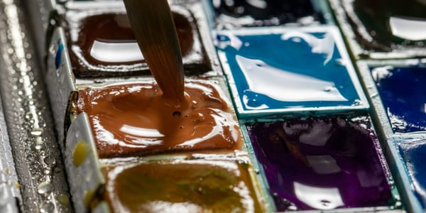
The instinct when starting out is to buy every color available. A palette with dozens of tubes or pans feels like possibility, like you're prepared for anything. But experienced artists often work with surprisingly limited palettes, sometimes just three to five colors plus white. This isn't deprivation or minimalism for its own sake, it's strategic limitation that creates stronger, more cohesive work than unlimited color ever could. The paradox is that restriction enhances rather than diminishes your color capabilities.
Limited palettes force you to really understand color mixing, to see relationships between colors, to create variety through subtle shifts rather than just reaching for different tubes. When you can't grab a premixed green, you learn how blue and yellow actually behave together. When you don't have purple, you figure out which red and blue combination creates the purple you need. This hands-on color education happens through necessity when you limit yourself, while unlimited palettes let you avoid truly understanding color by always having something close enough.
Limited palettes also create natural color harmony. When every color in your painting is mixed from the same few source pigments, they're automatically related. They all contain threads of the same colors, creating family resemblance that makes the work feel cohesive. This built-in harmony is what makes limited palette work look sophisticated and intentional even when the artist isn't consciously designing color relationships. The limitation does some of the work for you.
The challenge is choosing which colors to limit yourself to and learning to see the full range of what's possible within that limitation. Different limited palettes serve different purposes. A warm limited palette creates different possibilities than a cool one. A palette of three primaries works differently than a palette of earth tones. Understanding how to select and use limited palettes transforms them from constraint into powerful creative tool. The limitation becomes freedom once you understand how to work within it.
Why Limitations Enhance Creativity
The relationship between constraint and creativity is counterintuitive but well-documented. Unlimited choices often lead to paralysis or unfocused work, while strategic limitations focus energy and force creative problem-solving. Understanding why this happens helps you embrace limited palettes as enhancement rather than sacrifice.
Unlimited color options create decision fatigue before you even start painting. Which green? Which blue? Which of the three yellows? Every color decision becomes a separate choice from scratch, exhausting your mental energy before you've made anything. Limited palettes eliminate most of these decisions upfront. You've chosen your colors, now you just work with them. This frees mental resources for the actual creative decisions about composition, value, form, all the things that matter more than having the perfect premixed color.
Limited palettes force you to think more deeply about each color decision. When you can easily grab a different tube, you're not invested in making any particular color work. When you have to mix everything from three pigments, you think harder about whether you really need that color or if something else would work better. This consideration makes your color choices more intentional and often more interesting than default color-matching ever produces.
The constraint of limited colors makes you notice subtlety you'd otherwise miss. Within a limited palette, tiny shifts in mixture ratios create noticeable differences. You become sensitive to these subtle variations in ways you aren't when you can just reach for a different tube. This heightened sensitivity to subtle color difference is what makes experienced colorists so effective. They see nuances that others miss, and limited palette work develops exactly this ability.
Historical limited palettes emerged from necessity, from the limited pigments available, but produced some of art history's most beautiful color. The warm earth tone palettes of Renaissance underdrawing, the limited palettes of Asian ink painting with strategic color notes, the restricted palettes of early photography. These weren't choices made from abundance but they created sophisticated color approaches that influenced everything that followed. Understanding this history shows that limitation isn't compromise, it's often the path to the most refined results.
Psychological research on choice and satisfaction shows that people are often happier with decisions made from limited options than from unlimited ones. Too many choices creates anxiety and second-guessing. Optimal choice architecture provides enough options to feel like you have choice but not so many that choice becomes burden. Limited palettes hit this sweet spot. You have enough color possibility to create anything, but not so many options that you're paralyzed trying to choose between them.
Limited palettes also create a signature or recognizable approach to color that distinguishes your work. When you consistently work within particular color limitations, your work develops a characteristic look that comes from those limitations. This isn't about developing a formula or making the same painting repeatedly, it's about color language that becomes distinctively yours through working within chosen constraints. Unlimited palettes make it harder to develop this kind of signature approach because you're always working with different color sets.
The creativity that emerges from limitation comes specifically from having to solve problems with restricted tools. When you can't match the exact green you see in nature because you don't have that green premixed, you have to figure out how to create the effect of that green with what you do have. Sometimes this leads to unexpected solutions that are more interesting than the obvious color match would have been. These creative accidents and problem-solving insights rarely happen when you have unlimited options.
Choosing Your Limited Palette Colors
Selecting which colors to include in a limited palette is crucial because these choices determine everything you'll be able to mix. Understanding how to choose creates palettes that work rather than ones that frustrate you with their limitations.
The classic limited palette is a warm and cool version of each primary. Warm red like cadmium red, cool red like alizarin crimson, warm yellow like cadmium yellow, cool yellow like lemon yellow, warm blue like ultramarine, cool blue like phthalo or cerulean. This gives you six colors but comprehensive mixing possibilities. You can create any hue by choosing the appropriate temperature primaries to mix. This palette teaches you how primary temperature affects mixing while giving you full color range.
A split-primary palette uses just one warm and one cool primary, three colors total. Warm red, cool yellow, cool blue gives you a palette that leans cool overall but can create a full range of hues. The limitation is you can't make both warm and cool versions of every secondary, but this constraint forces interesting choices about which color temperature to use where. This extremely limited three-color approach is excellent for learning because it's simple enough to fully understand while still offering surprising range.
Earth tone limited palettes using burnt sienna, yellow ochre, and ultramarine create the classic warm-brown palette used extensively in classical painting. This palette can't make bright, saturated color but it creates beautiful, harmonious natural tones perfect for certain subjects and moods. Adding white gives you full value range. This earth palette teaches you about creating subtle color variation within a narrow hue range, valuable knowledge that applies even when you work with broader palettes.
Zorn palette, named after Anders Zorn who famously used it, consists of yellow ochre, vermillion or cadmium red, ivory black, and white. Technically just three chromatic colors plus black and white. This palette seems impossibly limited but it can create a full range of values and surprising color variety. The black mixed with yellow creates neutralized greens and blue-grays. The palette is warm-biased but handles cool colors through black combinations. This palette proves how far you can push limitation while still creating sophisticated work.
Complementary limited palettes use two complementary colors, their mixture creating neutral grays and browns. Red and green, blue and orange, yellow and purple. Adding white for value range gives you a simple palette that maintains color tension through the complementary relationship. This approach teaches you about neutralizing colors by mixing complements, about how much of each complement to add to shift toward neutral versus maintaining color identity. The limitation forces you to understand complementary relationships deeply.
Monochromatic palettes take limitation to its extreme, using variations of a single hue. One color plus white and maybe black gives you a full value range within one hue. This teaches you everything about value, saturation, and temperature within a single color. Monochromatic work proves that compelling images don't require color variety, they require value structure and composition. This limitation is severe but incredibly educational for understanding dimensions of color beyond hue.
Temperature-based limited palettes choose all warm or all cool colors rather than mixing temperatures. An all-warm palette might be cadmium red, cadmium orange, cadmium yellow, burnt sienna. An all-cool palette might be ultramarine, cerulean, phthalo green, alizarin crimson. These temperature-unified palettes create strong overall mood but sacrifice the spatial depth that temperature contrast provides. They're useful for specific effects and teach you about working within temperature constraints.
Choosing a limited palette for a specific project should consider what that project needs. Portraiture might benefit from a palette that handles skin tones well, earth tones plus cool colors for shadows. Landscape might need greens and blues, suggesting a cool yellow, two blues, and maybe a warm earth color. Still life might allow warmer overall palette. Matching your limited palette to your subject creates the right kind of limitation rather than arbitrary restriction that fights against what you're trying to achieve.
Mixing Secondary and Tertiary Hues
Understanding how to create the full color range from limited primaries is where limited palette work becomes practical rather than theoretical. This section covers the mixing knowledge that makes limited palettes viable for serious work.
Mixing clean, bright secondary colors requires using primaries that lean toward the secondary you want. For bright orange, use warm red and warm yellow, both leaning toward orange. For clean green, use cool yellow and cool blue, both leaning toward green. For vibrant purple, use cool red and cool blue, both leaning toward purple. When you use primaries that lean away from your target secondary, they contain traces of that secondary's complement, which neutralizes the mixture and creates muddy results.
This is why split-primary palettes work better than single-primary palettes for mixing. If you only have one yellow, you can't control whether you get clean greens or clean oranges. You get whatever that yellow's temperature biases toward. Having warm and cool versions of each primary gives you choice. Need bright green? Use cool yellow and cool blue. Need bright orange? Use warm yellow and warm red. The control comes from understanding and selecting primary temperature.
Tertiary colors, the browns and grays and neutralized hues that make up most of natural color, come from mixing complementaries or mixing all three primaries. These mixtures create the sophisticated neutrals that pure colors can't provide. A limited palette's ability to create interesting tertiaries often matters more than its ability to create bright secondaries. Most paintings need more neutrals than pure colors, so understanding how your limited palette creates neutrals determines how useful that palette actually is.
The ratio of colors in your mixtures affects not just hue but saturation and value. Adding more yellow to a green mixture makes it lighter and yellower. Adding more blue makes it darker and cooler. These ratio adjustments give you infinite gradations within any mixture. With just three colors, you can create hundreds of distinct hues by varying mixture ratios. This is how limited palettes avoid feeling limited. The variations within mixtures provide the range.
Black's role in limited palettes is controversial. Some artists avoid black entirely, mixing darks from complementaries or from all three primaries. Others use black as a fourth color for darkening and for creating certain color effects. Black mixed with yellow creates unique greens. Black mixed with white gives you grays that can read as blue or cool colors in certain contexts. Understanding what black does in your limited palette helps you decide whether to include it or work without it.
White's role is straightforward, it lightens colors and creates tints. But white also cools and desaturates most colors. Understanding this means knowing that lightening a color with white changes its temperature and intensity, not just its value. Sometimes you need to add a touch of warmer color when adding white to maintain the mixture's warmth. This compensation keeps your colors from going chalky or weak as you lighten them.
Transparent versus opaque pigments in your limited palette affect mixing results dramatically. Transparent colors glaze beautifully but have less covering power. Opaque colors mix to produce opaque secondaries. A limited palette with all transparent colors works very differently than one with all opaque colors. Most useful limited palettes include both, giving you options for different mixing and application needs.
The mixing limitations of your palette become creative opportunities rather than frustrations once you understand them. Maybe you can't make super bright purple because your red and blue are the wrong temperature. But the purple you can make might be more interesting, more sophisticated than pure purple would be. Maybe your palette's greens always lean slightly warm. That becomes a characteristic of work made with that palette rather than a flaw. Embracing what your palette does well rather than focusing on what it can't do leads to stronger work.
Creating Variety Within Constraints
The potential problem with limited palettes is monotony, all the paintings looking the same because they use the same colors. Understanding how to create variety within limitations prevents this problem and shows the full power of limited palette approaches.
Value range is your first tool for variety within limited color. Even with just one or two hues, full value range from light to dark creates dimension and interest. Many limited palette paintings are actually value paintings that happen to be tinted with color. The structure comes from value, the limited color provides mood and unity. Focusing on strong value structure prevents limited palettes from feeling flat even when hue variety is minimal.
Saturation variation creates dramatic differences within limited palettes. The same green at full saturation versus highly neutralized creates completely different effects. Varying how much you neutralize your mixtures, how much black or complement you add, how much you gray colors down, this gives you range from vivid to subtle all within the same basic hue. This saturation range provides variety that hue range provides in unlimited palettes.
Temperature shifts within limited palettes create variety that's subtle but significant. Even within earth tones, shifting from warmer to cooler versions creates different moods and spatial effects. A painting using all variations of brown but ranging from warm reddish browns to cool purplish browns has temperature variety that creates interest. Learning to see and exploit these temperature shifts within limited hue ranges is key to sophisticated limited palette work.
Texture and application methods add visual variety that color variety would provide in other approaches. Thick impasto versus thin glazes, rough texture versus smooth surface, these physical variations create visual interest independent of color. Limited palette work often emphasizes texture and surface because color isn't carrying all the weight of creating variety. This focus on material and process can enhance work in ways that color variety sometimes obscures.
Compositional variety ensures limited palette work doesn't feel repetitive across multiple pieces. Using the same colors but in different compositional arrangements, with different subjects, in different scales and formats, creates variety through structure rather than through palette. This is how series work maintains interest even when using consistent color approaches. The color becomes a constant while other elements vary.
Subject matter variety within consistent limited palette is how many artists develop recognizable styles. Their color approach is signature, but they paint diverse subjects. A portraitist might use the same warm limited palette for every painting but the different faces and personalities create variety. A landscape painter might use the same earth palette for every scene but different locations and conditions create interest. The limited palette becomes their color voice while subject provides content variety.
Seasonal or time-based variations on limited palettes create structure without falling into repetition. Use warm limited palette for summer work, cool limited palette for winter. Use high-key limited palette for morning light, low-key for evening. These systematic variations on limited palette approaches give you both consistency and range across bodies of work. The limitation remains but flexes with context.
Unexpected combinations within limitations surprise viewers and keep the work fresh. Even within earth tones, finding unusual juxtapositions or unexpected applications of these familiar colors creates interest. Using limitation in surprising ways, applying constrained colors to subjects they don't usually describe, this creative play within boundaries shows mastery rather than timidity. The limitation becomes framework for creativity rather than straightjacket.
Famous Artists and Their Limited Palettes
Understanding how great artists used limited palettes shows both the historical precedent for this approach and practical examples of how limitations create distinctive, powerful work. These examples prove that limited palettes aren't beginner exercises but serious professional approaches.
Anders Zorn's famous warm limited palette of yellow ochre, vermillion, ivory black, and white produced paintings with surprising color range despite extreme limitation. His portraits and figures show flesh tones that feel warm and alive, with cool shadow notes created by his black mixtures. Zorn proved that apparent limitation isn't actual limitation when understood deeply. His work teaches us that color variety comes from mixing knowledge rather than tube variety.
The Impressionists, despite their reputation for bright color, often worked with surprisingly limited palettes. Monet eliminated earth tones from his palette for periods, working with spectrum colors but not dozens of them. This limitation forced him to mix all his grays and browns from complementaries, creating the chromatic gray-browns that characterize Impressionist shadows. The limitation drove the innovation rather than hindering it.
Diego Velázquez used restricted palettes of earth tones with strategic brighter notes, creating paintings that feel rich despite limited hue range. His grays and browns have such variety that the overall impression is of sophisticated color even though the actual palette is narrow. He shows how value structure and subtle color variation within limited range creates compelling work that doesn't feel limited at all.
Andrew Wyeth worked primarily with earth tones, creating entire bodies of work within brown-gray-ochre ranges with occasional cool notes. This consistent limitation became his signature, recognizable immediately as Wyeth color. The limitation didn't restrict what he could paint or express, it became his voice. His work shows how sustained use of limited palette develops into a distinctive artistic identity.
Classical painting training used limited palettes extensively, particularly for underdrawing and underpainting. The brown underpainting of many Renaissance works used extremely limited earth palettes, with color added selectively in later layers. This layered approach to color, building from limited underpainting to more chromatic surface, shows how limited and full palettes can work together across a single painting's development.
Japanese woodblock prints often worked with very limited color palettes due to printing process constraints. Each color required a separate block, so economy dictated limitation. But this technical limitation produced sophisticated color approaches where every color earned its place. The restraint and precision of these limited palettes influenced Western artists and shows how limitation drives careful, intentional color use.
The Old Masters' limited palettes were partly due to available pigments but partly strategic. Rembrandt could have used more colors but often worked in restricted ranges of browns and earth tones with strategic color notes. This wasn't poverty or ignorance, it was sophisticated understanding that limitation often serves subject better than profusion. His shadows full of warm and cool browns show how much you can do with apparently simple palettes.
Contemporary painters continue using limited palettes not from necessity but from choice. Many successful contemporary artists maintain consistent limited palettes as their signature approach. This shows that limited palette work isn't historical curiosity or beginner exercise but viable sophisticated approach that holds its own against unlimited color. The consistency and mastery that comes from deep knowledge of limited palettes remains relevant.
When to Expand Beyond Your Palette
Understanding when and how to expand beyond limited palette, either adding colors to your limited set or transitioning to broader palette work, completes your understanding of how limitation works as tool rather than permanent constraint.
The signs that you need to expand your palette are usually practical rather than aesthetic. If you're constantly trying to mix a color your palette can't make, if you're fighting against your limitations rather than working within them, if the limitation is serving ego rather than art, these suggest expansion might help. But before expanding, make sure the limitation is really the problem. Often what seems like palette inadequacy is actually mixing or application weakness that more colors won't fix.
Adding one color at a time to tested limited palettes lets you understand what each addition enables without overwhelming your system. Many artists work with core limited palette plus strategic additions for specific needs. A basically earth-tone palette might add phthalo blue for skies. A warm limited palette might add a single cool color for shadows. These strategic additions maintain the benefits of limitation while addressing specific palette gaps.
Different projects might call for different limited palettes rather than one palette expansion. Instead of abandoning limited palette work, you might develop several different limited palettes for different purposes. Portraits get one palette, landscapes another, still life another. Each remains limited but the limitations are different. This gives you variety across your practice while maintaining limitation's benefits within each area.
Seasonal palette shifts maintain limitation while creating variety over time. Use warm limited palette half the year, cool limited palette the other half. Or shift palettes with bodies of work, using one limited set for one series and a different limited set for the next. This rotation prevents stagnation while never abandoning the power of limitation. You get fresh color experience without unlimited palette chaos.
The transition from limited to full palette should be gradual and conscious rather than just buying every color available. Add colors one at a time as you specifically need them. Understand what each addition does for you. Many artists who transition to fuller palettes maintain the mixing habits and color thinking developed through limited palette work. The limitation taught them to think about color relationships, and that thinking stays even when color options expand.
Some subjects genuinely benefit from broader palettes while others work better with limitation. Highly chromatic work, wide landscape vistas, certain kinds of contemporary color field work might need color range that limited palettes struggle to provide. But portraits, specific landscape approaches, work focused on value and form, these often benefit from limitation. Matching palette to subject and intention rather than using one approach for everything shows mature understanding.
Master paintings often use both limited and expanded palettes within single works. Underpainting with limited earth palette, then adding chromatic notes in later layers. Or maintaining limited palette for most of the painting with strategic brighter notes in focal areas. This integrated approach uses limitation's benefits for cohesion while adding color variety where it matters. Understanding this layered approach to palette lets you have both unity and range.
The goal isn't to forever remain limited or to abandon limitation entirely. The goal is to understand limitation so well that you can choose when to use it and when to expand. Making these choices consciously and purposefully rather than defaultly serves your work better than rigid adherence to either limited or unlimited approaches. The knowledge from working within limits makes you better with broader palettes too, so the learning is never wasted.