The Artist Statement That Opens Doors: Writing With Clarity and Conviction
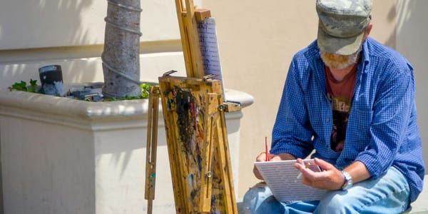
Artist statements provoke more anxiety than almost any professional requirement. Learn to write with clarity instead of art-speak, in your authentic voice.

Artist statements provoke more anxiety than almost any professional requirement. Learn to write with clarity instead of art-speak, in your authentic voice.
Studio Insider
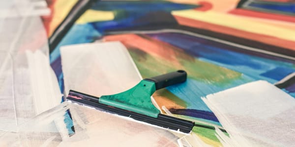
Master the invisible infrastructure that determines whether your paintings struggle or sing. Advanced ground preparation techniques for canvas, panel, and experimental surfaces.
Palette
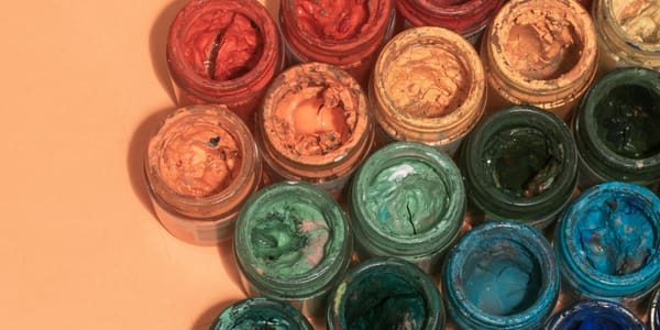
The same pigment appears dramatically different depending on surroundings and lighting. Understanding color constancy transforms frustration into technique.
Palette
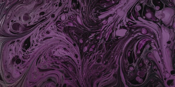
An 18-year-old's failed chemistry experiment in 1856 accidentally created the first synthetic dye. Mauve didn't just add a color; it revolutionized art materials forever.
Palette
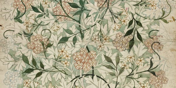
Art Nouveau's signature palette wasn't accidental. This triadic harmony of purple, orange, and green embodied the movement's philosophy while solving technical problems.

Marathon studio sessions and sacrifice-everything devotion produce predictable burnout. Learn to structure your practice for decades, not months of intensity.

Studio Notes
Your art style won't crystallize from practice alone. This six-month framework helps you systematically explore, identify, and develop your authentic visual voice.
Exhibitions
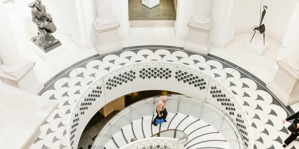
The landmark Turner and Constable exhibition at Tate Britain through April 2026 pairs Britain's greatest landscape rivals. Here's what their different approaches to atmosphere, light, and ambition reveal for contemporary practice.
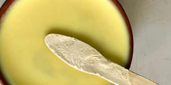
Unconventional materials strengthen work when their properties and cultural associations serve your concepts, not when they're just surprising. The distinction matters more than the materials themselves.
Featured
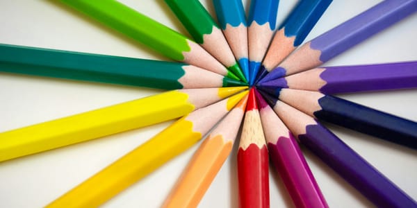
One medium is fluid and transparent, the other waxy and opaque. Understanding how watercolor and colored pencil work together opens new visual possibilities.
Studio Notes
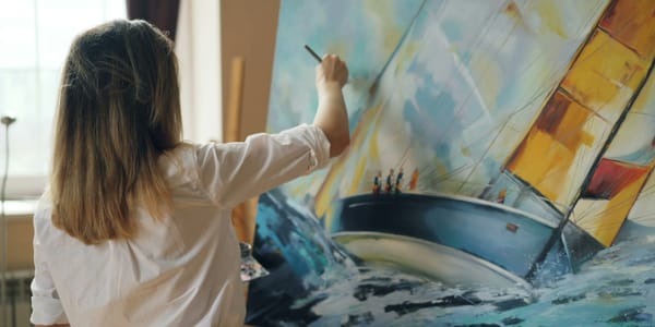
The fantasy of quitting your job to make art looks nothing like the reality. Ask yourself these hard questions before making moves you can't reverse.
Studio Notes
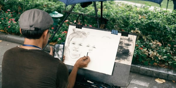
Pricing art commissions isn't about what feels comfortable to charge. It's about calculating actual costs and building rates that support your growth as an artist.