White: Purity, Mourning, and the Blank Canvas
White is the most loaded colour in art: purity in one culture, mourning in another, and a whole family of pigments — lead, zinc, and titanium — with different behaviour.
White is the most culturally loaded colour available to an artist — more than red, more than black, more than gold. That's a strange claim to make about a colour most people would call neutral, blank, or simply the absence of colour. But "neutral" is exactly the disguise that lets white do more ideological and compositional work than any other colour on the palette, almost always without getting caught.
The obvious objection
If white just is the absence of colour — pigment that reflects nearly all light rather than absorbing any particular wavelength — how can it be "loaded" with meaning at all? Isn't that like saying silence is the most expressive sound? The objection is reasonable, and it's also exactly backwards: white's blankness is precisely why it has been available to carry so many contradictory meanings at once, none of which cancel the others out.
Exhibit one: it means opposite things in different places
In the Western tradition, white means beginnings and purity — the christening gown, the clean page, the wedding dress. That last association is younger than it looks: white wedding dresses only became the default in the West after Queen Victoria wore one to marry Prince Albert in 1840, and the fashion spread from there rather than descending from ancient custom. In parts of China, Japan, and Korea, white has traditionally been the colour of mourning and funerals — the same absence of colour, doing the exact opposite emotional work. Neither meaning is more "correct." A colour that can mean both a wedding and a funeral, depending only on which culture is looking at it, is not a neutral colour. It's an unusually contested one.
Exhibit two: the pigment isn't neutral either
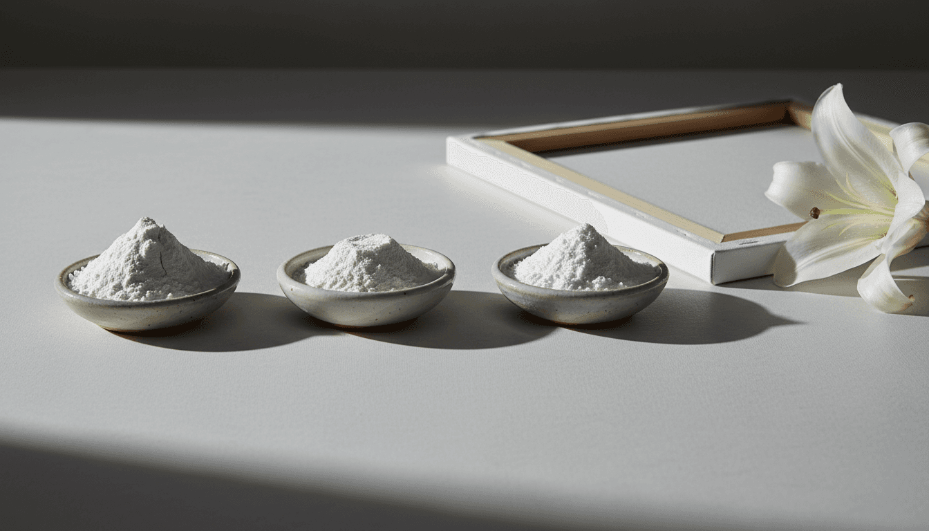
Even setting culture aside, "white" on a palette was never one substance. Lead white was the standard for centuries — warm, flexible, beautifully handling, and slowly poisoning the people who ground it. Zinc white, introduced as a safer alternative, is cooler and more translucent but forms a brittle film prone to cracking. Titanium white, the modern default since the twentieth century, is so opaque it can flatten a mixture faster than any other pigment on the palette. Three different whites, three different temperatures, three different sets of trade-offs — "white" was never a single, neutral answer, even before you consider what it's supposed to mean.
The counter-consideration: isn't this over-reading a blank surface?
A skeptic might say all of this is true of any pigment — every colour has variants, every colour means different things in different cultures — so why single out white as uniquely loaded? The answer is that white's specific claim to neutrality is the load-bearing lie. Nobody argues that red is neutral. But an entire twentieth-century institution — the modern art gallery — built its authority on the premise that white walls constitute a neutral, value-free background for looking at art. Critic Brian O'Doherty named and dismantled this premise directly in his 1976 essays, later collected as Inside the White Cube, arguing that the gallery's white walls don't disappear at all; they actively assert a particular ideology of how art should be seen, isolated and decontextualized, while pretending to assert nothing. The white cube's whiteness only works as neutrality if nobody looks at it directly — which is exactly the trick a "loaded" colour needs to pull off successfully.
Advertisement
Exhibit three: the physics won't let it be neutral even if you want it to be
White cannot be neutral even at the level of raw physics. The eye does not perceive an absolute white; it perceives the brightest available surface under the current light and calibrates around it — a phenomenon called colour constancy, which is why a white wall looks equally "white" under warm incandescent bulbs and cool daylight, even though the actual wavelengths reaching your eye are completely different in each case. Every white surface takes on the cast of whatever light falls on it and shifts with whatever it's placed beside. A colour that cannot hold a fixed identity independent of its surroundings is not a candidate for neutrality; it's the most context-dependent colour there is.
What artists have done with the loaded blank
Painters who understood white was never neutral used it as a weapon rather than a default. The Impressionists built their high-key palettes around white specifically to capture the sensation of outdoor light, placing it next to saturated colour rather than leaving it as background. Kazimir Malevich pushed the argument to its logical extreme in 1918 with Suprematist Composition: White on White, a nearly indistinguishable white square set at an angle within a white field — using the "neutral" colour to make the strongest possible statement about reduction, because a truly blank surface would have made no statement at all. Robert Ryman spent a five-decade career painting almost nothing but white, precisely because the constraint forced every remaining variable — texture, edge, support, the specific white used — into total visibility. None of these artists were using white as an absence. They were using it as the loudest possible assertion that could still masquerade as silence.
Exhibit four: even the blank canvas is a decision, not a default
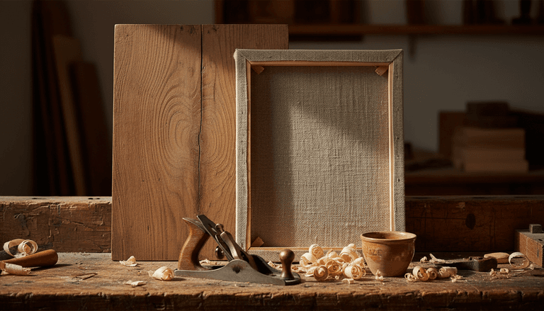
Before a single mark is made, a painter has already chosen a ground, and a white ground is not a neutral starting point — it's a choice with consequences. Light passes through thin or transparent paint and bounces back off a bright white ground beneath it, producing a luminosity no applied white pigment can quite match; a mid-toned or coloured ground does the opposite, unifying and muting whatever sits on top of it. Painters who leave patches of canvas exposed are relying on the ground's whiteness to do active optical work, not treating it as an absence they simply haven't gotten to yet. Even "blank" turns out to be a specific, consequential choice the moment you actually make a painting.
The verdict
White wins the argument for being the most loaded colour precisely because it's the only one still trying to pass as unloaded. Red, black, and gold all announce their symbolic weight up front; white gets to carry purity and mourning, warmth and poison, neutrality and ideology, all while claiming to carry nothing at all. That's not the profile of an absence. That's the profile of a colour that has simply gotten better than any other at hiding how much work it's doing.