Four Inks, 64 Colours: How to Read a 1960s Comic Page
The red has slid off its black outline, and the same face is a different pink two panels apart. A 1960s comic page was built by a relay of colourists, separators and platemakers, and each oddity points to one pair of hands.
You are looking at a comic page from the 1960s — in a longbox, on a screen, or beside the Lichtenstein it inspired — and the colour is doing things you can't explain. The red has slid off its black outline. The same face is a different pink two panels apart. A sky is a mesh of dots with holes in it, and a character who should be grey has a faint green cast. It is natural to assume that someone chose this, or that something went wrong. Usually neither: the page was built by a relay, and each hand in it had a narrow job.
The colourist of a 1960s Marvel or DC page never painted the page you are holding. He or she painted a guide on a copy of the line art, in a shorthand code, and passed it down a production line: separators who turned the code into transparent overlays, a camera that turned the overlays into dots, a plate maker, a press, and newsprint that soaked up part of every ink. The result has a grammar, and it can be read. Roy Lichtenstein: Like New is at the Whitney until 10 May 2027, and its comic-derived paintings began as printed pages of exactly this kind. Here are the printer's rules, the six hand-offs, seven checks to run on a page and a table that matches each oddity to its likely cause — with the people and places behind the colour along the way.
The rules the printer set
Every hand in the relay worked under the same five constraints, and they explain more of the page than anyone's taste does.
- Four inks. Cyan, magenta, yellow and black. Colour guides abbreviated the three colours: Y for yellow, R for red (meaning magenta) and B for blue (meaning cyan), in the Marvel Codex's summary. Black was a plate of its own.
- Four settings per colour ink. Off, 25, 50 or 100 per cent. A digit on the guide marked the tint: R2 meant a 25 per cent red and R3 a 50 per cent red, and there was no R1. DC's Jack Adler said in a 1975 interview that the numbers came from a series of grey paints made by the Miller Brush Company, in which number one "got lost"; the blog Legion of Andy, which reproduces the interview, adds that the 10 per cent grey was too pale to photograph.
- Sixty-four combinations. Three colour inks at four settings each is 4 × 4 × 4 = 64, and the 64th is white: every ink off, bare paper showing. The Codex counts a "total palette of only 64 possible colors" — including white, the colour of the paper. Legion of Andy notes that most comics used only a fraction of them.
- A ceiling on ink. Total ink was capped. The Marvel editor Tom Brevoort describes the increments as "never to exceed 250% cumulatively, lest the paper that was being printed on buckle"; Legion of Andy says printers urged publishers to avoid mixes over 240 per cent, and sometimes 200.
- A coarse screen on thirsty paper. Interiors were printed at 60 lines per inch — dots about 0.4 millimetres apart — on absorbent newsprint. Recalling the war comics he coloured around 1950, Stan Goldberg said the paper was "almost a gray color, it wasn't even white".
Advertisement
Black sat outside all of this. The black plate was photoengraved from the line art, and it was not part of the 64. Black tints — the stippled grey in a shadow — were, Legion of Andy says, "not actually made within the acetate system, but on the drawing board itself."
The relay: six hand-offs from drawing board to newsstand
The page passes through six sets of hands, and each can work only from what the last one handed over.
- The artist's board becomes the black plate. Original pages were drawn in an area of about 10 by 15 inches, and a camera shrank them to the printed size, generally 6 by 9, on Kodalith, an ultra-high-contrast film. That is the account of Marvel staffer Eliot R. Brown, who toured the separators' plant with the editor Sid Jacobson in what he later dated to late 1984 or early 1985. Legion of Andy says the black plate was made "in essentially the same way it had been since the first Sunday newspaper strips of the 1890s," and that is where the arrangement began. Richard F. Outcault's Hogan's Alley had its first colour printing on 5 May 1895, in Joseph Pulitzer's New York World, according to Wikipedia. When William Randolph Hearst's Journal hired Outcault away in 1896 and Pulitzer hired George Luks to keep the original going, the two papers "quickly became known as the yellow kid papers," and "yellow journalism" followed. A black line over flat colour on cheap paper was more than sixty years old by the time the Silver Age began.
- The colourist paints a guide. A colourist prepared "a colour guide for every page of a comic," Legion of Andy writes, at the reduced size of the printed page and in watercolour dyes — originally on a photographic "silver print" of the art, later on a photocopy. The dyes were Dr. Ph. Martin's, whose concentrated watercolours launched in 1934. Dick Blick's history says comic publishers preferred them for colouring line art, that they were not very lightfast, which did not matter because the original art was only a step towards a printed magazine, and that large publishers eventually commissioned custom batches of their most-used colours. Goldberg began at Timely Comics in 1949, at 16 or 17, according to Wikipedia, ran the colouring department from about 1951 and, in the 1960s, worked uncredited. "I cleared all the color schemes for all the super heroes from 1960 to 1965," he said in an interview. The guide itself was a diagram: Legion of Andy calls such guides "essentially just diagrams for the next person in the production line to work from." Goldberg remembered that colourists of his early years worked on silver prints and could only hope the printed shades came out close to what they had intended.
- The separator paints the overlays. The guide went to a plate house. Legion of Andy names the Chemical Color Plate Corporation of Connecticut as the firm that did colour separation for Marvel, DC and Archie, and Brown's visit was to the same firm. A separator laid clear plastic over the guide and, with a substance called opaquing medium that had to be thinned with lacquer thinner, blocked in every area that was to carry one tint of one ink; a pair of holes punched at the top kept the sheets in register. Three tints of each of three inks made nine overlays for a page, and a tenth sheet carried the black line art. "Everyone was paid by the piece," Brown writes. Mildred Marsh, who worked there in the 1950s, said she made $3,000 a year; Cynthia Blake worked there from 1974 for about seven years. Both gave interviews for a Connecticut Historical Society exhibition in 2003–04 on the state's part in the story of the comic book, and the state had a case. Eastern Color Printing of Waterbury, incorporated in 1928, had perfected an engraving process for adding colour to black-and-white comics around 1929, printed one million copies of the 32-page Funnies on Parade, a Procter & Gamble promotion, in spring 1933, and in 1934 tested Famous Funnies at ten cents a copy; it sold out, and a monthly followed with a July cover date.
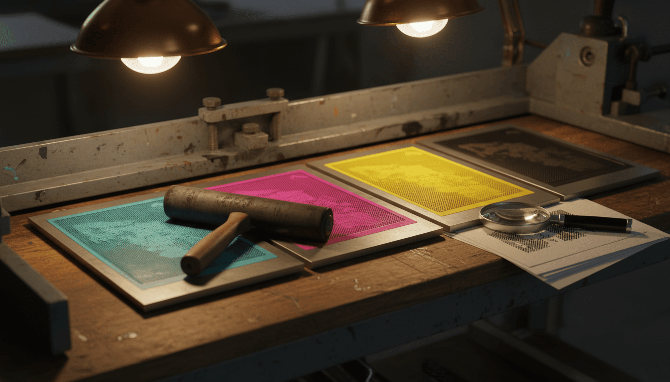
- The camera makes the dots. The painted overlays were photographed through screens, and the nine became three: in Brown's words the 100, 50 and 25 per cent values "are all 'burned' into one" film for each colour, with the black on its own. The 25 per cent tints printed as "positive" dots, "clearly dots composed of coloured ink," in Legion of Andy's phrase, and the 50 per cent tints as a grid of colour with round holes — "negative" dots, which the blog calls "a signature feature of the acetate method". That method had replaced Craftint, which dominated the 1940s and early 1950s and made darker tints from closely spaced lines and paler ones from dots. Marvel, then still Atlas, phased Craftint out in comics cover-dated October and November 1954, and DC followed in October 1956, the cover date of Showcase #4, the debut of the new Flash and the issue usually taken to open the Silver Age. "Charlton, for example, certainly used Craftint into the 1960s," the blog adds. The dots are usually called Ben-Day dots, after the illustrator and printer Benjamin Henry Day Jr., who developed his overlay-sheet process in 1879. The blog argues that the name outlived the method, since "the real Ben Day method had been largely phased out of comic books in the 1930s," and that when Lichtenstein "informed the world that he was copying 'Ben Day dots' from the comics," "No-one knows where he heard or read the name 'Ben Day dots'".
- The plate maker makes the metal. The films went on to World Color, where, Brown writes, they were "turned into large sheets of actual metal printing plates." Early comics used steel plates; "a cost saving move was to go to aluminum plates"; and "both steel and aluminum plates are used up quickly," so "for most runs of comics, several plates are made as a matter of course." Brown says World Color Press, in Illinois, printed comics for decades — all of them, in his telling. He dates the "ultimate move to save money," a process called Flexigraphic, to "some time in the early 1980s," and the "wiggly fine lines that resulted" came "at the same time they switched to bleached paper." Legion of Andy has the engraving company changing to "a cheaper camera system sometime in the mid-1970s," and mentions plastic printing plates replacing metal ones.
- The press lays four inks on newsprint. Legion of Andy calls the method "four-colour rotary perfecting letterpress on newsprint": plates curved round cylinders, ink carried on raised surfaces like those of a rubber stamp, both sides of the sheet printed in one pass. The paper drank the ink. A printed 50 per cent tint "could resemble 50% or a darker value more like 60 or even 70%," the blog says — the spread that printers call dot gain. The hardest colours were those built from several inks at once. Goldberg, recalling the war comics of around 1950, spoke of "certain colors that demanded three or four of the major colors," a grey uniform and a mud brown among them, and remembered Stan Lee, with some exaggeration, complaining that "if you make the tanks red, you make one guy's uniform blue and the other guy's uniform yellow."
Advertisement
Seven checks to run on any page
Take the page — or a scan at full size — and a ten-times loupe, and work down this list.
- Start with the black. The black plate is the cleanest thing on the page, made straight from the line art. If the line itself is soft, suspect a worn plate or the paper before you suspect the colourist. If shadows are stippled in black dots, those were drawn on the board.
- Name the dot. At 60 lines per inch the dots sit about 0.4 millimetres apart. A 25 per cent tint shows separate dots of ink, a 50 per cent tint shows a grid of ink with round holes, and 100 per cent is solid. A tint of fine parallel lines instead of dots is Craftint: the system Marvel dropped in 1954 and DC in 1956, though Charlton kept using it into the 1960s. From reading distance the dots fuse, which is why widely spaced magenta dots read as pink — the effect Seurat is usually said to have relied on, though modern analysis of his canvases says otherwise.
- Look for the overshoot. Colour that stops short of the black line or runs past it has two possible sources. A plate out of register is what Brevoort holds responsible for "that strange color haloing that you see in many early comics". But Brown, looking at the same fault, writes: "Some of this may be due to the actual printing press being a little off, but more often it was a separator needing to finish 10 pieces in one day." One way to tell them apart follows from the two accounts, though neither states it as a rule: a plate out of register should shift one whole colour in the same direction across the page, while a rushed separator's errors should be patchy, one area spilling and the next stopping short.
- Read the flesh. The Codex gives Y2R2, a 25 per cent yellow with a 25 per cent red, as a common skin tone for white characters. Legion of Andy says something narrower: that "every white person was R2-only until 1969, when artist Neal Adams got them to start using the yellow tints Y2 and Y3". If both are right, a plain pink face points to the earlier years and a peach one to the later. Treat that as a rule of thumb from one researcher, not a dating method.
- Find the mud. Dark, dull mixes — olive, brown, a grey that is not neutral — are where several inks stack towards the ceiling and the paper spreads them. Goldberg's remark about colours that "demanded three or four of the major colors" describes the same trap, and the sources give different ceilings: 250 per cent for Brevoort, 240 or even 200 for Legion of Andy.
- Ask whether it is a cover. Brown says covers were printed at "120 lines per inch" against 60 for the interiors, and that "a whole system of color proofing was invented by 3M" to check them. A cover's finer tints are therefore no evidence against the 64-colour rule for the newsprint inside. Do not judge a 1960s interior by its cover.
- Compare a second copy. Plates wore out, so a run used more than one, and the density of ink on press could vary. Two copies of one issue are not guaranteed to match. A foreign edition can be stranger still: Brevoort found a Swedish Fantastic Four #76 in which the local publisher had "inadvertently switched the film for the yellow and cyan plates".
Matching each oddity to its cause
| What you see | Likely cause | Stage of the relay | How well documented |
|---|---|---|---|
| Colour fringe following one colour round every outline | One colour plate printed out of register with the black | Plate and press (steps 5–6) | Brevoort; the Codex. The "whole colour shifts" test is an inference |
| Colour that overshoots or stops short of lines in patches | A separator rushing to finish the day's pieces; sometimes the press | Separator (step 3) | Brown's eyewitness account; one source |
| A mesh of colour with round holes in it | A 50% tint, printed as "negative" dots | Camera (step 4) | Legion of Andy; fits Brown's 25/50/100 split |
| Tints made of fine parallel lines, not dots | Craftint, dropped by Marvel in 1954 and DC in 1956; Charlton kept it into the 1960s | Older production system | Legion of Andy; one source |
| A flat pink face | Flesh coded R2 alone, a 25% red | Colour guide (step 2) | Legion of Andy dates this to before 1969; a rule of thumb |
| A peach face | Y2R2: 25% yellow plus 25% red | Colour guide (step 2) | The Codex, undated; Legion of Andy on Neal Adams and 1969 |
| Dark, dull mixes in a strongly coloured area | Several inks stacked towards the 240–250% ceiling, spread by absorbent paper | Guide and press (steps 2 and 6) | Ceiling and spread documented (Brevoort, Legion of Andy); the effect on a given page is inference |
| A character's colour varies from page to page | A grey the press could not hold steady, as in The Incredible Hulk #1 (1962) | Press (step 6) | Goethe-Institut; Mental Floss. Rests on recollection |
| A whole page in the wrong colours | Two colour films swapped, as in a Swedish Fantastic Four #76 | Plate shop or foreign printer | Brevoort |
| Finer tints and more colours on a cover | A 120-line screen and 3M colour proofs | Cover production | Brown |
| Smooth gradients on an interior page | Computer colouring, after 1987–88, or a later reprint | After the relay | Oliff; Wikipedia |
Use the table as a map, not a verdict. Several rows rest on one researcher's reconstruction, and the last column says which. Where a cause has more than one source, assume the plates, the paper and the press behaved as described before crediting a colourist with an effect that the 64-colour palette could not make.
Case study: the Hulk that would not stay grey
The Incredible Hulk #1 (1962) is the best-known case of a guide that the press could not honour. Stan Lee wanted a grey monster — a colour Mental Floss says he found "spooky," and one the Goethe-Institut's account says he wanted to appear "scary and chilling." The printed result did not match. "The colors used in the actual comic simply did not correspond to the original copies supplied by the colorist Stan Goldberg," the Goethe-Institut writes, and the colour Lee had wanted "turned out to be a mixture of various gray and even slightly greenish shades". It puts the cause on the press: "the press density is either too light on magenta or too heavy on a combination of cyan and yellow." Mental Floss describes the effect on the page: "On certain pages, the Hulk rocked a light, silvery complexion. On others, he was charcoal black."
Advertisement
The repair was to change the colour. Both accounts say Lee asked Goldberg to make the Hulk green, from the second issue, and Mental Floss adds that "Lee realized that green wasn't being used by any major characters." That is the article's own observation, with no source given, and the printing explanation itself rests on Lee's recollection and later retellings: none of the sources checked for this piece cites a printer's record for it. Britannica gives Lee and Jack Kirby the credit for the green. "It turned out to be a great choice," Lee said, since it let him use nicknames such as "The Jolly Green Giant."
The story is useful because it describes a failure the system invited. A grey built from coloured inks is a balancing act. Goldberg's "three or four of the major colors" must all land at the right density, and if any one drifts the grey tips towards green or towards black. In effect, Marvel's fix was to adopt a colour that the press could hold. It is also the cleanest demonstration of the point of this guide: the guide is an instruction, and the printed page is the press's answer to it. When the two disagree, you are looking at the relay and not at the artist.
How the relay ended
The system lasted as long as comics were separated by hand, and its end came in stages. Credit came first. Goldberg, like other Marvel colourists of his day, worked uncredited. Colourists began to be named in the 1970s: Glynis Wein, later Glynis Oliver, won the Shazam Award for best colourist in 1973 and, the Codex says, was one of the first to receive a consistent credit, while Tatjana Wood coloured, in the words of Wikipedia's entry on colourists, "virtually all DC covers from 1973 through the end of the Bronze Age".
Hardware followed. Brown describes the Flexigraphic plates and whiter paper of the early 1980s, and the Codex says Baxter paper, introduced in the late 1970s and 1980s, allowed a wider range of colours. Then, in 1987, Steve Oliff got a computer.
Oliff had been given four pages of Katsuhiro Otomo's Akira to colour as a test; Marvel published it through Epic. He writes that at first Marvel got hand separations done from his guides, and that they "weren't very exciting, in fact rather bad, so I suggested that they let me try to color it on the computer." "Two days after Christmas 1987, Federal Express delivered two boxes to my office in downtown Point Arena": an IBM 286 with an AT&T Targa graphics board. He spent the next three months colouring Akira #1, which he considers "the first time that a color guide artist was his own separator in comics" — "Richard Corben notwithstanding." The computer gave him "the ability to use gradations anywhere at all," and he won the Harvey Award for best colour in 1989. By Wikipedia's account computer colouring became increasingly prevalent after 1988; in the early 1990s DC still allowed only a 64-colour palette while Marvel had expanded its own to 125, and in 1993 Image Comics' use of computer colour pushed both publishers to upgrade.
Take it to the gallery
These checks work on printed pages. They do not work on a Lichtenstein, whose dots were painted by hand — the argument of Lichtenstein's Dots Weren't Printed. What they do is show you what he was working from, and so what he chose to change. If you are going to Roy Lichtenstein: Like New before it closes on 10 May 2027, our guide to getting more from an art exhibition is worth reading beforehand. Two other pieces follow the same paintings from different angles: who actually drew the pages he borrowed, and the paint he used for the flat areas.
FAQ
Do I need a loupe to see any of this?
Not for most of it. At 60 lines per inch the dots are about 0.4 millimetres apart, so the texture of a tint is usually visible to the naked eye on close inspection, and a full-size scan will show the mesh. A ten-times loupe earns its place in two jobs: telling a 25 per cent tint of separate dots from a 50 per cent tint with round holes, and checking whether a fringe follows one whole colour round every outline or only turns up here and there.
Why do two copies of the same issue look different?
Plates wore out, so a run used more than one: Eliot R. Brown writes that "for most runs of comics, several plates are made as a matter of course." The density of ink on press could also vary, which is the Goethe-Institut's explanation for the first Hulk. A foreign printing adds its own films and its own mistakes, such as the Swedish Fantastic Four #76 that Tom Brevoort found. A colour difference between two copies is therefore no evidence, on its own, of a variant or a recolouring.
How can I tell a 1960s separation from a later recolouring?
Look for gradients. The hand system offered three tints per ink, so tone changed in steps. Steve Oliff says computer colouring gave him "the ability to use gradations anywhere at all," so a smooth blend on an interior page of a 1960s story is a strong sign of colour made after 1987–88, in a reprint or a recolouring. The reverse is weaker: stepped tones fit the old system but do not prove that a page is original, and covers, printed at 120 lines per inch, are a separate case.
Where does the number 64 come from, and why do sources describe it differently?
It works as three colour inks with four settings each — off, 25, 50 and 100 per cent — which makes 4 × 4 × 4 = 64, with bare white paper as the all-off case. Black was a separate plate outside the count. Summaries that list "solid black" as a tint level, or count black as a fourth ink, are describing the same system loosely: four inks at four settings each would give 256 combinations, not 64. Most pages used far fewer than the full 64 in any case. Legion of Andy says "only a fraction of that gamut of 63 would ever be used in most published comics."
Who coloured the 1960s comic I own?
Almost certainly the credit box does not say. Stan Goldberg, who told an interviewer he cleared "all the color schemes for all the super heroes from 1960 to 1965," worked uncredited like his contemporaries, and the separators who turned guides into overlays went unnamed too; Mildred Marsh and Cynthia Blake are known partly because the Connecticut Historical Society interviewed them in 2003–04. Credits began to appear in the 1970s, with names such as Glynis Wein and Tatjana Wood. For an individual 1960s page, a colourist's name is an attribution rather than a credit, and is only as good as the interview or database behind it.