Why Acrylic Paint Dries Darker
The color you mix isn't the color you get. Learn why acrylic dries darker, which pigments shift most, and how to compensate before it ruins your values.
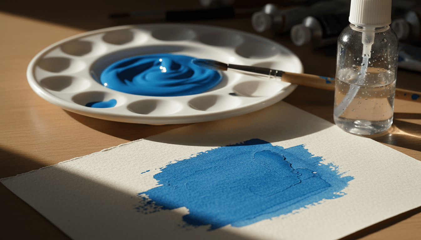
Wet acrylic sits on the palette glossy and bright, a smooth liquid skin throwing back light like the surface of a pond. Come back once it's dry and the same colour is deeper, richer, and noticeably darker — not because anything chemical went wrong, but because the paint just finished living out the one transformation every acrylic film goes through, whether the painter is watching for it or not.
Birth: a wet, reflective film
In its first minutes on the surface, acrylic paint is an emulsion — polymer particles suspended in water, kept apart from each other by the water itself. Like the fat droplets in milk, those separate particles scatter light, so the wet binder is milky white and tints every colour mixed into it — Golden's own mixing guide describes the wet emulsion doing exactly that. The film is glossy too, but it's that white veil that makes the colour look lighter on the palette than it will ever look again. Nothing about this stage is the "true" colour settling in. It's a temporary optical state, held together by water that's already beginning to leave — a very different fate from watercolour, which never stops being reworkable by that same water in the first place.
The transformation: coalescence and shrinkage
As the water evaporates, the suspended polymer particles are forced into contact with each other and fuse — coalesce — into a single, continuous film. Once they've merged, there are no separate particles left to scatter light, and the binder turns from milky white to clear — Winsor & Newton puts acrylic colour shift down to exactly that, "the binder changing from white to transparent as it dries." With the veil gone, the eye sees the pigment through a clear film, and the colour reads darker and more intense. The film also contracts as it forms, shrinking in volume as the water leaves, and Golden notes that the thicker the paint goes on, the more apparent the change. The paint hasn't changed colour in any chemical sense. It's changed structure, and the eye is responding to that structural change as if it were a colour shift.
How the film settles: gloss, matte, and light
| Colour or application | Wet-to-dry shift | Why |
|---|---|---|
| Dark, transparent colours (phthalo blues and greens, quinacridones, ultramarine) | Largest | Little scattering of their own, so the clearing binder reveals their full depth |
| Whites, pale tints and light yellows | Smallest | Opaque, light pigments scatter enough light to mask the milky wet binder |
| Thick, heavy-bodied passages | Larger | More binder to clear and more film to shrink |
| Mixtures heavily extended with medium | Large | Mostly binder: pastel-looking wet, much darker and more intense dry |
| Matte finish | Darks dry lighter | Matting solids scatter light at the surface, adding a faint milky veil |
| Gloss finish | Darks dry deepest | A smooth surface reflects light in one direction, leaving the darks deep |
How much a specific paint darkens depends on how much that milky veil was hiding in the first place. Transparent and dark colours have little scattering power of their own, so the clearing binder changes them most — Golden's mixing guide singles out "a large shift in value in very transparent colors such as Phthalo Blue," and its technical staff name Quinacridone Magenta as a colour whose shift is hard to design out. Opaque, light-valued colours already scatter plenty of light themselves, so the veil barely registers: Golden calls the shift "not noticeable" in a pale colour like Benzimidazolone Yellow Medium. Whites and pale tints are the safest colours to judge wet; phthalos and transparent reds are the riskiest.
Advertisement
Finish pulls the other way. A matte film is covered in microscopic surface roughness that scatters light in every direction — Golden notes that the matting solids in a matte varnish leave "dark colors looking lighter" and the whole surface faintly milky — which lifts the darks and flattens saturation; a gloss film stays smoother and reflects more light coherently, so its darks stay deep and saturated. The same pigment, mixed into gloss medium and matte medium, dries to two visibly different values — which means the finish a painter chooses isn't a coating applied after the colour decision. It's part of the colour decision.
Where it ends up: the cured, stable film
Once coalescence finishes, the shift is done — the film doesn't keep darkening indefinitely the way an oil film keeps slowly curing for years. What's left is a settled, structurally different object from the wet paint that went down: denser, more tightly packed, its brightness spent on the process of actually becoming solid.
What painters do with that knowledge
Once the dry-down is expected rather than discovered, it stops being a problem and becomes a variable to plan around. Mix and test on a scrap of the same surface, let it dry, and only then judge the colour. Paint slightly lighter and a touch less intense than the target, since the mixture will darken and gain chroma as the binder clears. Where exact colour matters, settle the finish before mixing and test in it, since a matte medium will lift the darks that a gloss one keeps deep. And because the shift is predictable, a dried passage can simply be corrected afterward with a glaze — treating the dry-down as one more step in the process, the same kind of foresight that goes into choosing a drying oil for a particular passage in the first place, rather than a surprise arriving after the fact.