The Chemistry of Cadmium and Cobalt Pigments
Cadmium and cobalt pigments behave and cost very differently. Learn the chemistry behind their color, opacity, stability, and how to handle them safely.
In 1817, a professor in Hanover named Friedrich Stromeyer was investigating a batch of calamine — zinc carbonate, the active ingredient apothecaries heated to make zinc oxide for skin lotion — that kept turning an odd yellow when it shouldn't have. He ruled out iron and lead, the usual suspects, and eventually isolated an entirely new metal responsible for the discoloration. He named it cadmium. Within a few decades it would give painters their brightest, most opaque reds, oranges, and yellows — colours nobody had gone looking for, unlike the cobalt blue a French minister had commissioned fifteen years earlier.
1817–1840s: cadmium waits for its own scarcity to end
Stromeyer's cadmium sulfide was proposed as a pigment as early as 1819, but commercial production didn't really begin until around 1840, delayed simply because cadmium metal itself was scarce and expensive to extract from zinc and lead ores. Once supply caught up, cadmium yellows and oranges displaced the older, more toxic chrome yellows (lead chromate) for exactly the reason painters still reach for them today: higher chroma and a purity of colour chrome yellow couldn't match. Claude Monet was reportedly among the painters who preferred the costlier cadmium over cheap chrome yellow for precisely that reason. Cadmium red followed much later, reaching the market as a commercial product only in 1919, once chemists worked out how to combine cadmium with selenium to shift the sulfide's yellow toward red.
1802: a government commissions a blue
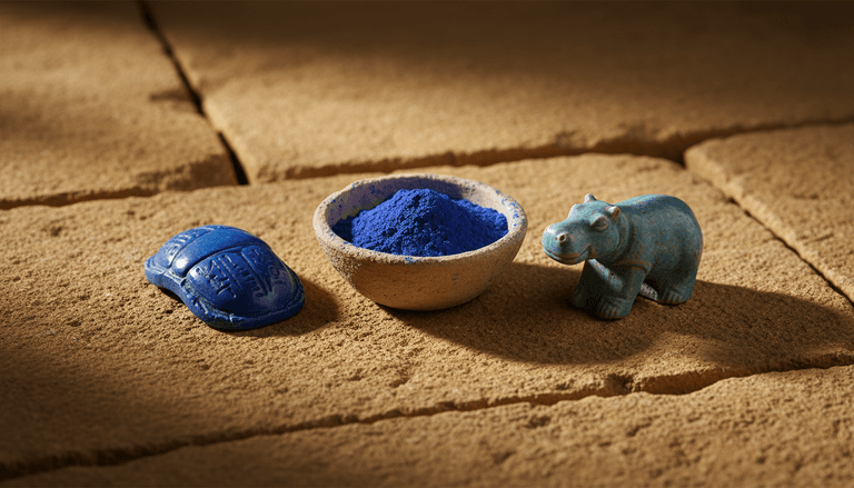
Cobalt's entry into painting happened on the opposite side of Europe, and for a very different reason. In 1802, the French chemist Louis Jacques Thénard developed cobalt aluminate — the pigment now called cobalt blue, or Thénard's blue — while working on a government-backed effort to find a stable, affordable blue for painters, since the alternatives available at the time were either wildly expensive (natural ultramarine) or chemically unstable. The answer came from ceramics — Thénard adapted the cobalt colours the Sèvres porcelain factory used to imitate lapis lazuli — and his blue went on to share painters' palettes with its later cobalt relatives: cerulean (cobalt stannate), cobalt violet (cobalt phosphate), and aureolin (cobalt potassium nitrite).
What both families share, chemically
The two families make their colour in different ways. Cadmium sulfide is a semiconductor: an electron needs a fixed minimum of energy — the band gap — to jump from the valence band into the conduction band, and only violet and some blue light carries that much, so those wavelengths are absorbed and the rest comes back as yellow. Replace some of the sulfur with selenium and the gap narrows, the absorption edge moves to longer wavelengths, and the colour runs through orange to the deep cadmium reds; pure cadmium selenide's gap falls below the energy of the reddest visible light, so it absorbs everything and is black. Zinc in place of some of the cadmium pushes the other way, toward paler lemon yellows. Most of the cadmium range, lemon to deep red, comes from sliding along that one scale.
Advertisement
Cobalt blue gets its colour from the metal ion itself. It is cobalt aluminate, CoAl₂O₄, a spinel in which the Co²⁺ ions sit in tetrahedral cages of four oxygen atoms. That cage splits the energies of cobalt's outer d-electrons, and the jumps between them absorb a broad band of light at roughly 550–680 nanometres — yellow, orange and red — leaving blue. Chemists call this a ligand-field colour: what the cobalt absorbs is decided by the atoms around it, not by the metal alone.
Cadmium and cobalt pigments earned their long careers, and their high prices, for the same underlying reason: the metal at each one's centre produces a pigment that's simultaneously intense, opaque or clear as needed, and remarkably lightfast. A cobalt blue painting from the nineteenth century looks very close to how it looked when it was made — a stability many organic and earth pigments simply can't match over that timescale. That combination of brightness and permanence is why both families have stayed at the expensive end of the palette for two centuries running, even as cheaper substitutes have repeatedly tried to replace them, and it's exactly the kind of gap that explains why certain colours can't be reached by mixing primaries at all — some jobs genuinely need a specific pigment, not a clever mixture.
The twentieth century: the safety question catches up
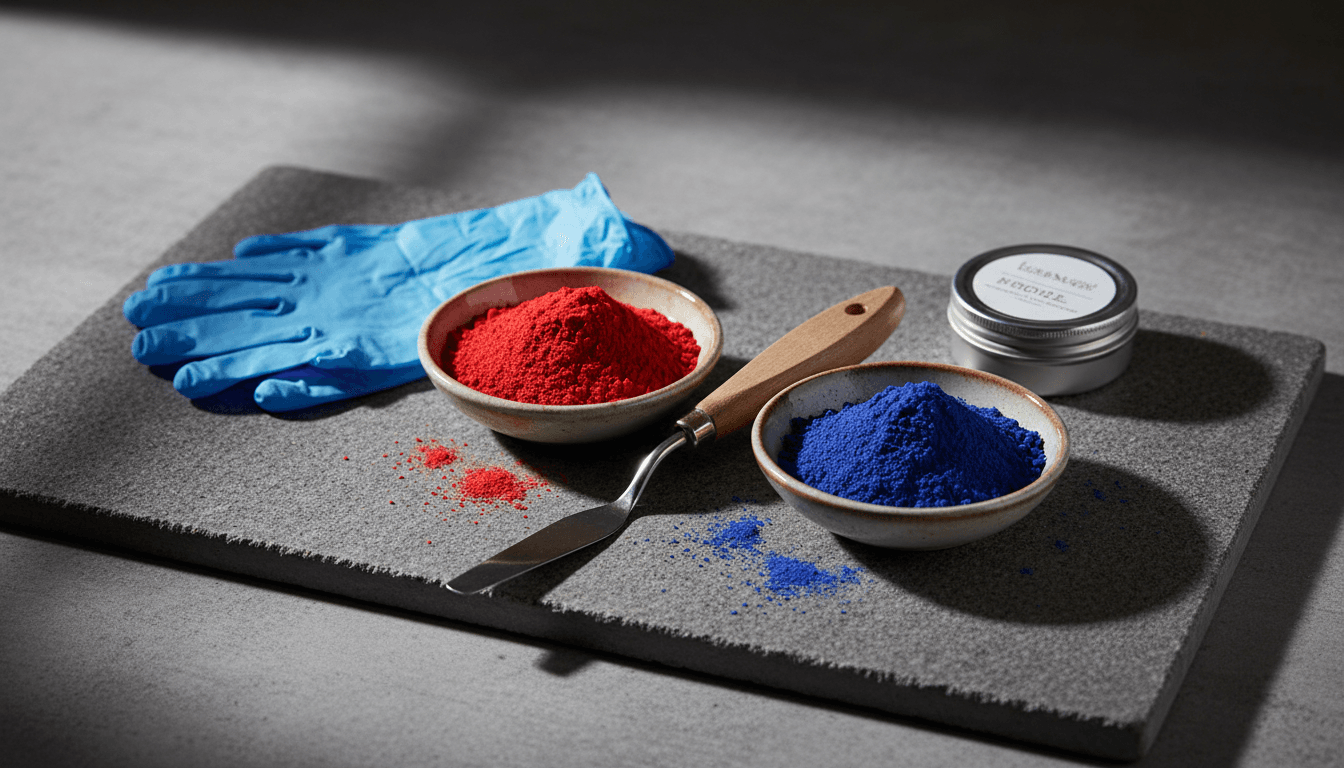
Cadmium's reputation shifted in the twentieth century as the health effects of cadmium exposure became better understood — not from finished, bound paint sitting on a palette, but from the dust generated in manufacturing, sanding, and spraying it, a distinction with real precedent in pigment history: vermilion's mercury and emerald green's arsenic both did their real damage in production and handling long before anyone worried about a finished painting itself. That distinction matters and gets lost easily: a cadmium oil paint used with ordinary studio hygiene poses little risk, while sanding a dried cadmium layer or airbrushing it without protection genuinely does. The response was a family of substitutes — pyrrole reds and benzimidazolone yellows for cadmium, ultramarine and phthalo blends for cobalt — good enough that many contemporary painters use them by default and reach for the metals only when the specific chroma calls for it.
Where they stand now
Both families are still manufactured, still expensive, and still occupy the top shelf of the paint aisle for reasons that haven't really changed since Stromeyer's contaminated calamine and Thénard's government commission: nothing else quite matches their combination of intensity and permanence. What has changed is how deliberately painters now choose them — not by habit, as the default "good colours," but for the specific jobs, a clean warm red or a blue that won't muddy in a mixture, that an accident in Hanover and a French government commission turned out to solve better than almost anything invented since.