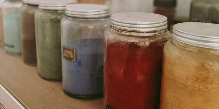
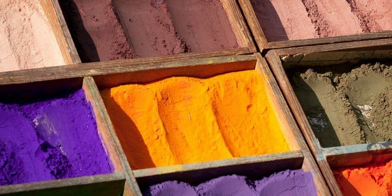
The History of Color: How Every Pigment Was Made, Feared, and Replaced
Every major pigment in art history follows the same four-act structure: discovery, luxury, industrialization, and a safety reckoning. Here's the complete story, pigment by pigment, and what it actually means for anyone standing at an easel today.
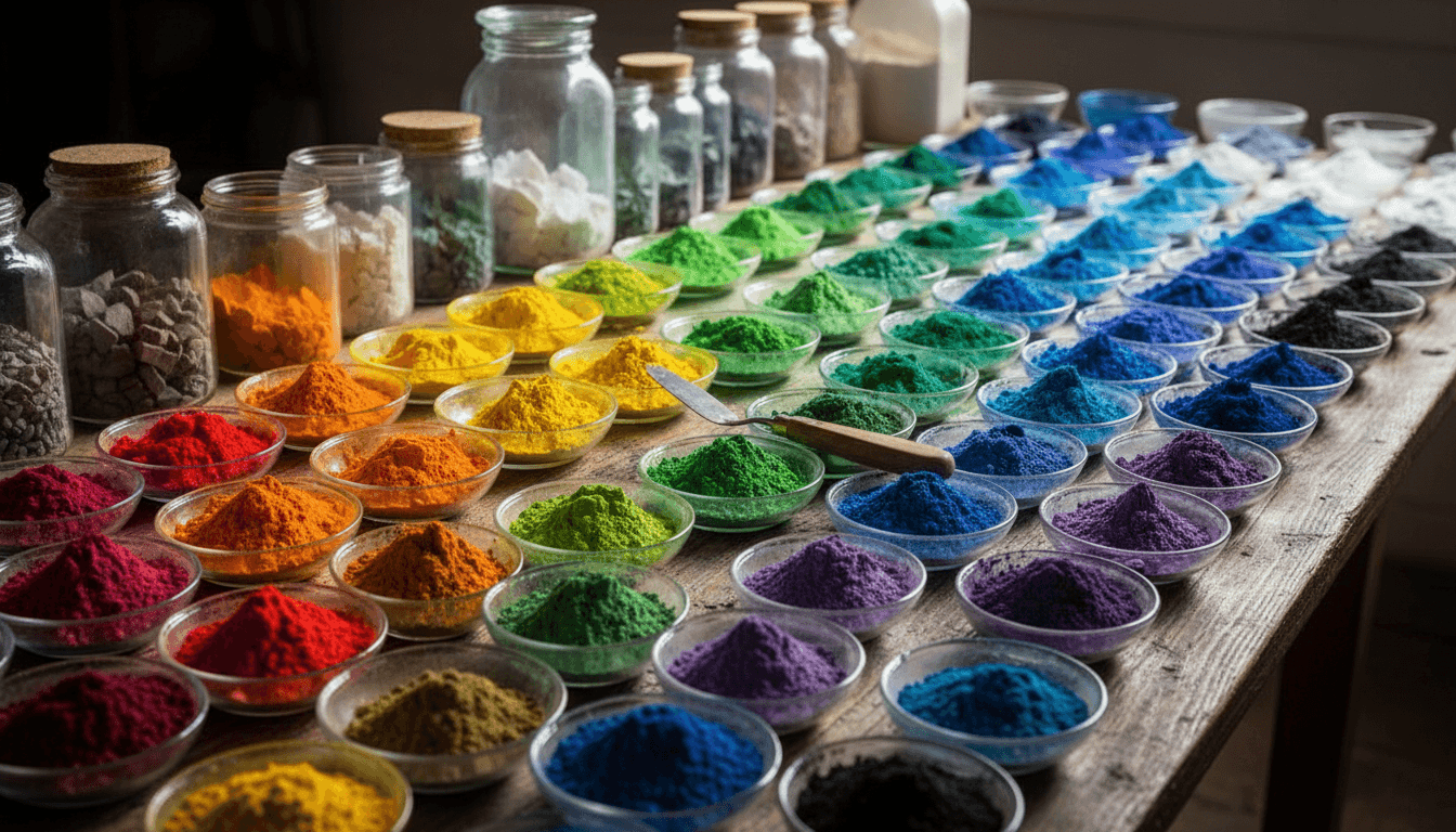
Pick almost any color on a modern painter's palette and you can trace the same four-act story behind it, just running at a different speed. Something is discovered or extracted, often by accident. It's prized while it stays scarce and expensive. Someone works out how to make it cheaply at industrial scale. And decades or centuries later, someone else works out what it was actually costing — in mercury poisoning, in arsenic exposure, in colonial labor, in a support that quietly rots from the inside. Color has a material history as dense and as strange as any war or invention, and almost nobody learns it as one continuous story. This is that story, pigment by pigment, era by era, from a Bronze Age kiln to a modern conservator's lab — and, just as tellingly, the story of the handful of colors that never had to go through any of it at all.
At a glance
| Era | Defining pigment | What changed |
|---|---|---|
| Ancient Egypt, c. 3100 BCE | Egyptian blue | The first pigment made by chemistry, not found in nature |
| Medieval Europe, c. 1100s–1400s | Ultramarine, gold | Color itself became a direct store of wealth |
| Age of Exploration, 1500s–1700s | Cochineal, indigo | Dye and pigment became a colonial commodity trade |
| Industrial era, 1700s–1800s | Emerald green, mummy brown, vermilion | Mass production outran anyone's understanding of the risk |
| 19th-century chemistry | Prussian blue, cadmium, cobalt | Laboratory synthesis replaced mining and farming |
| 20th century onward | Phthalocyanines, quinacridones | The palette was quietly reformulated around safety |
The first manufactured colors
Long before anyone worried about lead or arsenic, the first problem a painter faced was simpler: color mostly had to be found, not made. Ochres, charcoal, and ground minerals had been in use for tens of thousands of years, but every one of them was limited by whatever the local geology happened to provide. That changed around 3100 BCE in Egypt, where craftspeople worked out how to fire sand, copper, and lime together in a kiln and produce a vivid, stable blue that occurs nowhere in nature — Egyptian blue, the first pigment ever manufactured by a chemical reaction rather than dug up or scraped off a rock. It's a genuinely strange thing to have solved so early: the moment humans could synthesize a color, they could start designing a palette instead of merely collecting one, and Egyptian blue's crystal structure turned out to be so stable that it still glows under infrared light on tomb walls painted more than four thousand years ago.
Gold belongs in this same opening chapter, though it never behaved like an ordinary pigment at all. It doesn't oxidize, doesn't fade, and mirrors light rather than scattering it back from countless ground particles the way a pigment does — reflecting most of the red and yellow that reaches it while absorbing much of the blue, which is where its color comes from. That permanence is exactly why cultures that wanted to represent something outside time and decay kept reaching for the one material that doesn't visibly participate in either. Gold in art never went through the same rise-and-fall arc as everything else on this list, because it never needed replacing on safety grounds — its story is really the story of what artists chose to do with a material that simply refused to change.
Advertisement
Egypt wasn't alone in solving this problem independently, either. Chinese craftspeople developed a chemically related family of manufactured pigments — barium copper silicates now called Han blue and Han purple — during the Warring States and Han dynasty periods, entirely without contact with Egyptian workshops. They turn up on the famous Terracotta Army and in tomb decoration, and their chemistry is close enough to Egyptian blue's that both were, for a time, the only calcium- or barium-copper-silicate pigments known anywhere on earth. Two civilizations, working in total isolation from each other and with no way to compare notes, reached the same basic insight within a few centuries of each other: heat the right minerals together at the right temperature, and you can manufacture a color nature never gave you outright.
The medieval luxury palette
For most of the medieval period, the most expensive color available to a painter wasn't a rare dye or a toxic metal. It was a blue ground from a single mountain range in what is now Afghanistan. Lapis lazuli had to travel thousands of miles by caravan before a colorman in Venice or Florence could grind it into ultramarine, and the refining process itself — kneading the crushed stone in wax and lye to separate pure pigment from useless grey rock — was slow enough that the finest grade cost more per ounce than gold. The name itself records the journey: "ultramarine" comes from the Latin ultramarinus, "beyond the sea," a label describing how the pigment physically reached Europe rather than anything about its actual color. Painters didn't use it casually. Contracts from the period specify exactly which figures got the real thing, usually the Virgin Mary's robe, and which got a cheaper substitute; the pigment itself was a visible statement about whose commission had the budget to afford it.
The extraction process itself produced its own internal hierarchy of quality, which is part of what made ultramarine such a precise instrument of patronage. The first pressings of the wax-and-lye kneading yielded the purest, most saturated pigment, reserved for the single most important passage in a commission; later, weaker pressings of the same batch of stone produced a paler, greyer byproduct sometimes called ultramarine ash, still valuable but visibly inferior, and used for less important drapery or background passages in the same painting. A single mountain of stone could end up distributed across a whole hierarchy of blues in a single altarpiece, each grade legible to a contemporary eye trained to notice the difference between the robe on the central figure and the robe on someone standing behind them.
Gold and ultramarine together defined what a medieval patron's money could actually buy: not just skill, but scarcity made visible on a wall or a panel. That equation began to crack in a Berlin workshop early in the eighteenth century, with an accidental discovery this piece will come back to, and broke for good in the 1820s, when European chemists worked out how to manufacture ultramarine itself — the same blue, without the mountain.
Colonial commodity color
Where the medieval palette ran on mineral scarcity, the colors that followed European contact with the Americas and Asia ran on something closer to industrial agriculture, extracted through deeply unequal trade and labor systems. Cochineal is the starkest case: a red dye made from a scale insect that lives on prickly pear cactus, already a tribute good taxed by Aztec and Maya rulers before the Spanish conquest ever reached Mexico. It took roughly seventy thousand dried insects to produce a single pound of dye, and once Spain controlled the supply, cochineal became one of New Spain's most valuable exports — by some measures the second most valuable commodity shipped out of the Spanish Americas, after silver itself. The red coats of the British army and the scarlet robes of Catholic cardinals both trace back to the same insect farmed on the same cactus pads, and the trade was lucrative enough that Spain spent generations trying, and mostly failing, to keep the actual insect and its cultivation methods a state secret from rival European powers.
Blue ran a parallel, equally contested trade. Indigo and its European cousin woad produce the identical blue compound, indigotin, but indigo yields far more of it per pound of raw plant — and once Vasco da Gama's sea route to India opened the door to importing it at scale, European governments spent the better part of two centuries trying to ban a cheaper, better product to protect their own regional woad industries. Woad and indigo's blue dye wars ran on outright protectionism — Germany banned indigo in 1577, France in 1598, both under threat of serious punishment — right up until smuggling and simple economics made the bans unenforceable. Indigo's own colonial production, meanwhile, ran on coercive labor systems in South Carolina and Bengal that were every bit as exploitative as anything in the cochineal trade, and in Bengal's case provoked one of the earliest organized peasant revolts against colonial rule.
Advertisement
Yellow had its own version of this story, and a considerably darker one to actually confirm. For over a century, art reference books repeated a claim about Indian yellow that sounded too vivid to be true: that the pigment came from the urine of cattle deliberately starved onto a diet of nothing but mango leaves. The claim was first documented in 1883, doubted for well over a century afterward, and only chemically confirmed in 2018, when researchers published their analysis of century-old samples recovered from storage at Kew and reported exactly the chemical markers the original account predicted. The grim version of the story turned out to be the accurate one.
The toxic industrial boom
By the eighteenth and nineteenth centuries, chemistry could manufacture pigments faster than anyone could evaluate what they were actually made of, and three cases in particular show how long that gap could run before anyone noticed. Emerald green, a copper-arsenic compound discovered in 1814, produced a brilliant, cheap green that ended up in Victorian wallpaper by the mile, following its older cousin Scheele's green — the arsenical green usually identified on the surviving scrap of wallpaper from Napoleon's house on Saint Helena, which fed a genuine forensic controversy over whether arsenic exposure contributed to his death. The designer William Morris, whose own wallpapers had been colored with arsenical greens, wrote to the dyer Thomas Wardle in 1885 that the doctors behind the arsenic scare "were bitten as people were bitten by the witch fever" — an attitude entirely typical of an industry that treated the danger as unproven for as long as it could.
Emerald green's story didn't end when it finally left the paint aisle, either. The same copper-arsenic chemistry, sold under the related name Paris Green, found a long second career as an agricultural insecticide starting in the 1860s, deployed by the ton against the Colorado potato beetle and, decades later, tested as a mosquito larvicide in early twentieth-century public health campaigns. The compound that had quietly poisoned Victorian wallpaper hangers went on to be sprayed across farmland under a different name and for a different purpose, with exactly the same arsenic doing exactly the same underlying damage to anyone who inhaled too much of it.
Mummy brown is the strangest entry on this whole list: a warm, transparent brown ground from mummified human and animal remains, sold by colormen from roughly the sixteenth century into the twentieth. The supply chain that produced it was murky enough that most painters using it genuinely didn't know, or didn't ask, what they were actually mixing into their glazes — a confusion helped along by a centuries-old conflation between embalmed remains and a bituminous medical drug called mummia. Once painters did find out, the reaction ranged from indifference to horror; the Pre-Raphaelite Edward Burne-Jones reportedly buried his own tube of it in his garden once he learned what it contained.
Vermilion had the longest run of the three, prized since antiquity for the single most brilliant red then available — and manufactured, whether ground from cinnabar or synthesized from mercury and sulfur, in conditions that poisoned the people making it for as long as anyone had been making it at all. The mercury mines at Almadén in Spain were so lethal that being sentenced to work them was effectively a death sentence. Vermilion also carried a second, purely aesthetic flaw: light and chlorides together can turn its surface grey or black — long blamed on a conversion to metacinnabar, a black form of the same compound, though analyses since the early 2000s have mostly found mercury-chlorine compounds instead — which is why some old paintings show vermilion passages that have quietly darkened over the centuries. Twentieth-century cadmium reds eventually solved both problems at once — brighter, more stable, and dramatically less toxic to actually manufacture.
The synthetic turn
The pigment that arguably changed the entire trajectory of this story wasn't invented on purpose. In Berlin around 1706 — older references say 1704 — a colormaker named Johann Jacob Diesbach set out to make a red and, apparently to save money, used potash that had been fouled with animal oil and blood. What came out of the pot was a deep, saturated blue: Diesbach had made Prussian blue, the first modern synthetic pigment, without understanding a bit of the chemistry behind what he'd done. What mattered immediately was the economics: Prussian blue could be manufactured cheaply from common materials, at a fraction of ultramarine's cost, and for the first time a painter without a wealthy patron could buy a deep blue that a Berlin chronicler of the day claimed even outdid ultramarine. It reached Parisian painters within a decade, and by the early nineteenth century it had traveled as far as Japan, where its intensity gave Katsushika Hokusai's woodblock prints — The Great Wave chief among them — a depth of blue Japanese printmakers simply hadn't had access to before European trade brought it to their door.
Advertisement
Prussian blue's real legacy was proving that a lab could out-produce a mine or a farm, and the rest of the nineteenth-century palette followed the same playbook. Cadmium and cobalt pigments both trace back to government-funded chemistry, though only one by accident: a Hanover professor investigating contaminated zinc ore in 1817 isolated cadmium as a new element entirely, while a French government commission looking for a substitute for ultramarine in 1802 got exactly what it asked for — cobalt blue, adapted from the colors the Sèvres porcelain factory used to imitate lapis lazuli. Both families share the same underlying trade-off that had defined pigments for centuries — genuine brightness and permanence, purchased at a real cost, first in scarcity and later in the health risks tied to their industrial-scale manufacture.
The pattern didn't stop in the nineteenth century, either. In 2009, chemists at Oregon State University working on unrelated electronics research heated manganese oxide with other compounds at extremely high temperature and produced, entirely by accident, an intensely vivid blue now called YInMn blue — the first genuinely new inorganic blue pigment discovered in roughly two centuries. Three centuries after Diesbach's contaminated potash, the same basic story played out again: a chemist trying to solve one problem stumbled onto a color nobody had ordered, in a lab rather than a workshop, but through the identical mechanism of accident meeting the right raw materials at the right temperature.
The colors that never had to be replaced
Almost everything in this article so far has followed the same arc: scarce, then industrialized, then reckoned with. A handful of the oldest pigments in continuous use skipped that arc entirely, and they're worth naming precisely because their absence from the drama is itself informative. The earth pigments — yellow ochre, raw and burnt umber, raw and burnt sienna — are simple iron oxide clays, dug from the ground in more or less the same chemical form humans have used since Paleolithic cave painters worked them into the walls at Lascaux and Altamira tens of thousands of years ago. They were never scarce enough to be a luxury good, never required an industrial process to manufacture at scale, and were never found to be toxic, because iron oxide is chemically about as inert and safe a compound as pigment chemistry offers.
That total absence of drama is exactly why these colors never generated a historical record worth telling as a story — no smuggling, no forensic mysteries, no gardens with a buried tube of paint in them. They simply worked, cheaply and safely, for as long as anyone has been painting. Modern paint lines still sell versions of these earths today, often synthesized in a factory rather than dug from a specific quarry and labeled "Mars" yellow, red, or black, after the alchemists' name for iron — but the underlying chemistry, and the reason painters trust them without a second thought, hasn't meaningfully changed since Lascaux. Every other pigment in this article can be understood as a more dramatic, more expensive, or more dangerous attempt to reach a color the earth pigments couldn't provide on their own: a blue, a bright scarlet, an intense green, a color no ochre deposit anywhere has ever produced. The four-act structure this whole piece has been tracing isn't really about pigment in general. It's specifically about what happens whenever a painter wants a color that isn't already sitting, safe and free, in the dirt.
How pigment actually meets the eye
None of this history means much without understanding what a pigment is actually doing once it's on a surface, and the physics turns out to be stricter than most painters are ever taught. Mixing paint is a subtractive process — every pigment absorbs some wavelengths of light and reflects the rest, and a mixture of two pigments reflects only what both of them still let through, which means adding more paint to a mixture can only make it darker and duller, never brighter. That single fact is the whole explanation for why certain colors simply can't be mixed from red, yellow, and blue: a bright magenta or a clean, saturated green sits outside what any subtractive mixture of earth pigments can physically reach, which is exactly why phthalocyanine greens and quinacridone pigments, introduced across the twentieth century, exist as pigments to buy rather than colors to mix.
Light itself works by the opposite rule. Additive mixing — the principle behind a screen's red, green, and blue pixels — combines active light sources rather than reflective surfaces, and it can produce a genuinely brighter result than any pigment ever will, since it's adding light rather than merely bouncing back whatever's already in the room. That distinction is also most of the explanation for why one specific wavelength, a yellow-green around 555 nanometres, reads as the brightest color the human eye can perceive: it sits precisely at the peak of the eye's own light sensitivity, which is why tennis balls and safety vests converge on nearly the same shade regardless of who designed them.
Two colors that get treated as opposites, black and white, turn out to be governed by the same underlying idea: neither one is actually neutral. Black pigments come from genuinely different sources — charred bone, soot, synthetic iron oxide — and each carries a distinct warm or cool undertone rather than a single, uniform darkness, while white carries so much contradictory cultural weight, purity in one tradition and mourning in another, that its claim to neutrality is really just the most successful piece of disguise in the entire palette. Every color on a painter's shelf is doing more chemical and perceptual work than its label suggests.
Metamerism: when two mixed colors stop matching
One perceptual quirk explains a genuinely confusing experience almost every painter eventually runs into: two mixtures that look identical under one light source can look visibly different under another, even though nothing about either mixture has changed. This happens because the eye's three cone types respond to the total pattern of wavelengths reaching them, not to any single wavelength in isolation, so two physically different combinations of pigment can sometimes stimulate the cones in the same ratio under one specific light — a phenomenon called metamerism. Change the light source, and the two mixtures' underlying wavelength differences suddenly stop canceling out, and a "matched" pair of colors visibly splits apart. It's the same underlying reason a jacket that looked black in a shop's fluorescent lighting can look distinctly navy on the sidewalk outside, and it's a real, practical hazard for anyone matching or restoring a color under one light source without checking it under another before calling the match final. Professional color matching in printing, textiles, and conservation gets around this by specifying a standard illuminant — commonly D65, an internationally defined approximation of average daylight — and checking any proposed match against that fixed reference before ever trusting it under whatever light happens to be on in the studio that day.
The reckoning, and the exception that never needed one
By the twentieth century, the health costs buried inside the toxic boom finally caught up with the industry that had built itself around them. Cadmium's risk turned out to be concentrated almost entirely in manufacturing, sanding, and spraying — not in an ordinary tube of paint used with reasonable studio hygiene — but the distinction arrived only after decades of exposure among factory workers, echoing exactly the pattern that had already played out with vermilion's mercury and emerald green's arsenic a century earlier. The response was a wave of substitute pigments — pyrrole reds, benzimidazolone yellows — good enough that most contemporary painters now use them by default and reach for the original metals only when a specific chroma genuinely calls for it.
Not every pigment problem was about human safety, though. Verdigris, a vivid green made from copper acetate and in constant use from antiquity through the nineteenth century, turned out to be a slow-motion threat to the artwork itself rather than to the people handling it: converted into copper resinate for use as a glaze, it degrades over centuries from a glowing green into the dull brown or black now visible in a great many old master landscapes, and on paper it can migrate directly into the fibers of the support and cause the material itself to crumble. It's a reminder that a pigment's real cost sometimes isn't discovered by the people who made it or the people who used it, but by the conservators, generations later, trying to work out why a painting no longer looks the way its own century once saw it.
How conservators actually identify a historical pigment today
The Indian yellow story raises an obvious question: how does anyone confirm what a centuries-old pigment is actually made of, long after the person who mixed it is gone and no label survives? Modern conservation science answers it with tools that would have seemed like magic to the colormen this article has been describing. X-ray fluorescence bombards a paint sample with X-rays and reads back the specific elements present — iron, lead, mercury, copper, cadmium — each with its own unmistakable signature, without damaging the artwork at all. Raman spectroscopy goes a step further, identifying not just which elements are present but which specific molecular compound they're bound into, which is how a conservator can identify, say, the calomel — a mercury chloride — in the grey crust on a darkened vermilion passage, or confirm that a green passage really is verdigris rather than a chemically similar but different copper compound. Infrared reflectography sees straight through the top paint layer to reveal underdrawing and earlier compositional decisions the artist later painted over, sometimes revealing an entirely different pose or composition hiding beneath the finished surface.
These techniques are exactly what turned the Indian yellow legend from folklore into fact: the analysis of Mukharji's century-old samples, published in 2018, used precisely this kind of chemical fingerprinting, hunting for hippuric acid and euxanthic acid as specific, unambiguous markers rather than relying on the visual appearance of the pigment alone. The same toolkit is now routinely applied to disputed attributions, suspected forgeries, and condition reports before a major conservation treatment begins — a direct, unbroken line from Stromeyer's chemical curiosity about contaminated calamine to a lab identifying exactly which nineteenth-century tube of paint a forger couldn't have had access to, since a pigment invented in 1935 has no business appearing in a painting confidently dated to 1890.
Advertisement
Reading a modern paint tube
All of this history is still hiding, in compressed form, on the label of any tube of paint sold today, if you know what the codes actually mean. Every serious manufacturer lists a Colour Index generic name — a string like PB29 for genuine ultramarine (Pigment Blue 29) or PR108 for cadmium red (Pigment Red 108) — which identifies the actual chemical pigment inside, independent of whatever marketing name the brand has given the color. Two tubes from different manufacturers, both labeled "ultramarine," should carry the identical PB29 code if they contain the real pigment; a tube labeled only with a brand name and no code at all is worth a second look; and the word "hue" appended to a name — "cadmium red hue," say — is a manufacturer's explicit signal that the tube contains a modern, non-toxic substitute chosen to match the original's appearance rather than the historical pigment itself.
This is where a color's name and its chemistry can quietly drift apart, which is exactly why the code matters more than the label. "Naples yellow" once meant a specific lead antimonate compound; most tubes sold under that name today are a hue mixture with no lead at all. "Chinese white" is simply zinc oxide, a name describing nothing about its actual origin. "Payne's grey," a mixture invented by the English watercolourist William Payne, was never a single pigment to begin with, and every manufacturer's version is its own proprietary blend of blue and black. None of this is dishonest — it's just centuries of trade names outliving the specific formulas they were coined to describe, which is precisely why the Colour Index code, rather than the marketing name printed next to it, is the only part of the label actually worth trusting.
Lightfastness ratings complete the picture, usually given as a letter or number scale (commonly I, II, or III under the ASTM standard, with I the most permanent) describing how well a pigment resists fading under prolonged light exposure — a rating earned through accelerated aging tests rather than marketing copy, and the single most useful piece of information on the label for anyone deciding which colors are safe to use in a sun-exposed passage and which need to stay reserved for framed, UV-protected work. Between the Colour Index code and the lightfastness rating, a single line of small print on a paint tube is really a condensed, verifiable summary of everything this article has been describing: what the pigment actually is, and how well it's likely to survive the centuries a serious painting is meant to.
What this actually means at the easel
Pull the whole story together and a few practical patterns emerge. A pigment's price has always tracked its difficulty to make, not some intrinsic value in the color itself — which is why synthetic versions have repeatedly replaced natural ones the moment chemistry caught up, from ultramarine to indigo to nearly every red on this list. A pigment's brightness and its permanence are almost always in tension with something else, whether that's cost, toxicity, or long-term stability, and no single color in this entire history has ever offered all three advantages at once. And a pigment's listed hazard almost always concentrates in specific handling conditions — dry pigment dust, sanding, spraying, high heat — rather than in the finished, bound paint film sitting quietly in a tube. Buying and using pigments with real information about their history, rather than by habit, is the one thing every painter in this story, from a Bronze Age Egyptian kiln worker to a colorman selling mummy brown without asking questions, didn't have the chance to do.
FAQ
What was the first pigment humans ever manufactured, rather than found in nature?
Egyptian blue, made around 3100 BCE by firing sand, copper, and lime together — roughly 4,800 years before Prussian blue, the next commonly cited "first" synthetic pigment.
Why were so many historical pigments toxic?
Mass production consistently outran scientific understanding of the materials involved — mercury, arsenic, and lead compounds were all manufactured and sold at scale well before their health effects on workers and painters were properly documented.
Which pigment had the single biggest economic impact on European art history?
Ultramarine, whose extreme cost from ground lapis lazuli shaped medieval and Renaissance commissions directly, and whose synthetic replacement in the 1820s ended the centuries-old monopoly of lapis lazuli on the finest blue.
Are historical toxic pigments still used today?
Rarely in their original form — modern substitutes cover almost every case, though genuine cadmium and cobalt pigments remain in production for painters who want the specific chroma only the metal itself provides.
Why do some old paintings look different in color than when they were made?
Several historical pigments are chemically unstable over long timescales — verdigris degrades from green toward brown, vermilion can darken toward black, and some organic pigments fade — meaning a painting's colors today may not fully match what its original audience saw.
What's the actual difference between a pigment and a dye?
A pigment is an insoluble, finely ground solid suspended in a binder, sitting on top of or within a surface; a dye is a soluble compound that chemically bonds into the fibers of a material, like cloth. Indigo and cochineal are technically dyes first, only later adapted into pigment form for painting.
Why do manufacturers still sell toxic pigments like real cadmium at all, if safer substitutes exist?
Chiefly because a genuine metal-based pigment still outperforms its substitutes on some combination of chroma, opacity, and permanence, and manufacturers are legally required to disclose the hazard and recommend safe-handling practices rather than being required to stop selling the material outright — the same logic that keeps many industrial chemicals on the market with a warning label rather than a ban.
Which pigments are the most expensive to buy today, and does that track their historical cost?
Genuine cadmium and cobalt pigments are among the more expensive entries on a modern palette, since the raw metals and their extraction remain costly regardless of how the health-and-safety picture has changed, while historically rare ultramarine is now among the cheapest tubes available, since synthetic manufacturing removed the scarcity that once drove its price. Genuine Indian yellow is not made at all any more: tubes sold under that name are modern synthetic substitutes matched to its color. Cost today tracks manufacturing complexity almost entirely, not history or prestige.